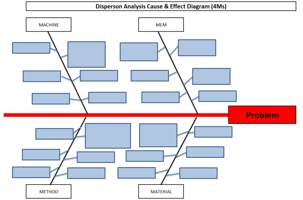
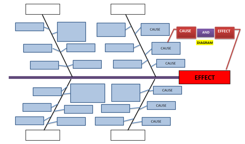
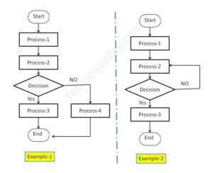
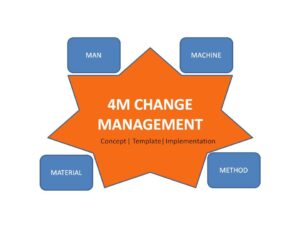
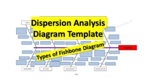
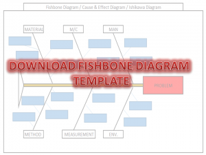
Dispersion Analysis & Process Classification Cause & Effect Diagram Template
Hi readers! Today we will discuss on types of Cause & Effect Diagram/Fishbone diagram. The cause and effect diagram is the most popular and frequently used tool among the seven QC tools. Basically Fishbone diagram is classified into mainly two types as [1] Dispersion Analysis Cause and Effect diagram, and [2] Process Classification Fishbone diagram. The Dispersion analysis fishbone diagram involves identifying the potential cause for a specific quality problem. However, a Process classification cause & effect diagram involves establishing causes related to the Process. In the manufacturing industry, both types of diagrams are used but Dispersion types are most frequently used to identify the potential causes of the quality-related problems. If you are interested in downloading the Dispersion Analysis Cause & Effect Diagram Template & Process Classification fishbone diagram, then click on the given below links.
DOWNLOAD– Dispersion analysis cause & effect diagram template. (4Ms).
Shanti Gopal Pradhan is an experienced professional in Quality Management Systems, QA, Operations, Business Excellence, and Process Improvement. He has strong expertise in international standards including IATF 16949, ISO 9001, ISO 14001, ISO 45001, and ISO 17025, along with methodologies such as TQM, TPM, and Six Sigma.
He holds a degree in Mechanical Engineering along with an MBA, combining strong technical acumen with strategic business insight, he is a Certified Internal Auditor, Lead Auditor, and Six Sigma Black Belt, with a proven track record in driving quality transformation and operational excellence.
Hi Readers! Today we will discuss here 5W1H Analysis with a manufacturing example. 5W1H is a methodology consisting of six questions as What? Where? When? Who? Why? How? Needs to ask a lot of questions to collect all the necessary data to draw up a report of the existing situation with the aim of identifying the phenomenon of the problem. Go through the below details of the 5W1H Analysis Example (Manufacturing Example).
5W1H Analysis will help you broadly to know the nature of the problem like What is the Problem? Where did the problem occur? When did the problem happen? Who do you need to get involved? Why is it happening? How can you overcome the Problem?
The above pattern may be subject to change if it does not fit with the scenario/ nature of the problem. We can use “how much” additionally as and when applicable regarding the nature of the problem. And then it’s namely called 5W2H.Here, we will illustrate only 5W1H.
Description
of 5W1H:
Phenomenon of Problem:
Explanation:
What is the
Problem?
Where did the problem occur?
When did the problem happen?
Describe the location, place, and m/c involved.
Who do you need to get involved?
Find out the time when a situation took place.
Involvement of people, external providers, etc.
Why is it happening?
How can you overcome the problem?
To know the reason behind of facts
Method of implementation, deployment, etc.
Method of implementation, deployment, etc.
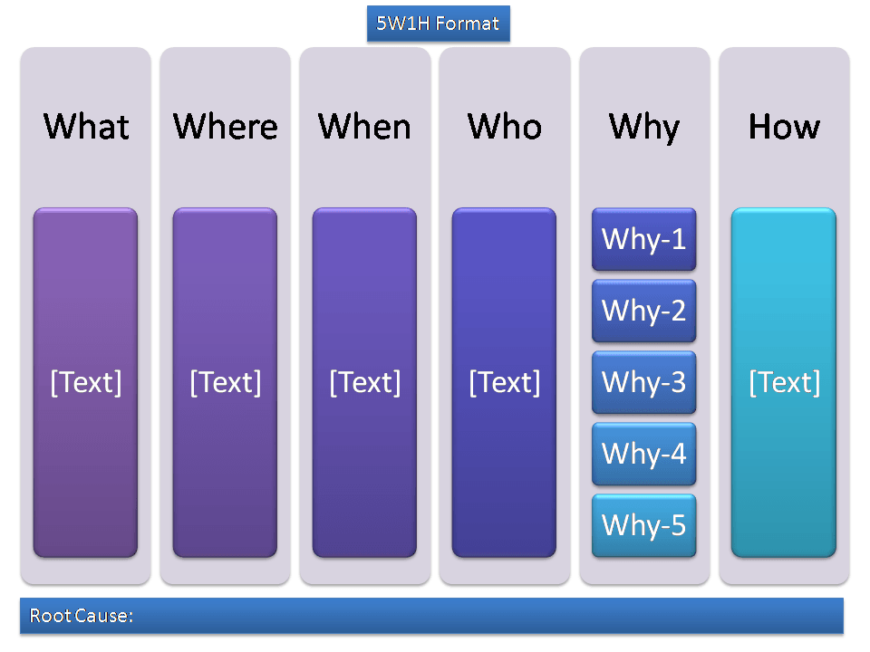
[5W1H Description Table]
Benefits of 5W1H Method:
It can apply to all types of industries.
One can use it to address all kinds of problems to ask questions from every angle.
It’s a simple method, that everyone can understand, no need for training to ask these types of questions.
From my past experience, I’m trying to share how I was involved with Gemba’s investigation of the line rejection problem. I often use the 5W1H and 5W2H methodology to collect the information on line rejection, before doing the brainstorming, our team members collect the information about the problem with details like which machine, which place, who is responsible, etc. so that we can get the complete data and information for root cause analysis. One day during the line product checking, we found 5 products were rejected. so next I collected the whole data and informed to our CFT team for analysis, Thereafter I realized that how this (5W1H methodology) is helpful. Below is the step-by-step approach described for the deployment of the 5W1H method in industries.
In Manufacturing Industries, this 5W1H format is generally used for problem-solving and It’s widely used during shop floor red bin analysis and also, it’s utilized for analysis of different types of problems like machine breakdown, process-related issue, man-related issues, material related issues, utility breakdown, tools related issue, mechanical & electrical related breakdown, etc.
Step by step approach:
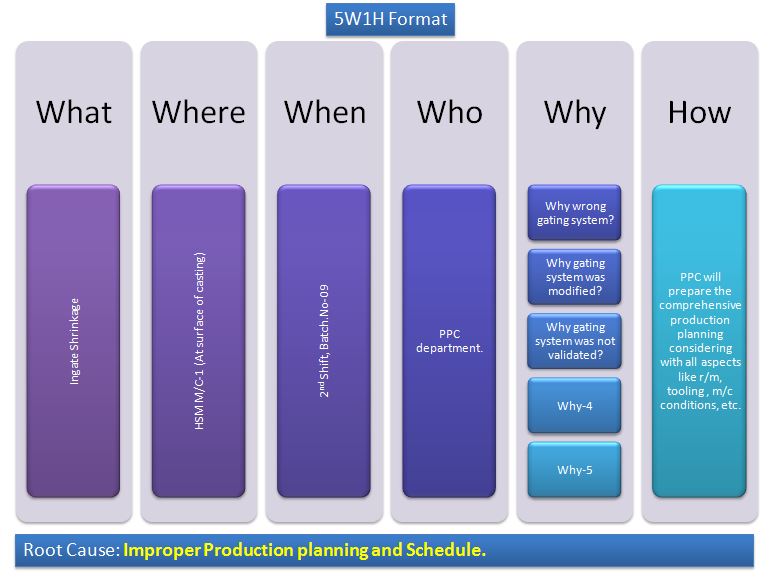
The 5W1H method is applicable to address all kinds of Problems, so go to the real place where the problem occurred. Understand and write in the first “W” that, what is the problem, e.g. Ingate shrinkage, write the technical definition and details of the problem with the defective product picture.
The second process is to cover the question related to “W-2” i.e (Where), Now we have to mention the process area, the machine no, defect location in the product, here we have to cover the defect’s generation area/ process, where it actually generated.
The third “W” is When, here you have to investigate the shop floor workforce and to check the relevant data to know the time/ period/ date/ shift, etc. that when the problem occurred.
In the step “HOW” we have to take an action plan against the root cause.
This is the last step i.e. “Who”: who is the responsible person to implement the action plan.
5W1H Analysis Example-1:
We have taken the same example here, which is already explained in previous articles. If you have not yet read then kindly go through it-previous article.
5W1H Analysis Template / Format
According to previous article the problem found in the process was Ingate Shrinkage. And same we are going to explain it through the 5W1H template.
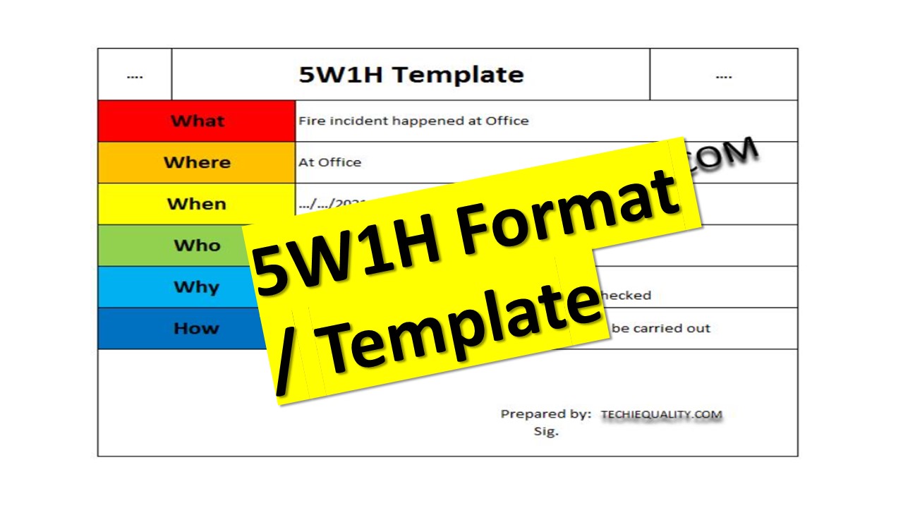
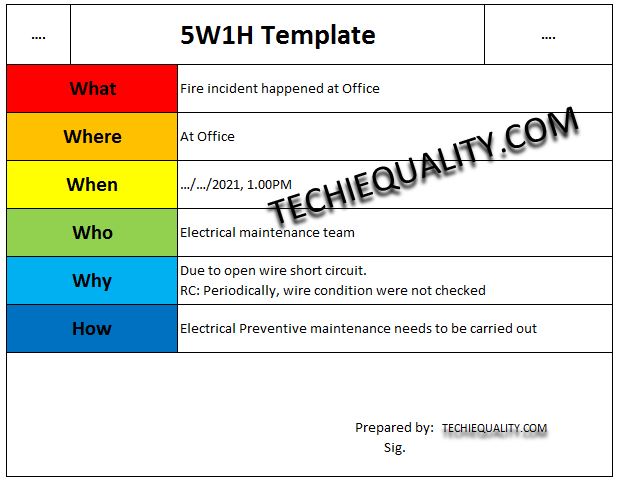
The cross-functional team has investigated the fire incident, which was happened in the office at 1.00PM. They have recorded the information in 5W1H format, the same as we have mentioned in below.
the main difference is the absence of 2H i.e. “How much” in the 5W1H methodology, otherwise all terms are the same in both 5W1H and 5W2H. but sometimes we use “how much” in place of “How” as per the nature of the problem in the 5W1H template
Shanti Gopal Pradhan is an experienced professional in Quality Management Systems, QA, Operations, Business Excellence, and Process Improvement. He has strong expertise in international standards including IATF 16949, ISO 9001, ISO 14001, ISO 45001, and ISO 17025, along with methodologies such as TQM, TPM, and Six Sigma.
He holds a degree in Mechanical Engineering along with an MBA, combining strong technical acumen with strategic business insight, he is a Certified Internal Auditor, Lead Auditor, and Six Sigma Black Belt, with a proven track record in driving quality transformation and operational excellence.
Hi Readers! Today we will discuss on 5W2H Analysis Example with industrial/manufacturing practices and also in this post, you can download our approved template for deployment in your workplace. We have already posted our previous article 5W1H analysis with examples. If you have not yet read that article then first go through it. Our 5W2H template/format is ready to use just download it from given below link.
How to use the 5W2H Method in Manufacturing Industries?
In Industry, both the 5W2H and 5W1H are frequently used methods to Understand, collect, and analyze the Problem. The application of the 5W2H method depends on the nature of the problem. The full form of 5W2H is What, Where, When, Who, Why, How, and How much. Information and Data on any problem are always required for analysis and to find out the root cause. So 5W2H Format will help you to get the collective data and information in one place for problem analysis. From my past experience, I’m sharing the approach and steps for the usage and implementation of the 5W2H methodology.
Daily we find some problem in our production process/line, to overcome such problem we have to resolve these as soon as possible. The problems may be maintenance-related (like Breakdown, equipment failure, utility problems, quality issues, etc.). To understand and solve the problem, we need info. and data. In my point of view, always problem-solving team should always visit the Gemba ( Actual place) to clearly understand and investigate the problem. Below are the steps that we generally were being followed;
Visit to the Gemba (E.g.-Shop floor)
Ask the question to the operator /shop floor person and collect the information and data.
Investigate the 4M or 6M (Men, M/C, Material, Method, Mother Nature, and Measurement) factors and see if any clues are present or not.
Do Brainstorming and find out the Root Cause.
The Manufacturing Example is mentioned below covering all the above steps.
5W2H Analysis:
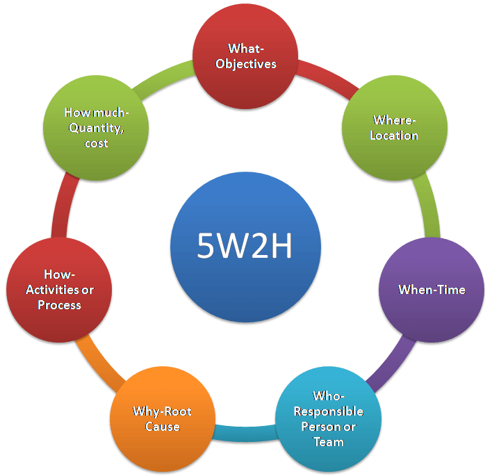
5W2H Analysis will help you broadly to know the nature of the problem like What is the Problem? Where did the problem occur? When did the problem happen? Who do you need to get involved with?Why is it happening? How can you overcome the Problem? How much quantity?
The above pattern may be subject to change if it does not fit with the scenario/ nature of the problem. We can use only “how” as and when applicable regarding the nature of the problem. And then it’s namely called 5W1H. Here. Today in this article we will discuss only 5W2H Analysis with examples.
Explanation of 5W2H:
5W2H terms
The Phenomenon of the Problem:
Explanation:
What
What is the Problem?
Goal or Objectives (To
describe the problem, activity, task, or project purpose)
Where
Where did the problem occur?
Location (Describe the location, place, and m/c involved)
When
When did the problem happen?
Time (Find out the time, date, and schedule when the situation took place)
Who
Who do you need to get involved with?
Responsible Person or Team (Involvement of people, external provider, etc.)
Why
Why is it happening?
Root Cause (To know the reason behind facts, popular tools used for root cause finding are, e.g. RCA, why-why analysis, etc.)
How
How can you overcome the problem?
Activities or Process (Method of implementation, deployment, etc.), e.g. CAPA.
How Much
How much quantity?
Cost, Quantity, etc.
Explanation Table [5W2H]
5W2H Analysis Example
The above phenomenon of question is not always common for all scenarios; the question patterns will be changed according to the nature of issues/problems/risks/opportunities.
EXAMPLE-1:
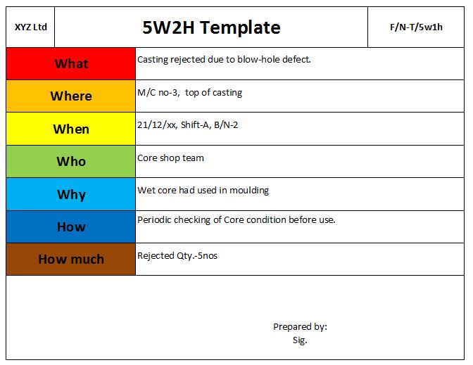
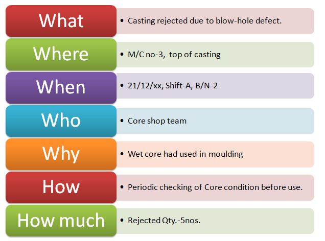
During shop floor rejection analysis at the rejection yard, we found 5 nos casting were rejected due to a blow-hole on the top surface. Same we have explained through the 5W2H format as;
5W2H Analysis Example
EXAMPLE-2:
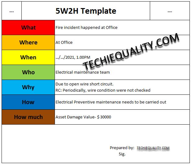
Unfortunately, one day at 1.00 PM, a Fire incident happened at the office. The organization had taken the necessary immediate action during the incident but later the CFT team investigated the area to collect the data for root cause analysis. They have recorded the data and analysis report in 5W2H Format, the same format is given below.
the main difference is the absence of 2H i.e. “How much” in the 5W1H methodology, otherwise all terms are the same in both 5W1H and 5W2H. but sometimes we use “how much” in place of “How” as per the nature of the problem in 5W1H format.
What is the meaning of 5W2H?
The methodology itself indicates that there are 5 Ws and two Hs. This means, what, where, when, who, why, how, and how much. it’s a questioning method and very easy to implement in any organization. we have already given multiple examples for your better understanding. and also defined each term of 5W2H in the above table. just think of one more example of a machine breakdown issue on the shop floor. and you are trying to solve it in a systematic way by applying the 5W2H methodology. Once you applied it and resolved the problem then simultaneously, you did both jobs i.e. one is a record of b/d CAPA and solved the actual problem. It’s a very useful record and you can refer to it when there is the same problem occurs on the same machine.
Shanti Gopal Pradhan is an experienced professional in Quality Management Systems, QA, Operations, Business Excellence, and Process Improvement. He has strong expertise in international standards including IATF 16949, ISO 9001, ISO 14001, ISO 45001, and ISO 17025, along with methodologies such as TQM, TPM, and Six Sigma.
He holds a degree in Mechanical Engineering along with an MBA, combining strong technical acumen with strategic business insight, he is a Certified Internal Auditor, Lead Auditor, and Six Sigma Black Belt, with a proven track record in driving quality transformation and operational excellence.
Fault tree analysis template | Download format | FTA with Example:
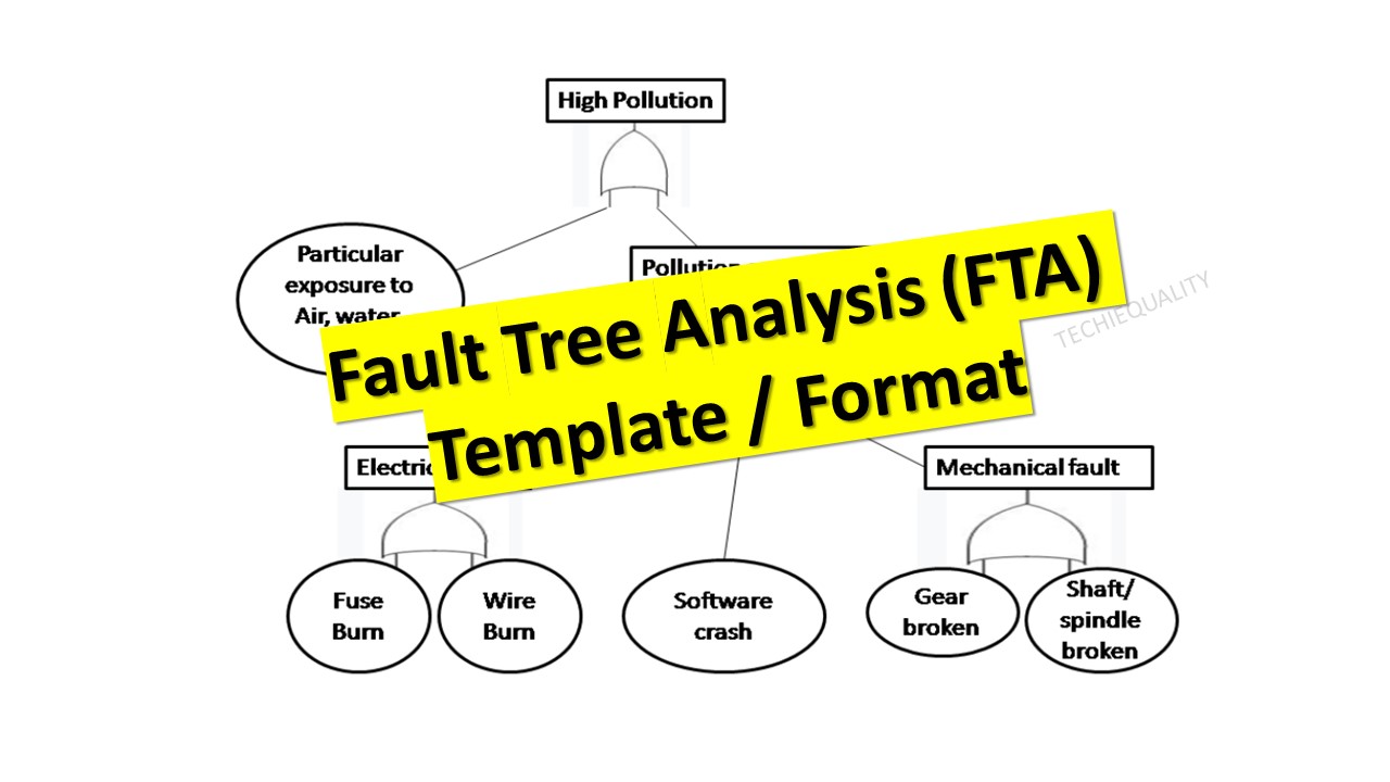
Hi Readers! Today we will discuss on FTA. And also we have prepared some templates/formats considering with some situations. You can download the same templates from the below links. FTA (Fault tree analysis template) was developed by H.A Watson at Bell Laboratory in 1962. Fault tree analysis is generally used to analyze the undesired state of a system through Boolean algebra. This is commonly applicable in the fields of the Nuclear power sector, Chemical manufacturing and service sector, Pharmaceutical, Petrochemical, Aerospace, and other high-hazard industries but now it has become a popular diagram that is being used in almost all types of organizations or sectors.
As we know, if any incidents occur (may be due to high-risk factors or particular system level failure) in a high-hazard factory may lead to a high Severity score in health, environment, and safety concerns. So here we will explain the FTA in detail with EHS-related Examples.
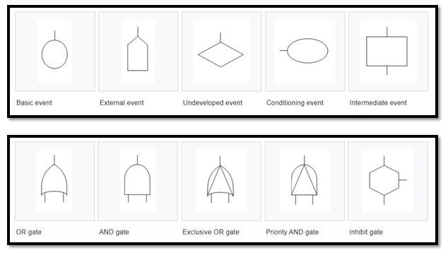
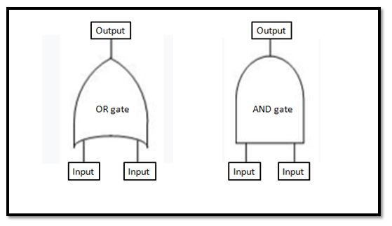
The output occurs if any input occurs. In the above figure you can see there is I/P-1 and I/P-2 in Or-Gate, The output of OR-gate will occur when any one of among two inputs will occurs. But in the case of AND-gate, the output will occur when both the input (I/P-1 & I/P-2) will occur.
Shanti Gopal Pradhan is an experienced professional in Quality Management Systems, QA, Operations, Business Excellence, and Process Improvement. He has strong expertise in international standards including IATF 16949, ISO 9001, ISO 14001, ISO 45001, and ISO 17025, along with methodologies such as TQM, TPM, and Six Sigma.
He holds a degree in Mechanical Engineering along with an MBA, combining strong technical acumen with strategic business insight, he is a Certified Internal Auditor, Lead Auditor, and Six Sigma Black Belt, with a proven track record in driving quality transformation and operational excellence.
Process Performance Excel Template (Pp & Ppk Format) | DOWNLOAD
Process Performance Excel Template: According to the SPC (Statistical Process Control Manual), the process Performance (Pp) compares the process performance of the process to the maximum allowable variation as indicated by the tolerance. The Pp (Process Performance) provides a measure of how well the process will satisfy the variability requirements. And the Index of process performance is termed as Ppk. It takes the process location as well as the performance into account. Download the Excel Template /Format of Pp & Ppk from the below link.
How to use the Pp & Ppk Excel Format in your process to calculate the index value?
1: Download the Template/ Format from the above links.
2: Read the note mentioned in the Excel template.
3: Only the yellow colour box (mentioned in format) is changeable and other values will calculate automatically.
The formula of Pp (Process Performance):
Pp = ((USL-LSL)/ (6 X S))
[Where USL=Upper specification limit, LSL=Lower
specification limit and S= Standard Deviation]
The formula of Ppk (Process Performance Index):
Ppk = Minimum of PPU or PPL
PPU= ((USL-Average of average)/ (3 X S))
PPL= ((Average of average-LSL)/ (3 X S))
Note: Pp ≥ Ppk.
Example:
Company XYZ pvt ltd is interested to know the process performance of moulding process that, how well the process is performing and satisfies the variability requirements of mould hardness. The process engineer has collected the total 100 numbers of readings considering with subgroup size 5. Readings are given below;
Sl.No.
1
2
3
4
5
6
7
8
9
10
Subgroup1
63.00
61.00
65.00
62.00
65.00
63.00
65.00
64.00
63.00
65.00
Subgroup2
63.00
62.00
64.00
62.00
66.00
64.00
65.00
62.00
64.00
62.00
Subgroup3
62.00
63.00
65.00
65.00
65.00
62.00
62.00
65.00
62.00
62.00
Subgroup4
63.00
66.00
64.00
64.00
65.00
63.00
62.00
63.00
65.00
64.00
Subgroup5
64.00
65.00
63.00
63.00
65.00
62.00
62.00
62.00
62.00
62.00
11
12
13
14
15
16
17
18
19
20
61.00
63.00
62.00
63.00
62.00
66.00
62.00
62.00
63.00
65.00
64.00
63.00
63.00
63.00
62.00
65.00
67.00
62.00
64.00
64.00
62.00
68.00
65.00
66.00
64.00
64.00
64.00
64.00
62.00
65.00
63.00
68.00
64.00
68.00
64.00
66.00
67.00
64.00
63.00
64.00
62.00
64.00
63.00
64.00
62.00
65.00
62.00
65.00
62.00
63.00
Characteristics
Mould Hardness
Process:
Moulding
Process
USL
70
LSL
60
Pp
1.06
Ppk
0.8
In the above example, the value of Ppk (0.8) is indicating that the process needs further improvement. The start-up process requires at least 1.33 and next to 1.67 and 2 onward.
Shanti Gopal Pradhan is an experienced professional in Quality Management Systems, QA, Operations, Business Excellence, and Process Improvement. He has strong expertise in international standards including IATF 16949, ISO 9001, ISO 14001, ISO 45001, and ISO 17025, along with methodologies such as TQM, TPM, and Six Sigma.
He holds a degree in Mechanical Engineering along with an MBA, combining strong technical acumen with strategic business insight, he is a Certified Internal Auditor, Lead Auditor, and Six Sigma Black Belt, with a proven track record in driving quality transformation and operational excellence.
The Histogram Template is prepared in a simple format with an industrial example. We have described the example in below, just go through this article and Download the Template / Format. It’s a very useful tool and is frequently used in manufacturing industries. The main function is to know the frequency distribution, symmetry, and skewness, and it also helps to determine the normality of data by drawing the bell curve.
A histogram is one of the 7QC tools and commonly used graph to show frequency distribution. Helps summarize data from a process that has been collected over a period of time.
A histogram is a representation of the frequency distribution of numerical data. it was first familiarized by Karl Pearson. A histogram is related to merely one type of variable data. You should calculate the interval value to represent the bins. Bins shall give an idea about the how much data falls within the selected data range’s width. Histogram gives the indication about data distribution as normal, skewed, or bi-modal.
How to use our Histogram
Template:
Step-1: Download the Histogram Template from the above link.
Step-2: Carefully read the “Note” mentioned in the Excel template.
Step-3: Enter the reading only in the yellow color box. Then other values will calculate automatically and your histogram will be ready for interpretation.
Note:
1. Only yellow colour boxes are changeable
2. Make sure that the sum of frequency is equal to the total count, e.g. sum of frequency in a given example [example is given in histogram excel format, just download and see the example] is 30 and the count is also 30, if not then you have to adjust the parameters and frequency table in frequency distribution format for doing so click on the link given “How to adjust parameters and frequency table in Histogram Template?”.
Shanti Gopal Pradhan is an experienced professional in Quality Management Systems, QA, Operations, Business Excellence, and Process Improvement. He has strong expertise in international standards including IATF 16949, ISO 9001, ISO 14001, ISO 45001, and ISO 17025, along with methodologies such as TQM, TPM, and Six Sigma.
He holds a degree in Mechanical Engineering along with an MBA, combining strong technical acumen with strategic business insight, he is a Certified Internal Auditor, Lead Auditor, and Six Sigma Black Belt, with a proven track record in driving quality transformation and operational excellence.
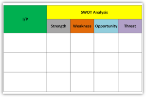
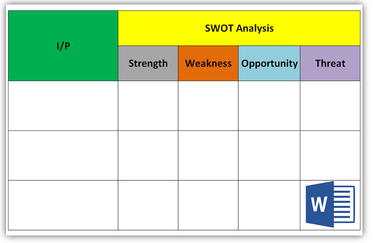
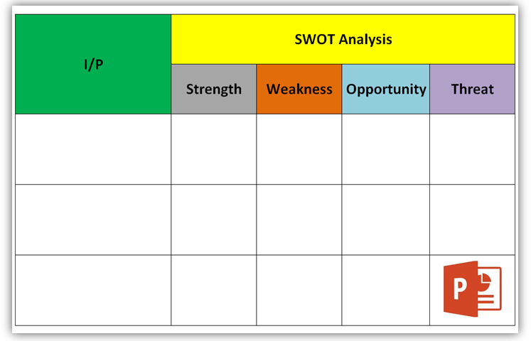
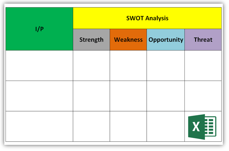
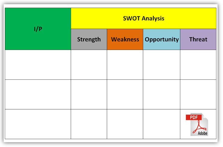
The SWOT Analysis is a strategic planning technique, which is generally used to identify the strengths, weaknesses, opportunities, and threats related to the context of the organization.
DOWNLOAD the SWOT Analysis Templates / Formats in Word, Excel, PDF, and PPT form:
I/P: This is the input points that you would like to do the SWOT analysis. For example, several factors and business issues (Internal and External).
Internal issues example: policy, Standards, business strategy, labor strikes, Major accidents, Raw material Crisis, etc.
External Issues Example: Legal, Customer Contract, Profit loss, loss in share market, etc.
Strength: Advantages of Business Characteristics.
Weakness: Disadvantage of Business Characteristics.
Opportunity: Business Element that could be exploited to its advantage.
Threat: The Business element that could cause trouble for the business.
When to use SWOT Analysis:
You can use the SWOT analysis process in the below field but not limited to;
To overcome the Business concern types problem.
To explore the new opportunities in NPD, Process Defects, Design defects, Manufacturing defects, R/M Defects, Customer End defects, technology up-gradation, Socio-political issues, Internal factors, Issues to business strategy, etc.
Note: The SWOT Analysis tool is the best one to use for identifying the Risk and Opportunity of several Business system standards like IATF 16949, ISO 9001, ISO 14001, ISO 45001, ISO 31000, etc.
EXAMPLES:
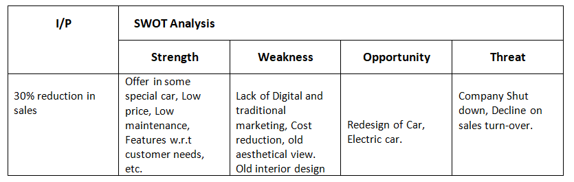
A car manufacturing company has lost its car sales 30% of the average of the last six months’ sales. After that, top management decided to do a SWOT analysis to identify the opportunity and their major threats.
SWOT Analysis (Example): 30% reduction in sales
I/P
Strength
Weakness
Opportunity
Threat
30% reduction in sales
Offer in some special car, Low price, Low maintenance, Features w.r.t customer needs, etc.
Lack of Digital and traditional marketing, Cost reduction, and old aesthetical view. Old interior design
Shanti Gopal Pradhan is an experienced professional in Quality Management Systems, QA, Operations, Business Excellence, and Process Improvement. He has strong expertise in international standards including IATF 16949, ISO 9001, ISO 14001, ISO 45001, and ISO 17025, along with methodologies such as TQM, TPM, and Six Sigma.
He holds a degree in Mechanical Engineering along with an MBA, combining strong technical acumen with strategic business insight, he is a Certified Internal Auditor, Lead Auditor, and Six Sigma Black Belt, with a proven track record in driving quality transformation and operational excellence.
Process Capability Analysis | Cp & Cpk Calculation Excel Sheet with Example
Process Capability Analysis: – The Process Capability (Cp) and Process Capability Index (Cpk) are the important tools, which give an Idea about the Process Capability of a Stable Process. Here we will discuss on Calculation of Cp and Cpk with Examples. We are offering here Process Capability Excel Template / Format for you, hence click on the below links to Download the Excel Format.
Process Capability (Cp) is a statistical measurement of a process’s ability to produce parts within specified limits on a consistent basis
It gives us an idea about the width of the Bell curve.
The Process Capability for a stable process is typically defined as ((USL-LSL)/ (6 x Standard Deviation)).
Cpk-Process Capability Index :
It shows how closely a process is able to produce the output to its overall specifications.
More Value of Cpk means more process capable.
The Process Capability Index for a stable process is typically defined as the minimum of CPU or CPL.
Process Capability Analysis:
Industrial
Example:
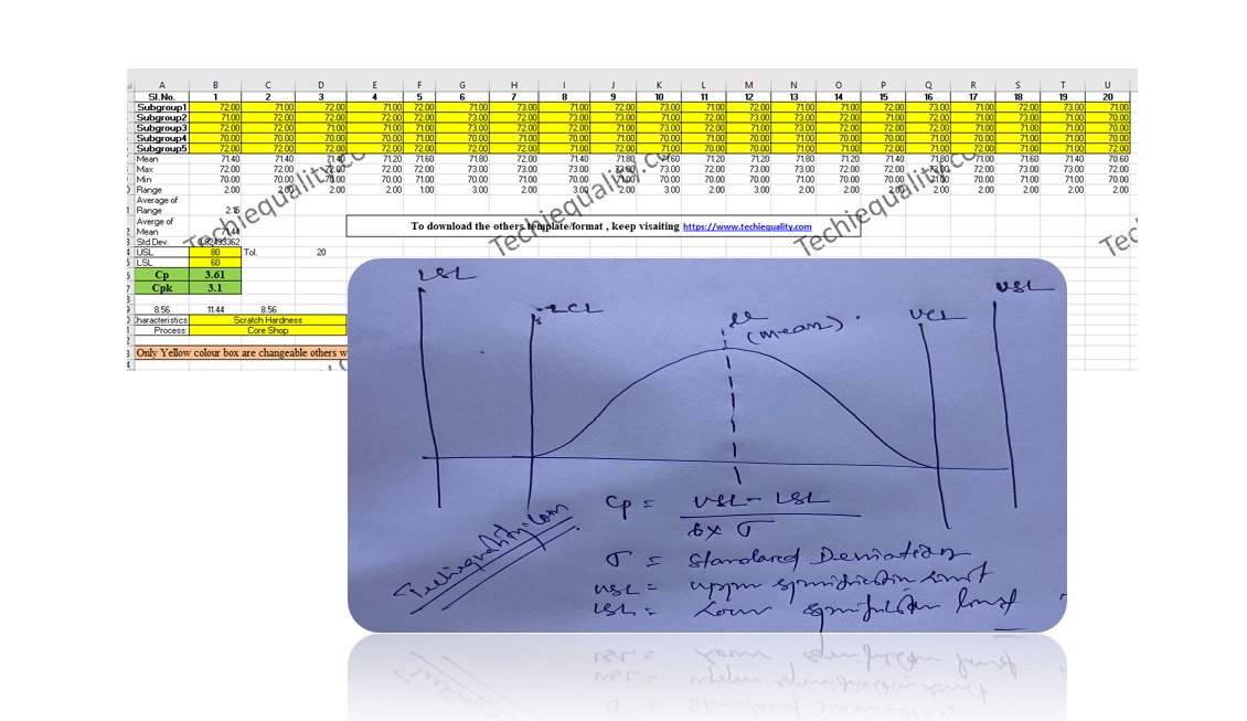
As per the Quality Assurance Plan, The shift engineers of Core Shop have started collecting the readings of the scratch hardness of Core. Given below are the details of Product Characteristics;
Specification of Scratch hardness is 70±10.
The Upper Specification Limit is 80.
The Lower Specification Limit is 60.
Tolerance is 20.
Scratch hardness readings Table:
Table-1
Sl.No.
1
2
3
4
5
6
7
8
9
10
SG 1
72.00
71.00
72.00
71.00
72.00
71.00
73.00
71.00
72.00
73.00
SG2
71.00
72.00
72.00
72.00
72.00
72.00
72.00
73.00
73.00
71.00
SG 3
72.00
72.00
71.00
71.00
71.00
73.00
72.00
72.00
71.00
73.00
SG4
70.00
70.00
70.00
70.00
71.00
70.00
71.00
70.00
71.00
70.00
SG 5
72.00
72.00
72.00
72.00
72.00
72.00
72.00
71.00
72.00
71.00
Table-1 [Scratch hardness readings Table]
Table-2
Sl.No.
11
12
13
14
15
16
17
18
19
20
SG1
71.00
72.00
71.00
71.00
72.00
73.00
71.00
72.00
73.00
71.00
SG2
72.00
73.00
73.00
72.00
71.00
72.00
71.00
73.00
71.00
70.00
SG3
72.00
71.00
73.00
72.00
72.00
72.00
71.00
71.00
71.00
70.00
SG4
71.00
70.00
71.00
70.00
70.00
71.00
70.00
71.00
71.00
70.00
SG5
70.00
70.00
71.00
71.00
72.00
71.00
72.00
71.00
71.00
72.00
Table-2 [Scratch hardness readings Table]
In the above two tables (Table-1 &2), we have taken the 100 readings i.e. (20 times X 5 readings at a time).
Range=Maximum Value-Minimum Value
Average of Range=2.15
Value of d2=2.326 (For Subgroup size 5)
USL = 80, LSL = 60.
Standard Deviation:
=
Average of Range/d2
2.15/2.326
=0.92
Process
Capability (Cp):
=
((USL-LSL)/ (6 x Standard Deviation))
(80-60)/ (6 x 0.92)
20/5.52
= 3.61
Process
Capability Index (Cpk):
CPU:
= ((USL-Average of Mean)/3 x Standard
Deviation)
(80-71.43)/ (3 x 0.92)
8.57/ 2.76
= 3.10
CPL:
= ((Average of Mean-LSL)/3 x Standard
Deviation)
(71.43-60)/ 2.76
10.4211.43/2.76
=4.14
Cpk= 3.10 (minimum of CPU or CPL).
After doing the Process Capability Analysis on Scratch hardness readings, we got the below result value:
Characteristics: Scratch Hardness
Cp (Process Capability) = 3.61
Cpk (Process Capability Index) = 3.10
[ Cp & CpK ]
Process Capability Analysis with Manufacturing Example
The process engineer has collected the 100 nos laddle temperature reading and the same is mentioned in the below table.
Laddle Temperature Specification= 600 ± 15°C
USL = 615
LSL = 585
Table-1
1
2
3
4
5
6
7
8
9
10
S1
605
599
610
605
603
604
600
609
605
601
S2
603
601
612
599
601
598
603
610
603
598
S3
604
598
609
610
612
609
605
612
604
603
S4
600
603
605
598
599
610
598
609
600
610
S5
602
602
607
609
605
612
599
605
609
603
Max.
605
603
612
610
612
612
605
612
609
610
Min.
600
598
605
598
599
598
598
605
600
598
Range
5
5
7
12
13
14
7
7
9
12
Average of Range
9.85
Mean
602.8
600.6
608.6
604.2
604
606.6
601
609
604.2
603
Average of Mean
603.92
Table-2
11
12
13
14
15
16
17
18
19
20
S1
599
601
602
604
598
598
609
598
600
598
S2
610
598
602
603
603
603
605
603
603
610
S3
598
603
607
598
610
607
612
607
605
598
S4
609
610
609
603
603
598
604
598
607
602
S5
600
603
605
607
598
610
603
610
598
603
Max.
610
610
609
607
610
610
612
610
607
610
Min.
598
598
602
598
598
598
603
598
598
598
Range
12
12
7
9
12
12
9
12
9
12
Mean
603.2
603
605
603
602.4
603.2
606.6
603.2
602.6
602.2
d2=2.326
Standard Deviation = Average of Range / d2 = 4.23
Cp = (USL-LSL)/6*Standard Deviation = 1.2
CPU = ((USL-Average of Mean)/3 x Standard Deviation) = 0.872
CPL = ((Average of Mean-LSL)/3 x Standard Deviation) = 1.489
CpK = 0.872(minimum of CPU or CPL).
Note: Download the Cp & Cpk excel template or format and deploy it in manufacturing process. downloading links are provided at top of this Article.
Ans.: Cp & CpK are termed as process capability and process capability index. In both cases, we would like to verify whether the process can meet the customer’s requirements or not. Generally, it is used when the process is under stable & statically control.
What is the formula of Cp & Cpk?
Cp= ((USL-LSL)/ (6 x Standard Deviation)) , where USL=Upper Specification Limit & LSL=Lower Specification Limit.
Cpk= Minimum of CPU or CPL, where CPU= ((USL-Average of Mean)/3 x Standard Deviation) & CPL= ((Average of Mean-LSL)/3 x Standard Deviation)
What are the good values of Cpk?
Generally, the customers provide the Cpk value to their supplier to maintain it in their manufacturing process. but for your knowledge, a Cpk value of 2 or greater than 2 is an excellent one.
What is cpk?
The cpk is the process capability index which shows how closely a process is able to produce the output to its overall specifications.
What is the IATF 16949 requirement of Statistical Concepts or SPC?
Application of statistical concepts in the IATF 16949 standard has been mentioned in Clause no-9.1.1.3, both Control chart (variable and Attribute) and process capability are the mandatory requirements. The application of statistical concepts shall be understood and used by the employees involved. We have published a separate article on Control Charts for our readers and you can Download Control Chart Excel Template / Format.
Shanti Gopal Pradhan is an experienced professional in Quality Management Systems, QA, Operations, Business Excellence, and Process Improvement. He has strong expertise in international standards including IATF 16949, ISO 9001, ISO 14001, ISO 45001, and ISO 17025, along with methodologies such as TQM, TPM, and Six Sigma.
He holds a degree in Mechanical Engineering along with an MBA, combining strong technical acumen with strategic business insight, he is a Certified Internal Auditor, Lead Auditor, and Six Sigma Black Belt, with a proven track record in driving quality transformation and operational excellence.
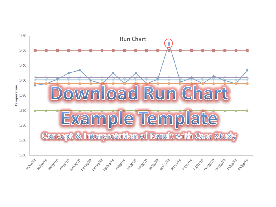
Run Chart Example | Concept & Interpretation of Result with Case Study | Industrial Example:
Hi readers! today we are going to discuss on Run Chart Example. A run chart is also called a Line graph. It’s a live Chart that you can use it on the shop floor to monitor the Process variation. In the run chart, you could able to set up the mean value, upper specification limit, and lower specification limit. A Run chart will not be able to give an idea about the control limits. It represents the variation in summarizing data of Process, or Product characteristics. However, it can show you how the process is running.
Interp.-1: Six or more consecutive points fall above or below the centre line (Median Line).
Interp.-2: Five or more successive points are going up or down.
Interp.-3: Too many or too few runs.
Interp.-4: An astronomical data point.
If any, one of the above interpretations has been identified in the run chart, it means variation (non-random variation) present in the process’s characteristics.
Industrial Practical Example of Run Chart (Run Chart Example):
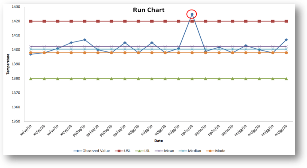
We are going to take an example from the Iron manufacturing industry. Such a company is produced as an automobile part with the following specifications.
Pouring Temperature =1400°C±20°C.
The company has decided to maintain the variation trend of Pouring temperature. They have implemented a run chart on the shop floor to monitor and measure the variation of pouring temperature w.r.t time period. The process engineer promptly started to measure the temperature readings four times a day (three working shifts) for five days. Below are the readings for your reference as;
Temperature Reading Table:
Date
Observed Value
xx/yy/19
1397
xx/yy/19
1398
xx/yy/19
1401
xx/yy/19
1405
pp/qq/19
1407
pp/qq/19
1400
pp/qq/19
1398
pp/qq/19
1405
ss/gg/19
1398
ss/gg/19
1405
ss/gg/19
1398
ss/gg/19
1401
pp/ss/19
1425
pp/ss/19
1399
pp/ss/19
1402
pp/ss/19
1398
nn/gg/19
1403
nn/gg/19
1400
nn/gg/19
1398
nn/gg/19
1407
Now, we are supposed to calculate the mean, median, and mode values to plot the run chart.
Date
Observed Value
USL
LSL
Mean
Median
Mode
xx/yy/19
1397
1420
1380
1402.25
1400.5
1398
xx/yy/19
1398
1420
1380
1402.25
1400.5
1398
xx/yy/19
1401
1420
1380
1402.25
1400.5
1398
xx/yy/19
1405
1420
1380
1402.25
1400.5
1398
pp/qq/19
1407
1420
1380
1402.25
1400.5
1398
pp/qq/19
1400
1420
1380
1402.25
1400.5
1398
pp/qq/19
1398
1420
1380
1402.25
1400.5
1398
pp/qq/19
1405
1420
1380
1402.25
1400.5
1398
ss/gg/19
1398
1420
1380
1402.25
1400.5
1398
ss/gg/19
1405
1420
1380
1402.25
1400.5
1398
ss/gg/19
1398
1420
1380
1402.25
1400.5
1398
ss/gg/19
1401
1420
1380
1402.25
1400.5
1398
pp/ss/19
1425
1420
1380
1402.25
1400.5
1398
pp/ss/19
1399
1420
1380
1402.25
1400.5
1398
pp/ss/19
1402
1420
1380
1402.25
1400.5
1398
pp/ss/19
1398
1420
1380
1402.25
1400.5
1398
nn/gg/19
1403
1420
1380
1402.25
1400.5
1398
nn/gg/19
1400
1420
1380
1402.25
1400.5
1398
nn/gg/19
1398
1420
1380
1402.25
1400.5
1398
nn/gg/19
1407
1420
1380
1402.25
1400.5
1398
By using the aforesaid data table, we have plotted a run chart/line chart with the help of Excel. But you can also plot the run chart by Minitab such a process we will discuss later in separate articles.
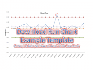
Run Chart Example
[Run Chart Plot by
Excel]
Interpretation of the above run chart:
Before, we discuss the result of the above run chart. I would like to request you kindly go through the above chart prudently.
In the above chart, one reading (red highlighted point) suddenly goes up and the chart represents an astronomical data point interpretation. It means there is the existence of variation in the process and it is a non-random variation. In such a way you can plot the run chart to know how the process is running and according you could able to act on it.
Shanti Gopal Pradhan is an experienced professional in Quality Management Systems, QA, Operations, Business Excellence, and Process Improvement. He has strong expertise in international standards including IATF 16949, ISO 9001, ISO 14001, ISO 45001, and ISO 17025, along with methodologies such as TQM, TPM, and Six Sigma.
He holds a degree in Mechanical Engineering along with an MBA, combining strong technical acumen with strategic business insight, he is a Certified Internal Auditor, Lead Auditor, and Six Sigma Black Belt, with a proven track record in driving quality transformation and operational excellence.
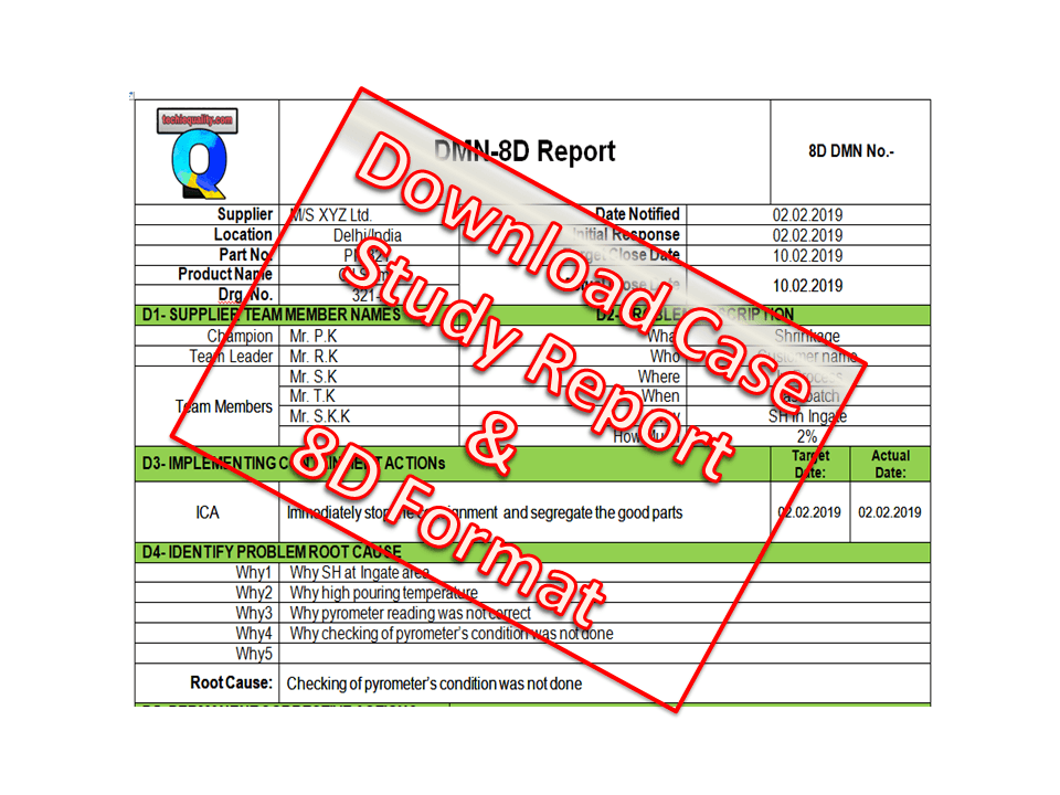
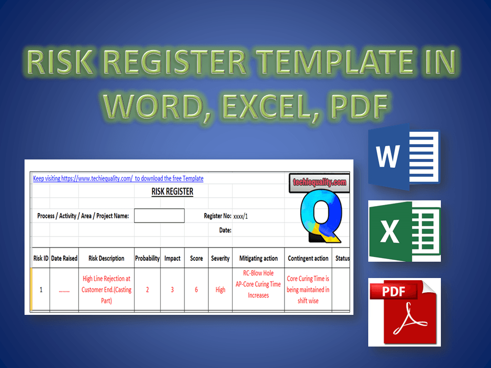
Hi Reader! Today we are going to discuss an important topic, which is called Risk-based thinking and Risk management. The organization uses different types of tools to identify the Risks but here, we will be discussing one of the popular tools, i.e. Risk Register. As we know most probably business standards like QMS, EMS, OH&SMS, etc. are now risk-based thinking approaches. So we will only concentrate on learning how to use the Risk register with Examples.
Step-1: Download the Above Template by simply clicking on the Download link.
Step-2: Read carefully the terminology.
Step-3: The severity Table is given in the Excel Template in a Separate Sheet, So don’t forget to download the Excel Template.
Step-4: Read carefully the sample example written in red colour in Template.
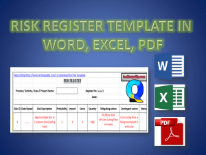
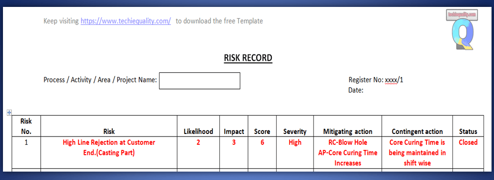
Example: Before I describe the Template, Please go through the below figure.
Risk Register Template
Terminology:
[1] Risk No.: Unique identification of each and every identified risk.
[2] Risk: Details about the Risk.
[3] Mitigating Action: Action to eliminate the Impact of Risk.
[4] Contingent Action: Action to eliminate the re-occurrence of Risk.
Here, in the above Figure, I have taken an Example of Customer complaints. So let’s get started with details about the above complaint.
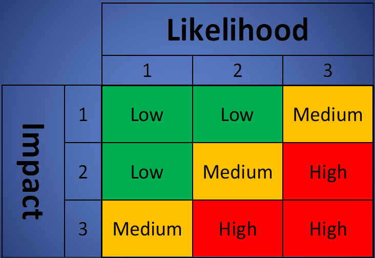
High Line rejection at the Customer end was the Risk which has the score value 6 and severity is coming under the High Level. The criteria of probability and impact depend upon the organization’s decision. For a sample basis, I have taken the severity ranking according to the below data;
A Mitigation plan has taken w.r.t the Root Cause Analysis, so here Increasing the core curing time was thecorrective action and contingent action is thePreventive action. Which is “Core curing time is being maintained shift-wise”.
FAQ:
Q1: Where can we use this template?
A1: You can use this template in Project management, Risk Management, to identify the QMS, EMS OHSAS, and Business-related risks.
Q2: Who will decide the Criteria of Probability, Impact, and Severity?
A2: The organization itself will decide the criteria as to what it would be.
Shanti Gopal Pradhan is an experienced professional in Quality Management Systems, QA, Operations, Business Excellence, and Process Improvement. He has strong expertise in international standards including IATF 16949, ISO 9001, ISO 14001, ISO 45001, and ISO 17025, along with methodologies such as TQM, TPM, and Six Sigma.
He holds a degree in Mechanical Engineering along with an MBA, combining strong technical acumen with strategic business insight, he is a Certified Internal Auditor, Lead Auditor, and Six Sigma Black Belt, with a proven track record in driving quality transformation and operational excellence.