Free Normality Test Calculator

Normality Test Calculator
FREE ONLINE STATISTICAL TOOL

Free Online Normality Test Calculator

Check whether your data follows a normal distribution using our free online Normality Test Calculator. Analyze your data quickly with the Anderson-Darling test, p-value, histogram and Q-Q plot.

Free to Use No software installation
Statistical Test Anderson-Darling
Visual Results Histogram & Q-Q Plot
Run Free Normality Test
Opens the Normality Test Calculator in a new tab
A²
Anderson-Darling Normality Test
Normal Distribution Data Analysis
ONLINE
Low
Mean
High
TEST A²
P-VALUE 0.05
LEVEL α = 0.05
✓
Analyze Your Data Get results in seconds
Normality Test • Normality Test Calculator • Anderson-Darling Test • Online Statistical Tool

Normality Test Calculator | Free Online Normality Test

Checking whether your data follows a normal distribution is an important step in statistical analysis, Six Sigma, quality control, process improvement, and data analysis. Our free online Normality Test Calculator allows you to test your data without installing statistical software. You can upload an Excel or CSV file or enter your measurements manually. The calculator performs an Anderson-Darling normality test and provides the test statistic, p-value, normality conclusion, histogram, Q-Q plot, and statistical interpretation.

Free Online Normality Test Calculator

Use the calculator above to quickly determine whether your dataset is consistent with a normal distribution.

You can:

  • Upload Excel (.xlsx or .xls) data
  • Upload CSV data
  • Enter data manually
  • Select a measurement column from an Excel file
  • Analyse multiple columns together
  • Analyse an entire worksheet
  • Calculate the Anderson-Darling normality test
  • View the p-value and test statistic
  • View the mean, standard deviation, minimum, maximum, and range
  • Examine a histogram
  • Examine a Q-Q plot
  • Download a PDF normality test report

The calculator requires at least 8 data points to perform the analysis.

What Is a Normality Test?

A normality test is a statistical method used to determine whether a dataset is reasonably consistent with a normal probability distribution.

A normal distribution is commonly represented by the familiar bell-shaped curve. Data that approximately follows a normal distribution tends to be distributed symmetrically around its mean, with observations becoming less frequent as they move further away from the center.

Normality is an important assumption in many statistical methods. Therefore, checking the distribution of your data can help you determine whether a statistical method based on normality is appropriate.

A normality test does not prove that a dataset is perfectly normal. Instead, it provides statistical evidence about whether the data are inconsistent with a normal distribution. Based on the above, you can do the Normality Test Online.

Why Is Normality Testing Important?

Normality testing is frequently used in:

  • Six Sigma projects
  • Quality control
  • Manufacturing
  • Process capability analysis
  • Statistical process control
  • Measurement system analysis
  • Engineering analysis
  • Scientific research
  • Hypothesis testing
  • Statistical modelling
  • Data analysis

For example, before performing a Cp or Cpk process capability analysis, analysts often examine whether the process data are reasonably consistent with a normal distribution.

Similarly, normality can be relevant when selecting statistical methods that make distributional assumptions.

However, normality should not be evaluated using a p-value alone. The shape of the data should also be examined using graphical methods such as a histogram and Q-Q plot.

How to Use the Normality Test Calculator

Using the online normality test calculator (our Free Normality Test) is straightforward.

Step 1: Prepare Your Data

Prepare a single column of numerical measurements.

For example:

1398

1402

1405

1397

1401

1404

1399

1403

1400

1406

Your dataset should contain numerical observations rather than text or categorical values.

Step 2: Upload Your Data or Enter It Manually

The calculator supports:

  • Excel files
  • CSV files
  • Manual data entry

For Excel files, the first row can contain a column heading.

You can also select the relevant measurement column when your workbook contains multiple columns.

Step 3: Run the Normality Test

After loading the data, run the analysis.

The calculator evaluates the dataset using the Anderson-Darling normality test.

Step 4: Review the Results

The calculator provides:

  • Sample size
  • Mean
  • Standard deviation
  • Minimum
  • Maximum
  • Range
  • Anderson-Darling statistic
  • p-value
  • Significance level
  • Normality conclusion

You can then examine the histogram and Q-Q plot to understand the shape of your data.

Anderson-Darling Normality Test

The Anderson-Darling test is a statistical test used to evaluate whether sample data are consistent with a specified probability distribution, including the normal distribution.

In this calculator, the Anderson-Darling test is used to assess normality.

The results include an adjusted Anderson-Darling statistic (A²) and a p-value.

The calculator uses a significance level of:

α = 0.05

The p-value is then compared with the significance level.

Normality Test Hypotheses

The normality test can be expressed using two hypotheses.

Null hypothesis (H₀)

The data come from a normal distribution.

Alternative hypothesis (H₁)

The data do not come from a normal distribution.

The p-value provides evidence that helps determine whether the null hypothesis should be rejected at the selected significance level.

How to Interpret the Normality Test P-Value

The p-value is one of the most important parts of a normality test.

For this calculator, the significance level is:

α = 0.05

There are two common situations.

If p-value > 0.05

When the p-value is greater than 0.05, there is not enough statistical evidence at the 5% significance level to reject the null hypothesis of normality.

In practical terms:

The data are consistent with a normal distribution based on this test.

This does not mean that the data are proven to be perfectly normal.

For example:

p-value = 0.247

Because:

0.247 > 0.05

the normality test does not provide sufficient evidence to reject the normal-distribution assumption.

If p-value ≤ 0.05

When the p-value is less than or equal to 0.05, the test provides evidence against the null hypothesis of normality.

For example:

p-value = 0.018

Because:

0.018 ≤ 0.05

the normality hypothesis is rejected at the 5% significance level.

The next step should be to examine the histogram and Q-Q plot and investigate possible reasons for the non-normal pattern.

Why You Should Not Look at the P-Value Alone

A normality test should ideally be interpreted together with graphical analysis.

Your calculator provides both a histogram and a Q-Q plot for this purpose.

This is useful because statistical tests can be affected by sample size.

With a very large dataset, relatively small departures from normality can produce a small p-value.

With a small dataset, substantial departures from normality may not always produce strong statistical evidence.

Therefore, statistical significance and practical distribution shape should be considered together.

Understanding the Histogram

A histogram shows how frequently observations occur across different ranges of values.

A dataset that is approximately normally distributed often produces a roughly:

  • Bell-shaped distribution
  • Symmetrical distribution
  • Single-peaked distribution

However, real-world data do not need to form a perfectly symmetrical bell curve to be useful for statistical analysis.

Look for patterns such as:

  • Strong right skew
  • Strong left skew
  • Multiple peaks
  • Heavy tails
  • Extreme observations
  • Gaps in the distribution

These patterns can provide clues about why a normality test may indicate non-normality.

Understanding the Q-Q Plot

A Q-Q plot, or quantile-quantile plot, compares the observed data with the theoretical quantiles expected under a normal distribution.

If the observations approximately follow the reference pattern, the data are more consistent with a normal distribution.

Large systematic departures from the reference line may indicate:

  • Skewness
  • Heavy or light tails
  • Outliers
  • Other departures from normality

The Q-Q plot is therefore a useful visual complement to the Anderson-Darling test.

What Does a Normal Q-Q Plot Look Like?

When data are reasonably consistent with a normal distribution, the points in a normal Q-Q plot generally follow an approximately straight-line pattern.

Small deviations are common in real datasets.

The important question is whether the deviations are random and relatively small or whether there is a clear systematic pattern.

For example, pronounced curvature at the ends of the Q-Q plot may indicate differences in the tails of the observed and theoretical distributions.

What If My Data Are Not Normally Distributed?

If your normality test indicates non-normality, do not immediately delete observations or transform the data.

First investigate the data.

Possible causes include:

1. Outliers

One or more extreme observations can strongly affect the distribution.

Investigate whether the observation represents:

  • Measurement error
  • Data-entry error
  • An unusual but legitimate event
  • A special cause
  • A genuine part of the process

2. Skewness

Some processes naturally produce skewed data.

Examples can include measurements that have a natural lower boundary or processes where unusually large values occur more frequently than unusually small values.

3. Mixed Processes

A dataset may combine observations from different populations or operating conditions.

For example, measurements collected from two different machines or process settings may produce a multi-modal distribution.

4. Measurement Problems

Poor measurement systems can also contribute to unusual patterns.

Before making statistical conclusions, verify that the data were collected consistently.

Does Non-Normal Data Mean the Process Is Bad?

No.

A non-normal distribution does not automatically mean that a process is defective or out of control.

Normality describes the distribution of the measurements.

Process performance and process stability are different questions.

For example, a stable process can produce data that are not normally distributed.

The correct statistical method depends on the objective of the analysis, the data structure, and the assumptions of the method being used.

Normality Test and Six Sigma

Normality testing is commonly encountered in Six Sigma and quality improvement projects.

During a DMAIC project, analysts may evaluate the distribution of process measurements before selecting or interpreting statistical methods.

For example, normality may be considered when working with:

  • Process capability
  • Control charts
  • Hypothesis tests
  • Measurement data
  • Process performance
  • Statistical analysis

However, the appropriate method should always be determined from the characteristics of the data and the specific statistical objective.

Normality Test vs Histogram

A histogram is a graphical method for examining the distribution of data.

A normality test is a statistical method for testing a distributional assumption.

They complement each other.

MethodPurpose
HistogramVisually examine the distribution
Q-Q plotCompare observed quantiles with theoretical normal quantiles
Anderson-Darling testStatistically test consistency with normality
P-valueQuantify evidence against the null hypothesis

Using both statistical and graphical evidence generally provides a more informative assessment than relying on one method alone.

How Many Data Points Are Needed?

The calculator requires a minimum of 8 observations before the analysis can be performed.

However, the appropriate sample size depends on the statistical objective and the characteristics of the dataset.

A larger sample generally provides more information about the underlying distribution, but larger samples can also make normality tests sensitive to relatively small departures from normality.

Therefore, sample size should always be considered when interpreting the result.

Normality Test Example

Suppose you collect measurements from a manufacturing process and want to determine whether the measurements are reasonably consistent with a normal distribution.

You enter the observations into the calculator.

The calculator reports:

  • Sample size: 50
  • Mean: 1401.2
  • Standard deviation: 4.13
  • Anderson-Darling statistic: calculated from the data
  • p-value: calculated from the data
  • Significance level: 0.05

Suppose the resulting p-value is:

0.126, means 0.126 > 0.05

there is not enough evidence at the 5% significance level to reject the null hypothesis of normality.

You would then examine the histogram and Q-Q plot to determine whether the distribution also appears reasonably consistent with normality.

What Is the Difference Between Normality and Normal Distribution?

A normal distribution is a theoretical probability distribution characterized by its mean and standard deviation.

Normality refers to how closely observed data are consistent with that distribution.

Can I Perform a Normality Test Online?

Yes.

An online normality test calculator can perform the statistical calculation directly in a web browser.

This can be useful when you want to quickly analyse a dataset without installing software.

The techiequality calculator allows you to upload Excel or CSV data or enter measurements manually and then analyse the data using the Anderson-Darling normality test.

Can I Use Excel Data for the Normality Test?

Yes.

The calculator supports Excel files with .xlsx and .xls extensions. It can also accept CSV files.

When an Excel workbook contains multiple columns, the calculator provides options for selecting a measurement column, combining multiple columns, or analysing a whole sheet.

Can I Download the Normality Test Report?

Yes.

After the analysis is completed, the calculator can generate a PDF normality test report.

The report includes the calculated statistical results and visual analysis.

This can be useful for maintaining statistical analysis records or documenting results during quality and Six Sigma projects.

Frequently Asked Questions

What is a normality test?

A normality test is a statistical procedure used to evaluate whether sample data are consistent with a normal distribution.

What is a normality test calculator?

A normality test calculator is an online statistical tool that calculates a normality test from a dataset and provides statistical results such as a test statistic and p-value.

Is this normality test calculator free?

Yes. The Techiequality online normality test calculator is a free

Which normality test does this calculator use?

This calculator uses the Anderson-Darling normality test.

What does p > 0.05 mean in a normality test?

A p-value greater than 0.05 means there is not enough statistical evidence at the 5% significance level to reject the null hypothesis that the data come from a normal distribution.

What does p ≤ 0.05 mean?

A p-value less than or equal to 0.05 provides evidence against the null hypothesis of normality at the 5% significance level. The histogram and Q-Q plot should also be examined.

What is the Anderson-Darling test?

The Anderson-Darling test is a statistical goodness-of-fit test that can be used to assess whether sample data are consistent with a specified distribution, including the normal distribution.

Can I upload CSV data?

Yes. The calculator supports CSV files.

Can I upload Excel data?

Yes. The calculator supports .xlsx and .xls files.

Can I enter data manually?

Yes. You can enter numerical observations manually instead of uploading a file.

How many observations are required?

The calculator requires at least 8 data points to run the analysis.

What should I do if my data are not normal?

First, investigate the histogram, Q-Q plot, outliers, skewness, measurement conditions, and whether the dataset combines different processes or populations. Then select an appropriate statistical method based on your analysis objective.

Thank you for visiting … Keep Visiting Techiequality

Normality Test Calculator

Online Free Dashboard Generator

Dashboard Builder Free
TECHIEQUALITY

Online Free Dashboard Generator

Generate professional dashboards from your CSV or Excel Sheet data quickly and easily.

📊 EXCEL
→
←
📄 CSV
Supported formats: .XLS .XLSX .CSV

Dashboard Builder Free | Generate Free Dashboards from Excel & CSV

Turn Your Excel or CSV Data into an Interactive Dashboard. Analysing a large Excel or CSV file manually can take hours.You may need to clean the data, identify numeric and categorical columns, create charts, calculate trends, check distributions, identify important categories, and prepare a professional report. Our Dashboard Builder Free simplifies this process.

Upload your Excel or CSV file and transform your raw data into a structured dashboard with automated data insights, charts, trends, distributions, comparisons, Pareto analysis, and quality analysis tools. Whether you work in quality, manufacturing, operations, business analysis, or project management, the dashboard helps you move from raw data to meaningful information faster.

Create Your Free Dashboard

Supported formats: .XLS · .XLSX · .CSV (Excel or CSV file).

What Is a Free Dashboard Builder?

A Dashboard Builder Free tool allows you to convert structured data into a visual dashboard without manually creating every chart and report.

Instead of spending time building charts one by one, you can upload your dataset and let the dashboard organize the information into different analytical sections.

A dashboard can help you understand:

  • Trends over time
  • Key metrics
  • Data distributions
  • Category performance
  • Monthly performance
  • Data quality
  • Pareto analysis
  • Statistical variation
  • Process stability
  • Process capability
  • Potential root causes

This makes a dashboard more than just a collection of charts. It becomes a central place for data analysis and decision-making.

Free Dashboard Generator for Excel and CSV

Our dashboard is designed around a simple workflow:

Excel/CSV Data → Upload → Automatic Analysis → Dashboard → Insights

Your uploaded dataset can contain multiple types of information, including:

  • Dates
  • Numeric values
  • Categories
  • Text
  • Comments
  • Quality information
  • Operational information

This means users don’t have to start by manually building every visualization.

How the Free Dashboard Builder Works

1. Upload Your Excel or CSV File

Start by uploading your .XLS, .XLSX, or .CSV file.

For the best results, use a structured dataset with clear column headers. Once uploaded, the dashboard can examine the structure of the dataset.

2. Automatically Understand Your Data

One of the useful features is report has automatic column classification.

The report identified:

  • Date columns
  • Categorical columns
  • Numeric columns
  • Text columns

This helps the dashboard determine how different fields can be analysed and visualized.

3. Get Automatic Key Insights

A major advantage of our dashboard is that it doesn’t stop at visualization.

It also provides a Key Insights & Interpretation section.

In the example report, the dashboard automatically identified:

  • Total number of rows and columns
  • Date range
  • Variation in the numeric metric
  • Monthly movement
  • Most common categorical value
  • Missing data percentage

This is where your product differentiates itself from a basic Dashboard Maker Free tool.

It doesn’t simply display the data. It helps interpret the data.

4. Analyse Trends Over Time

The Trend Over Time section helps users understand how a numeric metric changes over a date or timestamp field.

For example, the sample report analyzed:

5. Compare Metrics Side by Side

Sometimes a single trend isn’t enough. You may want to compare several metrics across the same period. The dashboard provides a Compare Metrics Side by Side capability where users can select multiple metrics for month-over-month comparison.

This can help users identify whether different business or operational metrics are moving together or in different directions.

6. Understand Data Distribution

A good dashboard should show not only averages and totals but also how values are distributed.

Our dashboard includes a Distribution / Histogram analysis.

Users can select a numeric column and examine how its values are spread.

For example, the sample report identified:

  • Minimum: 9
  • Maximum: 510
  • Mean: 152.03
  • Median: 120
  • Standard deviation: 118.57
7. Analyse Categories with Pareto Analysis

The dashboard also includes Pareto Analysis. A Pareto chart can help users understand which categories contribute most frequently to the total number of occurrences.

The report includes a Pareto view where bars represent the frequency of each category and a cumulative line shows the cumulative share.

Instead of reviewing every category equally, Pareto analysis helps focus attention on the categories with the greatest contribution.

8. Identify Data Quality Issues

A dashboard should also help users understand the quality of the dataset itself. The example reports automatically identified missing values.

Free Dashboard Builder with Quality Tools

This is one of the strongest differentiators of our product. Our dashboard doesn’t just provide business charts. It also includes Quality Tools.

The sample report contains:

  • Control Chart
  • Capability Study
  • Fishbone Diagram
  • Pareto Analysis
  • Distribution Analysis
  • Correlation / Heat Map

This creates an opportunity to position the product as a free dashboard and quality analysis tool.

Control Chart Analysis

The dashboard includes an Individuals Control Chart (I-Chart).

The report describes the control chart as displaying individual values with a center line and ±3σ control limits based on average moving range, with points outside the limits flagged for review.

In the example dataset, the dashboard calculated: CL, UCL, LCL

This can help quality and process teams identify observations that may require further investigation.

Capability Study

The dashboard also provides a Capability Study.

Users can enter specification limits such as:

  • LSL
  • USL

The tool can then calculate process capability measures such as:

  • Cp
  • Cpk

The example report provides the calculated mean, standard deviation, and sample size and allows specification limits to be entered for capability analysis.

This makes the dashboard particularly relevant to:

  • Quality engineers
  • Process engineers
  • Manufacturing engineers
  • Six Sigma professionals
  • Continuous improvement teams
  • SCM
  • Sales & Marketing
  • Production
  • NPD & NPI
  • HR
  • Finance
  • Engineering
  • R&D
  • Student

Fishbone Diagram for Root Cause Analysis

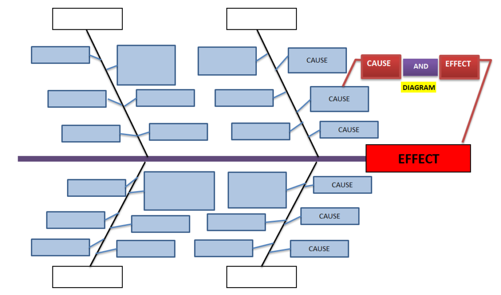
The dashboard also includes a Fishbone Diagram, also known as an Ishikawa Diagram.

The tool provides six categories:

  • Man / People
  • Method
  • Measurement
  • Machine
  • Material
  • Environment

Users can enter the problem or effect and add potential causes under each category.

Importantly, the example report specifies that the Fishbone worksheet is a free-form analysis tool and is not automatically generated from the uploaded data.

Dashboard Creator Free for Quality and Manufacturing

If you’re working in quality, manufacturing, IT or Service Industry the dashboard can be particularly useful.

Dashboard Maker Free for Daily Work Management

Dashboards can also support daily work management.

For example, the sample report was generated from a file named: daily production data, IQC, IPQC, QA, etc. Instead of maintaining a spreadsheet only for data entry, teams can use that same data as the foundation for visual analysis.

Dashboard Creator Online – No Complex Setup

A Dashboard Creator Online can be useful when you want to move from spreadsheet data to visual analysis without building a dashboard manually from scratch.

The workflow is straightforward:

Upload

Upload your Excel or CSV file.

Analyze

The dashboard identifies data types, trends, distributions, and important characteristics.

Visualize

Charts and analytical views help you understand your dataset.

Investigate

Use Pareto, control charts, capability analysis, and other quality tools where applicable.

Interpret

Review automatically generated insights and observations.

Report

Use the dashboard as a visual summary of your data.

What Can You Analyse With the Free Dashboard Builder?

Depending on the columns available in your dataset, you can analyse:

Trends

Understand how a metric changes over time.

Monthly Performance

Compare numeric metrics month by month.

Distributions

Understand how numeric values are spread.

Pareto

Identify the categories contributing most frequently.

Data Quality

Identify missing information and incomplete fields.

Process Stability

Use control chart analysis to identify observations outside calculated control limits.

Process Capability

Enter specification limits and evaluate Cp and Cpk.

Root Causes

Use the Fishbone worksheet to structure potential causes.

Why Use Techiequality as Your Free Dashboard Builder?

One Tool for Visualization and Analysis

Instead of using one tool to create charts and another tool for quality analysis, Techiequality brings multiple analytical capabilities together.

Start With Excel or CSV

You can begin with data you already have instead of rebuilding your dataset.

Automatic Data Understanding

The dashboard identifies different column types and provides an overview of the dataset.

Automatic Insights

The dashboard can summarize important characteristics of your data, including size, date range, variation, trends, and missing data.

Quality Analysis

Quality professionals can use additional analytical tools such as control charts, capability studies, Pareto analysis, and Fishbone analysis.

Useful for Multiple Industries

The same approach can be used for manufacturing, quality, operations, business reporting, and daily work management, etc

Free Dashboard Builder vs. Traditional Excel Reporting

Traditional Excel reporting often involves:

Collect Data → Clean Data → Create Formulas → Build Charts → Format Dashboard → Analyse → Prepare Report

The Techiequality approach is designed around:

Upload Data → Auto Analyse by Apps → Auto Visualize → Interpret

This can reduce repetitive manual reporting work and help users spend more time understanding their data.

Who Can Use the Free Dashboard Builder?

Quality Engineers

Analyze defects, process performance, variation, Pareto categories, and quality metrics.

Manufacturing Engineers

Review production and operational data and identify trends.

Six Sigma Professionals

Use dashboards alongside statistical and quality-analysis methods.

Operations Teams

Monitor daily work and operational performance.

Project Managers

Visualize project and activity-related datasets.

Business Analysts

Explore trends, categories, distributions, and business metrics.

Students

Learn practical data visualization and quality analysis using spreadsheet datasets.

IT Professional, Service industry Professional, SCM, R&D, etc.

How to Prepare Your Excel or CSV File

For the best dashboard experience, organize your data in a structured table.

Recommended practices

  • Use a clear header row.
  • Keep one record per row.
  • Avoid unnecessary merged cells.
  • Keep numeric fields numeric.
  • Use consistent date formats.
  • Avoid unnecessary blank rows.
  • Use meaningful column names.
  • Keep categories consistent.

What Makes This Different From a Basic Dashboard Maker?

A basic dashboard tool may focus primarily on creating charts. The Techiequality dashboard goes further by combining:

Data Structure Analysis

  •  

Automatic Insights

  •  

Trend Analysis

  •  

Metric Comparison

  •  

Distribution Analysis

  •  

Pareto Analysis

  •  

Control Chart

  •  

Capability Study

  •  

Fishbone Analysis

This makes the tool particularly interesting for professionals who don’t just want to see their data, but want to analyse it.

Frequently Asked Questions

What is a Dashboard Builder Free tool?

A free dashboard builder is a tool that allows you to turn structured data into visual dashboards without manually creating every chart and report.

Can I create a dashboard from Excel for free?

Yes. Techiequality’s dashboard is designed to work with supported Excel formats, including .XLS and .XLSX.

Can I create a dashboard from CSV?

Yes. CSV is one of the supported file formats.

What does the Techiequality Dashboard Generator analyse?

Depending on your uploaded dataset, the dashboard can provide column-type information, trends, comparisons, distributions, Pareto analysis, key insights, and quality-analysis tools.

Does the dashboard automatically generate insights?

The example report demonstrates an automatically generated Key Insights & Interpretation section

Does it have a control chart?

Yes. The report includes an Individuals Control Chart (I-Chart) with a center line and calculated control limits.

Can I perform capability analysis?

Yes. The report includes a Capability Study where users can enter specification limits and calculate Cp and Cpk.

Does the dashboard include a Fishbone Diagram?

Yes. The dashboard includes a free-form Fishbone/Ishikawa worksheet with six categories: People, Method, Measurement, Machine, Material, and Environment.

Is the Fishbone automatically generated from my data?

No. The Fishbone is a free-form worksheet and is not generated from the uploaded dataset.

Do I need coding skills?

The tool is intended to simplify dashboard creation from structured spreadsheet data, so users don’t need to manually code every visualization.

Create Your Free Dashboard Today

Your Excel or CSV file already contains valuable information.

The challenge is turning that information into something you can understand and act on. With the Free Dashboard Builder, you can upload your spreadsheet and explore your data through dashboards, trends, comparisons, distributions, Pareto analysis, and quality-analysis tools.

Instead of spending hours manually creating charts and reports, start with your existing data and let the dashboard help you discover what your dataset is telling you.

Thank you for reading. Keep Visiting Techiequality

Dashboard Builder Free

Scatter Diagram Template | Industrial Example | Download Excel Format

Scatter Diagram Template

 Industrial Example of Scatter Diagram | Interpretation of result | Scatter Diagram Template:

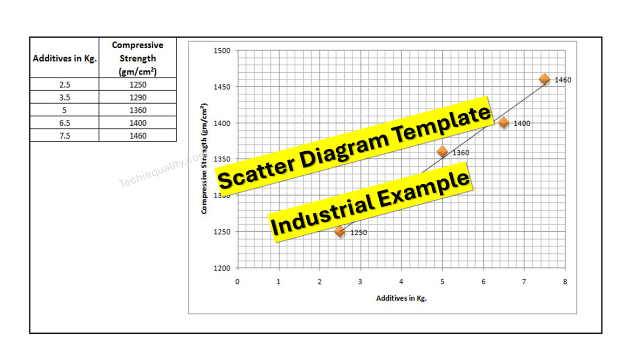
Hi readers! Today we will discuss on Scatter diagram Example with the interpretation of its results. The scatter diagram is one of the popular tools of 7QC tools. It’s a type of diagram to displays the value for typically two continuous variables for a set of data. One variable can be positioned on the X-axis and another variable can be positioned on the Y-axis. This diagram will help you to find out the significant causes among the total collection of potential causes. When you have variable types of data collection of potential causes and you do not know the positive or negative relationship that time you can plot the scatter diagram to know the relationship among them. You can download our simple Excel Scatter Diagram Template from the below link.  

DOWNLOAD– Sample Scatter Diagram Excel Template/ Format.

Example:

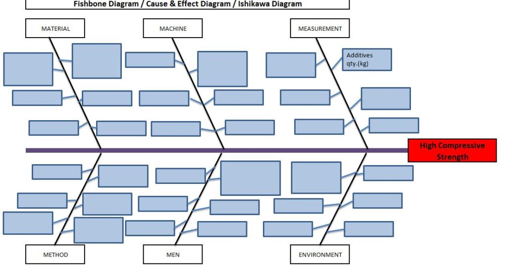
An organization has tried to know the significant causes for the high compressive strength of “X” quantity sand, so initially quality engineer drew the cause& effect diagram with the help of CFT team members and then he started the validation of each potential cause. The same C&F diagram is mentioned below.

Scatter Diagram Template

Here, we have not mentioned the other potential causes like mixing time, water%, etc. because these are already validated but now we have to know the relationship among the two variables as additive quantity v/s compressive strength through a scatter diagram. To do so data has to be collected and then a scatter diagram needs to be drawn.

Data table:

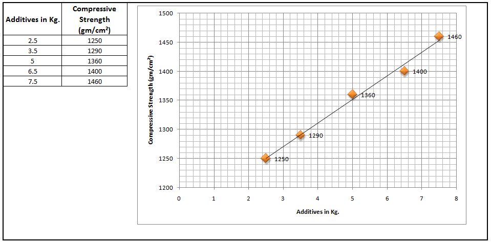
Additives in Kg. Compressive Strength (gm/cm²)
2.5 1245
3.5 1290
5 1330
6.5 1395
7.5 1435

 Scatter Diagram:

Scatter Diagram Template

Interpretation of result:

The above scatter diagram indicates us there is a perfect positive correlation between two variables i.e. Additives in Kg. vs. Compressive Strength (gm/cm²). So we can conclude that more the additive addition can result in high compressive strength.

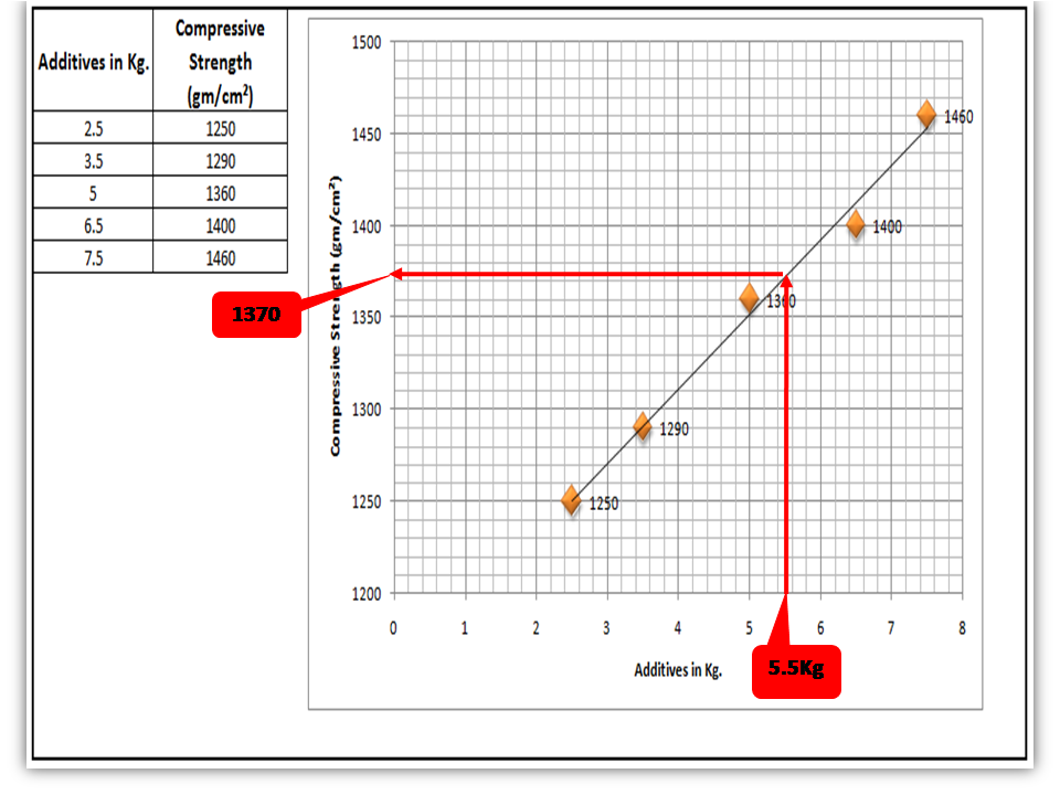
 Interpolation: you can guess the value from the set of data points. From the above graph, I would like to know the compressive strength if I will add 5.5 Kg additives in “X” Kg of Sand.

Scatter Diagram Template

FAQ:

Q1: What are the common possibilities of correlation between two variables of the scatter diagram?

 Ans.: There are so many possibilities but three common correlations are positive, negative, and no correlation. Positive and Negative correlations are further categorized into three types as.

Positive Correlation:

  • Low positive correlation
  • High positive correlation
  • Perfect positive correlation

Negative Correlation:

  • Low negative correlation
  • High negative correlation
  • Perfect negative correlation

Q2: What types of data are used to plot the scatter diagram?

Ans.: Continuous variable type data.

Useful Articles:

Types of Fishbone Diagram |Dispersion Analysis |Enumeration |Process Classification

7 QC Tools Template.

Repeatability vs Reproducibility | Discussion of Key difference.

Free Templates / Formats of QM: we have published some free templates or formats related to Quality Management with manufacturing / industrial practical examples for better understanding and learning. if you have not yet read these free template articles/posts then, you could visit our “Template/Format” section. Thanks for reading…keep visiting techiequality.com

Popular Post

Dispersion Analysis Cause & Effect Diagram Template |Download Excel Format

Dispersion Analysis Cause & Effect Diagram Template

Dispersion Analysis & Process Classification Cause & Effect Diagram Template

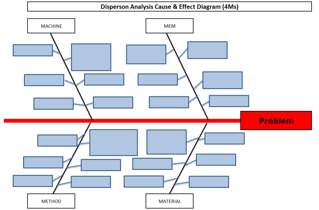
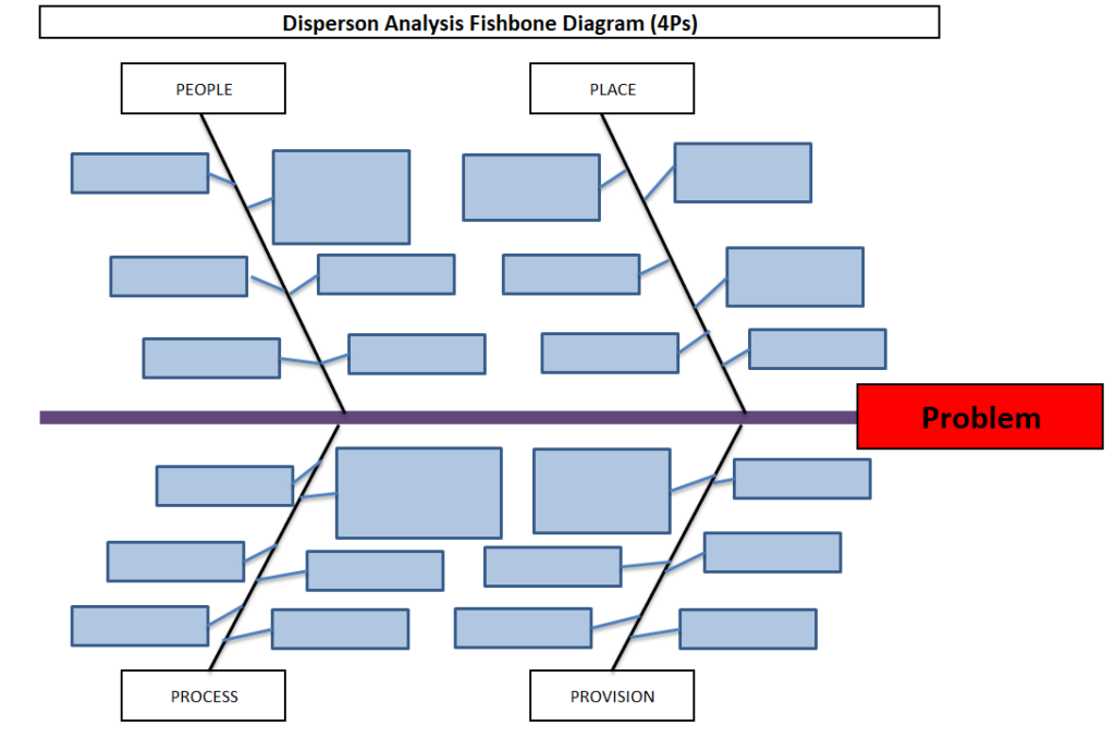
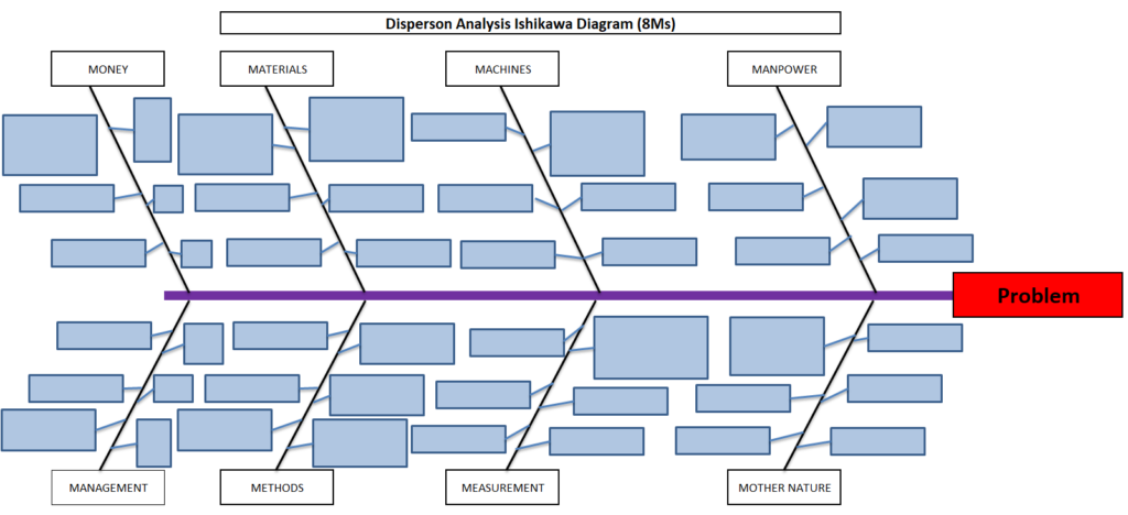
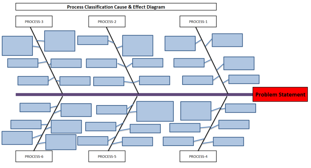
Hi readers! Today we will discuss on types of Cause & Effect Diagram/Fishbone diagram. The cause and effect diagram is the most popular and frequently used tool among the seven QC tools. Basically Fishbone diagram is classified into mainly two types as [1] Dispersion Analysis Cause and Effect diagram, and [2] Process Classification Fishbone diagram. The Dispersion analysis fishbone diagram involves identifying the potential cause for a specific quality problem. However, a Process classification cause & effect diagram involves establishing causes related to the Process. In the manufacturing industry, both types of diagrams are used but Dispersion types are most frequently used to identify the potential causes of the quality-related problems.  If you are interested in downloading the Dispersion Analysis Cause & Effect Diagram Template & Process Classification fishbone diagram, then click on the given below links.

DOWNLOAD– Dispersion analysis cause & effect diagram template. (4Ms).

Dispersion Analysis Cause & Effect Diagram Template
4Ms

Dispersion analysis Fishbone Diagram Excel Template. (4Ps)-DOWNLOAD.

Dispersion Analysis Cause & Effect Diagram Template
4Ps

DOWNLOAD– Dispersion analysis cause & effect diagram format. (8Ms).

Dispersion Analysis Cause & Effect Diagram Template
8Ms

Process Classification cause & effect diagram excel format-DOWNLOAD.

Dispersion Analysis Cause & Effect Diagram Template
Process Classification

Steps for construction of Cause & Effect Diagram:

  • Form a CFT- Team with a multifunctional experienced workforce.
  • The facilitator will listen carefully to the member’s potential causes to represent it in a diagram.
  • Draw a backbone line from left to right, terminating at the Head, and write the Problem statement.
  • Draw the small bone and write the potential cause.
Dispersion Analysis Cause & Effect Diagram Template

Advantages:

  • It helps to identify the potential cause to improve the process.
  • Helps in the root cause identification of the problem.
  • C&E diagram is easily constructed & understood.
  • It is an effective tool for the diagnosis of the various causes of the problem and helping to solve the problem.

Disadvantages:

  • Waste of time to identify the other causes that are not critical to the Problem.
  • It’s a time-consuming methodology.

Dispersion Analysis Cause & Effect diagram V/S Process Classification Fishbone diagram:

ishikawa Template
fishbone  Template

Useful Links:

Strategies for Manufacturing Process Improvement |11+ Strategies

7QC Tools for Problem Solving | What are 7 QC Tools

Fishbone Diagram Template With Example

Root Cause Analysis | 8 Steps of RCA

More on TECHIEQUALITY

Thanks for Reading…Keep visiting Techiequality.Com

Popular Post

Histogram Template with example | Download

Histogram Template

Histogram Template with example | Download

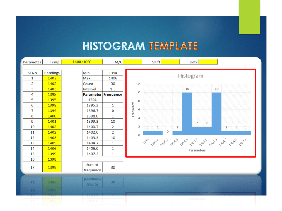
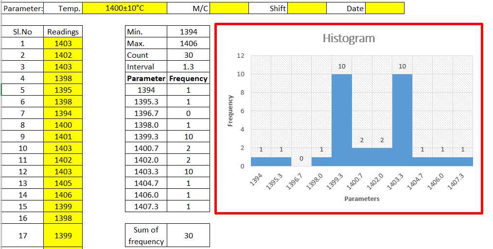
The Histogram Template is prepared in a simple format with an industrial example. We have described the example in below, just go through this article and Download the Template / Format. It’s a very useful tool and is frequently used in manufacturing industries. The main function is to know the frequency distribution, symmetry, and skewness, and it also helps to determine the normality of data by drawing the bell curve.

DOWNLOAD [Histogram Template in Excel format].

Histogram Template
Histogram Template

Basic Information on Histogram:

A histogram is one of the 7QC tools and commonly used graph to show frequency distribution. Helps summarize data from a process that has been collected over a period of time.

A histogram is a representation of the frequency distribution of numerical data. it was first familiarized by Karl Pearson. A histogram is related to merely one type of variable data. You should calculate the interval value to represent the bins. Bins shall give an idea about the how much data falls within the selected data range’s width. Histogram gives the indication about data distribution as normal, skewed, or bi-modal.

How to use our Histogram Template:

Step-1: Download the Histogram Template from the above link.

Step-2: Carefully read the “Note” mentioned in the Excel template.

Step-3: Enter the reading only in the yellow color box. Then other values will calculate automatically and your histogram will be ready for interpretation.

Note:

1. Only yellow colour boxes are changeable

2. Make sure that the sum of frequency is equal to the total count, e.g. sum of frequency in a given example [example is given in histogram excel format, just download and see the example] is 30 and the count is also 30, if not then you have to adjust the parameters and frequency table in frequency distribution format for doing so click on the link given “How to adjust parameters and frequency table in Histogram Template?”.

Useful Links:

How to Plot Pareto Chart in Excel ( with example)

What is SPC | SPC Tools?

Corrective and Preventive Action Format | CAPA with Example.

OEE Calculation-How To Calculate OEE (Overall Equipment Effectiveness) with Example

Implementation of KAIZEN in Industry

Thank you for reading…. Keep visiting Techiequality.Com

Let us know if you have any questions…and drop your comments below.

Popular Post:

Pareto Chart Excel Template | Download format

Pareto Chart Excel Template

Pareto Chart Excel Template | Step by Step guide of template usages:-

Hi Readers! In this article, we have discussed on Pareto Chart Excel Template with a manufacturing example. and also you can learn here, the Pareto chart principle (80/20 rule). if you would like to download our excel template or format then, go through the below link.

Download–Pareto chart Excel Template.

Pareto Chart Excel Template

[Figure 1]

How to Use Pareto Chart Excel Template:

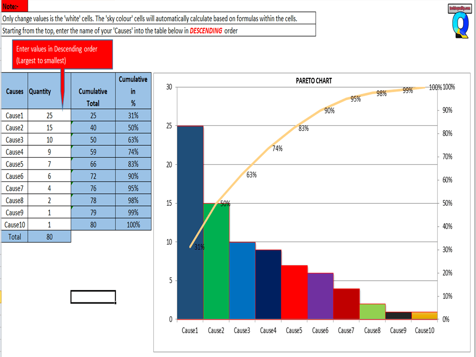
After downloading, the above Pareto Chart Excel Template Carefully read the Note and red highlighted box marked in excel.

Note 1:- White cells are only changed values. The sky colour cells will automatically calculate based on the formula within the cells.

Note 2:- Starting from the top, enter the name of causes into the table below in descending order (Largest to Smallest Values)

Example of Pareto chart:

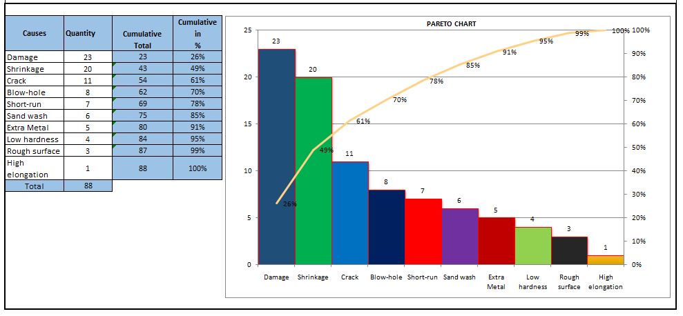
Let us have ten causes as Damage, Crack, Shrinkage, Short-run, Blowhole, Pin-hole, Extra Metal, Sand-wash, Rough Surface, Low hardness, and High elongation.

Causes Rejection Quantity
Damage 23
Shrinkage 20
Crack 11
Short-run 7
Blow-hole 8
Extra Metal 5
Sand wash 6
Rough surface 3
Low hardness 4
High elongation 1

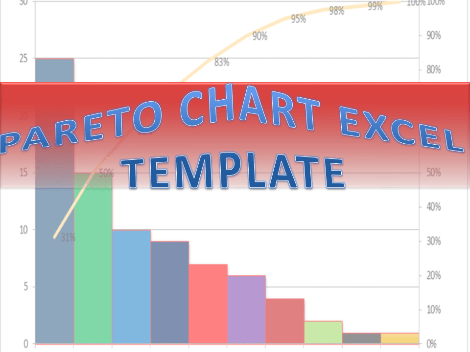
Now you have to do the sorting of Rejection Quantity in Descending order (Largest to smallest value)

Descending order of Rejection Quantity of above causes are,-

Causes Rejection Quantity
Damage 23
Shrinkage 20
Crack 11
Blow-hole 8
Short-run 7
Sand wash 6
Extra Metal 5
Low hardness 4
Rough surface 3
High elongation 1

Now directly we have to enter the name of causes and Rejection quantity (After sorting the value in descending order) into white cells of the Excel template sheet. After entering the values the Pareto chart will look like as below.

Pareto chart example
Pareto Principle (80/20 Rule):-

The 80/20 Rule or Pareto Principle is the most important part of Pareto Analysis. The rule 80/20 says that 80% of the effects come from 20% of the causes.

In Italy, Vilfredo Pareto has originally observed that 20% of people were owned 80% of the land. This principle was applied to quality control and favoured the use of the statement of phrase, which is “The Vital few and useful many” to define the 80/20 rule in the 20th century by Dr. Joseph M. Juran. Nowadays this principle is so popular and very useful in describing the contribution of the causes.

Understanding of Principle:-

Let’s get started with this principle, and how it is applicable in different sectors like manufacturing and non-manufacturing unit or service sectors. This principle is not limited to any particular sector or unit’s problems or defects to identify the contribution. It will help you to resolve 80% of problems/causes/defects among the 100% of problems.  

How this principle is related to the different fields: – (Example)-

  • Filed failure (for example (a)-80% of the field failure comes from 20% of the Causes.
    (b)-80% of the field failure comes from 20% of the Customer).
  •  80% of the results come from 20% of the Team.
  • Risk Management (e.g. 80% of the Risk comes from 20% of the Causes).

Let us have ten types of Causes and individual causes having a number of defects. Now we need to work on merely an 80% contribution to resolve the problem. But the things are how to identify the causes those are coming under the 80% contribution. So to identify the contribution we need to use the Pareto chart for knowing the contribution. So I would recommend you to download the above Pareto Chart Excel Template then, follow the steps and identify the contribution.

Advantages of Pareto Chart:

1. Production Optimisation.

2. Rejection Reduction.

3. Cost of Poor Quality Reduction.

4. Quality level Improvement.

5. Product Performance Improvement

6. Customer satisfaction Enhancement.

7. Rework cost reduction.

Etc.

The Pareto chart is the most commonly used tool in manufacturing industries, I remember when I was working in the quality department, how frequently I used this tool in our daily quality issue analysis. I used this tool on a daily line rejection analysis, as well as in different types of QA or QC projects like quality circle projects, SGA projects, Six Sigma projects, etc. With the help of the Pareto chart, you can easily visualize the defect’s contribution and accordingly, you can do an analysis of the majority contribution for improvement.

FAQ:

The Pareto chart is one of the commonly used 7 QC tools in manufacturing industries.

Similar Articles:

Histogram Example | Foundry Industries Examples.

Histogram Template with example | Download.

How to plot Histogram in Excel (Step by step guide with example)

SPC Format |DOWNLOAD Excel Template of SPC Study

7QC Tools for Problem Solving | What are 7 QC Tools

Root Cause Analysis | 8 Steps of RCA

More on TECHIEQUALITY

Thanks for reading…Keeps Visiting Techiequality.Com

Popular Post:

Fishbone Diagram Template With Example

Fishbone Diagram Template

Fishbone Diagram Template With Example | Download Template

Download the Fishbone Diagram Template by clicking on the below link. Fishbone Diagram will help you to represent the Potential Causes of a Problem.

DOWNLOAD the Cause & Effect Diagram / Fishbone Diagram.

How to Use Fishbone Diagram Template:

Fishbone Diagram Template

[Figure-1]

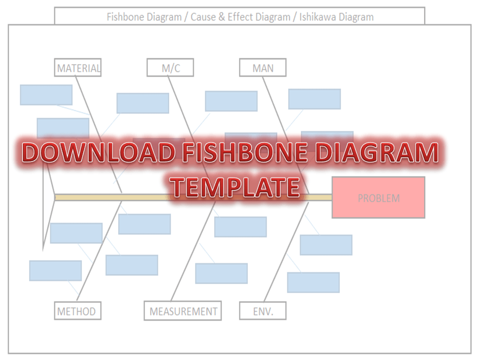
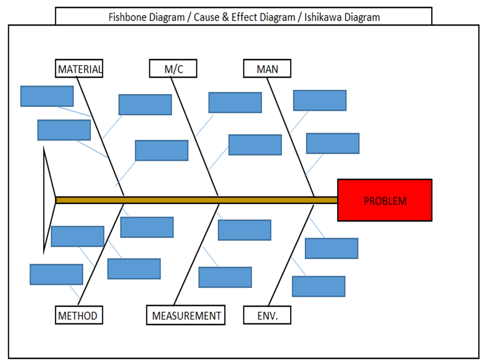
Step-1: Download the Fishbone Diagram Template (Link is given at the top)

Step-2: Enter the Name of the Problem in the Red Highlighted Box, marked in the Excel template (e.g. refer to the above Figure-1 for easy understanding)

Step-3: Identify and then enter the Potential causes in the Sky color box in the Excel template under Man, Machines, Material, Method, Measurement, and Environment. 

How to Identify the Potential Causes of a Problem:

Step-1: To make a CFT Team (Cross-Functional team). Members of CFT should be from different and different processes/areas or departments. E.g. someone from production, Quality, technical, R&D, Maintenance, etc.

Step-2: Individually identify the Causes through Brainstorming.

Step-3:  Before you identify the causes by all team members, you have to list up all causes without any repetition. Next, all members of the team should sit together to identify the new causes through Brainstorming. And finally, do the list up of all causes identify by individual and team.

Step-4: Represent all potential causes in the Cause and Effect Diagram Template or Fishbone Diagram Template or Ishikawa Diagram Template.

Step-5: Identify the Significant Causes with the help of Hypothesis testing.

Step-6: Do the Root cause analysis with the help of Why- why Analysis to identify the Root Cause

Step-7: Take Corrective and Preventive Action on the Root cause.

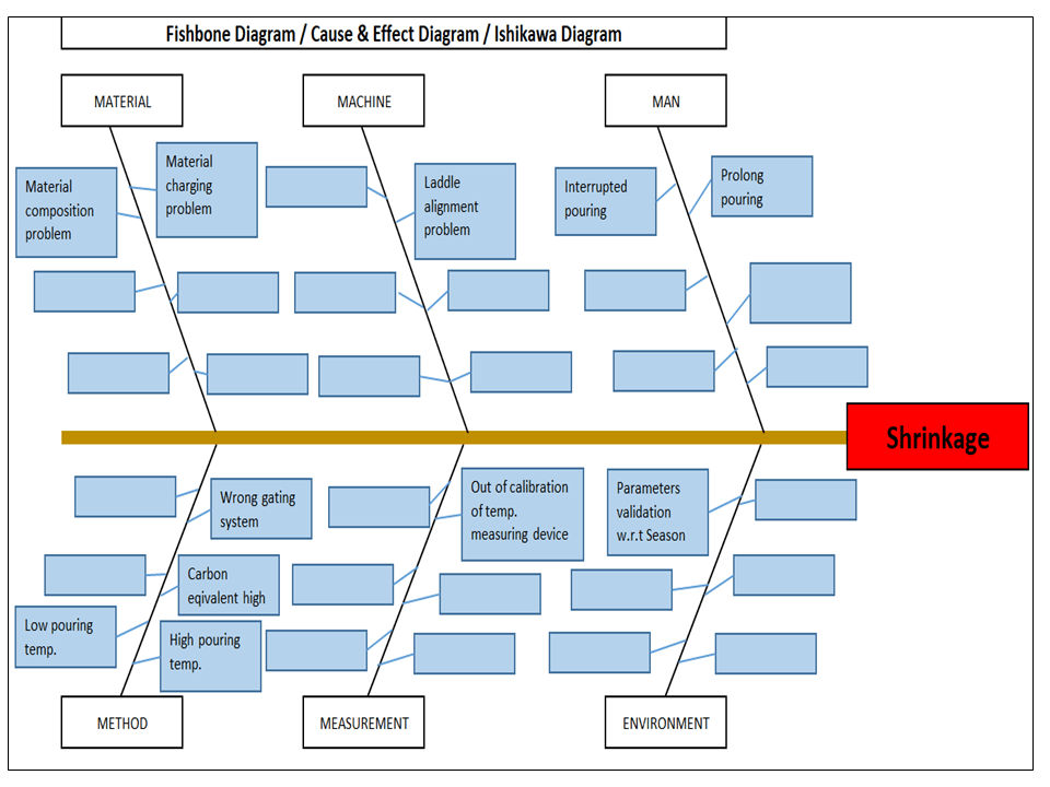
Example-1: Casting Shrinkage Problem.

I have taken a Problem from the Iron casting Process as Shrinkage. Here I need to represent the Potential causes of Shrinkage in the Fishbone Diagram Template or Cause and Effect Diagram Template or the Ishikawa Diagram template. First of all, I made a CFT team considering the members from the production process, quality, Development, and Maintenance Department.

Instructed all members to identify the Potential cause relevant to their work function in individually through Brainstorming. Next, collect all Potential causes. And then call a meeting for further identification of Causes together with all members through Brainstorming. List up all Causes and represent those in the Fishbone Diagram Template, just like the below figure.  

Fishbone Diagram Example
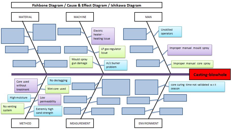
Example-2: Casting Blow-hole Problem:

Below are the potential causes that may cause the blow-hole problem in raw casting products;

  • Improper manual core spray.
  • Improper manual mould spray.
  • Unskilled operators.
  • Core curing time is not validated w.r.t season.
  • Core curing m/c burner problem.
  • LP gas regulator issue.
  • Electric heater -heating issue.
  • Mould spray gun damage.
  • No deslagging.
  • Wet core used.
  • Low permeability.
  • Extremely high sand strength.
  • No venting system.
  • High moisture.
  • Core used without treatment.
Fishbone Diagram Template
Benefits of Fishbone Diagram:
  • It represents and displays the relationship of potential causes w.r.t Problem: – All Possible causes will represent them under which category among the man, machines, method, measurement, material, and environment.
  • Accumulate the possible Reasons in a single diagram: – It will be very difficult to resolve the problem without any idea of the Possible or Potential causes of any problem. So this diagram will show you all the causes simultaneously.
  • Involvement in Brainstorming: – It will help you to boost and structure the brainstorming to identify the possible causes or reasons.
  • It will help you to maintain the team focus to achieve the common goal: – As you know the team mission is to achieve the common goal means to identify the possible causes or reasons. All team members will identify the Causes or Reasons individually and together in a team to list-up the possible causes.

How to plot Ishikawa or cause and effect diagram of customer complaint:

first of all, download the cause and effect diagram template or Ishikawa diagram template from the given above link (at the top) and then follow the below steps. As per my own experience regarding the preparation of cause and effect diagrams related to customer complaints. at first, when I received a customer complaint, I just tried to understand the nature and type of problem and immediately called for a meeting for initial problem understanding with team members. Once it’s understood by all the team members, then we form a special team for 8D or CAPA formation.

Before doing the why-why analysis we have to identify the potential causes by using popular tools i.e. fishbone or cause & effect or Ishikawa diagram. To do so, the individual team members should identify the potential cause w.r.t customer complaints, Once you collect the all identified potential causes by individual members, then you have to plot the final fishbone diagram to keep in your mind with the repeated potential causes. when you choose to form the team at that time members should be in CFT of that process where the customer problem is related.

More on TECHIEQUALITY