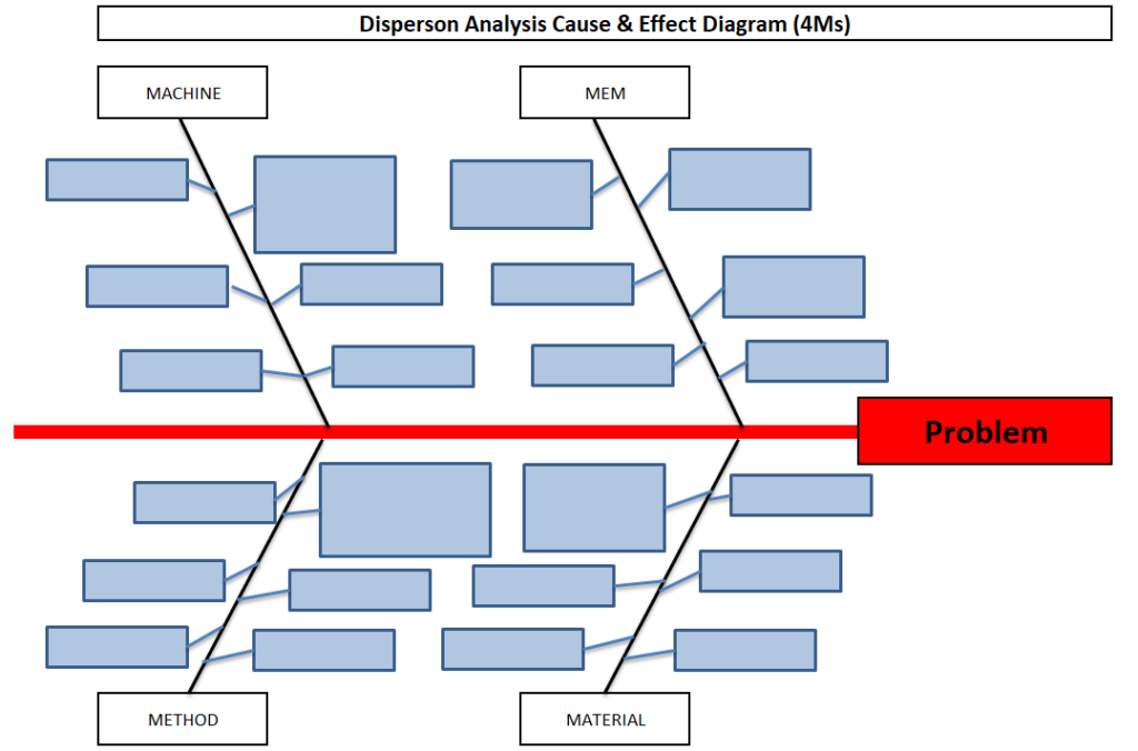
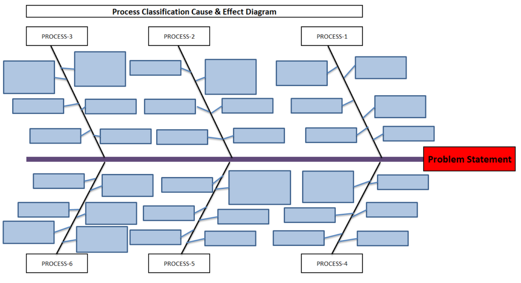
Dispersion Analysis & Process Classification Cause & Effect Diagram Template
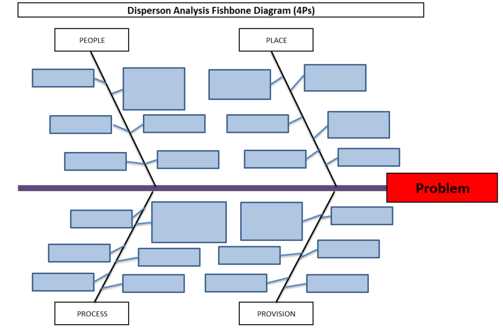
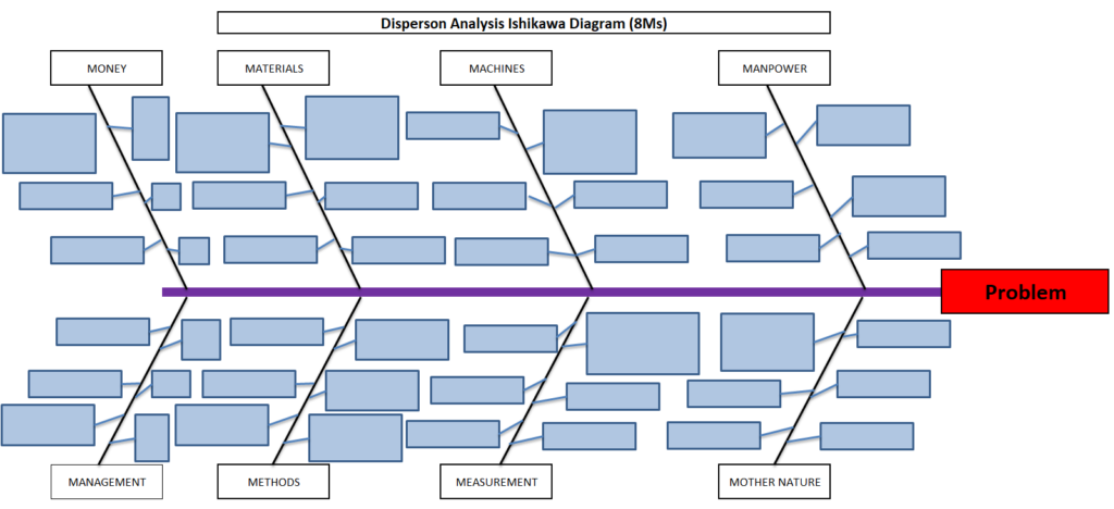
Hi readers! Today we will discuss on types of Cause & Effect Diagram/Fishbone diagram. The cause and effect diagram is the most popular and frequently used tool among the seven QC tools. Basically Fishbone diagram is classified into mainly two types as [1] Dispersion Analysis Cause and Effect diagram, and [2] Process Classification Fishbone diagram. The Dispersion analysis fishbone diagram involves identifying the potential cause for a specific quality problem. However, a Process classification cause & effect diagram involves establishing causes related to the Process. In the manufacturing industry, both types of diagrams are used but Dispersion types are most frequently used to identify the potential causes of the quality-related problems. If you are interested in downloading the Dispersion Analysis Cause & Effect Diagram Template & Process Classification fishbone diagram, then click on the given below links.
DOWNLOAD– Dispersion analysis cause & effect diagram template. (4Ms).
Shanti Gopal Pradhan is an experienced professional in Quality Management Systems, QA, Operations, Business Excellence, and Process Improvement. He has strong expertise in international standards including IATF 16949, ISO 9001, ISO 14001, ISO 45001, and ISO 17025, along with methodologies such as TQM, TPM, and Six Sigma.
He holds a degree in Mechanical Engineering along with an MBA, combining strong technical acumen with strategic business insight, he is a Certified Internal Auditor, Lead Auditor, and Six Sigma Black Belt, with a proven track record in driving quality transformation and operational excellence.
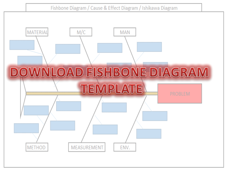
Fishbone Diagram Template With Example | Download Template
Download the Fishbone Diagram Template by clicking on the below link. Fishbone Diagram will help you to represent the Potential Causes of a Problem.
DOWNLOAD the Cause & Effect Diagram / Fishbone Diagram.
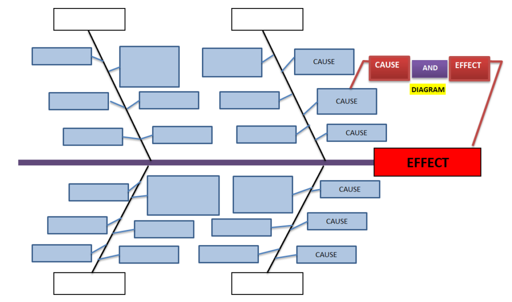
How to Use Fishbone
Diagram Template:
[Figure-1]
Step-1: Download the Fishbone Diagram Template (Link is given at the top)
Step-2: Enter the Name of the Problem in the Red Highlighted Box, marked in the Excel template (e.g. refer to the above Figure-1 for easy understanding)
Step-3: Identify and then enter the Potential causes in the Sky color box in the Excel template under Man, Machines, Material, Method, Measurement, and Environment.
How to Identify the
Potential Causes of a Problem:
Step-1: To make a CFT Team (Cross-Functional team). Members of CFT should be from different and different processes/areas or departments. E.g. someone from production, Quality, technical, R&D, Maintenance, etc.
Step-2: Individually identify the Causes through
Brainstorming.
Step-3: Before you identify the causes by all team members, you have to list up all causes without any repetition. Next, all members of the team should sit together to identify the new causes through Brainstorming. And finally, do the list up of all causes identify by individual and team.
Step-4: Represent all potential causes in the Cause and Effect Diagram Template or Fishbone Diagram Template or Ishikawa Diagram Template.
Step-5: Identify the Significant Causes with the help of Hypothesis testing.
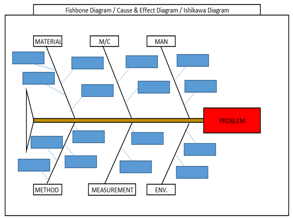
I have taken a Problem from the Iron casting Process as Shrinkage. Here I need to represent the Potential causes of Shrinkage in the Fishbone Diagram Template or Cause and Effect Diagram Template or the Ishikawa Diagram template. First of all, I made a CFT team considering the members from the production process, quality, Development, and Maintenance Department.
Instructed all members to identify the Potential cause relevant to their work function in individually through Brainstorming. Next, collect all Potential causes. And then call a meeting for further identification of Causes together with all members through Brainstorming. List up all Causes and represent those in the Fishbone Diagram Template, just like the below figure.
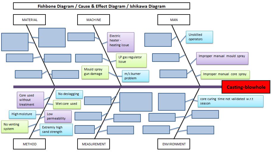
Example-2: Casting Blow-hole Problem:
Below are the potential causes that may cause the blow-hole problem in raw casting products;
Improper manual core spray.
Improper manual mould spray.
Unskilled operators.
Core curing time is not validated w.r.t season.
Core curing m/c burner problem.
LP gas regulator issue.
Electric heater -heating issue.
Mould spray gun damage.
No deslagging.
Wet core used.
Low permeability.
Extremely high sand strength.
No venting system.
High moisture.
Core used without treatment.
Benefits
of Fishbone Diagram:
It represents and displays the relationship of potential causes w.r.t Problem: – All Possible causes will represent them under which category among the man, machines, method, measurement, material, and environment.
Accumulate the possible Reasons in a single diagram: – It will be very difficult to resolve the problem without any idea of the Possible or Potential causes of any problem. So this diagram will show you all the causes simultaneously.
Involvement in Brainstorming: – It will help you to boost and structure the brainstorming to identify the possible causes or reasons.
It will help you to maintain the team focus to achieve the common goal: – As you know the team mission is to achieve the common goal means to identify the possible causes or reasons. All team members will identify the Causes or Reasons individually and together in a team to list-up the possible causes.
How to plot Ishikawa or cause and effect diagram of customer complaint:
first of all, download the cause and effect diagram template or Ishikawa diagram template from the given above link (at the top) and then follow the below steps. As per my own experience regarding the preparation of cause and effect diagrams related to customer complaints. at first, when I received a customer complaint, I just tried to understand the nature and type of problem and immediately called for a meeting for initial problem understanding with team members. Once it’s understood by all the team members, then we form a special team for 8D or CAPA formation.
Before doing the why-why analysis we have to identify the potential causes by using popular tools i.e. fishbone or cause & effect or Ishikawa diagram. To do so, the individual team members should identify the potential cause w.r.t customer complaints, Once you collect the all identified potential causes by individual members, then you have to plot the final fishbone diagram to keep in your mind with the repeated potential causes. when you choose to form the team at that time members should be in CFT of that process where the customer problem is related.
Shanti Gopal Pradhan is an experienced professional in Quality Management Systems, QA, Operations, Business Excellence, and Process Improvement. He has strong expertise in international standards including IATF 16949, ISO 9001, ISO 14001, ISO 45001, and ISO 17025, along with methodologies such as TQM, TPM, and Six Sigma.
He holds a degree in Mechanical Engineering along with an MBA, combining strong technical acumen with strategic business insight, he is a Certified Internal Auditor, Lead Auditor, and Six Sigma Black Belt, with a proven track record in driving quality transformation and operational excellence.
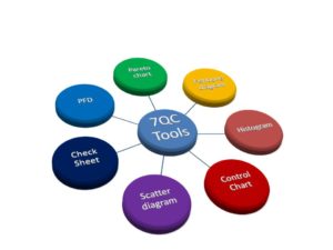
The 7QC Tools (Also Known as “Seven Basic Tools of Quality”) originated in Japan. First emphasized by Kaoru Ishikawa, a professor of engineering at Tokyo University and the father of “quality circles”. These tools are used to solve critical quality-related issues. You can use the 7 basic tools of quality to help understand and solve problems or defects in any industry. With the help of Excel, you can plot the graphs / Diagrams to resolve the daily quality problems. I will help you to understand the basic ideas and knowledge of 7QC Tools and their usage.
For solving problems seven QC tools are used Pareto Chart, Cause & Effect Diagram, Histogram, Control Charts, Scatter Diagrams, Graphs/Process Flow Diagram, and Check Sheets. All these tools are important tools used widely in the manufacturing field to monitor the overall operation and continuous process improvement. seven QC tools are used to find out the Root cause of the problem and implement the action plan to improve the process efficiency.
Enhances customer satisfaction through improved quality product
Reduce cycle time and improve efficiency
Control cost of poor quality / Cost of quality
Reduce defects and optimize the production
Reduce variations and improve the quality of Products
Encouragement of teamwork and confidence
Enhancement of customer focus.
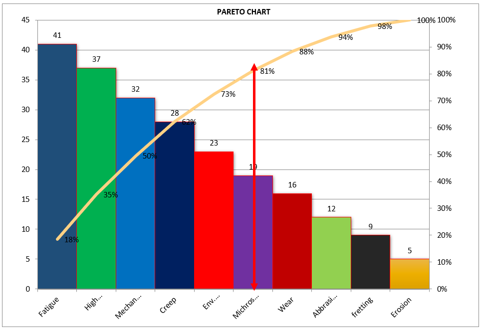
Pareto Chart:-
A Pareto Chart is named after the Italian Economist Vilfredo Pareto. It is a type of chart that contains both bars and a line graph, where the individual values are represented in the bar graph in descending order (largest to smallest value) and the cumulative percentage is represented in the line graph.
Click here to learn “How to Plot Pareto Chart In Excel”.
Understanding the Pareto Chart principle (The 80/20 rule):
The Pareto principle is also known as the 80/20 rule derived from the Italian Economist Vilfredo,
The principle is understood as –
20% of the input creates 80% of the results
Or
80 % of the effects come from 20% of the causes.
Pareto Chart Example
[Figure-1]
In the above Pareto Chart[Figure-1], we can see the cumulative% in the line graph, According to the Pareto Chart principle 80/20 rule, the 80% cumulative in the line graph is filling under the low hardness, which means BH, Damage, SH and Low hardness defers are coving the 80% of contribution over total types of defects. And those 80 % of contributions were due to the 20% caused.
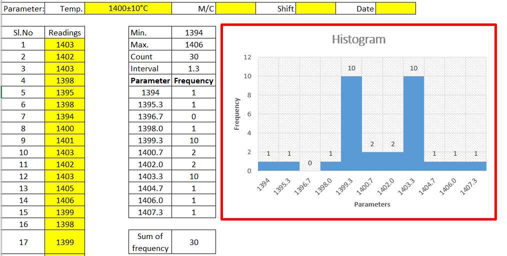
Histogram:-
The histogram is one of the 7QC tools, which is the most commonly used graph to show frequency distribution.
Helps summarize data from a process that has been collected over a period of time.
Click here to know the “How to Plot Histogram in Excel:
Histogram Template
[Figure-2]
Fish-bone Diagram/Cause and Effects /Ishikawa Diagram:-
The cause and Effects Diagram looks like a fish that’s why it’s called Fish-bone Diagram, also called the Ishikawa diagram.
It’s a visualization tool for categorizing the potential causes of a problem in order to identify its root causes.
CFT members are identifying the potential cause through the Brainstorming process of individuals and together.
The Potential cause is related w.r.t below as
Machine
Manpower
Environment
Method
Materials
Measurement
[Figure-3]
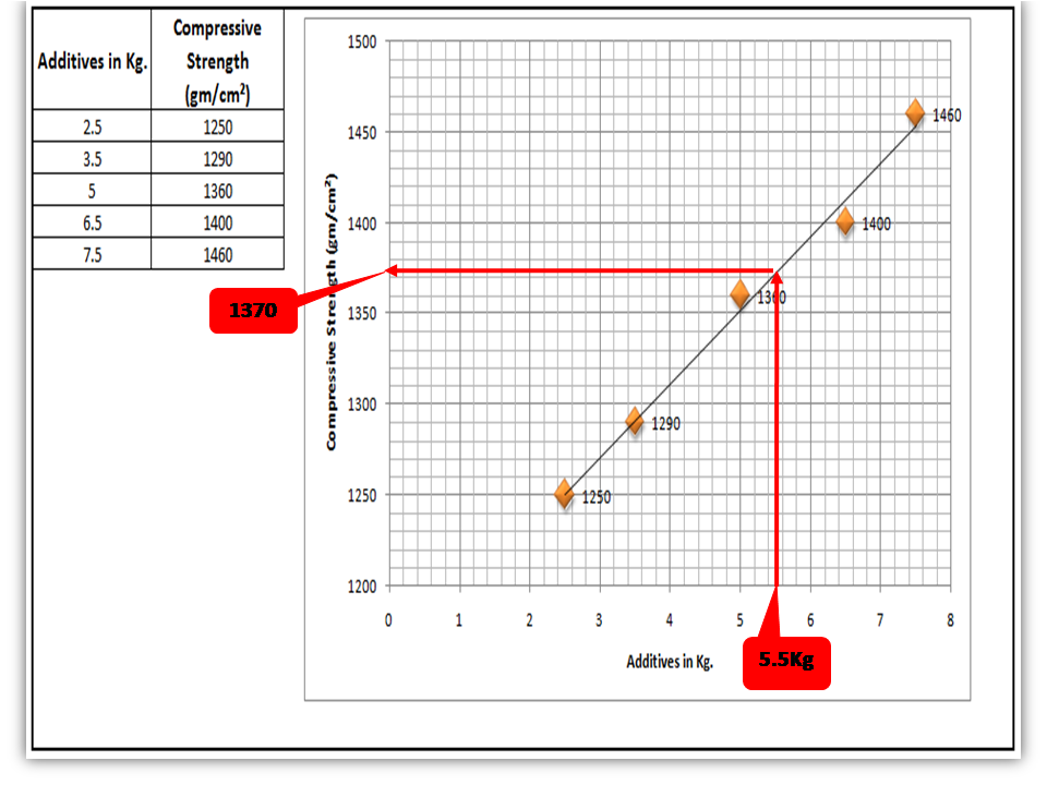
Scatter diagram:-
The scatter diagram graphs pairs of variable data, with one variable on each axis, to look for a relationship between them. If the variables correlate, the points will fall along a line or curve. The better the correlation, the more points will strongly cluster to the line. It generally gives the idea of the correlation between the variables.
[Figure-4]
In the above figure-4, the positive and Negative correlation is only due to the direction, and in both the correlation, points are clustered to the line but in the last figure in figure-4, Points are not clustered to the line but spread over the X and Y-axis.
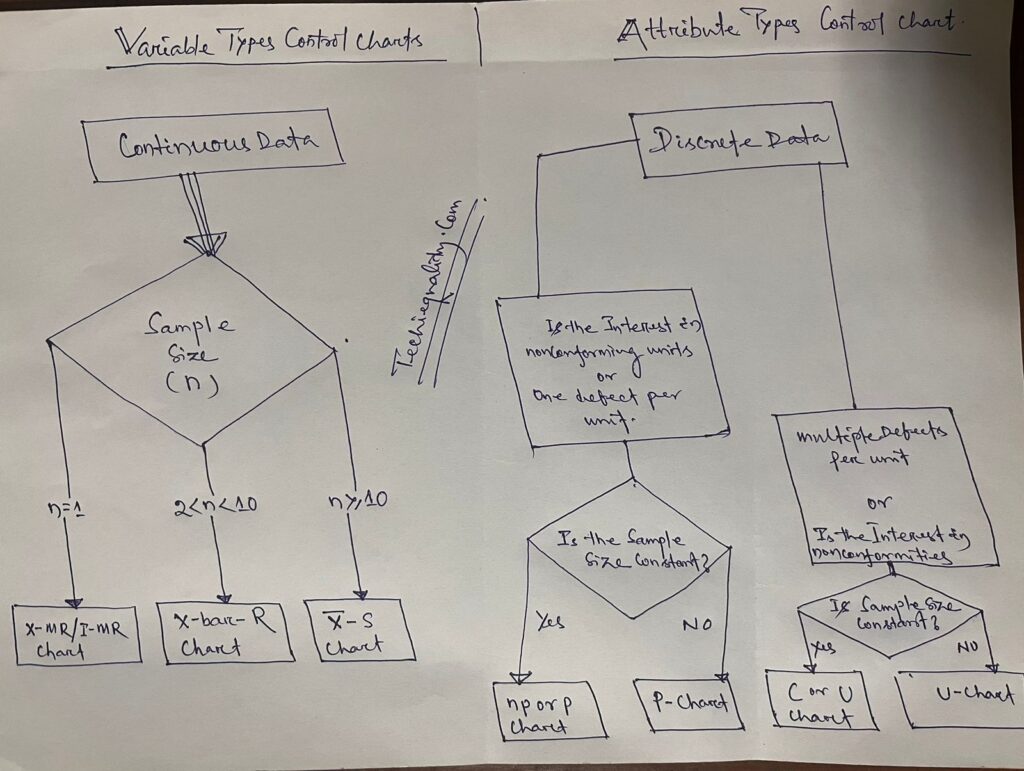
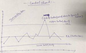
Control Chart:-
A line on a control chart is used as a basis for judging the stability of a process. If the observed points are beyond a control limit then it is evidence that special causes are affecting the process.
Control Charts can be used to monitor or evaluate a process.
There are basically two types of control charts, those for variable data and those for attributes data.
Click here to learn more about the Control Chart and Statistical Process Control.
Benefits:-Higher Quality, Lower Unit Cost, Higher effective Capability, etc.
Selection of Control Charts based on Attribute / Variable Type Data:-
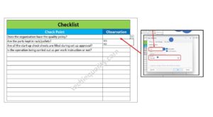
Check Sheet is a simple document used for collecting data in real time. Variable or Attribute type data is collected through a Check sheet. A check sheet generally helps to make the decision on the basis of a fact and to collect the data for analysis and evaluation.
Sample check Sheet:-
Logo
Title:-………
Format No-
Issue no-… rev. no-
Date-
Parameters
Specification
Observations
Remarks
Checked by:- Verified by:-
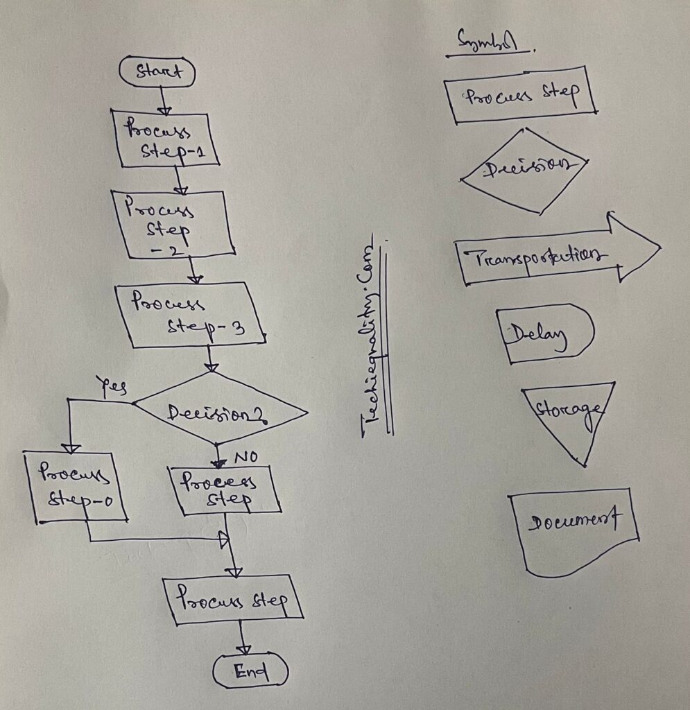
Process Flow diagram/Graphs:-
A process flow diagram is a diagram used to indicate the general flow of plant processes and equipment.
The 7QC tools are the most commonly used tool in the industry for improvement, With the help of the 7QC tools you can understand the process/activities, analyze the data, and interpret the result/graph/output.
Shanti Gopal Pradhan is an experienced professional in Quality Management Systems, QA, Operations, Business Excellence, and Process Improvement. He has strong expertise in international standards including IATF 16949, ISO 9001, ISO 14001, ISO 45001, and ISO 17025, along with methodologies such as TQM, TPM, and Six Sigma.
He holds a degree in Mechanical Engineering along with an MBA, combining strong technical acumen with strategic business insight, he is a Certified Internal Auditor, Lead Auditor, and Six Sigma Black Belt, with a proven track record in driving quality transformation and operational excellence.