Industrial Example of Scatter Diagram | Interpretation of result | Scatter Diagram Template:
Hi readers! Today we will discuss on Scatter diagram Example with the interpretation of its results. The scatter diagram is one of the popular tools of 7QC tools. It’s a type of diagram to displays the value for typically two continuous variables for a set of data. One variable can be positioned on the X-axis and another variable can be positioned on the Y-axis. This diagram will help you to find out the significant causes among the total collection of potential causes. When you have variable types of data collection of potential causes and you do not know the positive or negative relationship that time you can plot the scatter diagram to know the relationship among them. You can download our simple Excel Scatter Diagram Template from the below link.
DOWNLOAD– Sample Scatter Diagram Excel Template/ Format.
Example:
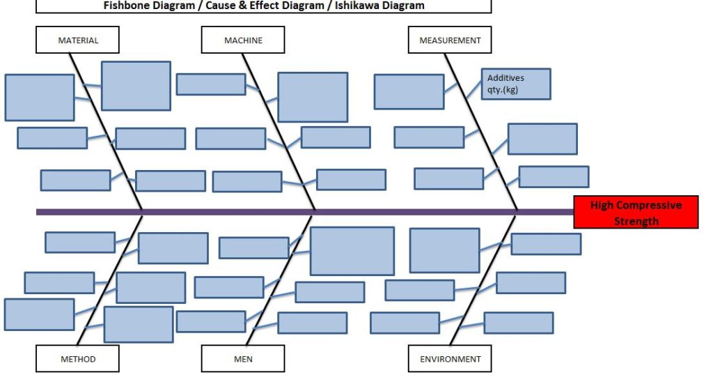
An organization has tried to know the significant causes for the high compressive strength of “X” quantity sand, so initially quality engineer drew the cause& effect diagram with the help of CFT team members and then he started the validation of each potential cause. The same C&F diagram is mentioned below.

Here, we have not mentioned the other potential causes like mixing time, water%, etc. because these are already validated but now we have to know the relationship among the two variables as additive quantity v/s compressive strength through a scatter diagram. To do so data has to be collected and then a scatter diagram needs to be drawn.
Data table:
| Additives in Kg. | Compressive Strength (gm/cm²) |
| 2.5 | 1245 |
| 3.5 | 1290 |
| 5 | 1330 |
| 6.5 | 1395 |
| 7.5 | 1435 |
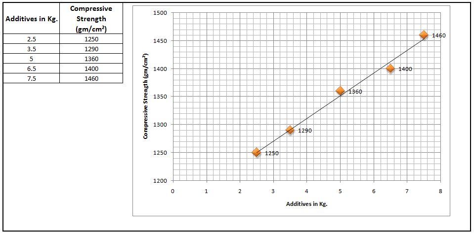
Scatter Diagram:

Interpretation of result:
The above scatter diagram indicates us there is a perfect positive correlation between two variables i.e. Additives in Kg. vs. Compressive Strength (gm/cm²). So we can conclude that more the additive addition can result in high compressive strength.
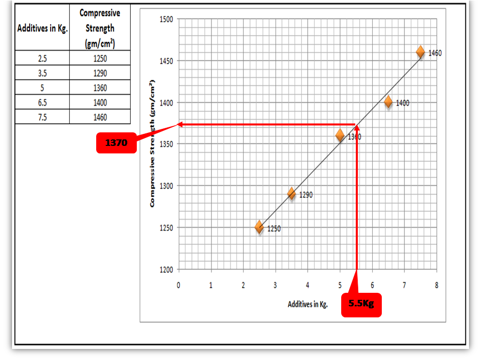
Interpolation: you can guess the value from the set of data points. From the above graph, I would like to know the compressive strength if I will add 5.5 Kg additives in “X” Kg of Sand.

FAQ:
Q1: What are the common possibilities of correlation between two variables of the scatter diagram?
Ans.: There are so many possibilities but three common correlations are positive, negative, and no correlation. Positive and Negative correlations are further categorized into three types as.
Positive Correlation:
- Low positive correlation
- High positive correlation
- Perfect positive correlation
Negative Correlation:
- Low negative correlation
- High negative correlation
- Perfect negative correlation
Q2: What types of data are used to plot the scatter diagram?
Ans.: Continuous variable type data.
Useful Articles:
Types of Fishbone Diagram |Dispersion Analysis |Enumeration |Process Classification
Repeatability vs Reproducibility | Discussion of Key difference.
Free Templates / Formats of QM: we have published some free templates or formats related to Quality Management with manufacturing / industrial practical examples for better understanding and learning. if you have not yet read these free template articles/posts then, you could visit our “Template/Format” section. Thanks for reading…keep visiting techiequality.com
Popular Post

Shanti Gopal Pradhan is an experienced professional in Quality Management Systems, QA, Operations, Business Excellence, and Process Improvement. He has strong expertise in international standards including IATF 16949, ISO 9001, ISO 14001, ISO 45001, and ISO 17025, along with methodologies such as TQM, TPM, and Six Sigma.
He holds a degree in Mechanical Engineering along with an MBA, combining strong technical acumen with strategic business insight, he is a Certified Internal Auditor, Lead Auditor, and Six Sigma Black Belt, with a proven track record in driving quality transformation and operational excellence.
