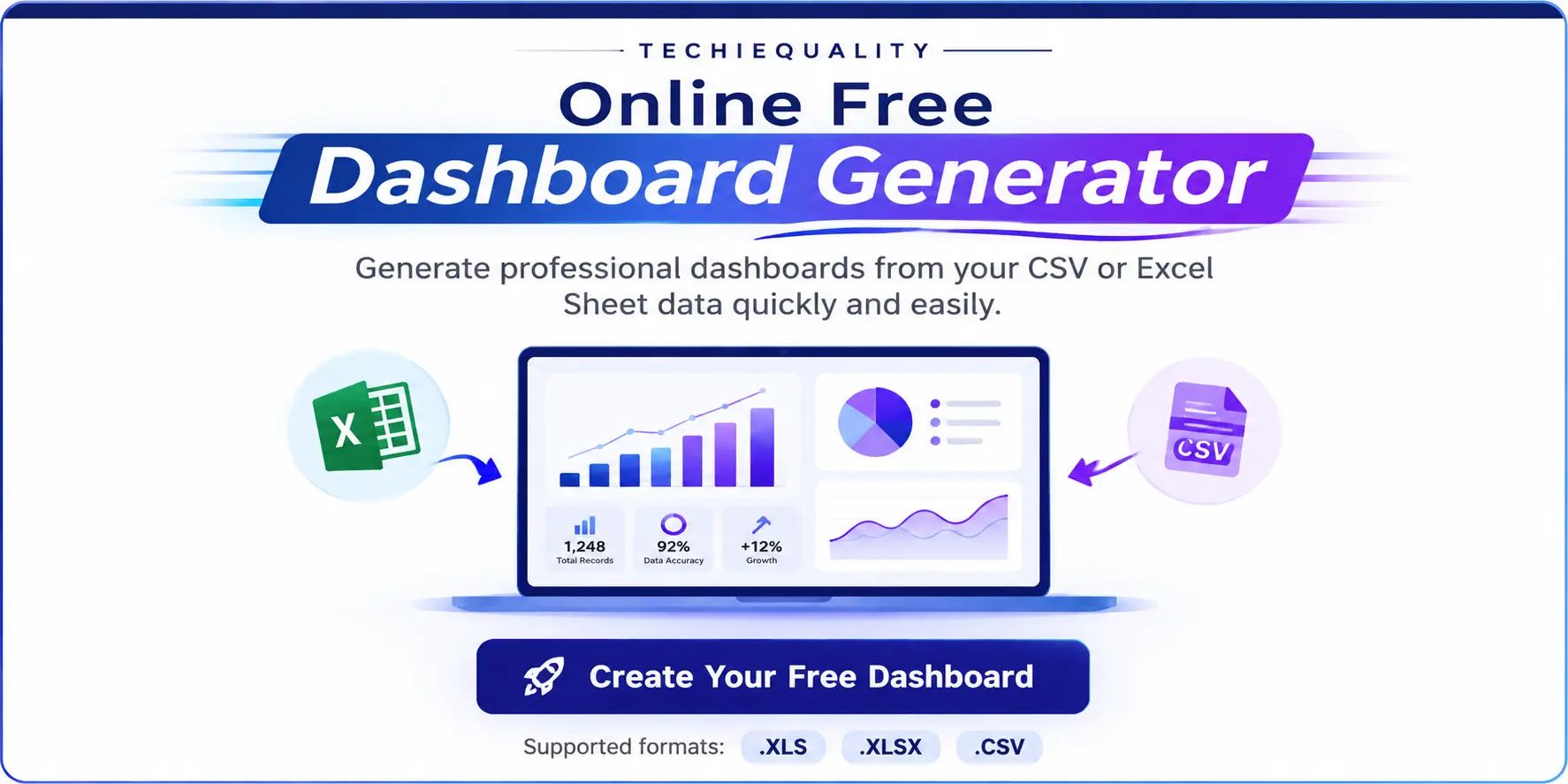
Online Free Dashboard Generator
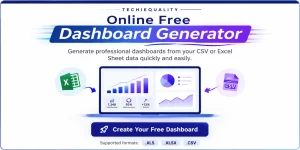
Generate professional dashboards from your CSV or Excel Sheet data quickly and easily.
Dashboard Builder Free | Generate Free Dashboards from Excel & CSV
Turn Your Excel or CSV Data into an Interactive Dashboard. Analysing a large Excel or CSV file manually can take hours.You may need to clean the data, identify numeric and categorical columns, create charts, calculate trends, check distributions, identify important categories, and prepare a professional report. Our Dashboard Builder Free simplifies this process.
Upload your Excel or CSV file and transform your raw data into a structured dashboard with automated data insights, charts, trends, distributions, comparisons, Pareto analysis, and quality analysis tools. Whether you work in quality, manufacturing, operations, business analysis, or project management, the dashboard helps you move from raw data to meaningful information faster.
Create Your Free Dashboard
Supported formats: .XLS · .XLSX · .CSV (Excel or CSV file).
What Is a Free Dashboard Builder?
A Dashboard Builder Free tool allows you to convert structured data into a visual dashboard without manually creating every chart and report.
Instead of spending time building charts one by one, you can upload your dataset and let the dashboard organize the information into different analytical sections.
A dashboard can help you understand:
- Trends over time
- Key metrics
- Data distributions
- Category performance
- Monthly performance
- Data quality
- Pareto analysis
- Statistical variation
- Process stability
- Process capability
- Potential root causes
This makes a dashboard more than just a collection of charts. It becomes a central place for data analysis and decision-making.
Free Dashboard Generator for Excel and CSV
Our dashboard is designed around a simple workflow:
Excel/CSV Data → Upload → Automatic Analysis → Dashboard → Insights
Your uploaded dataset can contain multiple types of information, including:
- Dates
- Numeric values
- Categories
- Text
- Comments
- Quality information
- Operational information
This means users don’t have to start by manually building every visualization.
How the Free Dashboard Builder Works
1. Upload Your Excel or CSV File
Start by uploading your .XLS, .XLSX, or .CSV file.
For the best results, use a structured dataset with clear column headers. Once uploaded, the dashboard can examine the structure of the dataset.
2. Automatically Understand Your Data
One of the useful features is report has automatic column classification.
The report identified:
- Date columns
- Categorical columns
- Numeric columns
- Text columns
This helps the dashboard determine how different fields can be analysed and visualized.
3. Get Automatic Key Insights
A major advantage of our dashboard is that it doesn’t stop at visualization.
It also provides a Key Insights & Interpretation section.
In the example report, the dashboard automatically identified:
- Total number of rows and columns
- Date range
- Variation in the numeric metric
- Monthly movement
- Most common categorical value
- Missing data percentage
This is where your product differentiates itself from a basic Dashboard Maker Free tool.
It doesn’t simply display the data. It helps interpret the data.
4. Analyse Trends Over Time
The Trend Over Time section helps users understand how a numeric metric changes over a date or timestamp field.
For example, the sample report analyzed:
5. Compare Metrics Side by Side
Sometimes a single trend isn’t enough. You may want to compare several metrics across the same period. The dashboard provides a Compare Metrics Side by Side capability where users can select multiple metrics for month-over-month comparison.
This can help users identify whether different business or operational metrics are moving together or in different directions.
6. Understand Data Distribution
A good dashboard should show not only averages and totals but also how values are distributed.
Our dashboard includes a Distribution / Histogram analysis.
Users can select a numeric column and examine how its values are spread.
For example, the sample report identified:
- Minimum: 9
- Maximum: 510
- Mean: 152.03
- Median: 120
- Standard deviation: 118.57
7. Analyse Categories with Pareto Analysis
The dashboard also includes Pareto Analysis. A Pareto chart can help users understand which categories contribute most frequently to the total number of occurrences.
The report includes a Pareto view where bars represent the frequency of each category and a cumulative line shows the cumulative share.
Instead of reviewing every category equally, Pareto analysis helps focus attention on the categories with the greatest contribution.
8. Identify Data Quality Issues
A dashboard should also help users understand the quality of the dataset itself. The example reports automatically identified missing values.
Free Dashboard Builder with Quality Tools
This is one of the strongest differentiators of our product. Our dashboard doesn’t just provide business charts. It also includes Quality Tools.
The sample report contains:
- Control Chart
- Capability Study
- Fishbone Diagram
- Pareto Analysis
- Distribution Analysis
- Correlation / Heat Map
This creates an opportunity to position the product as a free dashboard and quality analysis tool.
Control Chart Analysis
The dashboard includes an Individuals Control Chart (I-Chart).
The report describes the control chart as displaying individual values with a center line and ±3σ control limits based on average moving range, with points outside the limits flagged for review.
In the example dataset, the dashboard calculated: CL, UCL, LCL
This can help quality and process teams identify observations that may require further investigation.
Capability Study
The dashboard also provides a Capability Study.
Users can enter specification limits such as:
- LSL
- USL
The tool can then calculate process capability measures such as:
- Cp
- Cpk
The example report provides the calculated mean, standard deviation, and sample size and allows specification limits to be entered for capability analysis.
This makes the dashboard particularly relevant to:
- Quality engineers
- Process engineers
- Manufacturing engineers
- Six Sigma professionals
- Continuous improvement teams
- SCM
- Sales & Marketing
- Production
- NPD & NPI
- HR
- Finance
- Engineering
- R&D
- Student
Fishbone Diagram for Root Cause Analysis
The dashboard also includes a Fishbone Diagram, also known as an Ishikawa Diagram.
The tool provides six categories:
- Man / People
- Method
- Measurement
- Machine
- Material
- Environment
Users can enter the problem or effect and add potential causes under each category.
Importantly, the example report specifies that the Fishbone worksheet is a free-form analysis tool and is not automatically generated from the uploaded data.
Dashboard Creator Free for Quality and Manufacturing
If you’re working in quality, manufacturing, IT or Service Industry the dashboard can be particularly useful.
Dashboard Maker Free for Daily Work Management
Dashboards can also support daily work management.
For example, the sample report was generated from a file named: daily production data, IQC, IPQC, QA, etc. Instead of maintaining a spreadsheet only for data entry, teams can use that same data as the foundation for visual analysis.
Dashboard Creator Online – No Complex Setup
A Dashboard Creator Online can be useful when you want to move from spreadsheet data to visual analysis without building a dashboard manually from scratch.
The workflow is straightforward:
Upload
Upload your Excel or CSV file.
Analyze
The dashboard identifies data types, trends, distributions, and important characteristics.
Visualize
Charts and analytical views help you understand your dataset.
Investigate
Use Pareto, control charts, capability analysis, and other quality tools where applicable.
Interpret
Review automatically generated insights and observations.
Report
Use the dashboard as a visual summary of your data.
What Can You Analyse With the Free Dashboard Builder?
Depending on the columns available in your dataset, you can analyse:
Trends
Understand how a metric changes over time.
Monthly Performance
Compare numeric metrics month by month.
Distributions
Understand how numeric values are spread.
Pareto
Identify the categories contributing most frequently.
Data Quality
Identify missing information and incomplete fields.
Process Stability
Use control chart analysis to identify observations outside calculated control limits.
Process Capability
Enter specification limits and evaluate Cp and Cpk.
Root Causes
Use the Fishbone worksheet to structure potential causes.
Why Use Techiequality as Your Free Dashboard Builder?
One Tool for Visualization and Analysis
Instead of using one tool to create charts and another tool for quality analysis, Techiequality brings multiple analytical capabilities together.
Start With Excel or CSV
You can begin with data you already have instead of rebuilding your dataset.
Automatic Data Understanding
The dashboard identifies different column types and provides an overview of the dataset.
Automatic Insights
The dashboard can summarize important characteristics of your data, including size, date range, variation, trends, and missing data.
Quality Analysis
Quality professionals can use additional analytical tools such as control charts, capability studies, Pareto analysis, and Fishbone analysis.
Useful for Multiple Industries
The same approach can be used for manufacturing, quality, operations, business reporting, and daily work management, etc
Free Dashboard Builder vs. Traditional Excel Reporting
Traditional Excel reporting often involves:
Collect Data → Clean Data → Create Formulas → Build Charts → Format Dashboard → Analyse → Prepare Report
The Techiequality approach is designed around:
Upload Data → Auto Analyse by Apps → Auto Visualize → Interpret
This can reduce repetitive manual reporting work and help users spend more time understanding their data.
Who Can Use the Free Dashboard Builder?
Quality Engineers
Analyze defects, process performance, variation, Pareto categories, and quality metrics.
Manufacturing Engineers
Review production and operational data and identify trends.
Six Sigma Professionals
Use dashboards alongside statistical and quality-analysis methods.
Operations Teams
Monitor daily work and operational performance.
Project Managers
Visualize project and activity-related datasets.
Business Analysts
Explore trends, categories, distributions, and business metrics.
Students
Learn practical data visualization and quality analysis using spreadsheet datasets.
IT Professional, Service industry Professional, SCM, R&D, etc.
How to Prepare Your Excel or CSV File
For the best dashboard experience, organize your data in a structured table.
Recommended practices
- Use a clear header row.
- Keep one record per row.
- Avoid unnecessary merged cells.
- Keep numeric fields numeric.
- Use consistent date formats.
- Avoid unnecessary blank rows.
- Use meaningful column names.
- Keep categories consistent.
What Makes This Different From a Basic Dashboard Maker?
A basic dashboard tool may focus primarily on creating charts. The Techiequality dashboard goes further by combining:
Data Structure Analysis
Automatic Insights
Trend Analysis
Metric Comparison
Distribution Analysis
Pareto Analysis
Control Chart
Capability Study
Fishbone Analysis
This makes the tool particularly interesting for professionals who don’t just want to see their data, but want to analyse it.
Frequently Asked Questions
What is a Dashboard Builder Free tool?
A free dashboard builder is a tool that allows you to turn structured data into visual dashboards without manually creating every chart and report.
Can I create a dashboard from Excel for free?
Yes. Techiequality’s dashboard is designed to work with supported Excel formats, including .XLS and .XLSX.
Can I create a dashboard from CSV?
Yes. CSV is one of the supported file formats.
What does the Techiequality Dashboard Generator analyse?
Depending on your uploaded dataset, the dashboard can provide column-type information, trends, comparisons, distributions, Pareto analysis, key insights, and quality-analysis tools.
Does the dashboard automatically generate insights?
The example report demonstrates an automatically generated Key Insights & Interpretation section
Does it have a control chart?
Yes. The report includes an Individuals Control Chart (I-Chart) with a center line and calculated control limits.
Can I perform capability analysis?
Yes. The report includes a Capability Study where users can enter specification limits and calculate Cp and Cpk.
Does the dashboard include a Fishbone Diagram?
Yes. The dashboard includes a free-form Fishbone/Ishikawa worksheet with six categories: People, Method, Measurement, Machine, Material, and Environment.
Is the Fishbone automatically generated from my data?
No. The Fishbone is a free-form worksheet and is not generated from the uploaded dataset.
Do I need coding skills?
The tool is intended to simplify dashboard creation from structured spreadsheet data, so users don’t need to manually code every visualization.
Create Your Free Dashboard Today
Your Excel or CSV file already contains valuable information.
The challenge is turning that information into something you can understand and act on. With the Free Dashboard Builder, you can upload your spreadsheet and explore your data through dashboards, trends, comparisons, distributions, Pareto analysis, and quality-analysis tools.
Instead of spending hours manually creating charts and reports, start with your existing data and let the dashboard help you discover what your dataset is telling you.
Thank you for reading. Keep Visiting Techiequality


Shanti Gopal Pradhan is an experienced professional in Quality Management Systems, QA, Operations, Business Excellence, and Process Improvement. He has strong expertise in international standards including IATF 16949, ISO 9001, ISO 14001, ISO 45001, and ISO 17025, along with methodologies such as TQM, TPM, and Six Sigma.
He holds a degree in Mechanical Engineering along with an MBA, combining strong technical acumen with strategic business insight, he is a Certified Internal Auditor, Lead Auditor, and Six Sigma Black Belt, with a proven track record in driving quality transformation and operational excellence.