Dashboard Builder Free
TECHIEQUALITY

Online Free Dashboard Generator

Generate professional dashboards from your CSV or Excel Sheet data quickly and easily.

📊 EXCEL
📄 CSV
Supported formats: .XLS .XLSX .CSV

Dashboard Builder Free | Generate Free Dashboards from Excel & CSV

Turn Your Excel or CSV Data into an Interactive Dashboard. Analysing a large Excel or CSV file manually can take hours.You may need to clean the data, identify numeric and categorical columns, create charts, calculate trends, check distributions, identify important categories, and prepare a professional report. Our Dashboard Builder Free simplifies this process.

Upload your Excel or CSV file and transform your raw data into a structured dashboard with automated data insights, charts, trends, distributions, comparisons, Pareto analysis, and quality analysis tools. Whether you work in quality, manufacturing, operations, business analysis, or project management, the dashboard helps you move from raw data to meaningful information faster.

Create Your Free Dashboard

Supported formats: .XLS · .XLSX · .CSV (Excel or CSV file).

What Is a Free Dashboard Builder?

A Dashboard Builder Free tool allows you to convert structured data into a visual dashboard without manually creating every chart and report.

Instead of spending time building charts one by one, you can upload your dataset and let the dashboard organize the information into different analytical sections.

A dashboard can help you understand:

  • Trends over time
  • Key metrics
  • Data distributions
  • Category performance
  • Monthly performance
  • Data quality
  • Pareto analysis
  • Statistical variation
  • Process stability
  • Process capability
  • Potential root causes

This makes a dashboard more than just a collection of charts. It becomes a central place for data analysis and decision-making.

Free Dashboard Generator for Excel and CSV

Our dashboard is designed around a simple workflow:

Excel/CSV Data → Upload → Automatic Analysis → Dashboard → Insights

Your uploaded dataset can contain multiple types of information, including:

  • Dates
  • Numeric values
  • Categories
  • Text
  • Comments
  • Quality information
  • Operational information

This means users don’t have to start by manually building every visualization.

How the Free Dashboard Builder Works

1. Upload Your Excel or CSV File

Start by uploading your .XLS, .XLSX, or .CSV file.

For the best results, use a structured dataset with clear column headers. Once uploaded, the dashboard can examine the structure of the dataset.

2. Automatically Understand Your Data

One of the useful features is report has automatic column classification.

The report identified:

  • Date columns
  • Categorical columns
  • Numeric columns
  • Text columns

This helps the dashboard determine how different fields can be analysed and visualized.

3. Get Automatic Key Insights

A major advantage of our dashboard is that it doesn’t stop at visualization.

It also provides a Key Insights & Interpretation section.

In the example report, the dashboard automatically identified:

  • Total number of rows and columns
  • Date range
  • Variation in the numeric metric
  • Monthly movement
  • Most common categorical value
  • Missing data percentage

This is where your product differentiates itself from a basic Dashboard Maker Free tool.

It doesn’t simply display the data. It helps interpret the data.

4. Analyse Trends Over Time

The Trend Over Time section helps users understand how a numeric metric changes over a date or timestamp field.

For example, the sample report analyzed:

5. Compare Metrics Side by Side

Sometimes a single trend isn’t enough. You may want to compare several metrics across the same period. The dashboard provides a Compare Metrics Side by Side capability where users can select multiple metrics for month-over-month comparison.

This can help users identify whether different business or operational metrics are moving together or in different directions.

6. Understand Data Distribution

A good dashboard should show not only averages and totals but also how values are distributed.

Our dashboard includes a Distribution / Histogram analysis.

Users can select a numeric column and examine how its values are spread.

For example, the sample report identified:

  • Minimum: 9
  • Maximum: 510
  • Mean: 152.03
  • Median: 120
  • Standard deviation: 118.57
7. Analyse Categories with Pareto Analysis

The dashboard also includes Pareto Analysis. A Pareto chart can help users understand which categories contribute most frequently to the total number of occurrences.

The report includes a Pareto view where bars represent the frequency of each category and a cumulative line shows the cumulative share.

Instead of reviewing every category equally, Pareto analysis helps focus attention on the categories with the greatest contribution.

8. Identify Data Quality Issues

A dashboard should also help users understand the quality of the dataset itself. The example reports automatically identified missing values.

Free Dashboard Builder with Quality Tools

This is one of the strongest differentiators of our product. Our dashboard doesn’t just provide business charts. It also includes Quality Tools.

The sample report contains:

  • Control Chart
  • Capability Study
  • Fishbone Diagram
  • Pareto Analysis
  • Distribution Analysis
  • Correlation / Heat Map

This creates an opportunity to position the product as a free dashboard and quality analysis tool.

Control Chart Analysis

The dashboard includes an Individuals Control Chart (I-Chart).

The report describes the control chart as displaying individual values with a center line and ±3σ control limits based on average moving range, with points outside the limits flagged for review.

In the example dataset, the dashboard calculated: CL, UCL, LCL

This can help quality and process teams identify observations that may require further investigation.

Capability Study

The dashboard also provides a Capability Study.

Users can enter specification limits such as:

  • LSL
  • USL

The tool can then calculate process capability measures such as:

  • Cp
  • Cpk

The example report provides the calculated mean, standard deviation, and sample size and allows specification limits to be entered for capability analysis.

This makes the dashboard particularly relevant to:

  • Quality engineers
  • Process engineers
  • Manufacturing engineers
  • Six Sigma professionals
  • Continuous improvement teams
  • SCM
  • Sales & Marketing
  • Production
  • NPD & NPI
  • HR
  • Finance
  • Engineering
  • R&D
  • Student

Fishbone Diagram for Root Cause Analysis

The dashboard also includes a Fishbone Diagram, also known as an Ishikawa Diagram.

The tool provides six categories:

  • Man / People
  • Method
  • Measurement
  • Machine
  • Material
  • Environment

Users can enter the problem or effect and add potential causes under each category.

Importantly, the example report specifies that the Fishbone worksheet is a free-form analysis tool and is not automatically generated from the uploaded data.

Dashboard Creator Free for Quality and Manufacturing

If you’re working in quality, manufacturing, IT or Service Industry the dashboard can be particularly useful.

Dashboard Maker Free for Daily Work Management

Dashboards can also support daily work management.

For example, the sample report was generated from a file named: daily production data, IQC, IPQC, QA, etc. Instead of maintaining a spreadsheet only for data entry, teams can use that same data as the foundation for visual analysis.

Dashboard Creator Online – No Complex Setup

A Dashboard Creator Online can be useful when you want to move from spreadsheet data to visual analysis without building a dashboard manually from scratch.

The workflow is straightforward:

Upload

Upload your Excel or CSV file.

Analyze

The dashboard identifies data types, trends, distributions, and important characteristics.

Visualize

Charts and analytical views help you understand your dataset.

Investigate

Use Pareto, control charts, capability analysis, and other quality tools where applicable.

Interpret

Review automatically generated insights and observations.

Report

Use the dashboard as a visual summary of your data.

What Can You Analyse With the Free Dashboard Builder?

Depending on the columns available in your dataset, you can analyse:

Trends

Understand how a metric changes over time.

Monthly Performance

Compare numeric metrics month by month.

Distributions

Understand how numeric values are spread.

Pareto

Identify the categories contributing most frequently.

Data Quality

Identify missing information and incomplete fields.

Process Stability

Use control chart analysis to identify observations outside calculated control limits.

Process Capability

Enter specification limits and evaluate Cp and Cpk.

Root Causes

Use the Fishbone worksheet to structure potential causes.

Why Use Techiequality as Your Free Dashboard Builder?

One Tool for Visualization and Analysis

Instead of using one tool to create charts and another tool for quality analysis, Techiequality brings multiple analytical capabilities together.

Start With Excel or CSV

You can begin with data you already have instead of rebuilding your dataset.

Automatic Data Understanding

The dashboard identifies different column types and provides an overview of the dataset.

Automatic Insights

The dashboard can summarize important characteristics of your data, including size, date range, variation, trends, and missing data.

Quality Analysis

Quality professionals can use additional analytical tools such as control charts, capability studies, Pareto analysis, and Fishbone analysis.

Useful for Multiple Industries

The same approach can be used for manufacturing, quality, operations, business reporting, and daily work management, etc

Free Dashboard Builder vs. Traditional Excel Reporting

Traditional Excel reporting often involves:

Collect Data → Clean Data → Create Formulas → Build Charts → Format Dashboard → Analyse → Prepare Report

The Techiequality approach is designed around:

Upload Data → Auto Analyse by Apps → Auto Visualize → Interpret

This can reduce repetitive manual reporting work and help users spend more time understanding their data.

Who Can Use the Free Dashboard Builder?

Quality Engineers

Analyze defects, process performance, variation, Pareto categories, and quality metrics.

Manufacturing Engineers

Review production and operational data and identify trends.

Six Sigma Professionals

Use dashboards alongside statistical and quality-analysis methods.

Operations Teams

Monitor daily work and operational performance.

Project Managers

Visualize project and activity-related datasets.

Business Analysts

Explore trends, categories, distributions, and business metrics.

Students

Learn practical data visualization and quality analysis using spreadsheet datasets.

IT Professional, Service industry Professional, SCM, R&D, etc.

How to Prepare Your Excel or CSV File

For the best dashboard experience, organize your data in a structured table.

Recommended practices

  • Use a clear header row.
  • Keep one record per row.
  • Avoid unnecessary merged cells.
  • Keep numeric fields numeric.
  • Use consistent date formats.
  • Avoid unnecessary blank rows.
  • Use meaningful column names.
  • Keep categories consistent.

What Makes This Different From a Basic Dashboard Maker?

A basic dashboard tool may focus primarily on creating charts. The Techiequality dashboard goes further by combining:

Data Structure Analysis

  •  

Automatic Insights

  •  

Trend Analysis

  •  

Metric Comparison

  •  

Distribution Analysis

  •  

Pareto Analysis

  •  

Control Chart

  •  

Capability Study

  •  

Fishbone Analysis

This makes the tool particularly interesting for professionals who don’t just want to see their data, but want to analyse it.

Frequently Asked Questions

What is a Dashboard Builder Free tool?

A free dashboard builder is a tool that allows you to turn structured data into visual dashboards without manually creating every chart and report.

Can I create a dashboard from Excel for free?

Yes. Techiequality’s dashboard is designed to work with supported Excel formats, including .XLS and .XLSX.

Can I create a dashboard from CSV?

Yes. CSV is one of the supported file formats.

What does the Techiequality Dashboard Generator analyse?

Depending on your uploaded dataset, the dashboard can provide column-type information, trends, comparisons, distributions, Pareto analysis, key insights, and quality-analysis tools.

Does the dashboard automatically generate insights?

The example report demonstrates an automatically generated Key Insights & Interpretation section

Does it have a control chart?

Yes. The report includes an Individuals Control Chart (I-Chart) with a center line and calculated control limits.

Can I perform capability analysis?

Yes. The report includes a Capability Study where users can enter specification limits and calculate Cp and Cpk.

Does the dashboard include a Fishbone Diagram?

Yes. The dashboard includes a free-form Fishbone/Ishikawa worksheet with six categories: People, Method, Measurement, Machine, Material, and Environment.

Is the Fishbone automatically generated from my data?

No. The Fishbone is a free-form worksheet and is not generated from the uploaded dataset.

Do I need coding skills?

The tool is intended to simplify dashboard creation from structured spreadsheet data, so users don’t need to manually code every visualization.

Create Your Free Dashboard Today

Your Excel or CSV file already contains valuable information.

The challenge is turning that information into something you can understand and act on. With the Free Dashboard Builder, you can upload your spreadsheet and explore your data through dashboards, trends, comparisons, distributions, Pareto analysis, and quality-analysis tools.

Instead of spending hours manually creating charts and reports, start with your existing data and let the dashboard help you discover what your dataset is telling you.

Thank you for reading. Keep Visiting Techiequality

Dashboard Builder Free

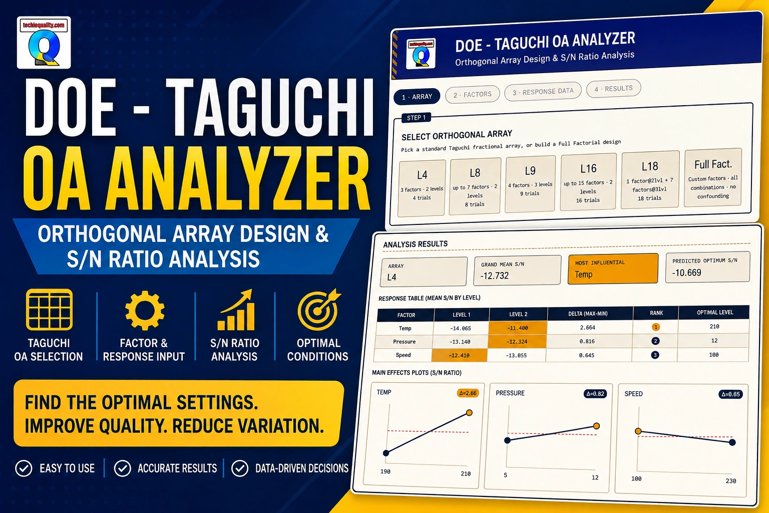
DOE Analyzer | DOE in Six Sigma | Try Free DOE Tools

DOE Analyzer

DOE Analyzer: Full Guide on How to Use

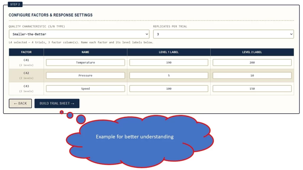
I want to conduct a Design of Experiments (DOE) study to determine the optimal process settings for minimizing shrinkage defects (%).

The proposed factors and two levels are:

FactorLevel 1Level 2
Temperature190200
Pressure510
Speed100150

Response: Shrinkage Defects (%)
DOE Objective: Minimize shrinkage defects
S/N Characteristic: Smaller-the-Better

The DOE will be used to evaluate the individual effects of Temperature, Pressure, and Speed, identify the most influential factors, and determine the optimal combination of factor levels to achieve the minimum shrinkage defect percentage. A confirmation experiment should subsequently be conducted at the recommended settings to validate the DOE results.

DOE Analyzer
DOE Analyzer
DOE Analyzer
DOE Analyzer
DOE Analyzer
DOE Analyzer

DOE Analyzer | DOE in Six Sigma | Try Free DOE Tools

In modern manufacturing and quality engineering, improving a process by changing one parameter at a time can be slow, expensive, and sometimes misleading.

When several process factors can influence a quality characteristic, Design of Experiments (DOE) provides a structured statistical approach for studying those factors simultaneously.

DOE helps engineers answer important questions such as:

  • Which process factors have the greatest influence on the response?
  • Which factor level provides better performance?
  • Which combination of process parameters should be selected?
  • How much does each factor contribute to the observed variation?
  • Can the number of experiments be reduced?
  • How can a process be optimized systematically?

One of the widely used approaches for efficient experimentation is the Taguchi method, which uses Orthogonal Arrays (OA) to study multiple factors with a structured experimental design.

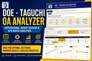
To make this analysis easier, an interactive Taguchi OA Analyzer / DOE Analyzer can be used to create an experimental design, enter response data, calculate Signal-to-Noise (S/N) ratios, generate response tables, rank factors, visualize main effects, and estimate factor contribution.

The DOE Analyzer is designed around this workflow. It provides Orthogonal Array selection, Full Factorial design, factor configuration, response-data entry, S/N analysis, response tables, main-effects analysis, simplified ANOVA, and result export.

What Is DOE?

DOE stands for Design of Experiments.

It is a systematic methodology for planning experiments so that the effects of multiple input factors on one or more responses can be studied efficiently.

In a manufacturing process, for example, the output may depend on:

  • Temperature
  • Pressure
  • Speed
  • Feed rate
  • Cycle time
  • Material
  • Tool condition
  • Cooling parameters

Instead of changing one parameter at a time, DOE allows several factors to be varied according to a planned experimental matrix.

Basic DOE concept

Process Factors

      ↓

Experimental Design

      ↓

Conduct Experiments

      ↓

Collect Response Data

      ↓

Statistical Analysis

      ↓

Identify Important Factors

      ↓

Select Optimum Levels

      ↓

Confirmation Experiment

This structured approach makes experimentation more efficient and provides a better basis for process optimization.

Why Is DOE Important in Manufacturing?

Consider a manufacturing process with four factors, each having two levels.

If every possible combination needs to be tested, the number of experiments is:

2⁴ = 16 experiments

If the number of factors increases to six:

2⁶ = 64 experiments

For larger experiments, the number of combinations can increase rapidly.

DOE methods can provide structured experimental designs that reduce the number of trials compared with testing every possible combination.

This is one reason Taguchi Orthogonal Arrays are widely associated with efficient experimentation.

What Is a Taguchi Method?

The Taguchi method is an approach to experimental design and robust process/product improvement associated with Genichi Taguchi.

A major feature of Taguchi experimentation is the use of Orthogonal Arrays.

The basic idea is to systematically vary multiple factors while using a structured experimental matrix.

Taguchi analysis also commonly uses the Signal-to-Noise (S/N) ratio to evaluate the performance and robustness of a response.

The objective is not simply to achieve a desirable average response, but to identify factor settings that provide better and more robust performance.

What is an Orthogonal Array?

An Orthogonal Array (OA) is an experimental matrix used to arrange factors and their levels in a structured manner.

Each row represents an experimental trial.

Each column can represent a factor or experimental assignment.

For example, a simple two-level experiment could look like this:

TrialFactor AFactor BFactor C
1LowLowLow
2LowHighHigh
3HighLowHigh
4HighHighLow

The actual Orthogonal Array selected depends on the number of factors, levels, and experimental requirements.

A Taguchi OA Analyzer helps automate the creation and analysis of these experimental matrices.

What is a Taguchi OA Analyzer?

A Taguchi OA Analyzer is a tool that helps engineers create and analyse experiments based on Taguchi Orthogonal Arrays.

A typical workflow includes:

  1. Select an Orthogonal Array.
  2. Define factors.
  3. Define factor levels.
  4. Select the response characteristic.
  5. Enter experimental response data.
  6. Calculate S/N ratios.
  7. Generate the response table.
  8. Rank factors.
  9. Identify preferred factor levels.
  10. Review main effects.
  11. Estimate factor contribution.
  12. Generate/export results.

The DOE Analyzer application follows this four-stage workflow:

Array → Factors → Response Data → Results.

DOE Analyzer vs Taguchi OA Analyzer

Although the terms are sometimes used interchangeably, they can have slightly different meanings.

DOE Analyzer

A broader DOE Analyzer can support different experimental designs such as:

  • Full Factorial
  • Fractional Factorial
  • Taguchi designs
  • Other DOE approaches

Taguchi OA Analyzer

A Taguchi OA Analyzer focuses specifically on:

  • Orthogonal Arrays
  • Factor-level analysis
  • S/N ratios
  • Response tables
  • Factor ranking
  • Main effects
  • Contribution analysis

The DOE Analyzer tool combines both concepts by supporting Taguchi Orthogonal Arrays and Full Factorial designs.

Full Factorial Design

The DOE Analyzer also provides a Full Factorial option.

In a Full Factorial experiment, all combinations of the selected factor levels are tested.

For example, with three factors and two levels:

Number of experiments = 2³ = 8

TrialABC
1LowLowLow
2LowLowHigh
3LowHighLow
4LowHighHigh
5HighLowLow
6HighLowHigh
7HighHighLow
8HighHighHigh

The application allows users to configure Full Factorial designs with 2 or 3 levels per factor and between 2 and 6 factors.

Factors and Levels in DOE

Understanding factors and levels is fundamental to DOE.

What Is a Factor?

A factor is an input variable that may influence the response.

For example:

  • Temperature
  • Pressure
  • Speed

What Is a Level?

A level is the specific setting at which a factor is tested.

For example:

FactorLevel 1Level 2
Temperature150°C180°C
Pressure2 bar4 bar
Speed100 RPM150 RPM

Therefore:

Factor = What you change

Level = The value at which you test it

The DOE Analyzer allows users to define factor names and level labels rather than relying only on generic factor names.

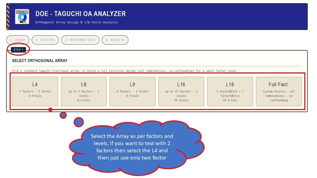
Step 1: Select the DOE Design

The first step in the analyzer is selecting the experimental design.

Depending on the experiment, the user can choose an appropriate Taguchi Orthogonal Array or build a Full Factorial design.

The design should be selected based on:

  • Number of factors
  • Number of levels
  • Available experimental resources
  • Desired interactions
  • Objective of the experiment

A good experimental design is essential because the quality of the final analysis depends heavily on the quality of the experimental plan.

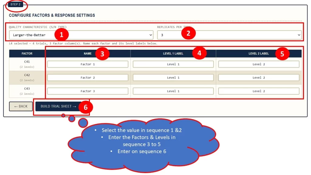
Step 2: Configure the Factors

After selecting the array, define the process factors.

Example: Injection Moulding Process

Suppose an engineer wants to study:

  • Injection temperature
  • Injection pressure
  • Cooling time

The factors could be:

FactorLevel 1Level 2
Temperature180°C200°C
Pressure80 bar100 bar
Cooling Time10 sec15 sec

These factor definitions are then mapped to the selected experimental design.

Step 3: Select the Response Characteristic

One of the most important decisions in Taguchi analysis is selecting the appropriate S/N characteristic.

The DOE Analyzer provides:

  • Smaller-the-Better
  • Larger-the-Better
  • Nominal-the-Best

and provides a target input for Nominal-the-Best analysis.

Smaller-the-Better

Use Smaller-the-Better when lower values are desirable.

Examples include:

  • Defects
  • Rejection
  • Scrap
  • Leakage
  • Noise
  • Cycle time
  • Dimensional variation

Example

If the objective is:

Minimize defects

then:

S/N characteristic = Smaller-the-Better

Larger-the-Better

Use Larger-the-Better when higher values are desirable.

Examples:

  • Strength
  • Efficiency
  • Battery life
  • Productivity
  • Output
  • Reliability

Example

If the objective is:

Maximize battery life

then:

S/N characteristic = Larger-the-Better

Nominal-the-Best

Use Nominal-the-Best when the target value is important.

Examples include:

  • Diameter
  • Thickness
  • Voltage
  • Pressure
  • Weight
  • Dimension

For example:

Target = 25.00 mm

The objective is to keep the measured value as close as possible to 25.00 mm.

The analyser supports a target value for this characteristic.

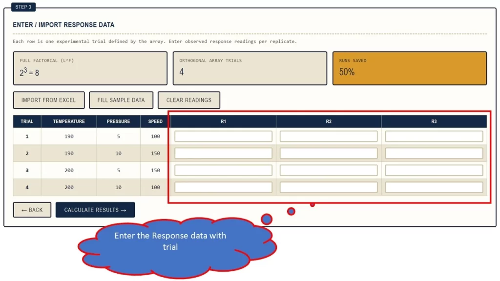
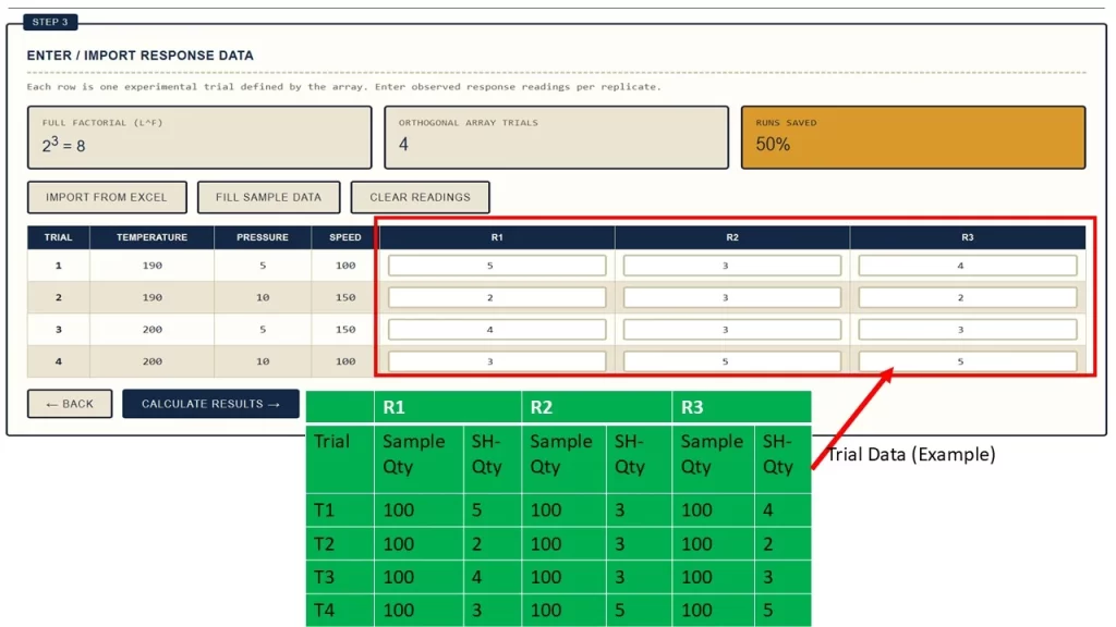
Step 4: Enter Response Data

Once the experiment has been performed, the measured responses must be entered.

For example:

TrialReplicate 1Replicate 2Replicate 3
112.112.312.2
213.413.513.3
311.811.911.7
414.114.014.2

The application supports multiple replicate readings per trial.

It also provides the ability to import experimental data from Excel.

What is the S/N Ratio?

The Signal-to-Noise ratio is an important component of Taguchi analysis.

The S/N ratio provides a way to evaluate the relationship between desirable performance and variation.

The objective is generally to identify factor levels that produce a higher S/N ratio for the selected quality characteristic.

The DOE Analyzer calculates an S/N value for each experimental trial and uses those values to generate factor-level response information.

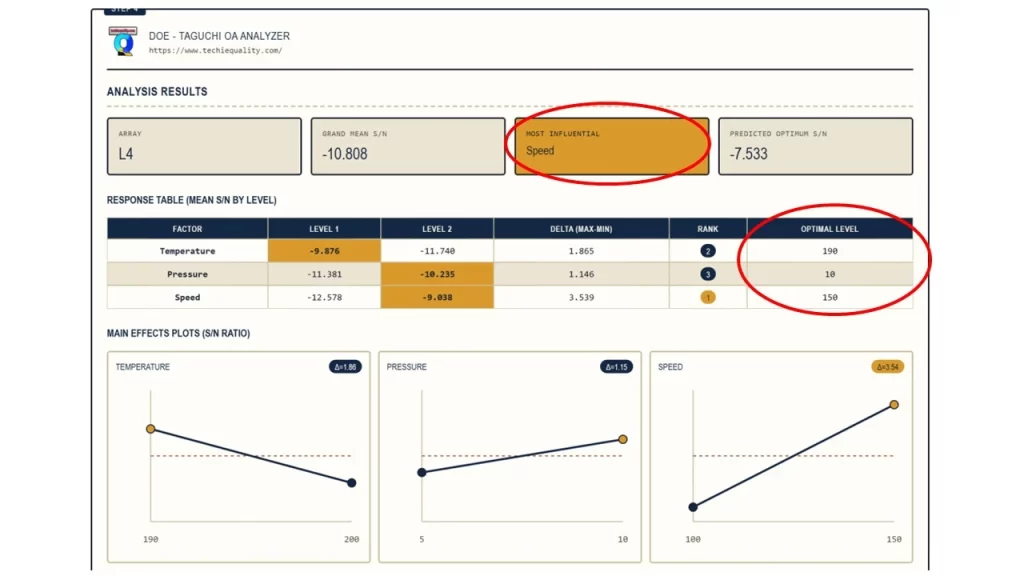
Response Table in Taguchi Analysis

The response table is one of the most useful outputs from a Taguchi OA Analyzer.

For each factor, the average S/N ratio is calculated at each level.

For example:

FactorLevel 1 S/NLevel 2 S/NDeltaRank
Temperature18.222.54.31
Pressure20.121.00.93
Speed22.019.42.62

The analyser calculates the Delta as:

Delta = Maximum Level Average − Minimum Level Average

Factors are then ranked according to their delta values.

How to Interpret Factor Ranking

Suppose the response table gives:

FactorDeltaRank
Temperature4.31
Speed2.62
Pressure0.93

Temperature has the highest delta.

This indicates that the average S/N response changes more across its levels than the other factors in this analysis.

Therefore, temperature is ranked as the most influential factor according to this response table measure.

Important: Factor ranking based on delta should be interpreted as a measure of relative effect in the selected DOE analysis, not automatically as proof of statistical significance.

How to Find the Optimum Factor Levels

The best level for each factor is generally the level having the highest average S/N ratio for the selected Taguchi characteristic.

For example:

FactorLevel 1Level 2Selected Level
Temperature18.222.5Level 2
Pressure20.121.0Level 2
Speed22.019.4Level 1

The recommended combination becomes:

Temperature = Level 2

Pressure = Level 2

Speed = Level 1

This combination should then be validated using a confirmation experiment.

Simplified ANOVA and Factor Contribution

ANOVA stands for Analysis of Variance.

It can be used to estimate how variation in the response is associated with different factors.

The analyser provides a simplified ANOVA contribution section containing:

  • Sum of Squares
  • Degrees of Freedom
  • Mean Square
  • Contribution %

The application’s calculation determines the contribution relative to total variation in the S/N response.

Example:

FactorContribution
Temperature48.2%
Pressure24.3%
Speed16.5%
Error11.0%

In this example, temperature accounts for the largest calculated contribution.

Again, this should be interpreted within the specific analysis method and experimental design rather than treated as a complete hypothesis-testing ANOVA.

Predicted Optimum

After identifying the best factor levels, the analyser calculates a predicted optimum S/N ratio.

The application uses the grand mean and the selected best-level S/N values to calculate the prediction.

The predicted value provides an estimate of the expected performance at the selected combination.

However, prediction should always be followed by a confirmation experiment.

DOE Analyzer Features

The DOE Analyser provides the following capabilities:

Experimental Design

  • Taguchi Orthogonal Arrays
  • Full Factorial design
  • 2-level experiments
  • 3-level experiments
  • Custom factor configuration

Factor Configuration

  • Custom factor names
  • Custom level labels
  • Multiple factor levels

Response Analysis

  • Larger-the-Better
  • Smaller-the-Better
  • Nominal-the-Best
  • Target value for Nominal-the-Best
  • Multiple replicate readings

Statistical Results

  • Trial S/N values
  • Grand mean
  • Response table
  • Delta
  • Factor ranking
  • Best factor levels
  • Main-effects plots
  • Simplified ANOVA
  • Factor contribution
  • Predicted optimum

Data and Reporting

  • Sample data
  • Excel import
  • Excel result export
  • PDF report generation

These capabilities are reflected directly in the application’s interface and analysis logic.

Who Should Use a DOE Analyzer?

Quality Engineers

Useful for:

  • Defect reduction
  • Process optimization
  • Variation reduction
  • Quality improvement
  • Root-cause investigation

Manufacturing Engineers

Useful for:

  • Machine parameter optimization
  • Cycle-time improvement
  • Process parameter selection
  • Productivity improvement

Six Sigma Professionals

DOE is particularly useful during the Improve phase of DMAIC.

R&D Engineers

DOE can help evaluate:

  • Product parameters
  • Material combinations
  • Design conditions
  • Process settings

Students and Beginners

A visual analyser can help users understand:

  • Factors
  • Levels
  • Orthogonal Arrays
  • S/N ratios
  • Response tables
  • Main effects
  • Factor ranking
DOE in Six Sigma

DOE is an important statistical tool in Six Sigma.

A typical improvement project may follow:

Define → Measure → Analyse → Improve → Control

DOE is particularly useful during the Improve stage when the team has identified potential process factors and wants to determine which factor settings produce better performance.

For example:

Problem: High rejection

Potential factors: Temperature, pressure, speed

DOE: Planned experiment

Response: Defect count

S/N Analysis

Factor Ranking

Optimum Levels

Confirmation Run

Standardize Process

This approach provides a structured path from experimentation to process optimization.

Advantages of Using a DOE Analyzer

A DOE Analyzer can provide several practical advantages.

Faster Analysis

Automated calculations reduce repetitive spreadsheet work.

Structured Workflow

The user follows a defined sequence from design selection to results.

Reduced Calculation Errors

Automating repetitive calculations can reduce manual formula errors.

Easy Factor Comparison

Response tables and rankings make factor comparison easier.

Visual Analysis

Main-effects plots provide an intuitive view of factor-level behaviour.

Data Import

Existing Excel experimental data can be brought into the application.

Reporting

Results can be exported for documentation and communication.

Common DOE Mistakes

Mistake 1: Choosing Too Many Factors Without a Clear Objective

Start with factors that have a reasonable technical basis.

Mistake 2: Selecting Incorrect Levels

Factor levels should be meaningful and practically achievable.

Mistake 3: Using the Wrong S/N Characteristic

For example, defect count should generally be treated as a smaller-is-better objective, while strength may be larger-is-better.

Mistake 4: Ignoring Measurement Variation

Poor measurement capability can distort DOE results.

Mistake 5: Treating Factor Ranking as Proof of Significance

A higher delta indicates a larger observed change across factor levels in the response-table analysis, but it should not automatically be interpreted as statistical significance.

Mistake 6: Skipping Confirmation Experiments

The predicted optimum should be verified experimentally before being implemented in production.

Frequently Asked Questions

What does DOE stand for?

DOE stands for Design of Experiments.

What is a DOE Analyzer?

A DOE Analyzer is a tool used to design and analyse experiments involving multiple factors and responses.

What is a Taguchi OA Analyzer?

A Taguchi OA Analyzer is a tool designed to work with Taguchi Orthogonal Arrays and analyse experimental responses using methods such as S/N ratio analysis and response tables.

What is an Orthogonal Array?

An Orthogonal Array is a structured experimental matrix used to arrange factor-level combinations for an experiment.

What is the S/N ratio?

The Signal-to-Noise ratio is a Taguchi analysis measure used to evaluate response performance relative to variation according to the selected quality characteristic.

What are the three Taguchi S/N characteristics?

The commonly used characteristics are:

  • Smaller-the-Better
  • Larger-the-Better
  • Nominal-the-Best

The Techiequality supports all three.

Can I perform Full Factorial DOE?

Yes. The Techiequality DOE analyser includes a Full Factorial design option.

Can I import Excel data?

Yes. The application provides Excel import functionality for response data.

Can I export the DOE results?

Yes. The application provides Excel and PDF export functionality.

Can a DOE Analyzer determine the optimum process setting?

It can identify the best tested factor level based on the selected S/N response and calculate a predicted optimum S/N value. The resulting settings should then be confirmed experimentally.

Thanks for visiting Techiequality

Six Sigma Green Belt Test Questions | 60+ Q&A with Example and Concept

Six Sigma Green Belt Test Questions

Six Sigma Green Belt Test Questions | 60+ Q&A with Example and Concept

Hi Readers, Today, we will be discussing an important topic on Six Sigma Green Belt Test Questions. Six Sigma Green Belt certification is one of the most recognized quality management credentials across manufacturing, automotive, healthcare, IT, logistics, and service industries. Green Belt professionals lead process improvement projects, reduce defects, improve customer satisfaction, and drive operational excellence using data-driven methodologies. This guide covers objective questions, practical questions, experience-based interview questions, and scenario-based questions with answers & examples.

Preparing for the green belt six sigma practice exam requires a strong understanding of:
  • DMAIC Methodology
  • Lean Principles
  • Statistical Analysis
  • Process Capability
  • Root Cause Analysis
  • Control Plans
  • Continuous Improvement
  • SIPOC
  • VSM
  • 7QC tools
  • 5 core tools
  • Hypothesis testing tools
The primary objectives of a green belt six sigma professional are:
  1. Reduce process variation.
  2. Eliminate defects and waste.
  3. Improve customer satisfaction.
  4. Increase process capability.
  5. Improve operational efficiency.
  6. Support organizational business goals.
  7. Lead DMAIC improvement projects.

Opportunity to lead and support nearly 200 improvement projects, including both Green Belt and Black Belt initiatives across various functions and industries.

Throughout this journey, I have gained extensive practical experience in problem-solving, process improvement, statistical analysis, project management, and business excellence methodologies. While certification examinations assess theoretical understanding, project execution provides invaluable insights that help professionals apply these concepts effectively.

To support both new and experienced professionals preparing for Six Sigma certification, I would like to share a collection of important and practical questions, along with key learning points, that are frequently encountered during project implementation and certification preparation. These questions are designed to strengthen conceptual understanding, enhance analytical thinking, and improve examination performance.

I hope this knowledge-sharing initiative will help aspiring Six Sigma professionals build confidence, deepen their expertise, and successfully achieve their certification goals while creating measurable business impact.

Wishing all certification aspirants the very best in their learning and professional development journey.

Six Sigma Green Belt Test Questions

Basic Six Sigma Green Belt Objective Questions

1. What does DMAIC stand for?

A. Define, Measure, Analyse, Improve, Control
B. Develop, Measure, Assess, Improve, check
C. Define, Manage, Analyse, Implement, Control
D. Develop, Measure, Analyse, Improve, Confirm

Answer: A

2. What is Six Sigma primarily focused on?

A. Increasing inventory
B. Reducing variation and defects
C. Increasing manpower
D. Reducing production volume

Answer: B

3. Which phase identifies customer requirements?

A. Measure
B. Analyse
C. Define
D. Improve

Answer: C

4. What is CTQ?

A. Critical To Quality
B. Customer Technical Quality
C. Cost To Quality
D. Critical Team Quality

Answer: A

5. Which tool is commonly used for root cause analysis?

A. Fishbone Diagram
B. Histogram
C. Check Sheet
D. Control Plan

Answer: A

DMAIC Practical Questions

6. A production line has a defect rate of 8%. What DMAIC phase should be used to identify reasons for defects?

Answer: Analyse Phase

Explanation:
During Analyse, teams identify root causes using tools such as:

  • Fishbone Diagram
  • 5 Why Analysis
  • Pareto Analysis
  • Regression Analysis

7.Customer complaints have increased by 30%.Which DMAIC phase should begin first?

Answer: Define Phase

Reason:
The problem statement, project charter, scope, stakeholders, and customer requirements must first be defined.

Statistical Questions

8. What does a process capability index (Cpk) greater than 1.33 indicate?

A. Poor process performance
B. Marginal process capability
C. Capable process
D. Unstable process

Answer: C

9. What does standard deviation measure?

A. Average value
B. Process variation
C. Defect count
D. Yield

Answer: B

10. Which chart monitors variable data?

A. P Chart
B. C Chart
C. X-Bar Chart
D. NP Chart

Answer: C

11. What are the 8 wastes in Lean?

Answer:

  1. Defects
  2. Overproduction
  3. Waiting
  4. Non-utilized Talent
  5. Transportation
  6. Inventory
  7. Motion
  8. Extra Processing

Remember using acronym: DOWNTIME

12. What is Kaizen?

A. Statistical analysis
B. Continuous improvement
C. Process audit
D. Control chart

Answer: B

Scenario-Based Six Sigma Green Belt Test Questions

Scenario 1: Manufacturing Defect Reduction

Situation: An automotive component manufacturing plant reports:

  • Monthly production = 10,000 units
  • Defective units = 600

Management wants to reduce defects.

Question: Which Six Sigma approach should be applied?

Answer

DMAIC methodology.

Steps

Define

Problem: 6% defect rate causing customer complaints.

Measure

Collect defect data.

Analyse

Use:

  • Pareto Chart
  • Fishbone Diagram
  • 5 Why Analysis

Improve

Implement:

  • Operator training
  • Process standardization
  • Error proofing (Poka-Yoke)

Control

Monitor using control charts.

Expected Result

Defect rate reduced from 6% to below 2%.

Scenario 2: AMR Manufacturing Example

Situation: An Autonomous Mobile Robot (AMR) manufacturer experiences recurring field failures due to Lidar connector looseness.

Question

How would you investigate?

Answer

Define

Field failures due to intermittent Lidar communication.

Measure

Collect:

  • Failure frequency
  • Failure location
  • Operating hours

Analyse

Use 5 Why Analysis.

Example:

Why failure?
→ Connector disconnected.

Why disconnected?
→ Excessive vibration.

Why vibration affected connector?
→ Improper harness routing.

Why improper routing?
→ No routing standard.

Root Cause:
Lack of harness routing standard.

Improve

  • Increase harness length.
  • Improve bend radius.
  • Add strain relief.
  • Update assembly SOP.

Control

  • Periodic audits.
  • Validation testing.
  • First-off inspection.

Scenario 3: Service Industry Example

Situation

Customer support ticket closure time increased from 24 hours to 72 hours.

Question

What Lean Six Sigma tools would you use?

Answer

  1. SIPOC
  2. Process Mapping
  3. Value Stream Mapping
  4. Pareto Analysis
  5. Root Cause Analysis

Likely findings:

  • Resource shortage
  • Approval delays
  • Manual data entry

Experience-Based Six Sigma Green Belt Test Questions

1.Describe a Six Sigma project you completed.

Sample Answer

I led a defect reduction project in an automotive assembly process where defect rates were 4.5%.

Using DMAIC:

  • Identified top defect categories
  • Conducted root cause analysis
  • Implemented process controls

Results:

  • Defects reduced to 1.2%
  • Annual savings of ₹25 Lakhs
  • Improved customer satisfaction

Question 2: How have you used Pareto Analysis?

Sample Answer

In a manufacturing quality project, Pareto analysis revealed that 80% of defects originated from three defect categories.

Focusing corrective actions on these categories reduced overall defects by 50%.

Question 3

Explain a successful root cause analysis.

Sample Answer

We observed repeated AMR field failures.

Using:

  • Fishbone Diagram
  • 5 Why Analysis

We discovered improper cable routing causing connector stress.

After redesigning routing standards, failures dropped significantly.

Advanced Six Sigma Green Belt Test Questions

1. What is DPMO?

Defects Per Million Opportunities.

Formula:

DPMO = {Defects/ (Units x opportunities)}x1000000

2. What is a Sigma Level?

Sigma level measures process capability and defect performance.

Higher sigma = fewer defects. For example, 6 sigma = 3.4 defects per million

3. What is Poka-Yoke?

A mistake-proofing method designed to prevent human errors before defects occur.

Examples:

  • Sensor-based assembly verification
  • Barcode validation systems

Phase-wise Six Sigma Green Belt Test Questions

Define Phase Questions

1. What is the primary purpose of the Define phase?

Answer: To clearly define the problem, project scope, goals, customer requirements, and stakeholders.

2. What is a Project Charter?

Answer: A document that formally authorizes a Six Sigma project and includes:

  • Problem Statement
  • Business Case
  • Goal Statement
  • Scope
  • Timeline
  • Team Members

3. What is VOC?

Answer: Voice of Customer.

It represents customer expectations, needs, and requirements.

4. What is SIPOC?

Answer:

S – Suppliers
I – Inputs
P – Process
O – Outputs
C – Customers

Used to understand a process at a high level.

5. Why is a SIPOC diagram useful?

Answer:
It helps identify process boundaries and stakeholders before detailed analysis begins.

Measure Phase Questions

6. What is a Baseline Measurement?

Answer:
The current performance level before improvements is implemented.

7. Why is data collection important?

Answer:
Improvement decisions should be based on facts and data rather than assumptions.

8. What is a Check Sheet?

Answer:
A structured form used to collect and organize data.

9.What is Yield?

Yield = {Good units/Total units} x 100

Answer:
The percentage of defect-free products produced.

10. What is Rolled Throughput Yield (RTY)?

Answer:
The probability that a unit passes through an entire process without defects.

Analyse Phase Questions

11. What is Root Cause Analysis?

Answer:
A systematic method to identify the fundamental cause of a problem.

12. What is the 5 Why Technique?

Answer:
A problem-solving technique that repeatedly asks “Why?” until the root cause is identified.

13. What is a Fishbone Diagram?

Answer:
A visual tool used to categorize potential causes of a problem.

Categories often include:

  • Man
  • Machine
  • Method
  • Material
  • Measurement
  • Environment

14. What is Pareto Analysis?

Answer:
A method based on the 80/20 rule where a small number of causes contribute to most problems.

15. What is Correlation?

Answer:
A measure showing the relationship between two variables.

Improve Phase Questions

16. What is Poka-Yoke?

Answer:
Mistake-proofing techniques that prevent errors from occurring.

Example:
A connector designed to fit only in one direction.

17. What is Kaizen?

Answer:
Continuous improvement through small incremental changes.

18. Why conduct pilot runs?

Answer:
To verify improvements before full implementation.

19. What is Cost of Poor Quality (COPQ)?

Answer:
Costs associated with defects, rework, scrap, warranty claims, and customer complaints.

20. What is Risk Assessment?

Answer:
The process of identifying and evaluating potential risks before implementing changes.

Control Phase Questions

21. What is a Control Plan?

Answer:
A document that ensures process improvements are sustained.

22. What is Statistical Process Control (SPC)?

Answer:
A method of monitoring and controlling processes using statistical tools.

23. What is a Control Chart?

Answer:
A graph used to monitor process stability over time.

24. What are Upper and Lower Control Limits?

Answer:
Boundaries indicating expected process variation.

25. Why is process standardization important?

Answer:
It ensures consistency and prevents recurrence of defects.

Statistical Questions

26. What is Mean?

Answer:
The average of a dataset.

27. What is Median?

Answer:
The middle value when data is arranged in order.

28. What is Mode?

Answer:
The value that occurs most frequently.

29. What is Standard Deviation?

Answer:
A measure of variation or spread in a dataset.

30. Why is a low standard deviation desirable?

Answer:
It indicates consistent process performance.

Process Capability Questions

31. What does Cp measure?

Answer:
Potential process capability.

32. What does Cpk measure?

Answer:
Actual process capability considering process centering.

33. What does Cpk less than 1 indicate?

Answer:
The process is not capable of consistently meeting specifications.

34. What is considered a good Cpk value?

Answer:
Generally, 1.33 or higher.

35. Why monitor process capability?

Answer:
To determine whether the process can meet customer requirements.

Lean Six Sigma Questions

36. What is Value-Added Activity?

Answer:
An activity the customer is willing to pay for.

37. What is Non-Value-Added Activity?

Answer:
An activity that consumes resources without adding customer value.

38. What is Value Stream Mapping?

Answer:
A visual representation of material and information flow.

39. What is Takt Time?

Take Time = Available Production Time/Customer Demand

40. What is Just-In-Time (JIT)?

Answer:
Producing only what is needed, when needed, in the required quantity.

Scenario-Based Questions

41. Scenario: AMR Battery Failure

An AMR battery is failing after 100 charging cycles instead of the specified 500 cycles.

Question: Which Six Sigma tools would you use?

Answer:

  • Pareto Analysis
  • Fishbone Diagram
  • 5 Why Analysis
  • DOE (Design of Experiments)
  • Process Capability Analysis

42. Scenario: High Dispatch Errors

Warehouse dispatch accuracy dropped from 99% to 94%.

Answer:
Investigate:

  • Picking process
  • Barcode scanning
  • Training effectiveness
  • Standard operating procedures

43. Scenario: Customer Complaints Increased

Complaints increased by 40%.

Question: What should be your first step?

Answer:
Collect VOC data and define the problem clearly.

44. Scenario: Production Cycle Time Increased

Cycle time increased from 5 minutes to 8 minutes.

Answer:
Perform:

  • Time Study
  • Process Mapping
  • Bottleneck Analysis
  • Value Stream Mapping
45. Scenario: Rework Increased

A manufacturing process shows increasing rework levels.

Answer:
Analyse:

  • Operator skill
  • Machine condition
  • Incoming material quality
  • Process parameters

46. How did Six Sigma help your organization?

Sample Answer:

Six Sigma reduced defect rates by identifying root causes and implementing process controls, resulting in improved customer satisfaction and cost savings.

47. Describe a successful CAPA project.

Sample Answer:

Field failures were traced to improper cable routing. We updated design standards, implemented training, and established validation checks. Failures reduced significantly.

48. How do you handle resistance to change?

Sample Answer:

By involving stakeholders early, presenting data-based evidence, and demonstrating benefits through pilot projects.

49. How do you prioritize improvement opportunities?

Sample Answer:

Using Pareto Analysis, risk assessment, customer impact, and business value.

50. What is the biggest mistake in Six Sigma projects?

Answer:

Jumping directly to solutions without:

  • Defining the problem clearly
  • Collecting accurate data
  • Identifying the true root cause

This often leads to ineffective corrective actions and recurring problems.

A process produces 50,000 units with 250 defects. Each unit has 5 defect opportunities.

Calculate DPMO.

DPMO = {250 x 1000000 /(50000 x 5)}

Answer:

DPMO = 1,000

Basic Hypothesis Testing Six Sigma Green Belt Test Questions

Hypothesis testing is a critical topic in Six Sigma Green Belt certification exams. It helps determine whether process changes, supplier differences, machine variations, or quality improvements are statistically significant.

1. What is Hypothesis Testing?

Answer:
Hypothesis testing is a statistical method used to determine whether a claim about a population is likely to be true based on sample data.

2. What are the two hypotheses used in hypothesis testing?

Answer:

Null Hypothesis (H₀):
Assumes no difference or no effect exists.

Alternative Hypothesis (H₁ or Ha):
Assumes a difference or effect exists.

Example:

H₀: New process cycle time = Old process cycle time

H₁: New process cycle time ≠ Old process cycle time

3. What is the purpose of the Null Hypothesis?

Answer:
The null hypothesis serves as the default assumption that there is no significant difference between groups or processes.

4. What is a P-value?

Answer:
The probability of obtaining the observed result if the null hypothesis is true.

Decision Rule

  • P-value ≤ 0.05 → Reject H₀
  • P-value > 0.05 → Fail to Reject H₀

5. What is the significance level (α)?

Answer:
The maximum acceptable risk of rejecting a true null hypothesis.

Common value:

α = 0.05 (5%)

Type I and Type II Error Questions

6. What is a Type I Error?

Answer:

Rejecting a true null hypothesis.

Example:

Concluding a new supplier is better when actually there is no difference.
7. What is a Type II Error?

Answer:

Failing to reject a false null hypothesis.

Example:

Concluding there is no supplier difference when one actually exists.

8. Which error is called “False Alarm”?

Answer:
Type I Error.

9. Which error is called “Missed Detection”?

Answer:
Type II Error.

One-Tailed and Two-Tailed Test Questions

10. When is a One-Tailed Test used?

Answer:
When the direction of change is important.

Example:

Testing whether a new process reduces defects.

H₁: Defect Rate < Current Defect Rate

11. When is a Two-Tailed Test used?

Answer:
When testing for any difference.
Example:

H₁: Mean Cycle Time ≠ Existing Cycle Time

t-Test Questions

12. What is a One-Sample t-Test?

Answer:
Compares a sample mean against a target value.

Example:

Target Cycle Time = 20 min

Sample Mean = 18 min

13. What is a Two-Sample t-Test?

Answer:
Compares means of two independent groups.

Example:

Machine A vs Machine B

14. What is a Paired t-Test?

Answer:
Compares measurements before and after a process change on the same sample.

Example:

Cycle time before automation and after automation.

15. A process improvement project resulted in a p-value of 0.02. What should be concluded?

Answer:

Since:

0.02 < 0.05

Reject H₀.

The improvement is statistically significant.

ANOVA Questions

16. What does ANOVA stand for?

Answer:

Analysis of Variance

17. When is ANOVA used?

Answer:
To compare means of three or more groups.

Example:

Comparing output from:

  • Machine A
  • Machine B
  • Machine C

18. What is the Null Hypothesis in ANOVA?

Answer:

H₀:
All group means are equal.

19. What is the Alternative Hypothesis in ANOVA?

Answer:

At least one group mean is different.

Chi-Square Test Questions

20. When is Chi-Square used?

Answer:
For categorical data.

Example:

Determining whether defect type depends on production shift.

21. Give an example of a Chi-Square Test.

Answer:

Testing whether:

  • Day Shift
  • Night Shift

have different defect distributions.

22. Scenario: New Supplier Approval

Supplier A defect rate = 2%

Supplier B defect rate = 4%

Question:
Which test should be used?

Answer:
2-Proportion Test

Because defect rates are proportions.

23. Scenario: Comparing Machine Outputs

Three machines produce the same component.

Question:
Which test should be used?

Answer:
ANOVA

Since more than two groups are being compared.

24. Scenario: Before and After Improvement

Cycle time before improvement = 15 min

Cycle time after improvement = 12 min

Question:
Which test should be used?

Answer:
Paired t-Test

25. Scenario: Process Target Verification

Target weight = 100 g

Sample average = 98 g

Question:
Which test should be used?

Answer:
One-Sample t-Test

Six Sigma Green Belt Ultimate Quick Memory Tricks

DMAIC = Roadmap of Six Sigma

Memory Trick:

D M A I C

Define → What is the problem?
Measure → How bad is it?
Analyse → Why is it happening?
Improve → Fix it.
Control → Sustain it.

Easy Phrase:

“Define, Measure, Analyse, Improve, Control”

Problem → Data → Cause → Solution → Sustain

8 Wastes of Lean

Memory Trick:

DOWNTIME

LetterWaste
DDefects
OOverproduction
WWaiting
NNon-utilized Talent
TTransportation
IInventory
MMotion
EExtra Processing

Root Cause Analysis

Memory Trick:

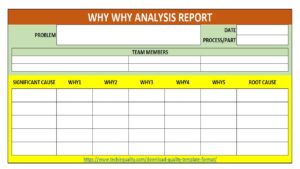
5 Why = Dig Until Root Cause

Problem → 1Why? → 2Why? →–3Why? -→ 4Why? → 5Why?

Never stop at symptoms.

4. Fishbone Categories

Memory Trick:

6M

  • Man
  • Machine
  • Method
  • Material
  • Measurement
  • Mother Nature (Environment)

Process Capability

Memory Trick:

Cp = Potential

Cpk = Actual Performance

Think: “Cpk keeps process centered.”

Green Belt Thumb Rule

CpkMeaning
<1Poor
1.0Barely Capable
1.33Good
1.67+Excellent

6 Sigma = 3.4 defects per million

This is the most frequently asked Six Sigma exam question.

Hypothesis Testing Shortcut

P-Value Rule

P ≤ 0.05 → Reject H₀

P > 0.05 → Fail to Reject H₀

Memory Trick

Small P = Big Difference

Control Charts

Memory Trick

Variable Data: X-Bar & R Chart

Examples:

  • Weight
  • Length
  • Voltage

Attribute Data: P, NP, C, U Charts

Examples:

  • Defects
  • Rejects
  • Pass/Fail

Pareto Principle

Memory Trick

80/20 Rule

80% Problems ← 20% Causes

Focus on the “Vital Few.”

Cost of Quality (COQ)

Memory Trick: PAFF

LetterMeaning
PPrevention
AAppraisal
FInternal Failure
FExternal Failure

Thanks for Reading… Keep visiting TECHIEQUALITY.

FMEA Scenario Based, AI Questions and Answers

FMEA Scenario Based AI Questions

FMEA Scenario Based AI Questions and Answers

Hi Readers, Today, we will be discussing an important topic on FMEA Scenario Based AI Questions and Answers. Failure Mode and Effects Analysis (FMEA) is one of the most critical tools used in quality engineering, manufacturing, and product design to identify potential failures and prevent defects before they occur. Whether you are preparing for an interview or strengthening your practical knowledge, understanding FMEA deeply is essential.

Traditional FMEA is powerful, but often manual, time-consuming, and dependent on human judgment. With the rise of Artificial Intelligence (AI), organizations are now moving toward smart, data-driven FMEA that predicts failures before they even occur.

Understanding FMEA concepts is important, but applying them in real-life situations is what truly matters in interviews and on the job. In this section, we cover FMEA Scenario Based AI Questions that test your practical knowledge, decision-making, and problem-solving skills.

FMEA Scenario Based AI Questions

1. What is FMEA?

FMEA (Failure Mode and Effects Analysis) is a structured, systematic method used to identify potential failure modes & Design failure modes in a system, product, or process and analyse their effects on performance.
Key Objective:

  • Identify risks before they occur
  • Prioritize issues based on severity
  • Take preventive actions

2. What are the types of FMEA?

There are mainly two types:

A. Design FMEA (DFMEA)

Focuses on product design-related failures.

B. Process FMEA (PFMEA)

Focuses on manufacturing or process-related failures.

3. What is a Failure Mode?

A failure mode is the way in which a process, product, or system can fail.

Example:

  • Motor not starting
  • Sensor malfunction
  • Loose wiring

4. What is the difference between Failure Mode and Failure Effect?

AspectFailure ModeFailure Effect
DefinitionWhat failedImpact of failure
ExampleLoose connectorSystem stops working

5. What is Severity (S), Occurrence (O), and Detection (D)?

These are the three key factors used in FMEA:

Severity (S)

  • Measures the impact of failure
  • Scale: 1 (low) to 10 (high)

Occurrence (O)

  • Frequency of failure
  • Scale: 1 (rare) to 10 (frequent)

Detection (D)

  • Ability to detect failure before it occurs
  • Scale: 1 (high detection) to 10 (low detection)

6. What is RPN (Risk Priority Number)?

RPN is used to prioritize risks.

Formula:

RPN = Severity × Occurrence × Detection

Example:

  • S = 8, O = 5, D = 4
  • RPN = 8 × 5 × 4 = 160

Higher RPN means higher risk and priority.

7. What is the limitation of RPN?

  • Different combinations can give the same RPN
  • Does not always reflect true risk priority
  • Modern systems sometimes use Action Priority (AP) instead

8. What is Action Priority (AP)?

Action Priority is a newer method (AIAG & VDA standard) used instead of RPN.

Categories:

  • High Priority
  • Medium Priority
  • Low Priority

It focuses more on Severity first, rather than just multiplication.

9. What are the steps involved in FMEA?

  1. Define the process/system
  2. Identify failure modes
  3. Identify effects of failure
  4. Identify causes
  5. Assign S, O, D ratings
  6. Calculate RPN
  7. Define corrective actions
  8. Re-evaluate after actions

10. What is the role of FMEA in quality?

FMEA helps in:

  • Preventing defects
  • Reducing rework and scrap
  • Improving product reliability
  • Enhancing customer satisfaction

11. What is a Control Plan and its relation to FMEA?

A Control Plan is derived from FMEA.

Relationship:

  • FMEA identifies risks
  • Control Plan defines how to control those risks

12. What is Detection Control?

Detection control is a method used to identify a failure before it reaches the customer.

Examples:

  • Inspection
  • Testing

13. What is Prevention Control?

Prevention control eliminates the cause of failure.
Examples:

  • Design change
  • Process improvement
  • Error-proofing (Poka-Yoke)

14. What is Poka-Yoke in FMEA?
Poka-Yoke is a mistake-proofing technique used to prevent errors.

Example:

  • Connector that fits only one way
  • Sensor to detect missing parts

15. What is the difference between PFMEA and DFMEA?

AspectDFMEAPFMEA
FocusDesign IssuesProcess / potential issues
StageProduct Developmentmanufacturing
ExampleMaterial failureAssembly error

16. What is a real-life example of FMEA?

Example: Conveyor System

Failure ModeFailure EffectCauseAction
Belt slipProduction stopLow tensionAdjust tension
Motor failureSystem shutdownoverheatingAdd cooling system

17. When should FMEA be done?

  • During product design
  • Before process launch
  • When changes occur
  • After major failures

18. What are common mistakes in FMEA?

  • Not updating FMEA regularly
  • Incorrect rating (S, O, D)
  • Treating it as documentation only
  • Lack of cross-functional team involvement

19. What is the role of a Quality Engineer in FMEA?

  • Lead FMEA discussions
  • Identify risks
  • Ensure proper ratings
  • Drive corrective actions
  • Link FMEA with control plan

20. How do you improve FMEA effectiveness?

  • Use real data instead of assumptions
  • Involve cross-functional teams
  • Update continuously
  • Focus on high severity issues
  • Implement strong preventive controls

Scenario- Based Question:

21. High RPN but Low Severity: You found a failure mode with:

  • Severity = 3
  • Occurrence = 9
  • Detection = 9

RPN = 243 (very high)

What will you prioritize, this or another failure with:

  • Severity = 9
  • Occurrence = 3
  • Detection = 3 (RPN = 81)?

Answer:
The second case should be prioritized despite the lower RPN.

Reason:

  • Severity is critical (9): impacts safety/customer
  • Modern FMEA (AIAG & VDA) prioritizes Severity first, not just RPN

Action:

  • Address high severity issues first
  • Then work on high RPN items

22. Detection Control Exists but Failures Still Reach Customer: Even after 100% inspection, defects are escaping to customers. What does this indicate in FMEA?

Answer:

  • Detection control is weak or ineffective
  • Detection ranking should be high (poor detection)

Inspection does not guarantee detection.

Action:

  • Improve detection method (automation, sensors)
  • Focus on prevention rather than detection

23. Frequent Failure but Easy to Detect: A defect occurs frequently but is always detected before dispatch. How will you handle it?

Answer:

  • Occurrence is high: needs action
  • Detection is good, but not a permanent solution

Action:

  • Reduce occurrence through root cause elimination
  • Detection is only a temporary safeguard
New Process Launch:

24. You are launching a new production line. How will you start PFMEA?

Answer:
Steps:

  1. Understand process flow
  2. Break into operations
  3. Identify failure modes at each step
  4. Assign S, O, D
  5. Define controls
  6. Create Control Plan

Use past data, lessons learned, and similar processes

Same RPN, Different Risks: Two failure modes have same RPN = 120

  • Case A: S=10, O=3, D=4
  • Case B: S=5, O=6, D=4

Which one will you prioritize?

Answer: Case A.

Reason:

  • Severity = 10 (critical risk, possibly safety issue)
  • Always prioritize high severity

25. Customer Complaint Received: A field failure occurred that was not identified in PFMEA. What will you do?

Answer:

  1. Update PFMEA with new failure mode
  2. Re-evaluate S, O, D
  3. Add corrective actions
  4. Update Control Plan
  5. Implement containment action

FMEA is a living document, not static

No Failure History Available:

26. You are doing FMEA for a new product with no historical data. How will you assign Occurrence?

Answer: Use Similar product data, Engineering judgment, Supplier input & Testing results

Start with assumptions then refine after production data

27. Operator Error Causing Failures: Failure is caused by operator mistake. What type of control will you suggest?

Answer: Best solution: Poka-Yoke (Error Proofing)

Examples:

  • Sensor-based detection
  • Interlocks
  • Fixtures that prevent wrong assembly

Avoid relying only on training.

28. Detection Rating Improvement: How can you reduce Detection rating from 8 to 3?

Answer:

  • Introduce automated inspection
  • Use sensors or vision systems
  • Add real-time monitoring

Lower detection rating = better detection system

29. High Severity but No Control Possible: If Severity is 10 and cannot be reduced, what should you do?

Answer:

  • Reduce Occurrence
  • Improve Detection

Severity is usually fixed → focus on prevention

30. Supplier-Related Failure: Failure mode is due to supplier material variation. How will you handle it?

Answer:

  • Add incoming inspection
  • Develop supplier quality plan
  • Conduct audits
  • Define specifications clearly

Work on supplier process improvement

31. Repeated Failures Despite Actions: Even after corrective actions, failure is repeating. What does it mean?

Answer:

  • Root cause not correctly identified
  • Actions are not effective

Action:

  • Re-do root cause analysis (5 Why)
  • Update FMEA accordingly

Manual Inspection vs Automation:

32. Manual inspection is missing defects. What will you recommend?

Answer: Replace or support with automation

Reason:

  • Manual inspection is error-prone
  • Automation improves consistency

FMEA Not Updated:

33. Team is not updating FMEA after process changes. What is the risk?

Answer:

  • New risks are not captured
  • Control plan becomes outdated
  • High chance of field failures

Action: Make FMEA update mandatory in change management

34. Low RPN but Critical Issue: A failure has low RPN but affects safety. Should you act?

Answer: YES

Reason: Safety issues always have top priority regardless of RPN

35. What is AI in FMEA?

AI in FMEA refers to the use of:

  • Machine Learning (ML)
  • Predictive Analytics
  • Data Mining
  • Automation tools

to improve how failure modes are identified, analysed, and prevented.

36. Why Traditional FMEA Needs AI

Challenges in Conventional FMEA:
  • Subjective scoring (S, O, D)
  • Static document (not updated frequently)
  • Relies heavily on experience
  • Misses hidden patterns in data

AI solves these by making FMEA:

  • Data-driven
  • Dynamic
  • Predictive

37. How AI Enhances FMEA

1. Predictive Failure Identification

AI analyses historical data to predict potential failure modes.

Example:
AI detects that motor failures increase when temperature > 60°C; flags risk before failure occurs

2. Smart Occurrence Rating

Instead of guessing Occurrence (O), AI:

  • Uses real production data
  • Calculates actual failure probability

Result: More accurate risk prioritization

3. Automated Detection Analysis

AI can evaluate:

  • Inspection effectiveness
  • Sensor data
  • False detection rates

Helps improve Detection (D) rating realistically

4. Real-Time FMEA Updates

Traditional FMEA = static
AI-based FMEA = live document

Automatically updates when:

  • New defects occur
  • Process changes happen
  • Field failures are reported

5. Root Cause Prediction

AI models can identify hidden relationships between:

  • Process parameters
  • Machine conditions
  • Failure patterns

Example: Combination of vibration + humidity: high failure probability

FMEA Scenario Based AI Questions

38. Problem: Frequent motor overheating in production

Traditional Approach:

  • Manual FMEA
  • Trial-and-error solution

AI-Based Approach:

  • Analyse temperature, load, runtime data
  • AI predicts overheating pattern
  • Suggests preventive maintenance schedule

39. How does AI improve FMEA?

By making it predictive, data-driven, and automated instead of manual.

40. What is the biggest advantage of AI in FMEA?

Accurate Occurrence prediction using real data.

Comment below if you would like to hear more about FMEA Scenario Based AI Questions and insights.

Thanks for Reading… Keep visiting TECHIEQUALITY.

Scatter Diagram Template | Industrial Example | Download Excel Format

Scatter Diagram Template

 Industrial Example of Scatter Diagram | Interpretation of result | Scatter Diagram Template:

Hi readers! Today we will discuss on Scatter diagram Example with the interpretation of its results. The scatter diagram is one of the popular tools of 7QC tools. It’s a type of diagram to displays the value for typically two continuous variables for a set of data. One variable can be positioned on the X-axis and another variable can be positioned on the Y-axis. This diagram will help you to find out the significant causes among the total collection of potential causes. When you have variable types of data collection of potential causes and you do not know the positive or negative relationship that time you can plot the scatter diagram to know the relationship among them. You can download our simple Excel Scatter Diagram Template from the below link.  

DOWNLOAD– Sample Scatter Diagram Excel Template/ Format.

Example:

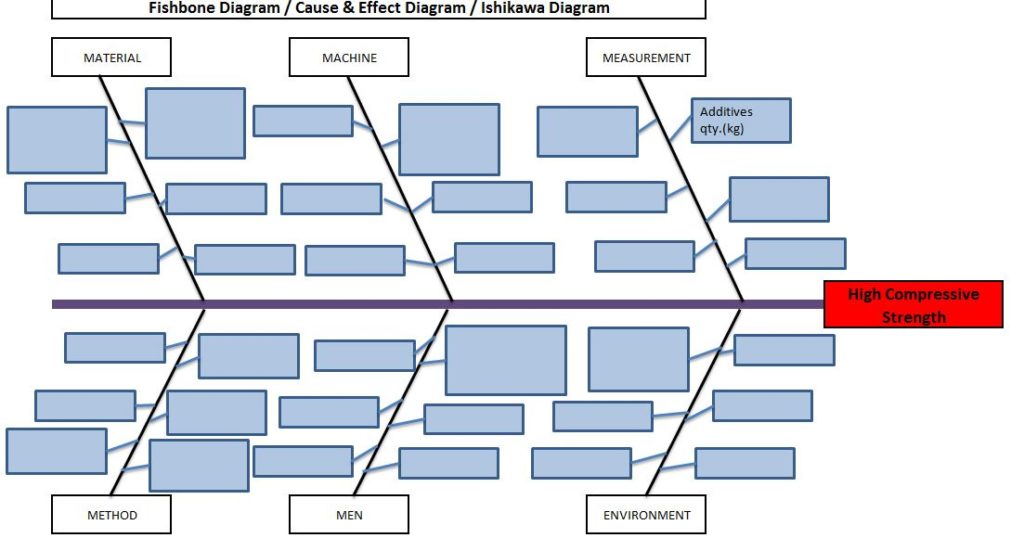
An organization has tried to know the significant causes for the high compressive strength of “X” quantity sand, so initially quality engineer drew the cause& effect diagram with the help of CFT team members and then he started the validation of each potential cause. The same C&F diagram is mentioned below.

Scatter Diagram Template

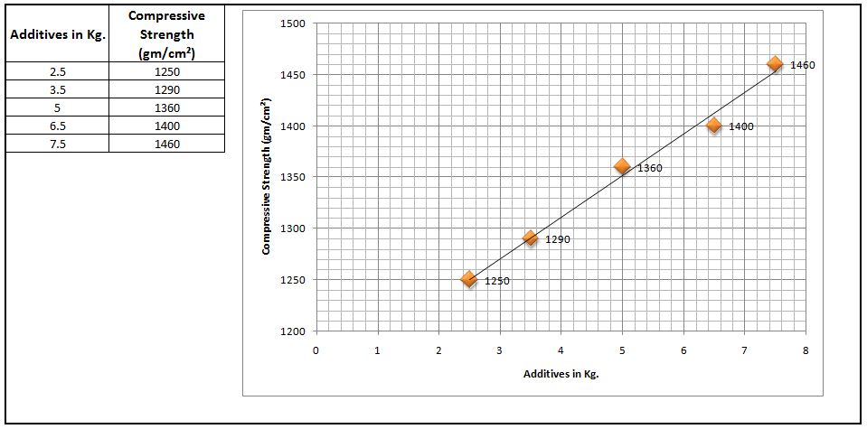
Here, we have not mentioned the other potential causes like mixing time, water%, etc. because these are already validated but now we have to know the relationship among the two variables as additive quantity v/s compressive strength through a scatter diagram. To do so data has to be collected and then a scatter diagram needs to be drawn.

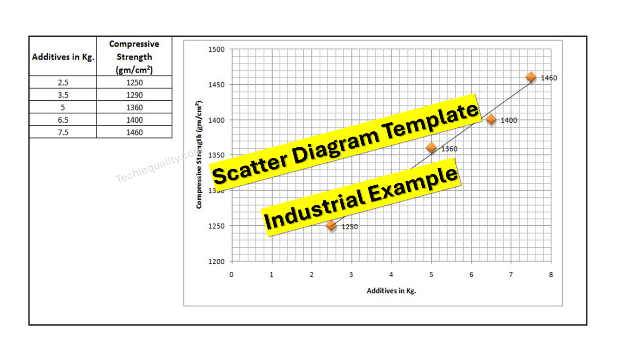
Data table:

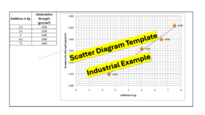
Additives in Kg. Compressive Strength (gm/cm²)
2.5 1245
3.5 1290
5 1330
6.5 1395
7.5 1435

 Scatter Diagram:

Scatter Diagram Template

Interpretation of result:

The above scatter diagram indicates us there is a perfect positive correlation between two variables i.e. Additives in Kg. vs. Compressive Strength (gm/cm²). So we can conclude that more the additive addition can result in high compressive strength.

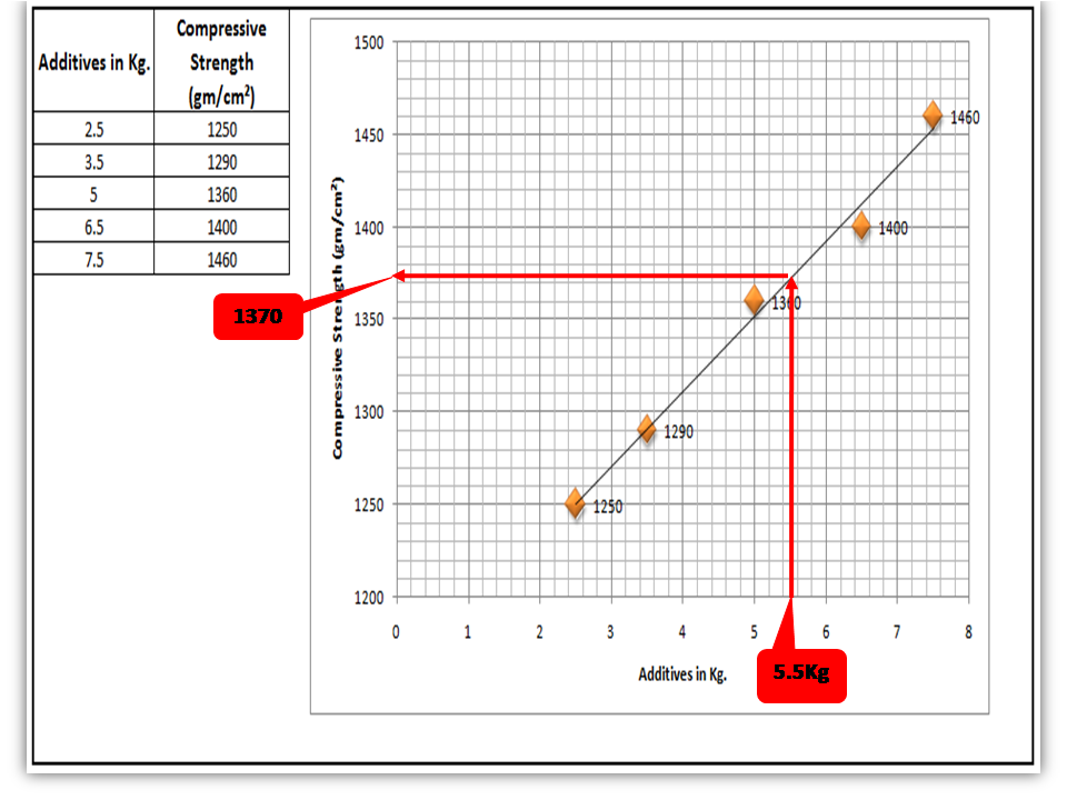
 Interpolation: you can guess the value from the set of data points. From the above graph, I would like to know the compressive strength if I will add 5.5 Kg additives in “X” Kg of Sand.

Scatter Diagram Template

FAQ:

Q1: What are the common possibilities of correlation between two variables of the scatter diagram?

 Ans.: There are so many possibilities but three common correlations are positive, negative, and no correlation. Positive and Negative correlations are further categorized into three types as.

Positive Correlation:

  • Low positive correlation
  • High positive correlation
  • Perfect positive correlation

Negative Correlation:

  • Low negative correlation
  • High negative correlation
  • Perfect negative correlation

Q2: What types of data are used to plot the scatter diagram?

Ans.: Continuous variable type data.

Useful Articles:

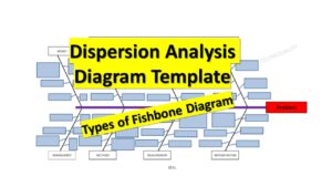
Types of Fishbone Diagram |Dispersion Analysis |Enumeration |Process Classification

7 QC Tools Template.

Repeatability vs Reproducibility | Discussion of Key difference.

Free Templates / Formats of QM: we have published some free templates or formats related to Quality Management with manufacturing / industrial practical examples for better understanding and learning. if you have not yet read these free template articles/posts then, you could visit our “Template/Format” section. Thanks for reading…keep visiting techiequality.com

Popular Post

4M Checklist Template | Free Download Format

4M Checklist Template

 4M Checklist Template |Free Download Format:

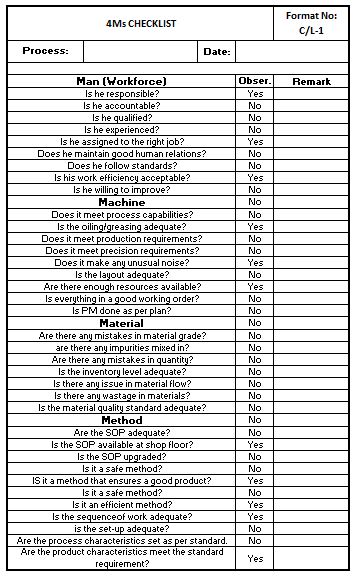
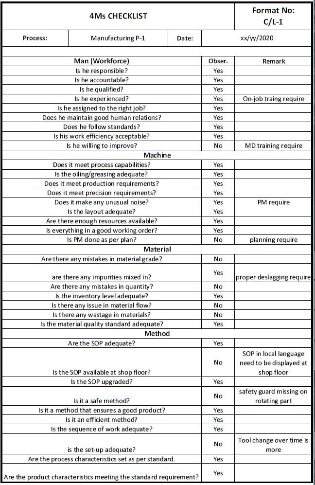
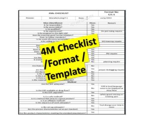
Hi Readers! Today we will discuss here on 4M Checklist Template. Generally, the 4M concept is used in several methodologies, In the Cause and effect diagram it represents the potential causes and similarly, it is also used as a checklist for Kaizen. In the kaizen approach, there are some checklists used as [1] 5MUs checklist [2] 5W1H checklist [3] 4M Checklist. But here we will only explain on the 4M checklist. We have prepared the 4M checklist for your ready reference. You can easily download this checklist/check sheet from the below link.

DOWNLOAD-4M Checklist/Check-sheet / 4m analysis template excel

Sample 4M Checklist Copy:

4M Checklist Template
4M Checklist Template:

4M i.e. Men, Machines, Materials & Methods are the common aspects and important for quality improvement and KAIZEN. Questions to be asked related to 4M to implement kaizen activities effectively are;

Man (Workforce)
Is he responsible?
Is he accountable?
Is he qualified?
Is he experienced?
Is he assigned to the right job?
Is everything in a good working order?
Does he follow standards?
Is his work efficiency acceptable?
Is he willing to improve?
Machine
Does it meet process capabilities?
Is the oiling/greasing adequate?
Does it meet production requirements?
Does it meet precision requirements?
Does it make any unusual noise?
Is the layout adequate?
Are there enough resources available?
Are there any mistakes in the material grade?
Is PM done as per plan?
Material
Is there any issue with material flow?
Are there any impurities mixed in?
Are there any mistakes in quantity?
Is the inventory level adequate?
Is there any wastage of materials?
Is the material quality standard adequate?
IS it a method that ensures a good product?
Method
Is the SOP adequate?
Is the SOP available on the shop floor?
Is the SOP upgraded?
Is it a safe method?
Is the setup adequate?
Is it a safe method?
Is it an efficient method?
Is the sequence of work adequate?
Are there any mistakes in the material grade?
Are the process characteristics set as per standard?
Are the product characteristics meeting the standard requirement?
Template
Example: We had audited the manufacturing process and got the below observations;
4M Checklist Template

During the process audit through the 4M checklist, we have observed so many improvement points, these are mentioned in the above checklist remark column. In this way, you can easily find out the process improvement points. Download the above 4M Checklist and try to customize it according to your manufacturing process.

How to Implement the 4M checklist /Check sheet in Manufacturing Industries?

I always try to share my own industrial experience so that my readers can easily understand, learn, and implement the skill-based concept in their operational process.

Posts/articles on this website are skilled base, you can read our articles for your personal learning, for training purposes, and for practical implementation in the industry as well.

Generally, we use the 4M, and 6M check sheets to audit /investigate and to check the condition and lacking points of 4M factors (Men, Machine, Method, and Material). Some industries plan the checking schedule on a weekly and some on a monthly basis as per the production plan. By doing so we can easily maintain the machine condition, reduce the B/D, Increase the machine run time, we can identify the on-job training of operators /workers, maintain the material inventory, monitor the effectiveness of the Method, we can further improve our process, etc.

Below are the steps for implementation of 4M checklist/ check sheet:
  • Prepare the 4M checklist /Check sheet as per your Process in detail considering with past 6 months’ quality defect causes, B/D nature causes, customer complaints, etc.
  • Define the Checking plan (e.g. weekly, monthly, etc.)
  • Check 4M factors by using the 4M check sheet as per your plan,
  • Write the observations.
  • Discuss with the concerned department and formulate the Action plan / CAPA.
  • Implement the CAPA /Action Plan.
  • Monitor the implementation of the action plan (For example, verify it in the next checking).
4M Change Management:

After doing the 4M Audit you can easily identify the 4M-related changes. the above 4m checklists is mentioned for your reference but the checking points are not limited. you can customize the above checklist as per your manufacturing process.

You can identify and monitor the 4M changes in the 4M change Record sheet as per below.

Sl. No.ProcessType of ChangeNature of ChangeDetails of ChangeAction TakenSet-up ApprovalRetroactive checkContainment Action
4M Change record

Example:

Type of Change: Man, Machine, Method, and Material.

Nature of Change: Plan change, Unplan change, Abnormal change

FAQ (Frequently Asked Question):
What is 4M in Manufacturing Industries?

Ans.: In Industries the term 4M is generally used as [1] Man [2] Machine [3] Material & [4] Method.

What is 4M method?

Ans.: The 4M method is generally used in manufacturing industries for problem-solving /analysis. These terms are generally represented in 4M change management and also in the Cause and effect diagram or Fishbone diagram. The potential causes are basically represented under the category of 4M- Cause and effect diagram for further processing like causes/problem analysis and validation of causes, etc.

More on TECHIEQUALITY

Dispersion Analysis Cause & Effect Diagram Template |Download Excel Format

Dispersion Analysis Cause & Effect Diagram Template

Dispersion Analysis & Process Classification Cause & Effect Diagram Template

Hi readers! Today we will discuss on types of Cause & Effect Diagram/Fishbone diagram. The cause and effect diagram is the most popular and frequently used tool among the seven QC tools. Basically Fishbone diagram is classified into mainly two types as [1] Dispersion Analysis Cause and Effect diagram, and [2] Process Classification Fishbone diagram. The Dispersion analysis fishbone diagram involves identifying the potential cause for a specific quality problem. However, a Process classification cause & effect diagram involves establishing causes related to the Process. In the manufacturing industry, both types of diagrams are used but Dispersion types are most frequently used to identify the potential causes of the quality-related problems.  If you are interested in downloading the Dispersion Analysis Cause & Effect Diagram Template & Process Classification fishbone diagram, then click on the given below links.

DOWNLOAD– Dispersion analysis cause & effect diagram template. (4Ms).

Dispersion Analysis Cause & Effect Diagram Template
4Ms

Dispersion analysis Fishbone Diagram Excel Template. (4Ps)-DOWNLOAD.

Dispersion Analysis Cause & Effect Diagram Template
4Ps

DOWNLOAD– Dispersion analysis cause & effect diagram format. (8Ms).

Dispersion Analysis Cause & Effect Diagram Template
8Ms

Process Classification cause & effect diagram excel format-DOWNLOAD.

Dispersion Analysis Cause & Effect Diagram Template
Process Classification

Steps for construction of Cause & Effect Diagram:

  • Form a CFT- Team with a multifunctional experienced workforce.
  • The facilitator will listen carefully to the member’s potential causes to represent it in a diagram.
  • Draw a backbone line from left to right, terminating at the Head, and write the Problem statement.
  • Draw the small bone and write the potential cause.
Dispersion Analysis Cause & Effect Diagram Template

Advantages:

  • It helps to identify the potential cause to improve the process.
  • Helps in the root cause identification of the problem.
  • C&E diagram is easily constructed & understood.
  • It is an effective tool for the diagnosis of the various causes of the problem and helping to solve the problem.

Disadvantages:

  • Waste of time to identify the other causes that are not critical to the Problem.
  • It’s a time-consuming methodology.

Dispersion Analysis Cause & Effect diagram V/S Process Classification Fishbone diagram:

ishikawa Template
fishbone  Template

Useful Links:

Strategies for Manufacturing Process Improvement |11+ Strategies

7QC Tools for Problem Solving | What are 7 QC Tools

Fishbone Diagram Template With Example

Root Cause Analysis | 8 Steps of RCA

More on TECHIEQUALITY

Thanks for Reading…Keep visiting Techiequality.Com

Popular Post

Fault tree analysis template | Download format free…

Fault tree analysis template

 Fault tree analysis template | Download format | FTA with Example:

Hi Readers! Today we will discuss on FTA. And also we have prepared some templates/formats considering with some situations. You can download the same templates from the below links. FTA (Fault tree analysis template) was developed by H.A Watson at Bell Laboratory in 1962. Fault tree analysis is generally used to analyze the undesired state of a system through Boolean algebra. This is commonly applicable in the fields of the Nuclear power sector, Chemical manufacturing and service sector, Pharmaceutical, Petrochemical, Aerospace, and other high-hazard industries but now it has become a popular diagram that is being used in almost all types of organizations or sectors.

DOWNLOAD –Fault Tree Analysis Sample Template.

As we know, if any incidents occur (may be due to high-risk factors or particular system level failure) in a high-hazard factory may lead to a high Severity score in health, environment, and safety concerns. So here we will explain the FTA in detail with EHS-related Examples.

FTA Event and Gate Symbols:

Fault tree analysis template

Frequently used gates are “OR gate” & “AND gate”.

Fault tree analysis template

You could also like to read our other articles:

5W2H Analysis Example |Download 5W2H Format.

5W1H Analysis Example |Download Template.

7 principles of QMS | Quality Management Principles.

Risk identification tools and techniques |Download Format.

SPC Format |DOWNLOAD Excel Template of SPC Study

Logic of “OR-Gate” & “AND-Gate”:

The output occurs if any input occurs. In the above figure you can see there is I/P-1 and I/P-2 in Or-Gate, The output of OR-gate will occur when any one of among two inputs will occurs. But in the case of AND-gate, the output will occur when both the input (I/P-1 & I/P-2) will occur.

Example: AFT of High Pollution:

Fault tree analysis template
Similar Post:

7QC Tools Excel Template |DOWNLOAD Format.

why why analysis methodology | 5-why analysis step by step guide.

MSA interview questions and answers.

Decision of process capability analysis |Download Format.

How to measure process capability (Cp & Cpk)? Download Excel Template.

How to measure process performance (Pp & Ppk)?

Thank you for reading…keeps visiting Techiequality.Com

Popular Post:

Histogram Template with example | Download

Histogram Template

Histogram Template with example | Download

The Histogram Template is prepared in a simple format with an industrial example. We have described the example in below, just go through this article and Download the Template / Format. It’s a very useful tool and is frequently used in manufacturing industries. The main function is to know the frequency distribution, symmetry, and skewness, and it also helps to determine the normality of data by drawing the bell curve.

DOWNLOAD [Histogram Template in Excel format].

Histogram Template
Histogram Template

Basic Information on Histogram:

A histogram is one of the 7QC tools and commonly used graph to show frequency distribution. Helps summarize data from a process that has been collected over a period of time.

A histogram is a representation of the frequency distribution of numerical data. it was first familiarized by Karl Pearson. A histogram is related to merely one type of variable data. You should calculate the interval value to represent the bins. Bins shall give an idea about the how much data falls within the selected data range’s width. Histogram gives the indication about data distribution as normal, skewed, or bi-modal.

How to use our Histogram Template:

Step-1: Download the Histogram Template from the above link.

Step-2: Carefully read the “Note” mentioned in the Excel template.

Step-3: Enter the reading only in the yellow color box. Then other values will calculate automatically and your histogram will be ready for interpretation.

Note:

1. Only yellow colour boxes are changeable

2. Make sure that the sum of frequency is equal to the total count, e.g. sum of frequency in a given example [example is given in histogram excel format, just download and see the example] is 30 and the count is also 30, if not then you have to adjust the parameters and frequency table in frequency distribution format for doing so click on the link given “How to adjust parameters and frequency table in Histogram Template?”.

Useful Links:

How to Plot Pareto Chart in Excel ( with example)

What is SPC | SPC Tools?

Corrective and Preventive Action Format | CAPA with Example.

OEE Calculation-How To Calculate OEE (Overall Equipment Effectiveness) with Example

Implementation of KAIZEN in Industry

Thank you for reading…. Keep visiting Techiequality.Com

Let us know if you have any questions…and drop your comments below.

Popular Post:

Pareto Chart Excel Template | Download format

Pareto Chart Excel Template

Pareto Chart Excel Template | Step by Step guide of template usages:-

Hi Readers! In this article, we have discussed on Pareto Chart Excel Template with a manufacturing example. and also you can learn here, the Pareto chart principle (80/20 rule). if you would like to download our excel template or format then, go through the below link.

DownloadPareto chart Excel Template.

Pareto Chart Excel Template

[Figure 1]

How to Use Pareto Chart Excel Template:

After downloading, the above Pareto Chart Excel Template Carefully read the Note and red highlighted box marked in excel.

Note 1:- White cells are only changed values. The sky colour cells will automatically calculate based on the formula within the cells.

Note 2:- Starting from the top, enter the name of causes into the table below in descending order (Largest to Smallest Values)

Example of Pareto chart:

Let us have ten causes as Damage, Crack, Shrinkage, Short-run, Blowhole, Pin-hole, Extra Metal, Sand-wash, Rough Surface, Low hardness, and High elongation.

Causes Rejection Quantity
Damage 23
Shrinkage 20
Crack 11
Short-run 7
Blow-hole 8
Extra Metal 5
Sand wash 6
Rough surface 3
Low hardness 4
High elongation 1

Now you have to do the sorting of Rejection Quantity in Descending order (Largest to smallest value)

Descending order of Rejection Quantity of above causes are,-

Causes Rejection Quantity
Damage 23
Shrinkage 20
Crack 11
Blow-hole 8
Short-run 7
Sand wash 6
Extra Metal 5
Low hardness 4
Rough surface 3
High elongation 1

Now directly we have to enter the name of causes and Rejection quantity (After sorting the value in descending order) into white cells of the Excel template sheet. After entering the values the Pareto chart will look like as below.

Pareto chart example
Pareto Principle (80/20 Rule):-

The 80/20 Rule or Pareto Principle is the most important part of Pareto Analysis. The rule 80/20 says that 80% of the effects come from 20% of the causes.

In Italy, Vilfredo Pareto has originally observed that 20% of people were owned 80% of the land. This principle was applied to quality control and favoured the use of the statement of phrase, which is “The Vital few and useful many” to define the 80/20 rule in the 20th century by Dr. Joseph M. Juran. Nowadays this principle is so popular and very useful in describing the contribution of the causes.

Understanding of Principle:-

Let’s get started with this principle, and how it is applicable in different sectors like manufacturing and non-manufacturing unit or service sectors. This principle is not limited to any particular sector or unit’s problems or defects to identify the contribution. It will help you to resolve 80% of problems/causes/defects among the 100% of problems.  

How this principle is related to the different fields: – (Example)-

  • Filed failure (for example (a)-80% of the field failure comes from 20% of the Causes.
    (b)-80% of the field failure comes from 20% of the Customer).
  •  80% of the results come from 20% of the Team.
  • Risk Management (e.g. 80% of the Risk comes from 20% of the Causes).

Let us have ten types of Causes and individual causes having a number of defects. Now we need to work on merely an 80% contribution to resolve the problem. But the things are how to identify the causes those are coming under the 80% contribution. So to identify the contribution we need to use the Pareto chart for knowing the contribution. So I would recommend you to download the above Pareto Chart Excel Template then, follow the steps and identify the contribution.

Advantages of Pareto Chart:

1. Production Optimisation.

2. Rejection Reduction.

3. Cost of Poor Quality Reduction.

4. Quality level Improvement.

5. Product Performance Improvement

6. Customer satisfaction Enhancement.

7. Rework cost reduction.

Etc.

The Pareto chart is the most commonly used tool in manufacturing industries, I remember when I was working in the quality department, how frequently I used this tool in our daily quality issue analysis. I used this tool on a daily line rejection analysis, as well as in different types of QA or QC projects like quality circle projects, SGA projects, Six Sigma projects, etc. With the help of the Pareto chart, you can easily visualize the defect’s contribution and accordingly, you can do an analysis of the majority contribution for improvement.

FAQ:

The Pareto chart is one of the commonly used 7 QC tools in manufacturing industries.

Similar Articles:

Histogram Example | Foundry Industries Examples.

Histogram Template with example | Download.

How to plot Histogram in Excel (Step by step guide with example)

SPC Format |DOWNLOAD Excel Template of SPC Study

7QC Tools for Problem Solving | What are 7 QC Tools

Root Cause Analysis | 8 Steps of RCA

More on TECHIEQUALITY

Thanks for reading…Keeps Visiting Techiequality.Com

Popular Post: