50+ SPC Interview Questions with Answers (Beginner to Advanced) | AI in SPC

spc interview questions

SPC Interview Questions (50+) with Answers + AI in SPC

Hi Readers, Today, we will be discussing an important topic related to interview preparation for Quality Assurance (QA) Engineers. Statistical Process Control (SPC) is a fundamental concept in quality engineering, manufacturing, and continuous improvement. For professionals preparing for roles in quality, production, or Six Sigma, a strong understanding of spc interview questions is essential.

This guide provides a comprehensive overview, covering fundamental concepts through to real-world scenarios, to help you prepare effectively and confidently for your interviews.

Don’t just memorize these SPC interview questions; practice them with real examples and apply them to your daily work scenarios. The more you connect concepts like control charts and process capability to real situations, the more confident and impactful your answers will be.

spc interview questions

Basic SPC interview questions & Answers:

1. What is SPC?

SPC (Statistical Process Control) is a method of monitoring and controlling a process using statistical tools to ensure consistent quality.

Example: 1. Monitoring shaft diameter in production using control charts to ensure it stays within limits. 2. Monitoring the grid thickness using a control chart.

2. Why is SPC important?

The SPC is important because of Detects variation early, prevents defects, improves process stability, & Reduces cost of poor quality.

3. What are the types of variations?

Common Cause Variation – Natural variation (inherent in the process) & Special Cause Variation – Due to specific issues (machine failure, operator error).

Example:

Common: slight temperature fluctuation, and Special: tool breakage

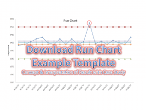
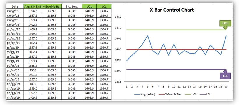
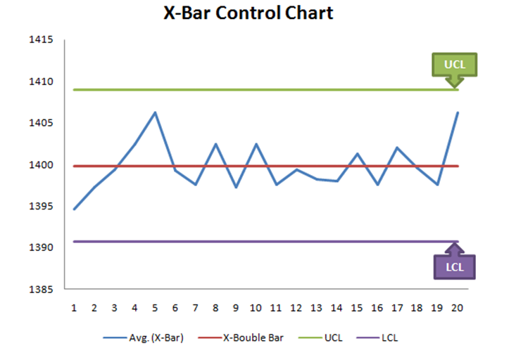
4. What is a Control Chart?

A control chart is a graphical tool used to study how a process changes over time.

5. What are UCL and LCL?

UCL (Upper Control Limit) & LCL (Lower Control Limit), which define the acceptable range of variation.

Intermediate SPC Interview Questions

6. Difference between Control Limits and Specification Limits?

Control limits: based on process data, used for monitoring, and dynamic. Specification limits: based on customer requirements, used for acceptance, and fixed.

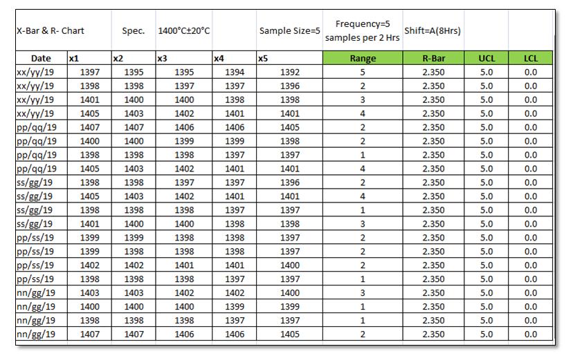
7. What are the types of control charts?

For Variable Data: 1] X-bar R chart, 2] X-bar S chart 3] X MR chart.

For Attribute Data: 1] NP chart, 2] P chart, 3] U chart & 4] C chart.

8. What is Process Capability?

Process capability measures how well a process meets specification limits.

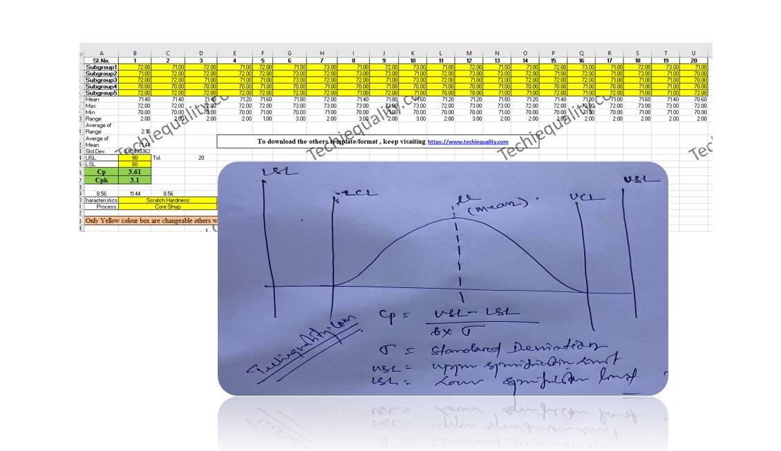
9. What is Cp and Cpk?

Cp is Process capability (potential), and Cpk is Actual performance (centeredness included).

Advanced SPC Interview Questions

10. What is the difference between Cp and Cpk?

Cp measures the potential capability assuming the process is centered, while Cpk measures the actual capability by considering both variation and process mean shift. If Cp and Cpk are equal, the process is centered.

Cp (Process Capability)

Cp = (USL-LSL)/6x standard deviation

Assumes the process is perfectly centered between the limits. Looks only at spread (variation). Does not consider the process mean (μ).

Think of Cp as: “How capable could this process be if perfectly centered?”

Cpk (Process Capability Index)

Cpk = min {(USL-mean)/3xstandard deviation, (Mean-LSL)/3x standard deviation}.

Considers both variation and centering. Measures how close the process is to spec limits. Takes the worst-case side (minimum distance to limits).

Think of Cpk as: “How capable is the process right now?”

11. What is a stable process?

A process is stable when only common cause variation exists.

12. What is an out-of-control condition?

When data points violate control rules (e.g., beyond limits, patterns, trends)

13. What are the Rules of the control chart?

Control chart rules help identify non-random patterns. These include points beyond limits, trends, shifts, and unusual clustering, which indicate special causes affecting the process.

One point beyond 3σ (control limits): Any single point outside UCL or LCL, a strong signal of an out-of-control process.

Two out of three consecutive points beyond 2σ (same side): Out of 3 points, at least 2 fall beyond on the same side of the center line. Indicates a possible shift

Four out of five consecutive points beyond 1σ (same side): 4 of 5 points lie beyond on the same side. Suggests process drift.

Eight consecutive points on one side of the center line: All points above or below the mean. Indicates a process shift in the mean.

Six consecutive points increasing or decreasing: Continuous upward or downward trend. Shows a trend (systematic change)

Fourteen points alternating up and down: Zig-zag pattern. Indicates over-adjustment or instability.

Fifteen consecutive points within ±1σ (both sides): Too many points near the center. Suggests reduced variation or possible data manipulation/measurement issue.

14. What is process shift?

A sudden change in the process mean due to a special cause.

Scenario-Based SPC Interview Questions

15. Points are within limits but showing a trend. What will you do?

  • Identify pattern: possible special cause
  • Investigate the root cause
  • Check the machine, material, and operator
  • Take corrective action

16. Cp is good but Cpk is low

Interpretation: Process has potential but is off-centre

Action: Adjust mean toward target

17. The control chart shows a sudden spike

Steps:

  • Stop production (if critical)
  • Identify the assignable cause
  • Check tool wear/machine issue
  • Correct and resume

Practical SPC Interview Questions

18. How do you implement SPC in a production line?

  1. Identify critical parameters
  2. Collect data
  3. Choose a control chart
  4. Set control limits
  5. Monitor continuously
  6. Take action on deviations

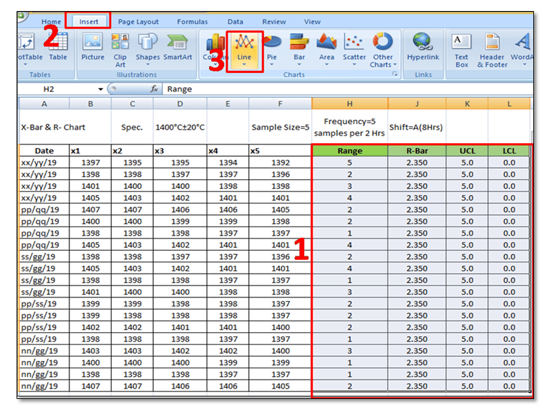
19. What software/tools have you used?

  • Excel
  • SPC software tools

20. How do you select the sample size?

Depends on: Production volume, Process variability, Criticality.

21. How do you react to out-of-control signals?

  • Immediate containment
  • Root cause analysis (5 Why, RCA)
  • Corrective action
  • Verification

Experience-Based SPC Interview Questions

22. Explain a situation where SPC helped improve quality

Example Answer: In my previous role, we observed high variation in shaft diameter. Using X-bar and R charts, we identified tool wear as a special cause. After implementing tool change intervals, variation reduced by 30%. Like that you can explain your job area example.

23. Have you handled process instability?

Answer Approach:

  • Describe issue
  • Explain analysis
  • Share corrective action
  • Highlight results

Concept Explanation with Example

Control Chart

A control chart tracks process variation over time. Example: You are measuring bolt length: Mean = 50 mm, UCL = 52 mm, LCL = 48 mm

If readings stay within limits, then the process is stable; if a point hits 53 mm, then it is out of control

Cp vs Cpk:

Example: Spec limits: 45–55, Process range: 46–54 then, Cp is good, for example, mean shifted to 53 then, Cpk becomes low

24. What is variable data?

Variable data is measurable and continuous. Examples: Length (mm), Weight (kg), Temperature (°C)

25. When do you use an X-bar and R chart?

When the sample size is small (typically 2 to 10), & To monitor process mean and variation

26. When do you use an X-bar and S chart?

When sample size is larger (>10), S chart tracks standard deviation.

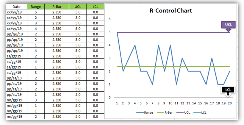
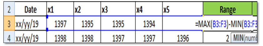
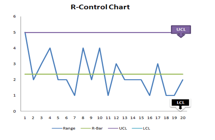
27. What does the R chart indicate?

It shows within-sample variation (range). If R chart is unstable then, X-bar chart results are unreliable.

28. Why is R chart analysed before X-bar chart?

Because variation must be in control before analysing the mean.

29. R chart is out of control, but X-bar chart looks fine. What will you do?

Do NOT trust X-bar chart, Investigate variation causes (tool wear, operator inconsistency) & Fix variation first.

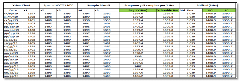
30. What is subgrouping in SPC?

Grouping samples collected under similar conditions to detect variation properly. Example: 5 parts every hour from the same machine.

31. What is rational subgrouping?

Samples should represent only common cause variation, not mixed sources.

32. What is attribute data?

Discrete/countable data. Examples: Number of defects, Pass/fail results.

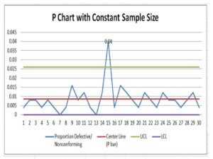
33. What is a P chart?

Used to monitor proportion of defective items. Use when sample size varies.

34. What is an NP chart?

Used to monitor number of defectives. Use when sample size is constant.

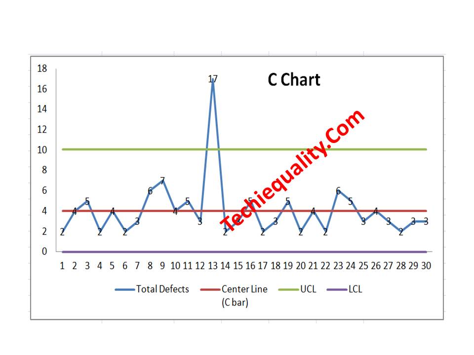
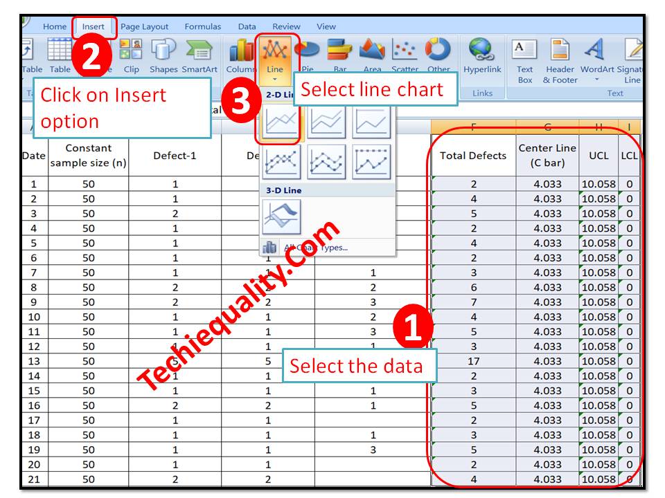
35. What is a C chart?

Used to count number of defects per unit (fixed area/sample size)

36. What is a U chart?

Used for defects per unit when sample size varies

37. Difference between defect and defective?

Defect: flaw in a product, Defective: entire product is rejected.

Example: A shirt with 2 holes = 2 defects but 1 defective unit.

38. Sample size varies daily, and you track rejection %. Which chart?

Answer: P chart

39. You track number of scratches per car. Which chart?

Answer: C chart

40. What are the limitations of attribute charts?

Less sensitive than variable charts, requires larger sample size, Does not show magnitude of variation.

41. What is process capability?

It measures how well a process meets specification limits.

42. What is Pp and Ppk?

Pp and Ppk are process performance indices based on overall variation. Pp measures potential performance assuming centering, while Ppk measures actual performance by considering both variation and the process mean.

43. What is the acceptable value of Cp and Cpk?

  • Cp ≥ 1.33:  acceptable
  • Cp ≥ 1.67: good
  • Cp ≥ 2.0: excellent

44. Cp = 1.5, Cpk = 0.8. What does it mean?

Process has good potential; Process is not centered. Action: Adjust mean

45. Cp = Cpk

Process is perfectly centered

46. Cpk is negative

Process mean is outside specification limits

47. What conditions are required before calculating Cp/Cpk?

Process must be stable. Data should be normally distributed.

48. What happens if process is not stable?

Capability indices are meaningless

49. How do you improve Cpk?

Center the process, reduce variation, Improve machine/process control.

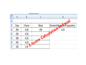
50. What is Z-score in process capability?

Represents how many standard deviations the process is from the mean.

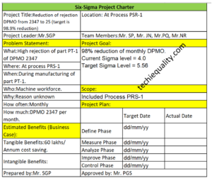
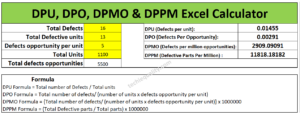
51. What is Six Sigma level?

6 sigma: 3.4 defects per million opportunities (DPMO)

52. Both Cp and Cpk are low

Process is poor. Action:Improve process design, reduce variability, Recalibrate machines.

53. How do you check normality before capability analysis?

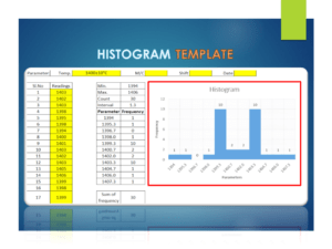
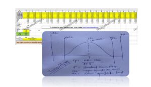
Histogram, Normal probability plot, Statistical tests.

AI In SPC Interview Questions

54. What is AI in SPC?


AI in SPC refers to the use of machine learning and data analytics to enhance traditional statistical process control. It helps in predicting defects, detecting complex patterns, and reducing false alarms, which are difficult to achieve with conventional control charts.

55. How does AI improve traditional SPC?


Traditional SPC is rule-based and reactive, while AI is predictive and adaptive. AI can:

  • Detect nonlinear patterns
  • Handle large and multivariate data
  • Predict issues before they occur
  • Reduce false alarms

56. How does AI detect anomalies better than SPC rules?
SPC rules detect only predefined patterns (like trends or shifts), but AI:

  • Learns from historical data
  • Detects hidden and complex relationships
  • Identifies anomalies even when they don’t follow standard SPC rules

57. What machine learning algorithms are used in SPC?
Common algorithms include:

  • Regression: Predict process output
  • Classification: Defect / No defect
  • Clustering: Identify abnormal patterns
  • Neural Networks: Complex nonlinear relationships

58. A process is stable as per control charts, but defects are increasing. How can AI help?
Expected: AI can detect hidden patterns, nonlinear relationships, or external factors not visible in SPC.

Thanks for Reading… Keep visiting TECHIEQUALITY.

C Chart Excel Template | Formula | Example | Calculation

C Chart Excel Template

C Chart Excel Template| Formula |Example |Calculation:

Hi Readers! Today, we will be discussing here on attribute type SPC chart i.e. C chart. Its formula, calculation, and industrial example. The C chart is also called the number of nonconformities chart. Where the sample size is constant. Read the below description to learn about its selection and application in industries. If you are interested in downloading the sample C Chart Excel Template then, click on the given below link.

Sample C Chart Excel Template with industrial example-Download.

Number of nonconformities chart (C Chart):

The C chart, attribute type SPC control chart, or the number of nonconformities chart is generally used to identify the common or special causes present in the process and is also used for monitoring and detecting process variation over time. It helps to determine whether the process is in a state of statistical stable or not. Overall, it indicates that special causes are present in the process or not, whether the process is under control or not, and process variability. This C chart is selected when there is a constant sample size and multiple defects per unit are present.

Selection of Attribute type SPC Control chart (C Chart):

Step-1: Data Types?

Condition: – Discrete type data (Attribute type data)

Step-2: Is the interest in nonconformities or multiple defects per unit?

Condition: – yes, multiple defects per unit

Step-3.:- Is the sample size constant?

Condition: – Yes, then use the C chart.

DescriptionCondition
Data Type:Discrete type data (Attribute type data)
Is the interest in nonconformities or multiple defects per unit?Yes, Multiple defects per unit present
Is the sample size constant?Yes
Chart type:C Chart

C Chart Formula:

The three important things need to be calculated before plotting the C chart i.e. [1] Centerline, [2] Upper control limit, & [3] lower control limit.

Centerline (CL) or C bar = Total number of nonconformities or defects / Number of samples

Upper control limit (UCL) = C-bar + 3 x Square root of C-bar

Lower control limit (LCL) = C-bar – 3 x Square root of C-bar

 The formula of C chart
CL or C- bar =Total number of nonconformities or defects / Number of samples
UCL =C-bar + 3 x Square root of C-bar
LCL =C-bar – 3 x Square root of C-bar

How to plot a c chart in excel?

Here, I’m going to share my own industrial experience regarding the application and usage of a c chart in the manufacturing industry by providing a sample example for your quick learning and implementation in your organization. I have considered 50 sample sizes, and three different defects and collected the data for 30 days. Details of data are given below table.   

DateConstant sample size (n)Defect-1Defect-2Defect-3Total Defects
15011 2
2501124
3502215
45011 2
5501124
65011 2
7501113
8502226
9502237
10501124
11501135
12501113
135055717
145011 2
15501113
16502215
175011 2
18501113
19501135
205011 2
215022 4
225011 2
23502226
24501135
25501113
265022 4
27501113
285011 2
29501113
30501113

All the above three defects are attribute type defects. Before plotting the c chart in excel we have to calculate the three important things first, one is CL, UCL & LCL.

Calculation:

Centerline (CL) or C-bar:

Formula = Total number of nonconformities or defects / Number of samples

CL = 121 / 30 =4.033

UCL (Upper control limit):

Formula = C-bar + 3 x Square root of C-bar

UCL = 4.033 + 3* Square root of 4.033

UCL = 4.033+3*2.008

UCL = 10.0577

UCL = 10.058

LCL (Lower control limit):

LCL = C-bar – 3 x Square root of C-bar

LCL = 4.033 – 3* Square root of 4.033

LCL = 4.033-3*2.008

LCL = 4.033-6.024

LCL = -1.991 (the value is negative so LCL is Zero)

LCL = 0.00

 Calculation value
CL =4.033
UCL =10.058
LCL =0
Follow the below step to plot the c chart in excel:

Step-1: open the excel sheet.

Step-2: Do the data entry on the Excel sheet.

Step-3: Select the data and then go to the insert option in the main menu and next to select line chart. The detail is mentioned in the below image.

C Chart Excel Template
C Chart:

With the help of the above data, we have plotted the c chart, which is given below. if you would like to download the C Chart Excel Template then, click here.

C Chart Excel Template
Interpretation of the above C Chart:

In the above C chart, we have seen that one defect value is beyond the upper control limit. It means on day-13 special cause was present in the process, so we have to take the action on it to control the process.

Free Templates / Formats of QM: we have published some free templates or formats related to Quality Management with manufacturing / industrial practical examples for better understanding and learning. if you have not yet read these free template articles/posts then, you could visit our “Template/Format” section. Thanks for reading…keep visiting techiequality.com

Useful Post:

What is Preventive Maintenance? | Predictive Maintenance |Types & Example

Plan Do Check Act Cycle | PDCA Cycle Manufacturing Example | Implementation

Attribute MSA |How to do Attribute type MSA Study| Example |Acceptance Criteria

Gage R and R |Attribute type MSA |How to do MSA Study | Acceptance Criteria

More on TECHIEQUALITY

Process Performance (Pp) & Ppk Excel Template |DOWNLOAD

Process Performance Excel Template

Process Performance Excel Template (Pp & Ppk Format) | DOWNLOAD

Process Performance Excel Template: According to the SPC (Statistical Process Control Manual), the process Performance (Pp) compares the process performance of the process to the maximum allowable variation as indicated by the tolerance. The Pp (Process Performance) provides a measure of how well the process will satisfy the variability requirements. And the Index of process performance is termed as Ppk. It takes the process location as well as the performance into account. Download the Excel Template /Format of Pp & Ppk from the below link.

DOWNLOAD Excel Template/Format of Pp & Ppk calculation with Example.

Process Performance Excel Template

How to use the Pp & Ppk Excel Format in your process to calculate the index value?

1: Download the Template/ Format from the above links.

2: Read the note mentioned in the Excel template.

3: Only the yellow colour box (mentioned in format) is changeable and other values will calculate automatically.

 The formula of Pp (Process Performance):

Pp = ((USL-LSL)/ (6 X S))

[Where USL=Upper specification limit, LSL=Lower specification limit and S= Standard Deviation]

The formula of Ppk (Process Performance Index):

Ppk = Minimum of PPU or PPL

PPU= ((USL-Average of average)/ (3 X S))

PPL= ((Average of average-LSL)/ (3 X S))

Note: Pp ≥ Ppk.

Example:

Company XYZ pvt ltd is interested to know the process performance of moulding process that, how well the process is performing and satisfies the variability requirements of mould hardness. The process engineer has collected the total 100 numbers of readings considering with subgroup size 5. Readings are given below;

Sl.No. 1 2 3 4 5 6 7 8 9 10
Subgroup1 63.00 61.00 65.00 62.00 65.00 63.00 65.00 64.00 63.00 65.00
Subgroup2 63.00 62.00 64.00 62.00 66.00 64.00 65.00 62.00 64.00 62.00
Subgroup3 62.00 63.00 65.00 65.00 65.00 62.00 62.00 65.00 62.00 62.00
Subgroup4 63.00 66.00 64.00 64.00 65.00 63.00 62.00 63.00 65.00 64.00
Subgroup5 64.00 65.00 63.00 63.00 65.00 62.00 62.00 62.00 62.00 62.00
11 12 13 14 15 16 17 18 19 20
61.00 63.00 62.00 63.00 62.00 66.00 62.00 62.00 63.00 65.00
64.00 63.00 63.00 63.00 62.00 65.00 67.00 62.00 64.00 64.00
62.00 68.00 65.00 66.00 64.00 64.00 64.00 64.00 62.00 65.00
63.00 68.00 64.00 68.00 64.00 66.00 67.00 64.00 63.00 64.00
62.00 64.00 63.00 64.00 62.00 65.00 62.00 65.00 62.00 63.00
Characteristics Mould Hardness
Process: Moulding Process
USL 70
LSL 60
Pp 1.06
Ppk 0.8

In the above example, the value of Ppk (0.8) is indicating that the process needs further improvement. The start-up process requires at least 1.33 and next to 1.67 and 2 onward.

Useful Articles:

Quality at the source | Steps to Implement It

Jidoka Autonomation, Bakayoke & Yo-I-don |Concept in TPS

Pull Production System | Concept

Download QA & QC useful template/ format in free

More on TECHIEQUALITY

Thank you for reading… Keep visiting Techiequality.Com

Popular Post

Process Capability Analysis | Cp & Cpk Calculation Excel Sheet with Example

Process Capability Analysis

Process Capability Analysis | Cp & Cpk Calculation Excel Sheet with Example

Process Capability Analysis: – The Process Capability (Cp) and Process Capability Index (Cpk) are the important tools, which give an Idea about the Process Capability of a Stable Process. Here we will discuss on Calculation of Cp and Cpk with Examples. We are offering here Process Capability Excel Template / Format for you, hence click on the below links to Download the Excel Format.

DOWNLOAD (Cp & Cpk Excel Template / Format-Sample copy)

Process Capability (Cp):

  • Process Capability (Cp) is a statistical measurement of a process’s ability to produce parts within specified limits on a consistent basis
  • It gives us an idea about the width of the Bell curve.
  • The Process Capability for a stable process is typically defined as ((USL-LSL)/ (6 x Standard Deviation)).
Cpk-Process Capability Index :
  • It shows how closely a process is able to produce the output to its overall specifications.
  • More Value of Cpk means more process capable.
  • The Process Capability Index for a stable process is typically defined as the minimum of CPU or CPL.
Process Capability Analysis:

Industrial Example:

As per the Quality Assurance Plan, The shift engineers of Core Shop have started collecting the readings of the scratch hardness of Core. Given below are the details of Product Characteristics;

Specification of Scratch hardness is 70±10.

The Upper Specification Limit is 80.

The Lower Specification Limit is 60.

Tolerance is 20.

Scratch hardness readings Table:
Table-1
Sl.No. 1 2 3 4 5 6 7 8 9 10
SG 1 72.00 71.00 72.00 71.00 72.00 71.00 73.00 71.00 72.00 73.00
SG2 71.00 72.00 72.00 72.00 72.00 72.00 72.00 73.00 73.00 71.00
SG 3 72.00 72.00 71.00 71.00 71.00 73.00 72.00 72.00 71.00 73.00
SG4 70.00 70.00 70.00 70.00 71.00 70.00 71.00 70.00 71.00 70.00
SG 5 72.00 72.00 72.00 72.00 72.00 72.00 72.00 71.00 72.00 71.00
Table-1 [Scratch hardness readings Table]
Table-2
Sl.No. 11 12 13 14 15 16 17 18 19 20
SG1 71.00 72.00 71.00 71.00 72.00 73.00 71.00 72.00 73.00 71.00
SG2 72.00 73.00 73.00 72.00 71.00 72.00 71.00 73.00 71.00 70.00
SG3 72.00 71.00 73.00 72.00 72.00 72.00 71.00 71.00 71.00 70.00
SG4 71.00 70.00 71.00 70.00 70.00 71.00 70.00 71.00 71.00 70.00
SG5 70.00 70.00 71.00 71.00 72.00 71.00 72.00 71.00 71.00 72.00
Table-2 [Scratch hardness readings Table]

In the above two tables (Table-1 &2), we have taken the 100 readings i.e. (20 times X 5 readings at a time).

Range=Maximum Value-Minimum Value

Average of Range=2.15

Value of d2=2.326 (For Subgroup size 5)

USL = 80, LSL = 60.

Standard Deviation:

 = Average of Range/d2

 2.15/2.326

=0.92

Process Capability (Cp):

 = ((USL-LSL)/ (6 x Standard Deviation))

(80-60)/ (6 x 0.92)

20/5.52

= 3.61

Process Capability Index (Cpk):

CPU:

= ((USL-Average of Mean)/3 x Standard Deviation)

(80-71.43)/ (3 x 0.92)

8.57/ 2.76

= 3.10

CPL:

= ((Average of Mean-LSL)/3 x Standard Deviation)

(71.43-60)/ 2.76

10.4211.43/2.76

=4.14

Cpk= 3.10 (minimum of CPU or CPL).

After doing the Process Capability Analysis on Scratch hardness readings, we got the below result value:

Characteristics: Scratch Hardness
Cp (Process Capability) = 3.61
Cpk (Process Capability Index) = 3.10
[ Cp & CpK ]
Process Capability Analysis with Manufacturing Example

The process engineer has collected the 100 nos laddle temperature reading and the same is mentioned in the below table.

Laddle Temperature Specification= 600 ± 15°C

USL = 615

LSL = 585

Table-1
 12345678910
S1605599610605603604600609605601
S2603601612599601598603610603598
S3604598609610612609605612604603
S4600603605598599610598609600610
S5602602607609605612599605609603
Max.605603612610612612605612609610
Min.600598605598599598598605600598
Range55712131477912
Average of Range9.85         
Mean602.8600.6608.6604.2604606.6601609604.2603
Average of Mean603.92         
Table-2
 11121314151617181920
S1599601602604598598609598600598
S2610598602603603603605603603610
S3598603607598610607612607605598
S4609610609603603598604598607602
S5600603605607598610603610598603
Max.610610609607610610612610607610
Min.598598602598598598603598598598
Range1212791212912912
Mean603.2603605603602.4603.2606.6603.2602.6602.2

d2=2.326

Standard Deviation = Average of Range / d2 = 4.23

Cp = (USL-LSL)/6*Standard Deviation = 1.2

CPU = ((USL-Average of Mean)/3 x Standard Deviation) = 0.872

CPL = ((Average of Mean-LSL)/3 x Standard Deviation) = 1.489

CpK = 0.872(minimum of CPU or CPL).

Note: Download the Cp & Cpk excel template or format and deploy it in manufacturing process. downloading links are provided at top of this Article.
FAQ:
What is the difference between Cp & Cpk?

Ans.: Cp & CpK are termed as process capability and process capability index. In both cases, we would like to verify whether the process can meet the customer’s requirements or not. Generally, it is used when the process is under stable & statically control.

What is the formula of Cp & Cpk?

Cp= ((USL-LSL)/ (6 x Standard Deviation)) , where USL=Upper Specification Limit & LSL=Lower Specification Limit.

Cpk= Minimum of CPU or CPL, where CPU= ((USL-Average of Mean)/3 x Standard Deviation) & CPL= ((Average of Mean-LSL)/3 x Standard Deviation)

What are the good values of Cpk?

Generally, the customers provide the Cpk value to their supplier to maintain it in their manufacturing process. but for your knowledge, a Cpk value of 2 or greater than 2 is an excellent one.

What is cpk?

The cpk is the process capability index which shows how closely a process is able to produce the output to its overall specifications.

What is the IATF 16949 requirement of Statistical Concepts or SPC?

Application of statistical concepts in the IATF 16949 standard has been mentioned in Clause no-9.1.1.3, both Control chart (variable and Attribute) and process capability are the mandatory requirements. The application of statistical concepts shall be understood and used by the employees involved. We have published a separate article on Control Charts for our readers and you can Download Control Chart Excel Template / Format.

More on TECHIEQUALITY

Control Chart Excel Template | How to Plot Control Chart in Excel | Download Template

Control Chart Excel

Control Chart Excel Template |How to Plot Control Chart in Excel | Download Template:

Hi! Reader, today we will guide you on how to plot a control chart in Excel with an example. To take more concentration on Process Improvement, the control chart always takes vital rules to identify the Special causes and common causes in Process Variation. Control Chart Excel Template is available here; just download it by clicking on the below link.

Download the Control Chart Excel Template.

Control Chart Excel Template

[Figure 1-X- Bar Control Chart Excel Template]

control chart excel

[Figure 2-R-Control Chart Excel Template]

A Control Chart is a graphic representation of a characteristic of a process, showing plotted values of some statistic gathered from that characteristic, a centerline, and one or two control limits. It has two basic uses as an adjustment to determine if a process has been operating in statistical control and to aid in maintaining statistical control.

Control Chart Approach for Continual Process Improvement:

  • Data Collection.
  • Control.
  • Analysis and Improvement.
data
  • Data Collection:-
  1. To Collect Data and Plot the Control Chart.
  • Control:-
  1. Calculate control limits from process data.
  2. Identify Special Causes of Variation and Act upon them.
  • Analysis & Improvement:-
  1. Quantify Common Cause Variation, and take action to reduce it.
You will also like to read the CAPA Process

7QC Tools for Problem Solving | What are 7 QC Tools

How to Plot Pareto Chart in Excel ( with example)

How to Create Control Chart Excel Template| Step-by-Step Guides (X-Bar & Range Chart) with Example:

Step-1: Collect The Data day-wise/shift-wise.

control chart excel

As you can see in the above figure, we have collected data with a sample size of 5 for A-Shift with frequency (5 samples per 2 hours). So we have only one shift data for 5 days. Total 100 number observations.  You are supposed to collect the data as per the Control Plan or Quality Assurance Plan.

Step-2: Select the Data types and applicable Control Chart.

So we have variable type data and the sample size is 5. Hence the applicable Chart is the Average and Range Chart (X-Bar & Range).

Step-3: According to data type and Sample size, presently we are going to plot the X-Bar & R-Chart. So individually we will plot both charts (X-Bar Chart & Range Chart). First, we will plot the X-bar chart and then the R-chart.

3.1 X-Bar Chart:
Control Chart Excel

 Before we start, just go through the green highlighted terms in the above figure as [1] Average

[2] X-Double Bar means an average of average. [3] Standard Deviation. [4] UCL. [5] LCL.

Calculation:

[1] Average:
Control Chart Excel

Make sure that your attention is now on the right side corner of the above figure. To calculate the average value of individual subgroup size. You have to type as (=average)and then double click on the average function and next select the sample value from x1 to x5.

[2] X-Double Bar: After calculating the Average value of all Subgroups (Individual Date wise), now we have to calculate the average of Average (Average of X-Bar).  

[3] Standard Deviation: Standard Deviation of Average (X-Bar),

steps

Type as (=Stdev) and select all X-Bar Data to Calculate the Std. Dev. of Average.

[4] UCL: 

UCL=X Double Bar +3*Sigma

UCL= X Double Bar +3*Standard Deviation

For the calculation of the UCL in Excel use the above formula.

[5]LCL:

LCL=X Double Bar -3*Sigma

LCL= X Double Bar -3*Standard Deviation

Use the above Formula in Excel.

3.11 Plot X-Bar Chart: This is the last step to plot the X-Bar Chart by using Line Graph in Excel, follow the below steps:

steps
steps

Simply Follow Sl. No.1 to 4.

In Sl. No.1, Select X-Bar, X-Double Bar, UCL, LCL, and then select Insert Option and next to Line Chart. After selecting the Line Graph/Chart, The X-Bar Control Chart Excel Template will be ready as below.

control chart excel
3.2 Range Chart:
control chart excel

To Plot the R-Control Chart, we have to calculate the [1] Range. [2] R-Bar (Average of Range). [3]UCL. [4]LCL.

[1] Range: R=Max. Value – Min. Value of Subgroup.

control chart excel

[2] R- Bar (Average of Range): Put the Excel formula of average.

[3] UCL:

UCL= D4 x R-Bar

UCL= 2.114 x R-Bar Value of individual Subgroup. (Note for Subgroup Size 5, D4=2.114).

Use this formula in Excel to calculate the UCL.

[4] LCL:

LCL=D3 x R-Bar

LCL=0 (Note Foe subgroup size 5, D3=0)

Simply put the “0” in the Excel sheet.

3.22 Plot R-Chart: Just follow steps 1 to 3, and select the line chart.
control chart excel

In step-1, you have to select the “Range, R-Bar, UCL, and LCL” simultaneously and then select the Line Chart, after selecting the line chart R-Control Chart Excel Template will be ready as below 

Control chart excel
R-Control Chart
FAQ:

Q1: What are control chart rules?

A1: Read the full article What is SPC”.

Q2: How to add upper and lower control limits in Excel?

A2: Carefully read the aforesaid Articles.

Q3: How to create a control chart in Excel 2013?

A3: Step by Step guide is described above with Statistical process control chart examples. Please go through it.

Q4: How to create a Six Sigma control chart in Excel?

A4: Control charts are classified into two types [1] Variable type and [2] Attribute Type. Both two types are further classified into several as

[1]Variable types
  1. X and MR Chart
  2. X-Bar and Range
  3. X-Bar and S
[2] Attribute Chart
  1. np-chart
  2. p-chart
  3. u-chart
  4. c-chart

In the above articles, we have described only how to create an X-bar and range type Control Chart in Excel with a process control chart example. As you can see all these above types of control charts are used in Six Sigma projects but the applicable chart depends on Data type and Subgroup size (Sample size).

Q5: How to calculate upper and lower control limits (UCL & LCL) in Excel?

A5: For X-Bar Chart-UCL: 

UCL=X Double Bar +3*Sigma

UCL= X Double Bar +3*Standard Deviation

For the calculation of the UCL in Excel, use the above formula.

LCL:

LCL=X Double Bar -3*Sigma

LCL= X Double Bar -3*Standard Deviation

Use the above Formula in Excel.

For R-Chart:

UCL:

UCL= D4 x R-Bar

UCL= 2.114 x R-Bar Value of individual Subgroup. (Note for Subgroup Size 5, D4=2.114).

Use this formula in Excel to calculate the UCL.

LCL:

LCL=D3 x R-Bar

LCL=0 (Note Foe subgroup size 5, D3=0)

Simply put the “0” in the Excel sheet.

Q6: What are the types of control charts?

A6: [1] Variable types
  • X and MR Chart
  • X-Bar and Range
  • X-Bar and S
[2] Attribute Chart
Useful Articles:

Scatter Diagram Template.

Pareto Chart Template.

Fishbone Diagram Template.

Histogram Template.

Run Chart Excel Template.

More on TECHIEQUALITY

Thank you for reading…….keep visiting Techiequality.Com

I hope the above article is useful to you…

Popular Post: