Correlation Analysis in Minitab |Step by step guide with example
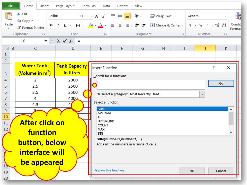
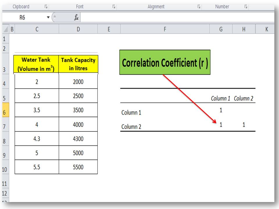
Hi reader! Today we will discuss on Correlation Analysis in Minitab, this tool is generally used to know the correlation between two variables. Alternatively, you can do the test of two variables in Excel also. If you are interested in executing the correlation analysis in Excel then read our below article (link is given below). But here in this tutorial, we will explain to you how to do a correlation test in Minitab with an example.
Correlation Analysis in Minitab (Step-by-Step guides):
Here we are going to analyze the correlation between variables “water tank (volume) vs Tank capacity” to know the interpretation of correlation and value of the coefficient of correlation. The Data table is given below;
Water Tank (Volume in m3)
Tank Capacity in litres
6
6000
6.2
6200
6.5
6500
6.8
6800
7.2
7200
7.6
7600
8
8000
Step-1:
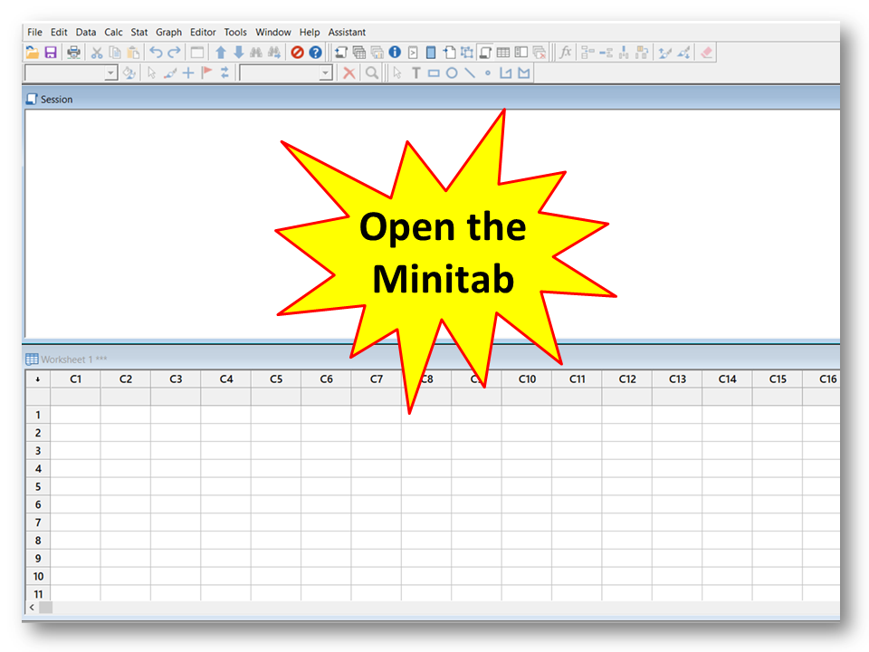
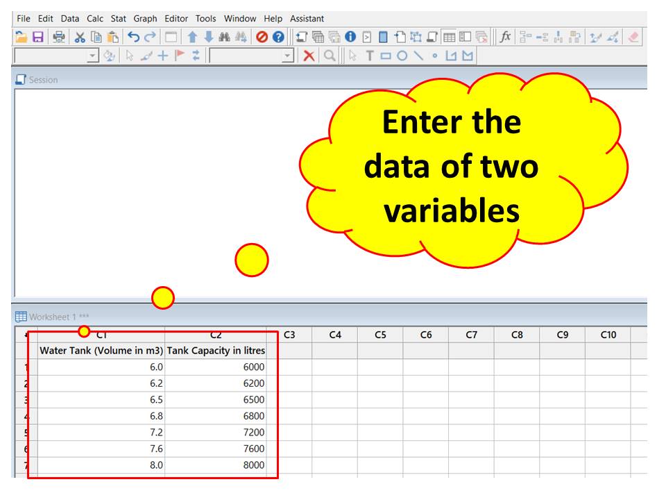
Open the Minitab software. You will see an interface like the below figure.
Step-2:
Type the data of two variables in Minitab’s worksheet.
Step-3:
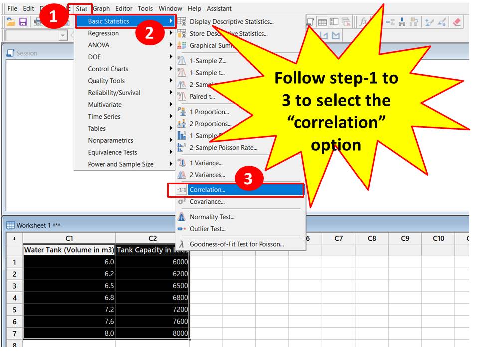
Just follow the below path to select the Correlation option. Path: Stat » Basic Statistics » Correlation
Step-4:
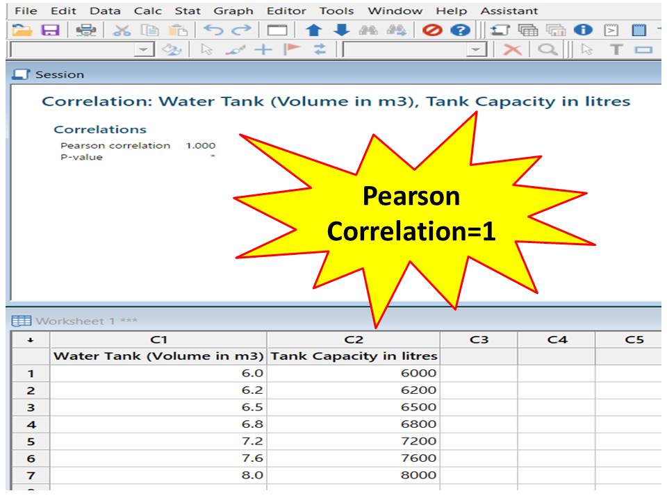
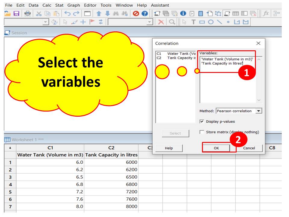
Select the variables, here we have selected Water tank volume and tank capacity then enter the “OK” button to execute the test.
Step-5:
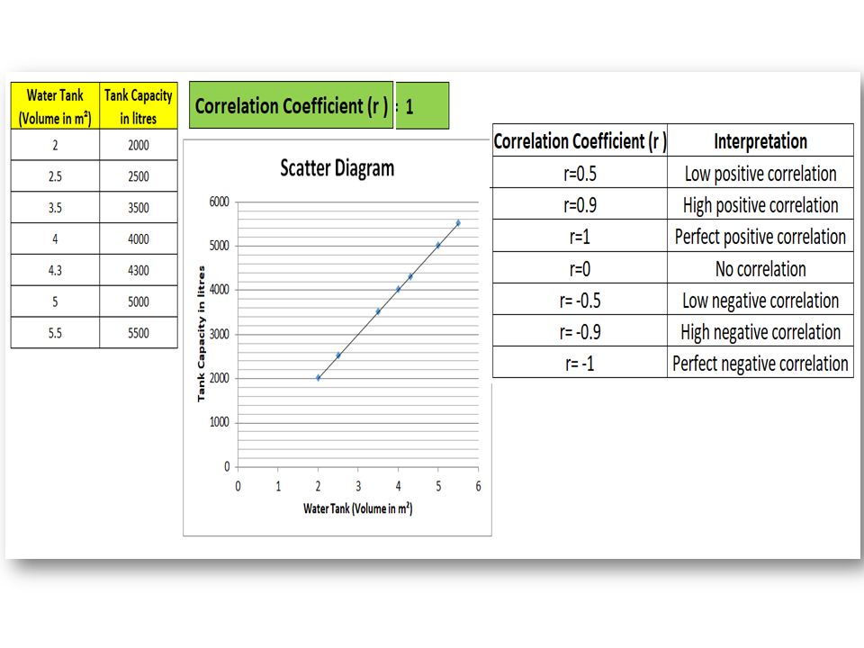
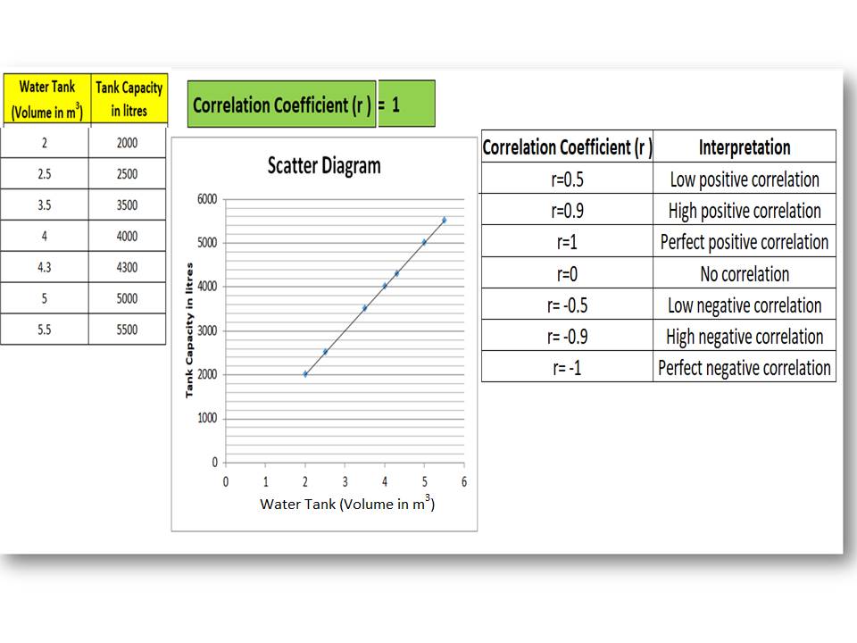
After the execution of correlation analysis, you will get the Pearson correlation value; here we got the value i.e. 1 of two variables “water tank volume vs tank capacity”.
Interpretation of Correlation coefficient (r):
Correlation Coefficient (r )
Interpretation
r=0.5
Low positive correlation
r=0.9
High positive correlation
r=1
Perfect positive correlation
r=0
No correlation
r= -0.5
Low negative correlation
r= -0.9
High negative correlation
r= -1
Perfect negative correlation
In the above example, we got the Pearson correlation value is 1, which means it indicates that there is a perfect positive correlation between two variables.
Free Templates / Formats of QM: we have published some free templates or formats related to Quality Management with manufacturing / industrial practical examples for better understanding and learning. if you have not yet read these free template articles/posts then, you could visit our “Template/Format” section. Thanks for reading…keep visiting techiequality.com
Shanti Gopal Pradhan is an experienced professional in Quality Management Systems, QA, Operations, Business Excellence, and Process Improvement. He has strong expertise in international standards including IATF 16949, ISO 9001, ISO 14001, ISO 45001, and ISO 17025, along with methodologies such as TQM, TPM, and Six Sigma.
He holds a degree in Mechanical Engineering along with an MBA, combining strong technical acumen with strategic business insight, he is a Certified Internal Auditor, Lead Auditor, and Six Sigma Black Belt, with a proven track record in driving quality transformation and operational excellence.
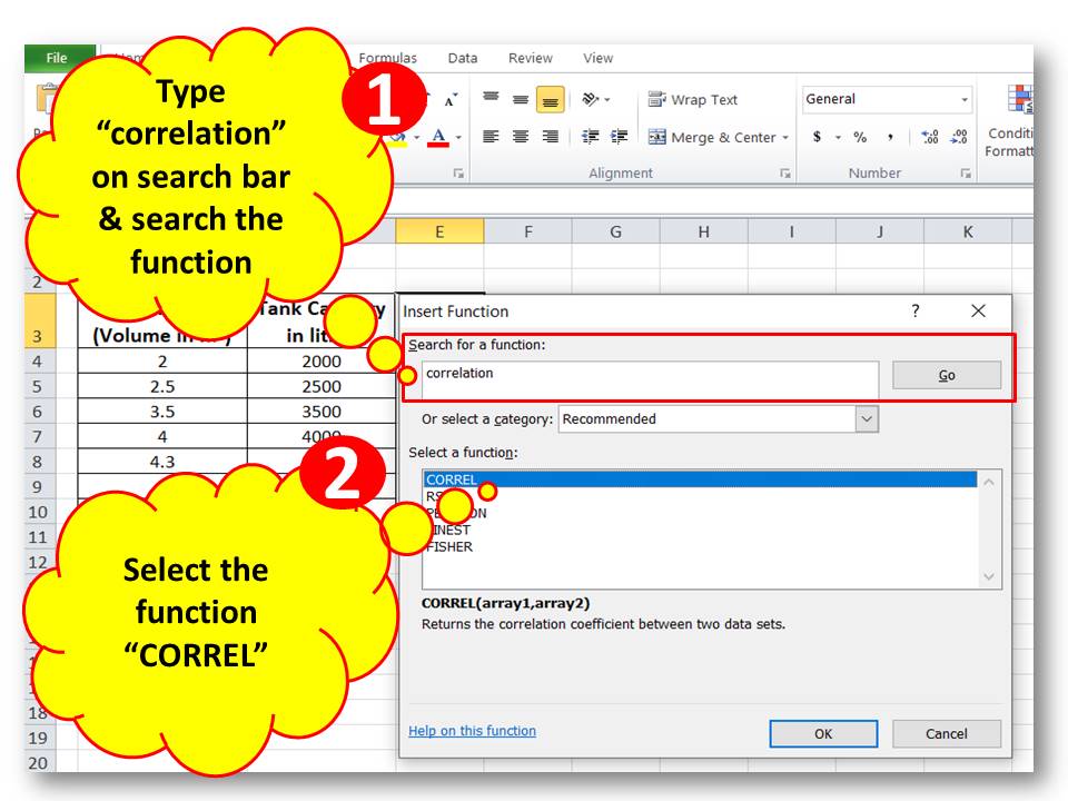
Correlation Analysis Example and Interpretation of Result
Hi readers! Today we will discuss on Correlation Analysis Example and Interpretation of the Result, let me tell you one thing correlation analysis is generally used to know the correlation between two variables. We have published two articles on how to do correlation analysis in Excel and Minitab (both links are given below). But here in this tutorial, we will explain to you the Interpretation of correlation results with industrial examples.
Correlation Analysis Example and Interpretation of Result:
We have explained here both positive and negative correlation analyses with industrial examples. Details are given below.
Example-1:
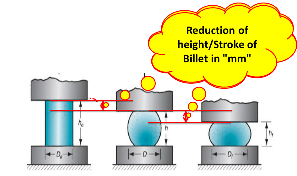
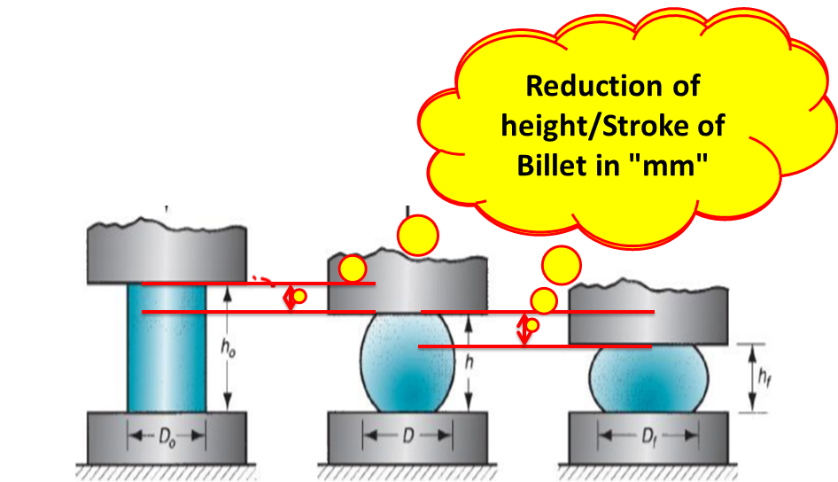
The Forging force has been applied in the billet at four different stages, as you can see in the above figure. At every stage, there is a reduction of height per stroke of the billet. The original height of the billet is 140.0mm. The details data for every stage is mentioned in the below table.
Forging Force in “N”
Reduction of height/Stroke of Billet in
“mm”
500
6.5
750
19.5
1000
30
1250
36
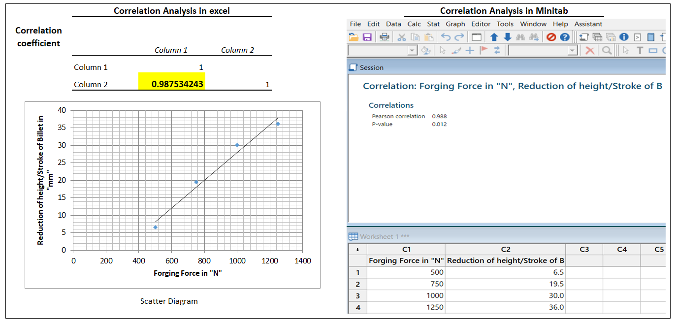
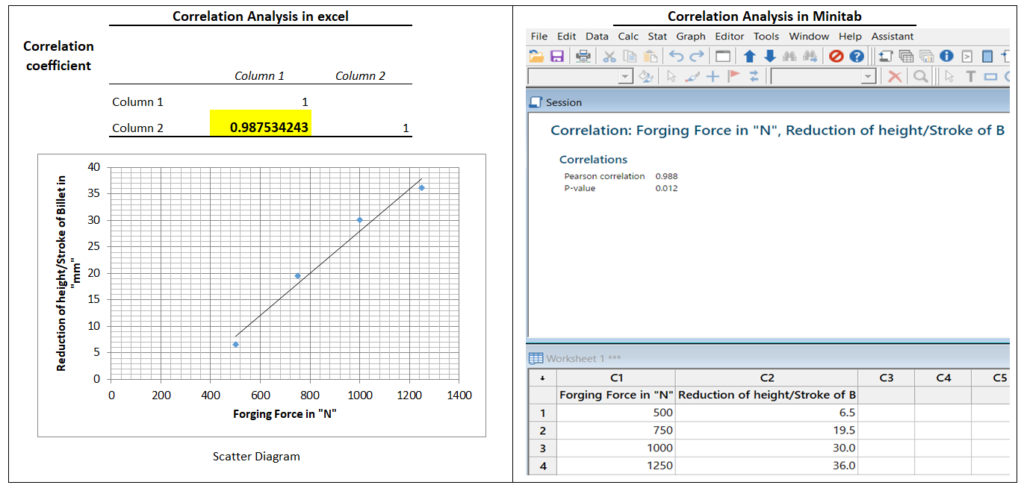
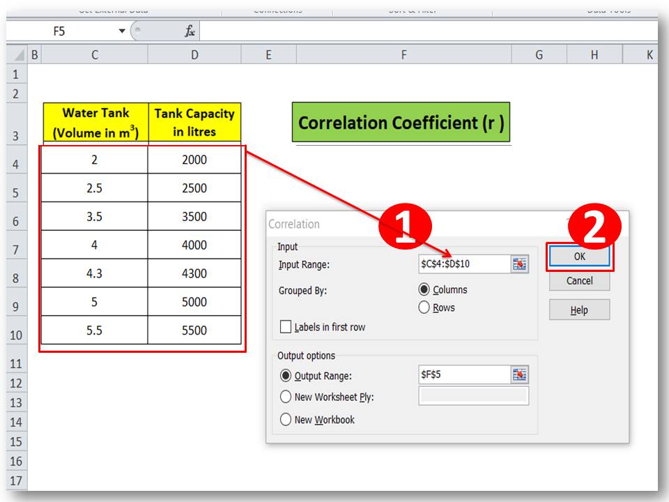
We are going to analyze the correlation test of the above two variables i.e. “forging force vs reduction of the height of billet” by two different methods [1] Analysis by Excel [2] analysis by Minitab.
Note that in both the methods, the correlation coefficient value is 0.98; it means the value lies between 0.91 to 1.0, which indicates us there is a perfect positive correlation between the two variables.
Example-2:
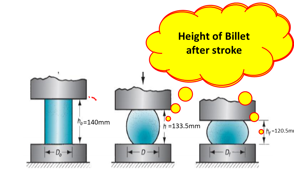
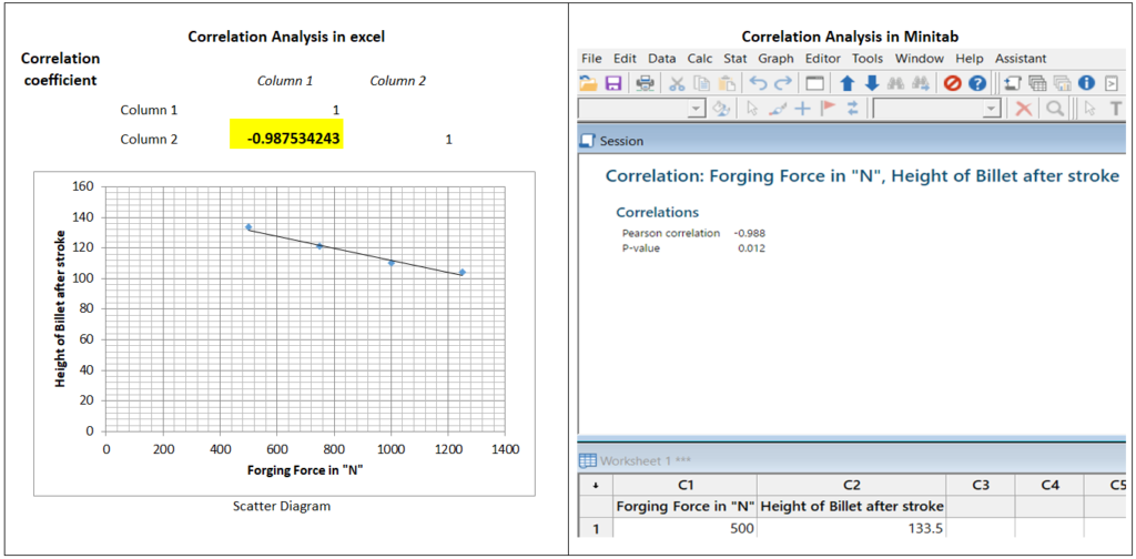
This example is part of Example-1, here we are going to analyze the correlation between the forging force applied and the height of the billet after each stroke in two different methods (both in Excel and Minitab). A Data table is given below;
Forging Force in “N”
Height of Billet after stroke
500
133.5
750
120.5
1000
110
1250
104
Note that in both methods, the correlation coefficient value is -0.98; it means the value lies from -0.91 to -1.0, which indicates us there is a perfect negative correlation between the two variables.
Example-3:
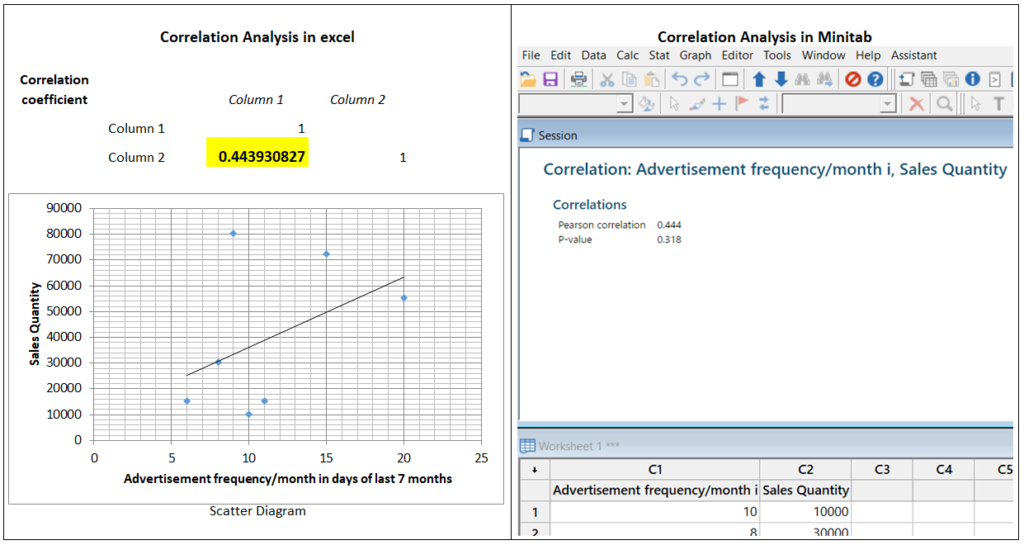
A company ABC Ltd has advertised its product for seven months at different frequencies and respectively collected the sales volume to know the effectiveness of advertisement against sales quantity. Details data is given below;
Advertisement frequency/month in days of last 7
months
Sales Quantity
10
10000
8
30000
15
72000
20
55000
6
15000
9
80000
11
15000
Note that in both the methods, the correlation coefficient value is 0.44; it means the value lies in 0.00 to 0.5 (refer the Table-A), which indicates us there is a low positive correlation between the two variables.
Interpretation of Correlation coefficient (r):
Correlation Coefficient (r )
Interpretation
r=0.5
Low positive correlation
r=0.9
High positive correlation
r=1
Perfect positive correlation
r=0
No correlation
r= -0.5
Low negative correlation
r= -0.9
High negative correlation
r= -1
Perfect negative correlation
Table-A
Free Templates / Formats of QM: we have published some free templates or formats related to Quality Management with manufacturing / industrial practical examples for better understanding and learning. if you have not yet read these free template articles/posts then, you could visit our “Template/Format” section. Thanks for reading…keep visiting techiequality.com
Shanti Gopal Pradhan is an experienced professional in Quality Management Systems, QA, Operations, Business Excellence, and Process Improvement. He has strong expertise in international standards including IATF 16949, ISO 9001, ISO 14001, ISO 45001, and ISO 17025, along with methodologies such as TQM, TPM, and Six Sigma.
He holds a degree in Mechanical Engineering along with an MBA, combining strong technical acumen with strategic business insight, he is a Certified Internal Auditor, Lead Auditor, and Six Sigma Black Belt, with a proven track record in driving quality transformation and operational excellence.
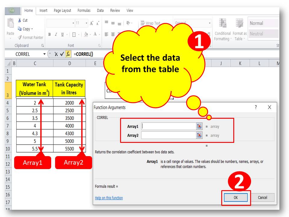
How to Calculate Correlation Coefficient (r) |Correlation Coefficient Formula
Hi readers! Today we will discuss How to Calculate Correlation Coefficient (r)?Basically coefficient of correlation gives an idea about the nature of the correlation between two variables, i.e. No correlation, positive correlation, and negative correlation. A detailed interpretation of the coefficient of correlation is given in Table-A. We have published three similar articles on correlation analysis and links of the individuals mentioned below. But here we will merely explain the calculation part of the correlation coefficient with an example.
How to Calculate Correlation Coefficient (r) |Correlation Coefficient Formula:
Let’s consider a manufacturing-related example to calculate the correlation coefficient (r). The process engineer has applied the Forging force in the billet at four different stages, as you can see in the above figure. At every stage, there is a reduction of height per stroke of the billet. The original height of the billet is 140.0mm. The details data for every stage is mentioned in the below table.
Forging Force in “N” (X)
Reduction of height/Stroke of Billet in “mm” (Y)
500
6.2
750
19
1000
29.5
1250
36
1500
39.5
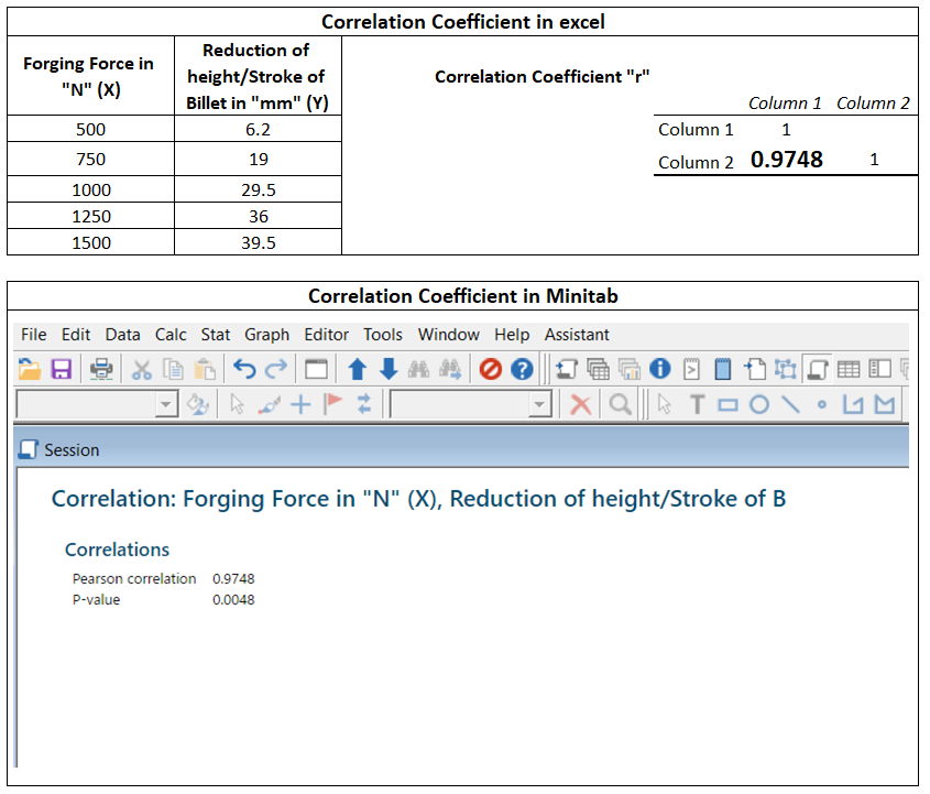
From the above data table, we are going to calculate the correlation coefficient (r). And we will verify the manual calculation of the “r” value against the value calculated by Minitab and Excel.
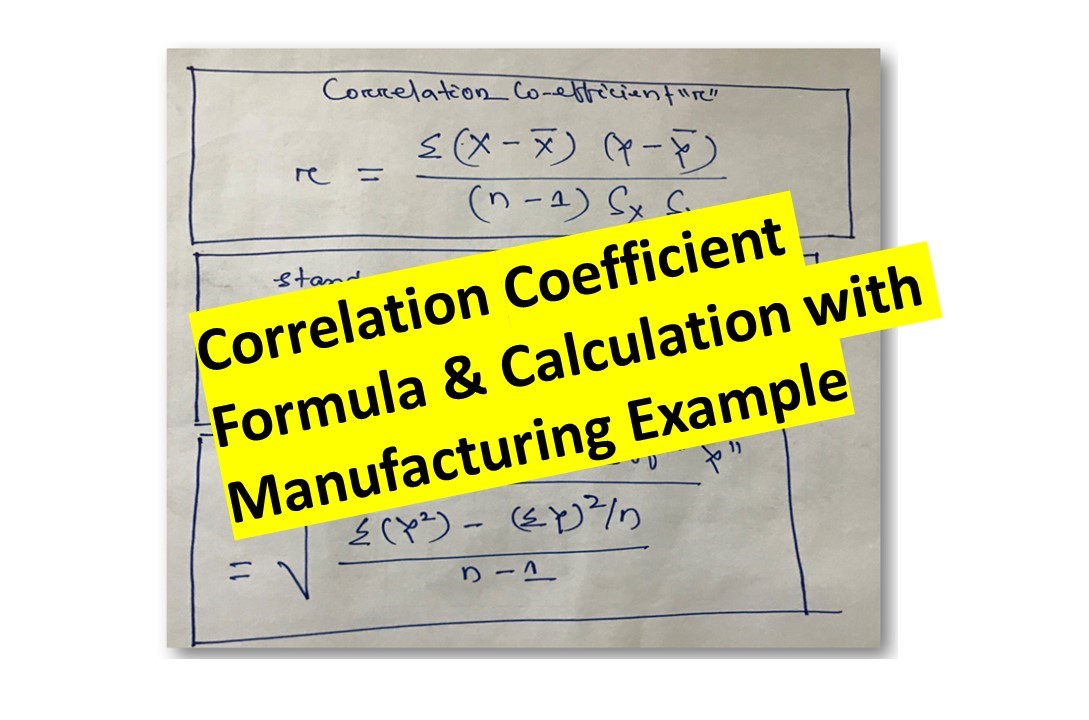
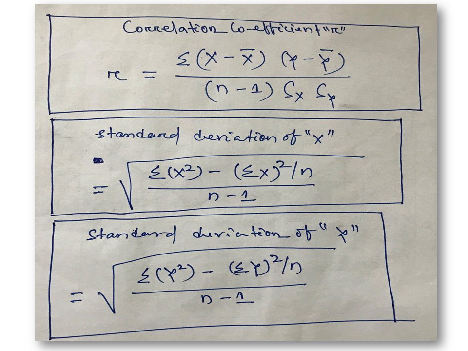
Correlation Coefficient Formula:
Calculation of Correlation Coefficient “r”:
Data table:
Forging Force in “N” (X)
Reduction of height/Stroke of Billet in “mm” (Y)
500
6.2
750
19
1000
29.5
1250
36
1500
39.5
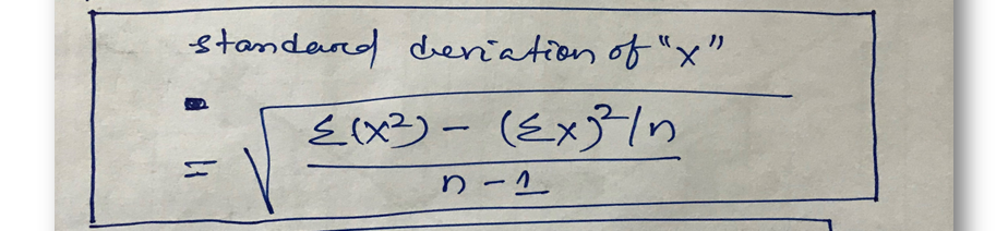
The standard deviation of “X”:
Forging
Force in “N” (X)
X²
500
250000
750
562500
1000
1000000
1250
1562500
1500
2250000
Σ(X²) =
5625000
(ΣX) =
5000
(ΣX)² =
25000000
(ΣX)²/n =
5000000
n-1 =
4
Σ(X²)-(ΣX)²/n =
625000
[{Σ(X²)-(ΣX)²/n}/(n-1)] =
156250
Square root of [{Σ(X²)-(ΣX)²/n}/(n-1)] =
395.2847075
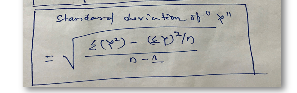
The standard deviation of “Y”:
Reduction
of height/Stroke of Billet in “mm” (Y)
Y²
6.2
38.44
19
361
29.5
870.25
36
1296
39.5
1560.25
Σ(X²) =
4125.94
(ΣX) =
130.2
(ΣX)² =
16952.04
(ΣX)²/n =
3390.408
n-1=
4
Σ(X²)-(ΣX)²/n =
735.532
[{Σ(X²)-(ΣX)²/n}/(n-1)] =
183.883
Square root of [{Σ(X²)-(ΣX)²/n}/(n-1)] =
13.5603466
Correlation Coefficient “r”:
Forging Force in “N” (X)
Reduction of height/Stroke of Billet in “mm” (Y)
X-X̅
Y-Y̅
(X-X̅) * (Y-Y̅)
500
6.2
-500
-19.84
9920
750
19
-250
-7.04
1760
1000
29.5
0
3.46
0
1250
36
250
9.96
2490
1500
39.5
500
13.46
6730
X̅ = 1000
Y̅ = 26.04
Σ(X-X̅) (Y-Y̅) =
20900
(Sx) * (Sy) =
5360.197641
(n-1) *((Sx) * (Sy)) =
21440.79056
r=
0.9748
Similarly, we have done the correlation analysis in excel and Minitab and found the value of the Correlation coefficient is 0.9748.
Interpretation of Correlation coefficient (r), Table-A:
Correlation Coefficient (r )
Interpretation
r=0.5
Low positive correlation
r=0.9
High positive correlation
r=1
Perfect positive correlation
r=0
No correlation
r= -0.5
Low negative correlation
r= -0.9
High negative correlation
r= -1
Perfect negative correlation
Summary of the Above Example:
From the above example, we found the value of “r” (Correlation coefficient) 0.975, which means there is a perfect positive correlation between the two variables.
When and How to Apply Correlation Analysis Tool in Manufacturing Industries?
We are always trying to share our own manufacturing experience so that our readers can easily understand, and learn the concept and can apply it in the manufacturing process to solve the problem. we think the calculation part is clear to all and the next, part we’re going to explain is the application of the Correlation tool. Always keep in your mind that correlation analysis can be applicable only between two variables. it’s a very useful tool generally used in industry to resolve the quality-related problems.
let’s say for example, you have 10 no cast iron blocks in the same shape and size, each and every block has a different percentage of “Mn”, but other compositions are the same in all the blocks. All blocks were tested to know the hardness. After getting the result we analyze both the variables by applying the Correlation tool to know whether block hardness is varied w.r.t Mn % or not. it means whether is there any relation between variables or not. Similarly, you can apply this tool between two quality-related factors like cause and effect to know whether significant relation or in-signification relation between cause and effect. so that you take the action plan to fix-up the problem.
Free Templates / Formats of QM: we have published some free templates or formats related to Quality Management with manufacturing / industrial practical examples for better understanding and learning. if you have not yet read these free template articles/posts then, you could visit our “Template/Format” section. Thanks for reading…keep visiting techiequality.com
Shanti Gopal Pradhan is an experienced professional in Quality Management Systems, QA, Operations, Business Excellence, and Process Improvement. He has strong expertise in international standards including IATF 16949, ISO 9001, ISO 14001, ISO 45001, and ISO 17025, along with methodologies such as TQM, TPM, and Six Sigma.
He holds a degree in Mechanical Engineering along with an MBA, combining strong technical acumen with strategic business insight, he is a Certified Internal Auditor, Lead Auditor, and Six Sigma Black Belt, with a proven track record in driving quality transformation and operational excellence.
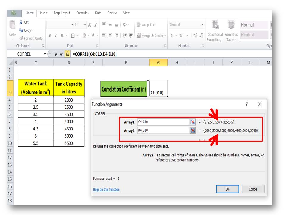
How to do data analysis by excel sheet? i| Step by step guides
Hi Readers! Today we will discuss an important topic i.e. How to do data analysis by excel sheet. Data analysis is very important and it helps to make the correct decision on fact basis. While data analysis we generally use many tools/ techniques like 7QC Tools (Pareto chart, fishbone diagram, histogram, scatter diagram, control chart, checklist, diagram & PFC) and Statistical tools, etc. Basically, we use several platforms to execute the test or plot the graph to know the interpretation of results. But with the help of a simple Excel sheet you can analyze your data by doing advanced tests like Regression analysis, Correlation, ANOVA, Z-test, etc. but you can’t get the option of those tests directly in your Excel sheet, for getting the option you have to install the data analysis tools in your excel sheet, so we will aid you through this article for easy installation of analysis tools.
Below are the step-by-step installation processes of Data Analysis Tools:
Step-1:
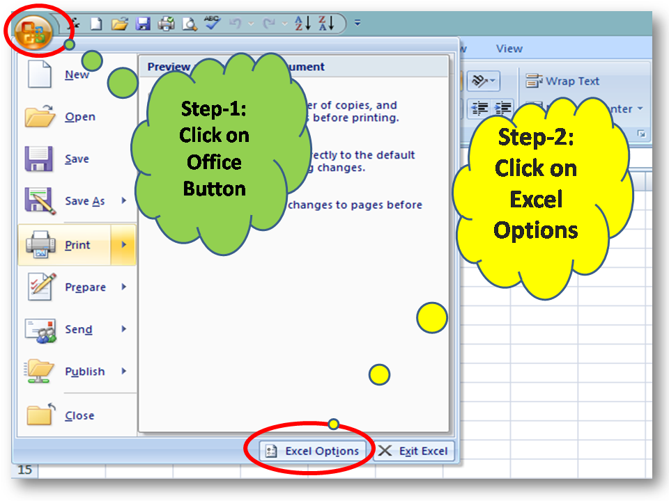
We cannot find the Data Analysis option in excel sheet because this tool is not pre-installed. You have to install it manually, so open your excel sheet and then click on the Office Button, and then follow the step-2 mentioned in the below figure.
Note that location of “excel options” may differ from one version to another version (Excel 2007, 2010, 2013, 2016, etc.)
Step-2:
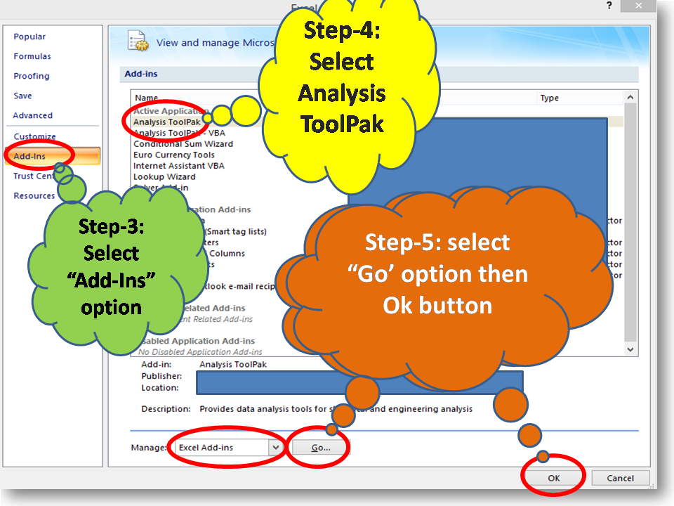
Now select the Add-Ins” option as shown in the below figure, next select Analysis ToolPak, and then follow the step-5 of below figure to install the Analysis Tool Pack.
Step-3:
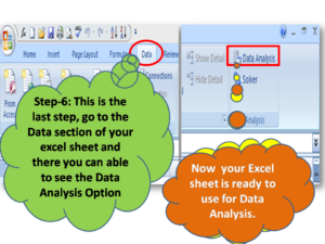
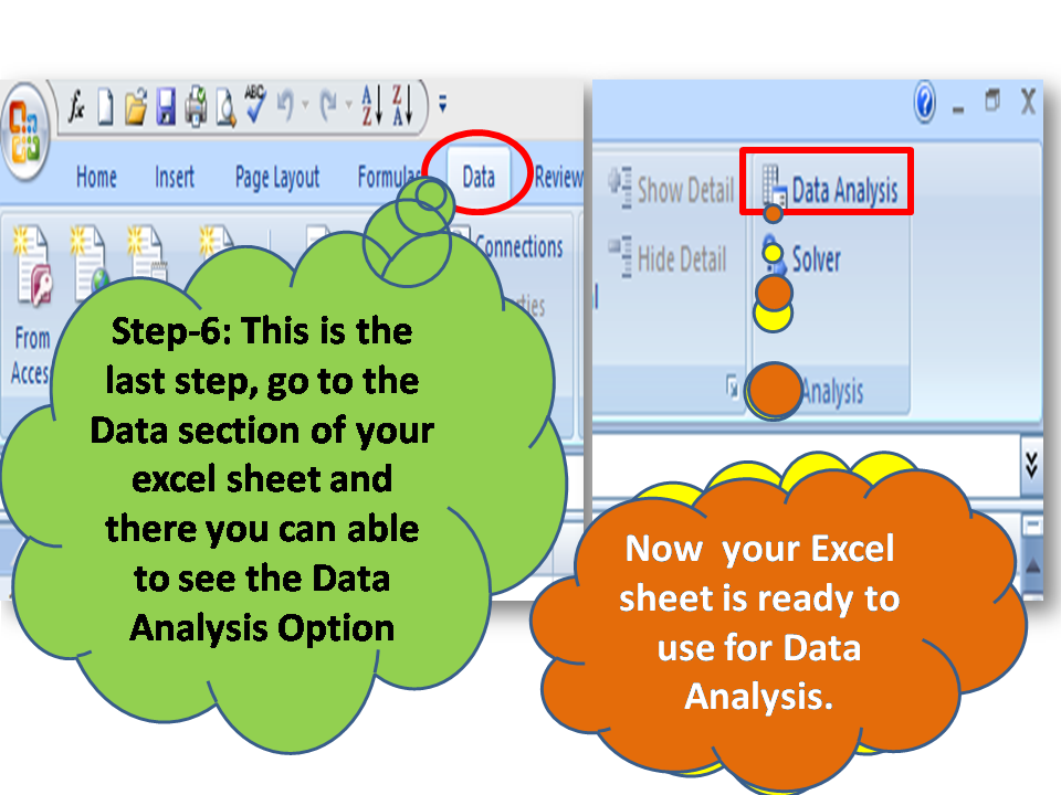
You have successfully installed the Data Analysis Tools Pack, and now you are ready to use the Data Analysis options. Just go to the Data section in excel sheet for usages of Analysis Tools.
For doing individual tests like correlation, regression analysis, ANOVA, Z-test, etc, open the data analysis option and select the data as per individual test instructions.
FAQ:
How to organize data in excel for analysis?
Ans.: it depends on which data analysis tools you are going to use, for example, if are going to do the ANOVA-single factor test then the selection criteria and data arrangement will be different than other tests like paired comparison, 2P test, etc.
What are the common data analysis tools used in manufacturing industries?
There are many common tools used in the manufacturing industry but some are 7QC tools, why-why analysis, 5 Core tools, hypothesis testing tools, etc. Directly you can also use the data analysis tool in excel which is given in the “Data” section in excel as Data Analysis. just you have to install the same by following the above process. so follow the above steps and use it for data analysis. you can also use the excel function for data analysis, it purely depends on the data type, nature of the test, etc.
Free Templates / Formats of QM: we have published some free templates or formats related to Quality Management with manufacturing / industrial practical examples for better understanding and learning. if you have not yet read these free template articles/posts then, you could visit our “Template/Format” section. Thanks for reading…keep visiting techiequality.com
Shanti Gopal Pradhan is an experienced professional in Quality Management Systems, QA, Operations, Business Excellence, and Process Improvement. He has strong expertise in international standards including IATF 16949, ISO 9001, ISO 14001, ISO 45001, and ISO 17025, along with methodologies such as TQM, TPM, and Six Sigma.
He holds a degree in Mechanical Engineering along with an MBA, combining strong technical acumen with strategic business insight, he is a Certified Internal Auditor, Lead Auditor, and Six Sigma Black Belt, with a proven track record in driving quality transformation and operational excellence.
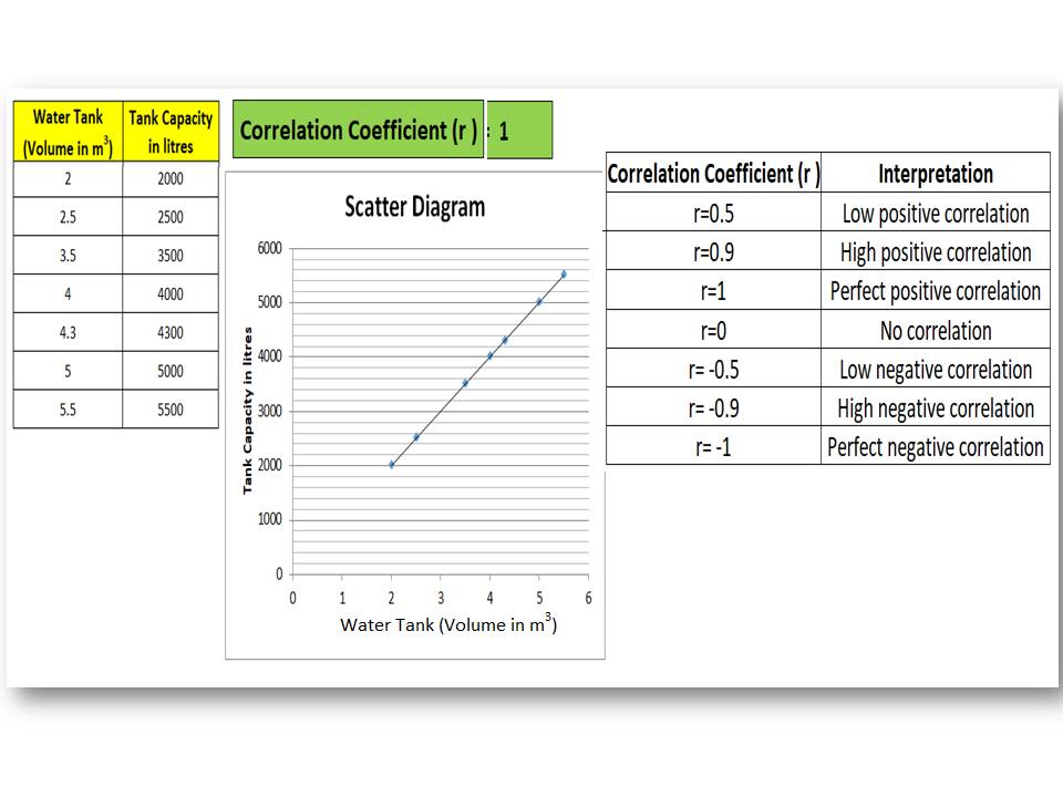
Industrial Example of Scatter Diagram | Interpretation of result | Scatter Diagram Template:
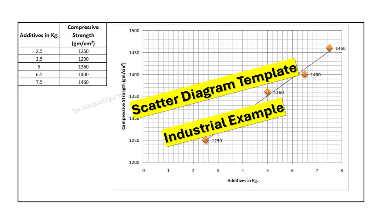
Hi readers! Today we will discuss on Scatter diagram Example with the interpretation of its results. The scatter diagram is one of the popular tools of 7QC tools. It’s a type of diagram to displays the value for typically two continuous variables for a set of data. One variable can be positioned on the X-axis and another variable can be positioned on the Y-axis. This diagram will help you to find out the significant causes among the total collection of potential causes. When you have variable types of data collection of potential causes and you do not know the positive or negative relationship that time you can plot the scatter diagram to know the relationship among them. You can download our simple Excel Scatter Diagram Template from the below link.
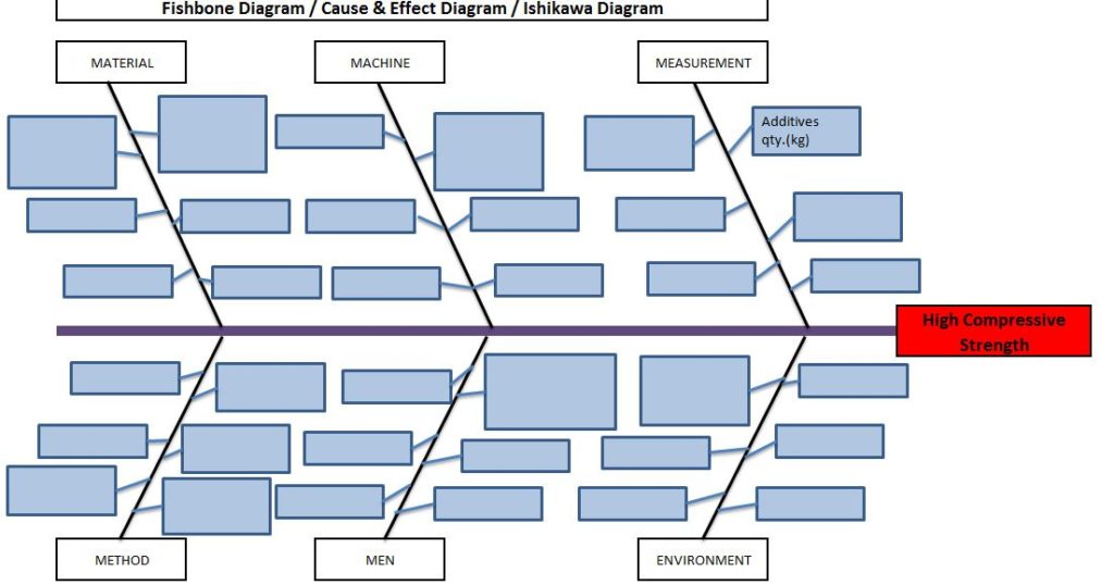
An organization has tried to know the significant causes for the high compressive strength of “X” quantity sand, so initially quality engineer drew the cause& effect diagram with the help of CFT team members and then he started the validation of each potential cause. The same C&F diagram is mentioned below.
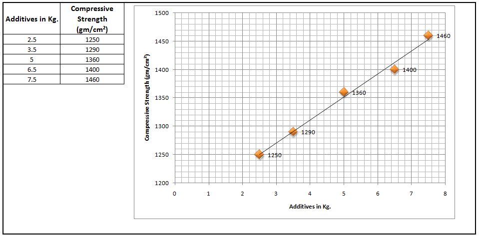
Here, we have not mentioned the other potential causes like mixing time, water%, etc. because these are already validated but now we have to know the relationship among the two variables as additive quantity v/s compressive strength through a scatter diagram. To do so data has to be collected and then a scatter diagram needs to be drawn.
Data table:
Additives in Kg.
Compressive Strength
(gm/cm²)
2.5
1245
3.5
1290
5
1330
6.5
1395
7.5
1435
Scatter Diagram:
Interpretation
of result:
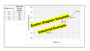
The above scatter diagram indicates us there is a perfect positive correlation between two variables i.e. Additives in Kg. vs. Compressive Strength (gm/cm²). So we can conclude that more the additive addition can result in high compressive strength.
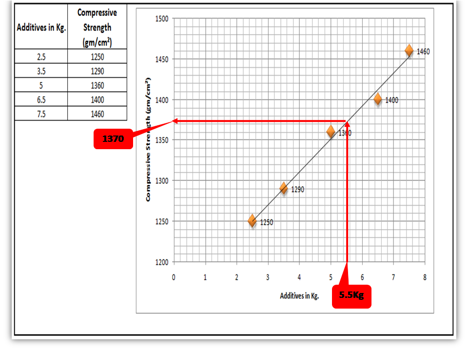
Interpolation: you can guess the value from the set of data points. From the above graph, I would like to know the compressive strength if I will add 5.5 Kg additives in “X” Kg of Sand.
FAQ:
Q1: What are the common possibilities of correlation between two variables of the scatter diagram?
Ans.: There are so many possibilities but three common correlations are positive, negative, and no correlation. Positive and Negative correlations are further categorized into three types as.
Positive Correlation:
Low positive correlation
High positive correlation
Perfect positive correlation
Negative Correlation:
Low negative correlation
High negative correlation
Perfect negative correlation
Q2: What types
of data are used to plot the scatter diagram?
Free Templates / Formats of QM: we have published some free templates or formats related to Quality Management with manufacturing / industrial practical examples for better understanding and learning. if you have not yet read these free template articles/posts then, you could visit our “Template/Format” section. Thanks for reading…keep visiting techiequality.com
Shanti Gopal Pradhan is an experienced professional in Quality Management Systems, QA, Operations, Business Excellence, and Process Improvement. He has strong expertise in international standards including IATF 16949, ISO 9001, ISO 14001, ISO 45001, and ISO 17025, along with methodologies such as TQM, TPM, and Six Sigma.
He holds a degree in Mechanical Engineering along with an MBA, combining strong technical acumen with strategic business insight, he is a Certified Internal Auditor, Lead Auditor, and Six Sigma Black Belt, with a proven track record in driving quality transformation and operational excellence.
How to Plot Scatter Diagram in Excel |Guides with example | Interpretation:
Hi reader! Today we will discuss on How to Plot Scatter Diagram in Excel? The scatter diagram is a type of tool that is generally used to know the correlation between two variables. We have published a separate post on the concept of scatter diagrams with industrial examples and interpretation of results, if you are interested in knowing the concept before reading this article then you may read more, the link is provided below.
A class teacher tried to survey their top five students’ marks obtained in % v/s study hours. Details of the data are given below.
Variable-1
Variable-2
Study hours
Mark obtained in %
5
40
6
50
7
65
8
82
10
89
Now class teacher has drawn the scatter diagram to know the correlation between variables. Step by step guide is mentioned below;
Step-1:
Open the excel sheet and make a table.
Step-2:
Select the table to plot
the diagram.
Step-3:
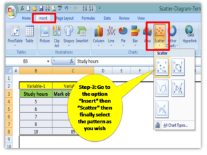
Choose the pattern of the Scatter diagram as you wish, To do so first go to the option “Insert” and then select the scatter diagram option with your preferred pattern. Details are mentioned in the below figure.
Step-4:
Now, your Scatter Diagram
is ready.
Interpretation of the above scatter diagram:
All sample points are nearer to the trend line and in a positive direction. So the scatter diagram indicates us there is a perfect positive correlation between two variables. Read more…to know more about common possibilities of correlation.
Free Templates / Formats of QM: we have published some free templates or formats related to Quality Management with manufacturing / industrial practical examples for better understanding and learning. if you have not yet read these free template articles/posts then, you could visit our “Template/Format” section. Thanks for reading…keep visiting techiequality.com
Shanti Gopal Pradhan is an experienced professional in Quality Management Systems, QA, Operations, Business Excellence, and Process Improvement. He has strong expertise in international standards including IATF 16949, ISO 9001, ISO 14001, ISO 45001, and ISO 17025, along with methodologies such as TQM, TPM, and Six Sigma.
He holds a degree in Mechanical Engineering along with an MBA, combining strong technical acumen with strategic business insight, he is a Certified Internal Auditor, Lead Auditor, and Six Sigma Black Belt, with a proven track record in driving quality transformation and operational excellence.
Hi readers! Today we will discuss on Types of Fishbone Diagram. Basically, the fishbone/ cause & Effect/Ishikawa diagram is one of the most popular tools among 7QC Tools. Due to the simplicity and easy understanding, almost all sectors (manufacturing, service sector, non-manufacturing) are using this tool for represent the potential cause of a Problem statement. It’s an effective tool for the diagnosis of the various causes of the problem and helping to solve the problem. You can download the all types of C&E Diagram Template/formats from the below links.
DOWNLOAD– Cause & Effect Diagram Template (DA, E & PC types).
Types of
Fishbone Diagram/ Cause & Effect/ Ishikawa Diagram:
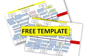
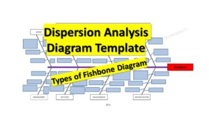
Three basic types of Fishbone Diagrams are [1] Dispersion Analysis [2] Process Classification [3] Enumeration. Dispersion analysis type of cause and effect diagram involves identifying and classifying possible causes for a specific quality problem. For example, 4Ps, 4Ms, 8Ms, and 4M1E are the most popular pattern of dispersion analysis fishbone diagrams. Some sample pattern templates are given below;
The Process classification fishbone diagram involves establishing causes related to the Process. But in Enumeration types, there a slight changes as compared to the above both types, simply list all the possible causes first and then draw the chart in order to relate the causes to each other.
Example of Dispersion analysis type of cause and effect diagram:
We have built the two popular C&E diagrams considering with two scenarios as [1] Electric fire [2] Product delivery issues. First of all, we have listed up the potential causes and then constructed the fishbone diagram.
What are the 3 types of cause and effect diagrams?
Ans. The common three types of fishbone or cause & effect diagrams are 1-Dispersion Analysis, 2- Process Classification, and 3-Enumeration.
Free Templates / Formats of QM: we have published some free templates or formats related to Quality Management with manufacturing / industrial practical examples for better understanding and learning. if you have not yet read these free template articles/posts then, you could visit our “Template/Format” section. Thanks for reading…keep visiting techiequality.com
Shanti Gopal Pradhan is an experienced professional in Quality Management Systems, QA, Operations, Business Excellence, and Process Improvement. He has strong expertise in international standards including IATF 16949, ISO 9001, ISO 14001, ISO 45001, and ISO 17025, along with methodologies such as TQM, TPM, and Six Sigma.
He holds a degree in Mechanical Engineering along with an MBA, combining strong technical acumen with strategic business insight, he is a Certified Internal Auditor, Lead Auditor, and Six Sigma Black Belt, with a proven track record in driving quality transformation and operational excellence.
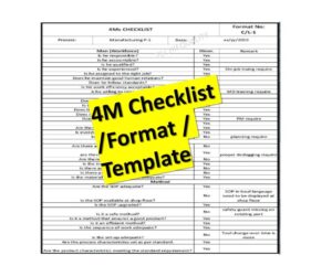
Hi Readers! Today we will discuss here on 4M Checklist Template. Generally, the 4M concept is used in several methodologies, In the Cause and effect diagram it represents the potential causes and similarly, it is also used as a checklist for Kaizen. In the kaizen approach, there are some checklists used as [1] 5MUs checklist [2] 5W1H checklist [3] 4M Checklist. But here we will only explain on the 4M checklist. We have prepared the 4M checklist for your ready reference. You can easily download this checklist/check sheet from the below link.
4M i.e. Men, Machines, Materials & Methods are the common aspects and important for quality improvement and KAIZEN. Questions to be asked related to 4M to implement kaizen activities effectively are;
Man (Workforce)
Is he responsible?
Is he accountable?
Is he qualified?
Is he experienced?
Is he assigned to the right job?
Is everything in a good working order?
Does he follow standards?
Is his work efficiency acceptable?
Is he willing to improve?
Machine
Does it meet process capabilities?
Is the oiling/greasing adequate?
Does it meet production requirements?
Does it meet precision requirements?
Does it make any unusual noise?
Is the layout adequate?
Are there enough resources available?
Are there any mistakes in the material grade?
Is PM done as per plan?
Material
Is there any issue with material flow?
Are there any impurities mixed in?
Are there any mistakes in quantity?
Is the inventory level adequate?
Is there any wastage of materials?
Is the material quality standard adequate?
IS it a method that ensures a good product?
Method
Is the SOP adequate?
Is the SOP available on the shop floor?
Is the SOP upgraded?
Is it a safe method?
Is the setup adequate?
Is it a safe method?
Is it an efficient method?
Is the sequence of work adequate?
Are there any mistakes in the material grade?
Are the process characteristics set as per standard?
Are the product characteristics meeting the standard requirement?
Template
Example: We had audited the manufacturing process and got the below observations;
4M Checklist Template
During the process audit through the 4M checklist, we have observed so many improvement points, these are mentioned in the above checklist remark column. In this way, you can easily find out the process improvement points. Download the above 4M Checklist and try to customize it according to your manufacturing process.
How to Implement the 4M checklist /Check sheet in Manufacturing Industries?
I always try to share my own industrial experience so that my readers can easily understand, learn, and implement the skill-based concept in their operational process.
Posts/articles on this website are skilled base, you can read our articles for your personal learning, for training purposes, and for practical implementation in the industry as well.
Generally, we use the 4M, and 6M check sheets to audit /investigate and to check the condition and lacking points of 4M factors (Men, Machine, Method, and Material). Some industries plan the checking schedule on a weekly and some on a monthly basis as per the production plan. By doing so we can easily maintain the machine condition, reduce the B/D, Increase the machine run time, we can identify the on-job training of operators /workers, maintain the material inventory, monitor the effectiveness of the Method, we can further improve our process, etc.
Below are the steps for implementation of 4M checklist/ check sheet:
Prepare the 4M checklist /Check sheet as per your Process in detail considering with past 6 months’ quality defect causes, B/D nature causes, customer complaints, etc.
Define the Checking plan (e.g. weekly, monthly, etc.)
Check 4M factors by using the 4M check sheet as per your plan,
Write the observations.
Discuss with the concerned department and formulate the Action plan / CAPA.
Implement the CAPA /Action Plan.
Monitor the implementation of the action plan (For example, verify it in the next checking).
4M Change Management:
After doing the 4M Audit you can easily identify the 4M-related changes. the above 4m checklists is mentioned for your reference but the checking points are not limited. you can customize the above checklist as per your manufacturing process.
Ans.: In Industries the term 4M is generally used as [1] Man [2] Machine [3] Material & [4] Method.
What is 4M method?
Ans.: The 4M method is generally used in manufacturing industries for problem-solving /analysis. These terms are generally represented in 4M change management and also in the Cause and effect diagram or Fishbone diagram. The potential causes are basically represented under the category of 4M- Cause and effect diagram for further processing like causes/problem analysis and validation of causes, etc.
Shanti Gopal Pradhan is an experienced professional in Quality Management Systems, QA, Operations, Business Excellence, and Process Improvement. He has strong expertise in international standards including IATF 16949, ISO 9001, ISO 14001, ISO 45001, and ISO 17025, along with methodologies such as TQM, TPM, and Six Sigma.
He holds a degree in Mechanical Engineering along with an MBA, combining strong technical acumen with strategic business insight, he is a Certified Internal Auditor, Lead Auditor, and Six Sigma Black Belt, with a proven track record in driving quality transformation and operational excellence.
Hi Readers! Today we will discuss here details on MURA, MURI & MUDA. you can download our free template of the 3MU check sheet from the below links. The 3MU’s are MURA (Discrepancy), MURI (Strain), MUDA Waste).
A system, facility, or process designed beyond the physical capacities of equipment/ workforce
Activities which does not add value.
MUDA:
Waste, Unusefulness;
An any activities that do not add value w.r.t the customer perspective, presently in industry; elimination of waste (MUDA) is the big challenge. Many lean tools are there that you can implement it to deduce the MUDA. Value stream mapping is the one of the popular tools that basically used in many industries. But the identification of waste is a big job. The common 7 wastes are;
Defects: The Defective product is total waste.
Overproduction: Production more than demand or less than demand is a loss.
Over Processing: Rework, Repair, Rechecking is a waste of time and money.
Waiting: Waste of time, and money.
Moving: The movement of goods within or outside is waste.
Inventory: Unfinished goods, R/M, BOP add no
value.
Transportation: Unnecessary transfer of goods is
waste.
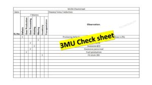
Considering with above points we have prepared a sample MUDA Checklist for your ready reference. DOWNLOAD the MUDA Check sheet.
MURA:
Unevenness, Discrepancy, Irregular;
MURA can exist when the workflow is out of balance.
A system, facility, or process designed beyond the physical
capacities of equipment/ workforces.
How to
eliminate 3MUs?
The MURA (Unbalanced Process) can lead to an overburden on the workforce or equipment which may cause later on all kinds of non-value-added activities (MUDA). So to eliminate the 3MUs you have to give more focus on Value stream mapping, Process layout design, and 5’S, Visual standard, Kaizen, Process feasibility analysis, and Process variation.
Example:
You can audit your respective area by using our 3MU-MUDA Check Sheet, Similarly, we have done this in the manufacturing unit and found some observations, same mentioned in below for your easy understanding.
Shanti Gopal Pradhan is an experienced professional in Quality Management Systems, QA, Operations, Business Excellence, and Process Improvement. He has strong expertise in international standards including IATF 16949, ISO 9001, ISO 14001, ISO 45001, and ISO 17025, along with methodologies such as TQM, TPM, and Six Sigma.
He holds a degree in Mechanical Engineering along with an MBA, combining strong technical acumen with strategic business insight, he is a Certified Internal Auditor, Lead Auditor, and Six Sigma Black Belt, with a proven track record in driving quality transformation and operational excellence.
Strategies for Manufacturing Process Improvement |11+ Strategies:
Process improvement is the challenging work in manufacturing industries for continuous Improvement. For continuous improvement, many organizations are following arbitrarily several strategies to improve the process. But they can’t achieve it. As we know the manufacturing unit has many different processes, so they can’t follow a single strategy in all processes. So here we are going to discuss some common standard strategies that will help you to improve the manufacturing process. Following are the Strategies for Manufacturing Process Improvement.
Strategies for Manufacturing Process Improvement
Strategies:
Details of Process:
Team members who are involved in process improvement should have details knowledge of the process. You have to first prepare the PFD (Process flow diagram) or SIPOC (Supplier, Input, Process, Output, Customer) to know the depth idea in the process. Study the Work procedure and verify the work going on in the process. If any obvious problem is identified then immediately correct it.
Tools/Methods/Approaches used in this Strategy are PFD, SIPOC, WP, and Process verification with standard Procedure.
Process Standardization:
Operators involved in operation should follow the standardized procedure, which is the most efficient, effective, and best. So process owner should take the initiative to standardize the check sheet, operational procedure, control plan, etc. To do so process owner is supposed to create a CFT team to validate process characteristics and standardize the validated parameters. Monitoring of record to be executed. And time to time all relevant documents need to be revised.
Tools/Methods/Approaches used in this Strategy are WP, CFT, Check sheet, SOP, Process validation, and Standardization of operation.
Process Streamline:
Streamlining of the process can be done by removing unnecessary activities and reducing the cycle time, inventory, etc. During the streamlining of the process, all the team members should eliminate the extra activities that do not provide the desired result and value to the organization and customer. Strong brain-storming is needed to identify the non-value-added activities.
Tools/Methods/Approaches used in this Strategy are VSM, Brain-storming, JIT, World class supply management, etc.
Elimination of Errors:
In this activity, CFT team members need to study the process including 4M (Man, Machine, Material, and Method) factors as a potential source of error. Following are the methods or approaches that CFT team members need to follow to identify the source of error and need to react immediately to improve.
Tools/Methods/Approach used in this Strategy are:
Man
On-job Training, Visual Standard, 5’S, MSA, WP, Operators skills, etc.
Machine
Calibration, Test report, Validation, Error proofing device, Machine maintenance, etc.
SOP, Skill of operator, Testing, equipment calibration, etc.
Statistical Process Control:
Process Inspectors have to collect the data and prepare the control chart according to data types. If a special cause exists there then they have to plan for continual improvement.
The CFT team needs to decide first which factors are going to be measured for improvement by experiment (DOE, DSS, etc.) methods. Before starting the experiment project, CFT members should represent the theoretical benefits and technical logic behind the improvement project. Then they have to set up, conduct an experiment project, and collect the data for analysis. If found positive result then the action of the experiment needs to be implemented in the process.
Tools/Methods/Approaches used in this Strategy are DOE, DSS, Experiment Projects, etc.
Flow Production:
Machines should be set up in such a way that productions will run smoothly and steadily without interruption. Process layout needs to be standardized according to workflow.
Tools/Methods/Approach used in this Strategy is: Standardizing of Work Layout.
Level Production:
This involves breaking the large lots into smaller lots and producing them at a constant level. All manufacturing industries should prepare the production plan accordingly so that a constant quantity of daily production will run without storing the whole period of raw material as inventory.
Tools/Methods/Approaches used in this Strategy are JIT, PPC, Inventory Management, etc.
Visual Control:
Visual control is one of the best methodologies for process improvement, in this process, you can visualize the Q-component level and decision-making component level in the shop floor process, activities, and machine to know the deviation in the process. You can easily act on it online.
For example, leveling of lubricant oil at the machine, during daily machine inspection you can easily check the oil level, which may allow you to prevent the machine break-down caused by the low level of lubricant oil in the machine.
Tools/Methods/Approach used in this Strategy is Match-mark, sign, level, Photos, 5’S, etc.
This involves identifying the process variation (special cause, common cause, wastage, defects, yield, scrap, etc.). Process owners need to analyze it and take the necessary action on it.
By actively doing the TPM activities may lead to some benefits like zero breakdown, zero defects, etc. and the machine’s basic condition will be maintained.
Note that all the above strategies are not applicable to all sectors/ units and it depends on the nature of the Manufacturing process and suitability.
Shanti Gopal Pradhan is an experienced professional in Quality Management Systems, QA, Operations, Business Excellence, and Process Improvement. He has strong expertise in international standards including IATF 16949, ISO 9001, ISO 14001, ISO 45001, and ISO 17025, along with methodologies such as TQM, TPM, and Six Sigma.
He holds a degree in Mechanical Engineering along with an MBA, combining strong technical acumen with strategic business insight, he is a Certified Internal Auditor, Lead Auditor, and Six Sigma Black Belt, with a proven track record in driving quality transformation and operational excellence.