Correlation analysis in excel | 3 best method |step by step guide with example
Hi reader! Today we will discuss on Correlation analysis in excel, this tool is generally used to know the correlation between two variables. There is so many software available in the market that you can execute the correlation test. But in this tutorial, we will explain to you how to do a correlation test in excel with an industrial example. There are three common methods that you can execute for the test i.e. [1] shortcut function method [2] direct function method [3] Through data analysis method. For doing the data analysis method you have to install the analysis tool pack if you have not yet installed then follow the steps to install it. The Link is given below.
Step by step guide for installation of Data Analysis tools in excel.
Processes of Correlation analysis in excel:
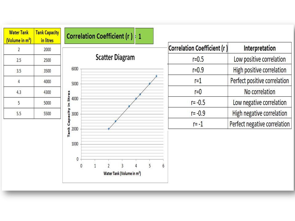
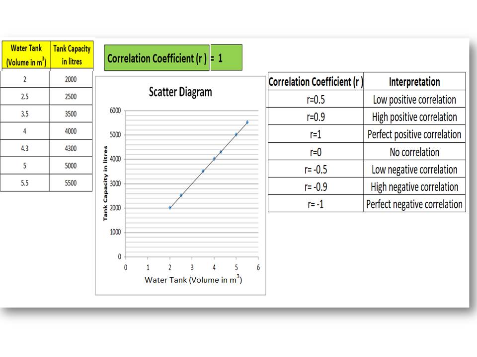
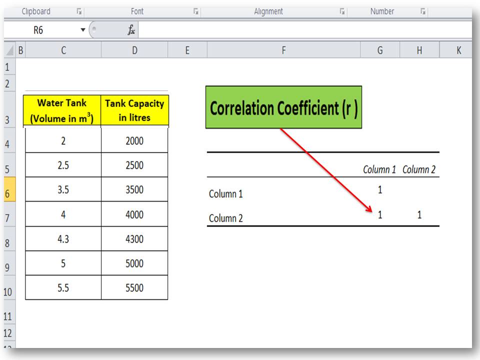
There are three common methods that we are going to explain it step by step. Here we have analyzed the correlation between variables “water tank (volume) vs Tank capacity” to know the interpretation of correlation and value of the coefficient of correlation. A Data table is given below;
| Water Tank (Volume in m3) | Tank Capacity in liters’ |
| 2 | 2000 |
| 2.5 | 2500 |
| 3.5 | 3500 |
| 4 | 4000 |
| 4.3 | 4300 |
| 5 | 5000 |
| 5.5 | 5500 |
Method -1;
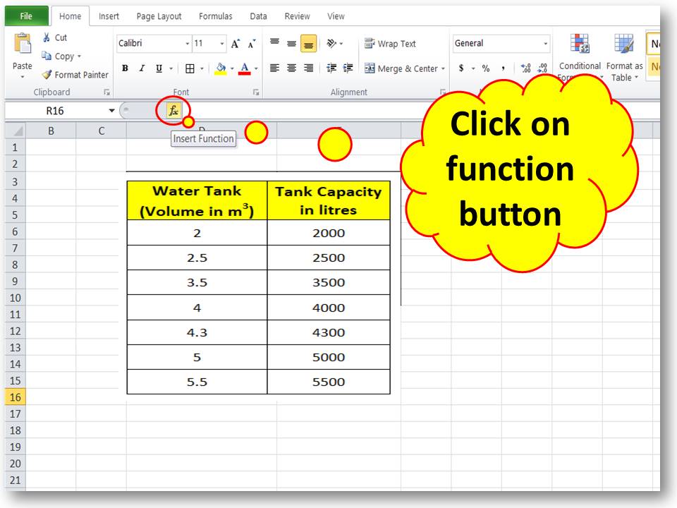
Step-1:
Open the Excel sheet, then create a table of two variables, and next, click on the function button. Follow the below figure.
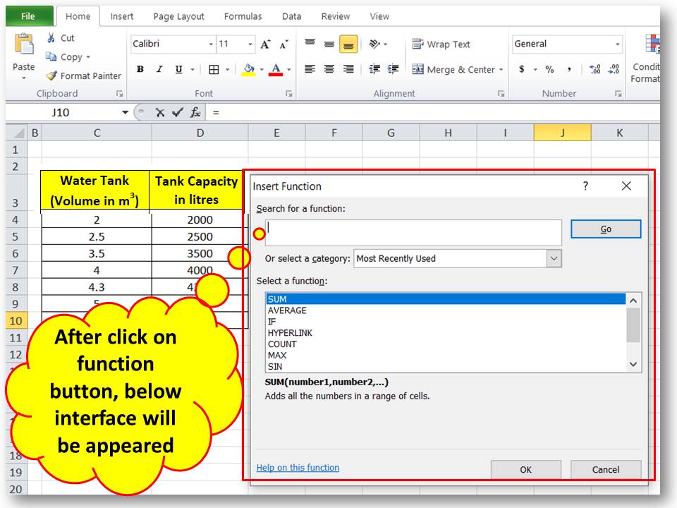
Step-2:
After clicking on the function button, the below interface will appear.
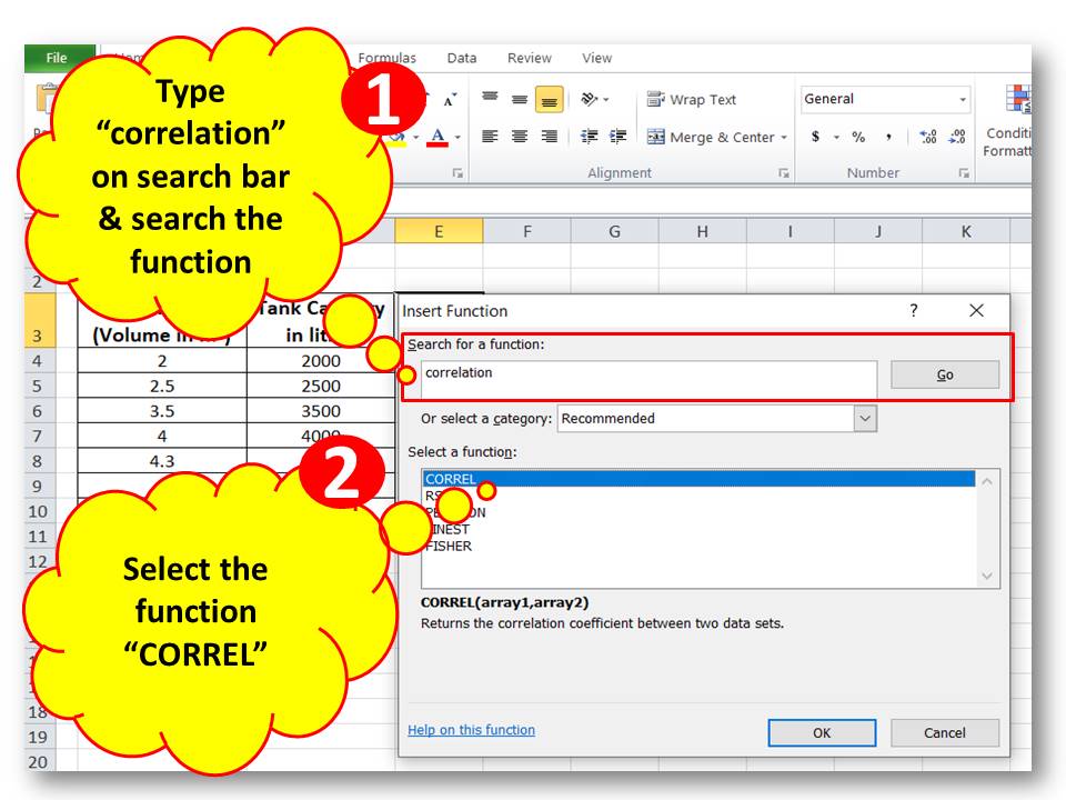
Step-3:
Type “correlation” on the search bar and search the function, then select the function “CORREL”.
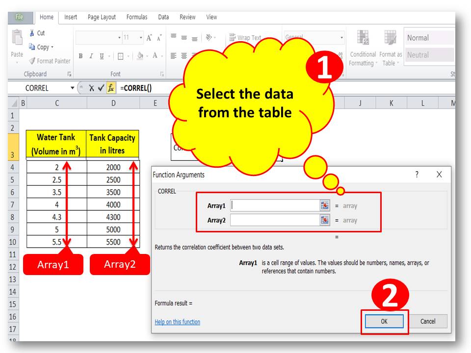
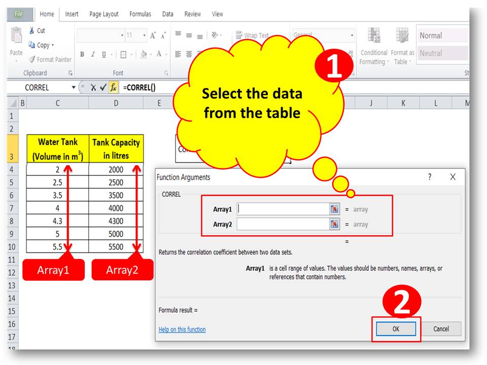
Step-4:
Select the data for array1 and array2; here we have selected the column of water tank volume as array1 and tank capacity as array2.
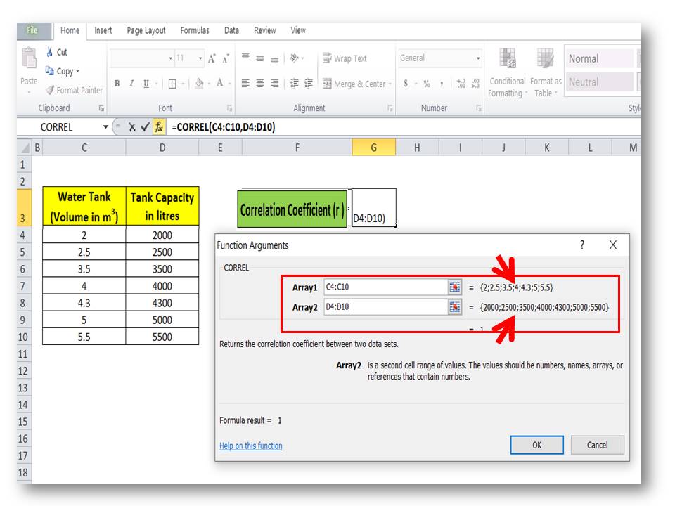
Step-5:
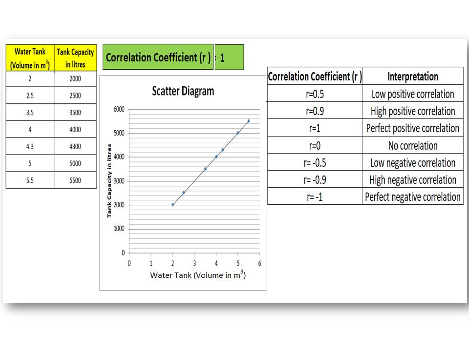
The Correlation coefficient will be calculated automatically. You can see in the below figure the value of the coefficient of correlation is 1. For better understanding, we have plotted the scatter diagram. And the graph and value of the coefficient of correlation indicate that there is a perfect positive correlation between the two variables.
Method-2;
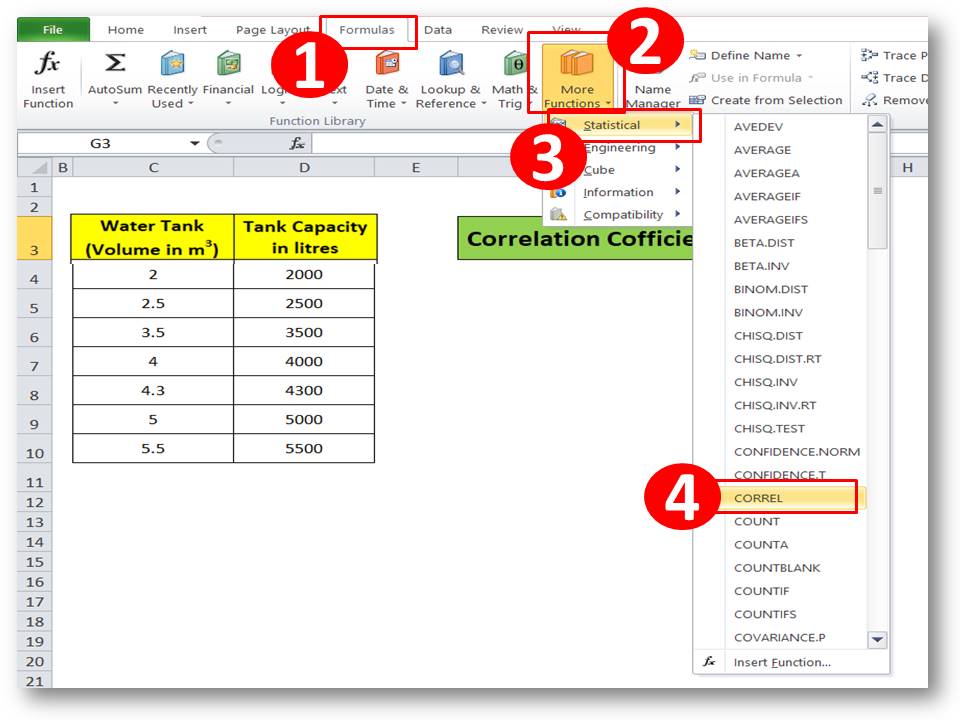
Step-1:
Select the correlation function from the statistical option, and go through the below figure.
Step-2:
Select the data for array1 and array2 from the data table.
Step-3:
The Value of the coefficient of correlation will be calculated automatically.
Method-3;
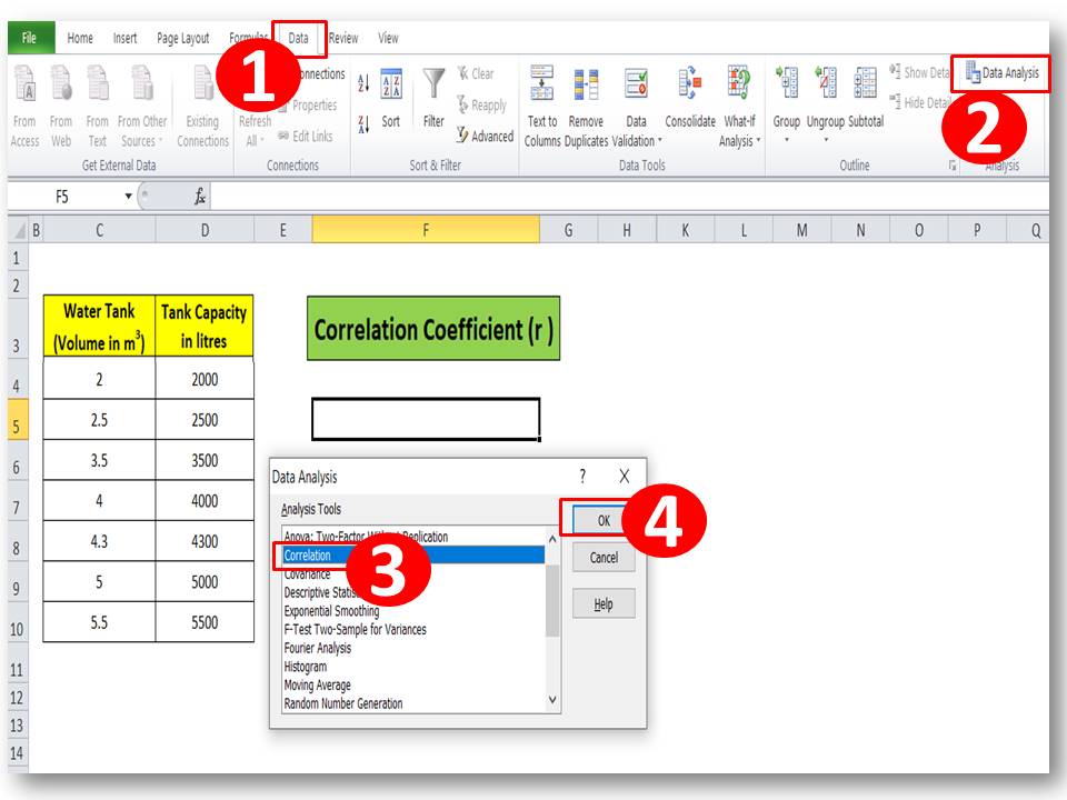
Step-1:
Ensure that the data analysis tool has been installed already in Excel, else click here to learn the step-by-step process. Now go to the data option and select the data analysis option.
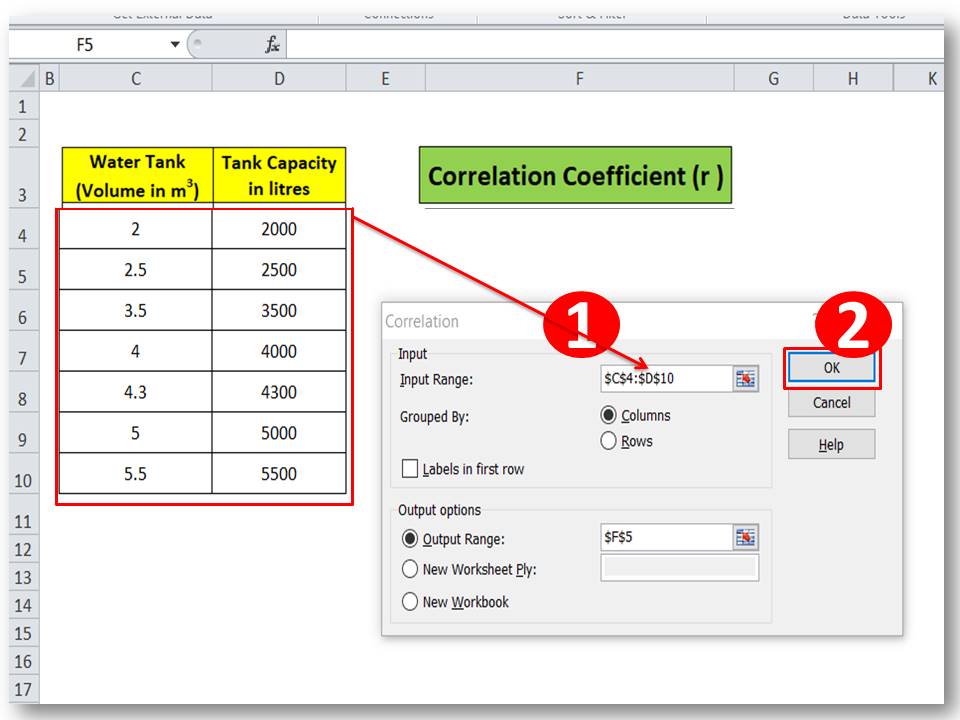
Step-2:
Select the input data range
Step-3:
The Correlation coefficient will be calculated automatically.
Interpretation of Correlation coefficient (r):
| Correlation Coefficient (r ) | Interpretation |
| r=0.5 | Low positive correlation |
| r=0.9 | High positive correlation |
| r=1 | Perfect positive correlation |
| r=0 | No correlation |
| r= -0.5 | Low negative correlation |
| r= -0.9 | High negative correlation |
| r= -1 | Perfect negative correlation |
Similar Post:
How to Plot Scatter Diagram in Excel? |Guides with example | Interpretation.
Scatter Diagram Template |Industrial Example |Download Excel Format.
Free Templates / Formats of QM: we have published some free templates or formats related to Quality Management with manufacturing / industrial practical examples for better understanding and learning. if you have not yet read these free template articles/posts then, you could visit our “Template/Format” section. Thanks for reading…keep visiting techiequality.com
More on Techiequality


Shanti Gopal Pradhan is an experienced professional in Quality Management Systems, QA, Operations, Business Excellence, and Process Improvement. He has strong expertise in international standards including IATF 16949, ISO 9001, ISO 14001, ISO 45001, and ISO 17025, along with methodologies such as TQM, TPM, and Six Sigma.
He holds a degree in Mechanical Engineering along with an MBA, combining strong technical acumen with strategic business insight, he is a Certified Internal Auditor, Lead Auditor, and Six Sigma Black Belt, with a proven track record in driving quality transformation and operational excellence.