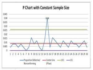
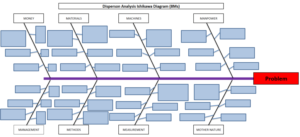
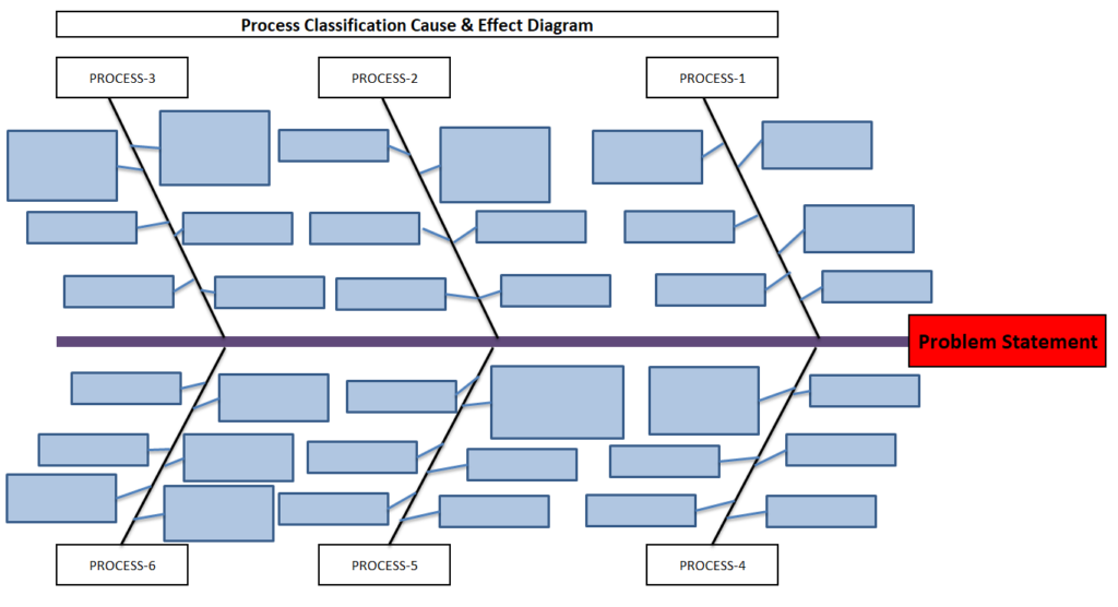
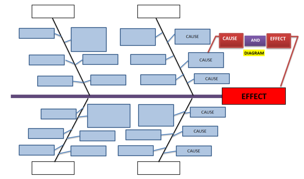
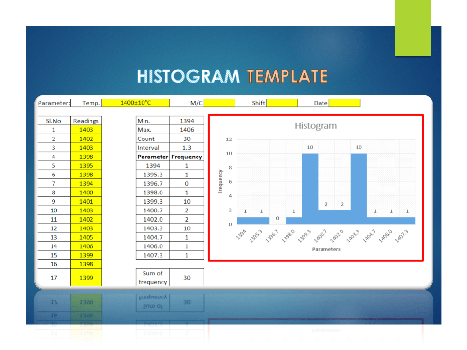
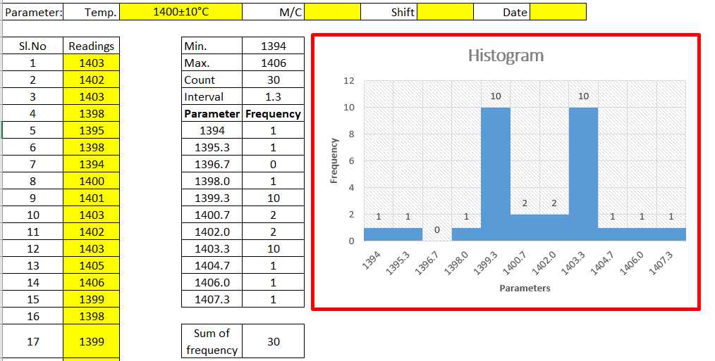
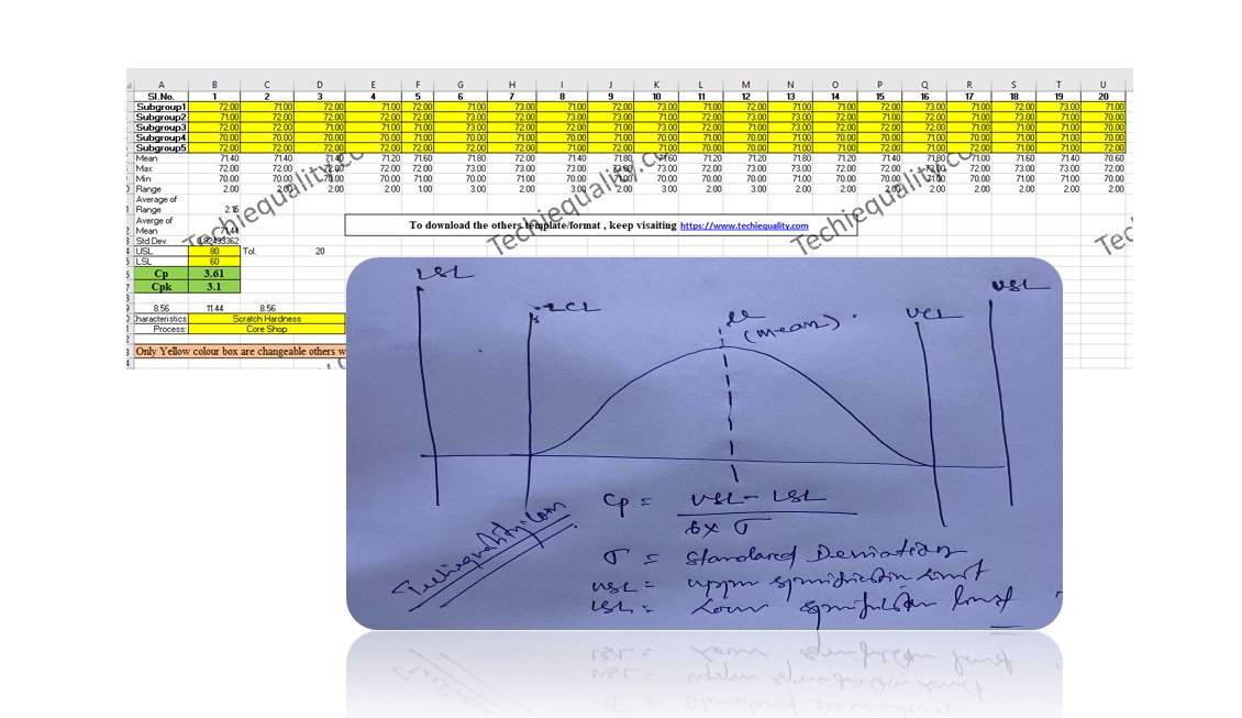
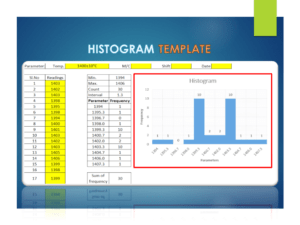
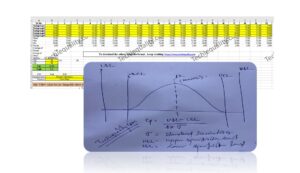
The Histogram Template is prepared in a simple format with an industrial example. We have described the example in below, just go through this article and Download the Template / Format. It’s a very useful tool and is frequently used in manufacturing industries. The main function is to know the frequency distribution, symmetry, and skewness, and it also helps to determine the normality of data by drawing the bell curve.
A histogram is one of the 7QC tools and commonly used graph to show frequency distribution. Helps summarize data from a process that has been collected over a period of time.
A histogram is a representation of the frequency distribution of numerical data. it was first familiarized by Karl Pearson. A histogram is related to merely one type of variable data. You should calculate the interval value to represent the bins. Bins shall give an idea about the how much data falls within the selected data range’s width. Histogram gives the indication about data distribution as normal, skewed, or bi-modal.
How to use our Histogram
Template:
Step-1: Download the Histogram Template from the above link.
Step-2: Carefully read the “Note” mentioned in the Excel template.
Step-3: Enter the reading only in the yellow color box. Then other values will calculate automatically and your histogram will be ready for interpretation.
Note:
1. Only yellow colour boxes are changeable
2. Make sure that the sum of frequency is equal to the total count, e.g. sum of frequency in a given example [example is given in histogram excel format, just download and see the example] is 30 and the count is also 30, if not then you have to adjust the parameters and frequency table in frequency distribution format for doing so click on the link given “How to adjust parameters and frequency table in Histogram Template?”.
Shanti Gopal Pradhan is an experienced professional in Quality Management Systems, QA, Operations, Business Excellence, and Process Improvement. He has strong expertise in international standards including IATF 16949, ISO 9001, ISO 14001, ISO 45001, and ISO 17025, along with methodologies such as TQM, TPM, and Six Sigma.
He holds a degree in Mechanical Engineering along with an MBA, combining strong technical acumen with strategic business insight, he is a Certified Internal Auditor, Lead Auditor, and Six Sigma Black Belt, with a proven track record in driving quality transformation and operational excellence.
Process Capability Analysis | Cp & Cpk Calculation Excel Sheet with Example
Process Capability Analysis: – The Process Capability (Cp) and Process Capability Index (Cpk) are the important tools, which give an Idea about the Process Capability of a Stable Process. Here we will discuss on Calculation of Cp and Cpk with Examples. We are offering here Process Capability Excel Template / Format for you, hence click on the below links to Download the Excel Format.
Process Capability (Cp) is a statistical measurement of a process’s ability to produce parts within specified limits on a consistent basis
It gives us an idea about the width of the Bell curve.
The Process Capability for a stable process is typically defined as ((USL-LSL)/ (6 x Standard Deviation)).
Cpk-Process Capability Index :
It shows how closely a process is able to produce the output to its overall specifications.
More Value of Cpk means more process capable.
The Process Capability Index for a stable process is typically defined as the minimum of CPU or CPL.
Process Capability Analysis:
Industrial
Example:
As per the Quality Assurance Plan, The shift engineers of Core Shop have started collecting the readings of the scratch hardness of Core. Given below are the details of Product Characteristics;
Specification of Scratch hardness is 70±10.
The Upper Specification Limit is 80.
The Lower Specification Limit is 60.
Tolerance is 20.
Scratch hardness readings Table:
Table-1
Sl.No.
1
2
3
4
5
6
7
8
9
10
SG 1
72.00
71.00
72.00
71.00
72.00
71.00
73.00
71.00
72.00
73.00
SG2
71.00
72.00
72.00
72.00
72.00
72.00
72.00
73.00
73.00
71.00
SG 3
72.00
72.00
71.00
71.00
71.00
73.00
72.00
72.00
71.00
73.00
SG4
70.00
70.00
70.00
70.00
71.00
70.00
71.00
70.00
71.00
70.00
SG 5
72.00
72.00
72.00
72.00
72.00
72.00
72.00
71.00
72.00
71.00
Table-1 [Scratch hardness readings Table]
Table-2
Sl.No.
11
12
13
14
15
16
17
18
19
20
SG1
71.00
72.00
71.00
71.00
72.00
73.00
71.00
72.00
73.00
71.00
SG2
72.00
73.00
73.00
72.00
71.00
72.00
71.00
73.00
71.00
70.00
SG3
72.00
71.00
73.00
72.00
72.00
72.00
71.00
71.00
71.00
70.00
SG4
71.00
70.00
71.00
70.00
70.00
71.00
70.00
71.00
71.00
70.00
SG5
70.00
70.00
71.00
71.00
72.00
71.00
72.00
71.00
71.00
72.00
Table-2 [Scratch hardness readings Table]
In the above two tables (Table-1 &2), we have taken the 100 readings i.e. (20 times X 5 readings at a time).
Range=Maximum Value-Minimum Value
Average of Range=2.15
Value of d2=2.326 (For Subgroup size 5)
USL = 80, LSL = 60.
Standard Deviation:
=
Average of Range/d2
2.15/2.326
=0.92
Process
Capability (Cp):
=
((USL-LSL)/ (6 x Standard Deviation))
(80-60)/ (6 x 0.92)
20/5.52
= 3.61
Process
Capability Index (Cpk):
CPU:
= ((USL-Average of Mean)/3 x Standard
Deviation)
(80-71.43)/ (3 x 0.92)
8.57/ 2.76
= 3.10
CPL:
= ((Average of Mean-LSL)/3 x Standard
Deviation)
(71.43-60)/ 2.76
10.4211.43/2.76
=4.14
Cpk= 3.10 (minimum of CPU or CPL).
After doing the Process Capability Analysis on Scratch hardness readings, we got the below result value:
Characteristics: Scratch Hardness
Cp (Process Capability) = 3.61
Cpk (Process Capability Index) = 3.10
[ Cp & CpK ]
Process Capability Analysis with Manufacturing Example
The process engineer has collected the 100 nos laddle temperature reading and the same is mentioned in the below table.
Laddle Temperature Specification= 600 ± 15°C
USL = 615
LSL = 585
Table-1
1
2
3
4
5
6
7
8
9
10
S1
605
599
610
605
603
604
600
609
605
601
S2
603
601
612
599
601
598
603
610
603
598
S3
604
598
609
610
612
609
605
612
604
603
S4
600
603
605
598
599
610
598
609
600
610
S5
602
602
607
609
605
612
599
605
609
603
Max.
605
603
612
610
612
612
605
612
609
610
Min.
600
598
605
598
599
598
598
605
600
598
Range
5
5
7
12
13
14
7
7
9
12
Average of Range
9.85
Mean
602.8
600.6
608.6
604.2
604
606.6
601
609
604.2
603
Average of Mean
603.92
Table-2
11
12
13
14
15
16
17
18
19
20
S1
599
601
602
604
598
598
609
598
600
598
S2
610
598
602
603
603
603
605
603
603
610
S3
598
603
607
598
610
607
612
607
605
598
S4
609
610
609
603
603
598
604
598
607
602
S5
600
603
605
607
598
610
603
610
598
603
Max.
610
610
609
607
610
610
612
610
607
610
Min.
598
598
602
598
598
598
603
598
598
598
Range
12
12
7
9
12
12
9
12
9
12
Mean
603.2
603
605
603
602.4
603.2
606.6
603.2
602.6
602.2
d2=2.326
Standard Deviation = Average of Range / d2 = 4.23
Cp = (USL-LSL)/6*Standard Deviation = 1.2
CPU = ((USL-Average of Mean)/3 x Standard Deviation) = 0.872
CPL = ((Average of Mean-LSL)/3 x Standard Deviation) = 1.489
CpK = 0.872(minimum of CPU or CPL).
Note: Download the Cp & Cpk excel template or format and deploy it in manufacturing process. downloading links are provided at top of this Article.
Ans.: Cp & CpK are termed as process capability and process capability index. In both cases, we would like to verify whether the process can meet the customer’s requirements or not. Generally, it is used when the process is under stable & statically control.
What is the formula of Cp & Cpk?
Cp= ((USL-LSL)/ (6 x Standard Deviation)) , where USL=Upper Specification Limit & LSL=Lower Specification Limit.
Cpk= Minimum of CPU or CPL, where CPU= ((USL-Average of Mean)/3 x Standard Deviation) & CPL= ((Average of Mean-LSL)/3 x Standard Deviation)
What are the good values of Cpk?
Generally, the customers provide the Cpk value to their supplier to maintain it in their manufacturing process. but for your knowledge, a Cpk value of 2 or greater than 2 is an excellent one.
What is cpk?
The cpk is the process capability index which shows how closely a process is able to produce the output to its overall specifications.
What is the IATF 16949 requirement of Statistical Concepts or SPC?
Application of statistical concepts in the IATF 16949 standard has been mentioned in Clause no-9.1.1.3, both Control chart (variable and Attribute) and process capability are the mandatory requirements. The application of statistical concepts shall be understood and used by the employees involved. We have published a separate article on Control Charts for our readers and you can Download Control Chart Excel Template / Format.
Shanti Gopal Pradhan is an experienced professional in Quality Management Systems, QA, Operations, Business Excellence, and Process Improvement. He has strong expertise in international standards including IATF 16949, ISO 9001, ISO 14001, ISO 45001, and ISO 17025, along with methodologies such as TQM, TPM, and Six Sigma.
He holds a degree in Mechanical Engineering along with an MBA, combining strong technical acumen with strategic business insight, he is a Certified Internal Auditor, Lead Auditor, and Six Sigma Black Belt, with a proven track record in driving quality transformation and operational excellence.
Control Chart Excel Template |How to Plot Control Chart in Excel | Download Template:
Hi! Reader, today we will guide you on how to plot a control chart in Excel with an example. To take more concentration on Process Improvement, the control chart always takes vital rules to identify the Special causes and common causes in Process Variation. Control Chart Excel Template is available here; just download it by clicking on the below link.
A Control Chart is a graphic representation of a characteristic of a process, showing plotted values of some statistic gathered from that characteristic, a centerline, and one or two control limits. It has two basic uses as an adjustment to determine if a process has been operating in statistical control and to aid in maintaining statistical control.
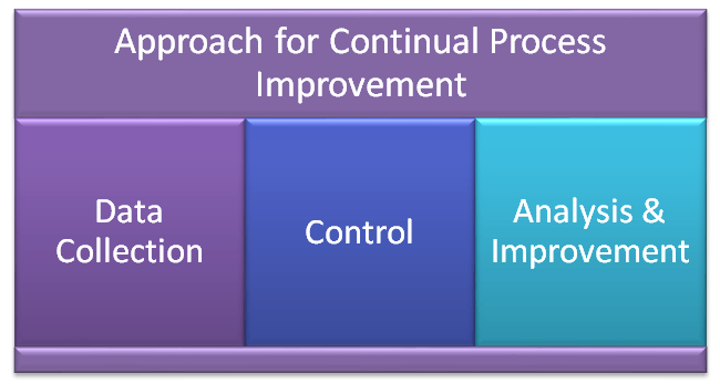
Control Chart Approach
for Continual Process Improvement:
Data Collection.
Control.
Analysis and Improvement.
Data Collection:-
To Collect Data and Plot the Control Chart.
Control:-
Calculate control limits from process data.
Identify Special Causes of Variation and Act upon them.
Analysis & Improvement:-
Quantify Common Cause Variation, and take action to reduce it.
How to Create Control Chart Excel Template| Step-by-Step Guides (X-Bar & Range Chart) with Example:
Step-1: Collect The Data day-wise/shift-wise.
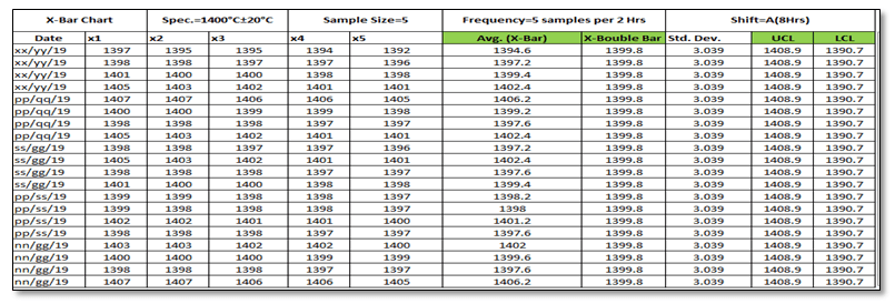
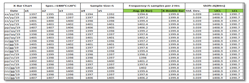
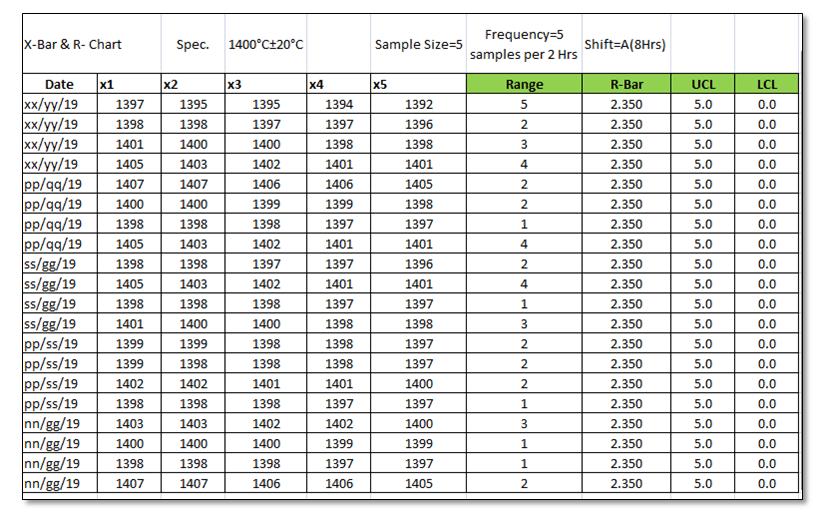
As you can see in the above figure, we have collected data with a sample size of 5 for A-Shift with frequency (5 samples per 2 hours). So we have only one shift data for 5 days. Total 100 number observations. You are supposed to collect the data as per the Control Plan or Quality Assurance Plan.
Step-2: Select
the Data types and applicable Control Chart.
So we have variable type data and the sample size is 5. Hence the applicable Chart is the Average and Range Chart (X-Bar & Range).
Step-3: According to data type and Sample size, presently we are going to plot the X-Bar & R-Chart. So individually we will plot both charts (X-Bar Chart & Range Chart). First, we will plot the X-bar chart and then the R-chart.
3.1 X-Bar Chart:
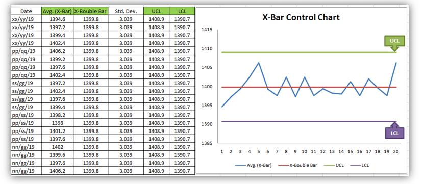
Before we start, just go through the green highlighted terms in the above figure as [1] Average
[2] X-Double Bar means an average of average. [3] Standard Deviation. [4] UCL. [5] LCL.
Calculation:
[1] Average:
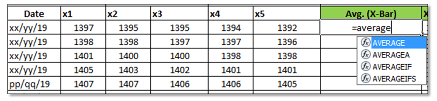
Make sure that your attention is now on the right side corner of the above figure. To calculate the average value of individual subgroup size. You have to type as (=average)and then double click on the average function and next select the sample value from x1 to x5.
[2] X-Double Bar: After calculating the Average value of all Subgroups (Individual Date wise), now we have to calculate the average of Average (Average of X-Bar).
[3] Standard
Deviation: Standard Deviation of Average (X-Bar),
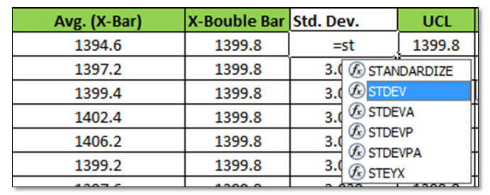
Type as (=Stdev) and select all X-Bar Data to Calculate the
Std. Dev. of Average.
[4] UCL:
UCL=X Double Bar +3*Sigma
UCL= X Double Bar +3*Standard Deviation
For the calculation of the UCL in Excel use the above formula.
[5]LCL:
LCL=X Double Bar -3*Sigma
LCL= X Double Bar -3*Standard Deviation
Use the above Formula in Excel.
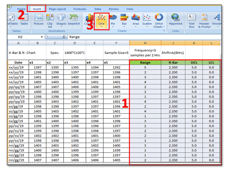
3.11 Plot X-Bar Chart: This is the last step to plot the X-Bar Chart by using Line Graph in Excel, follow the below steps:
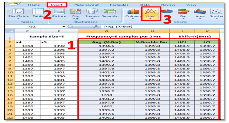
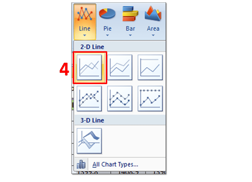
Simply Follow Sl. No.1 to 4.
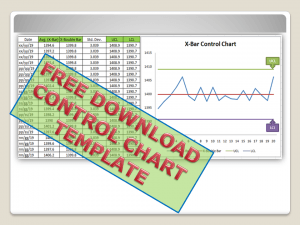
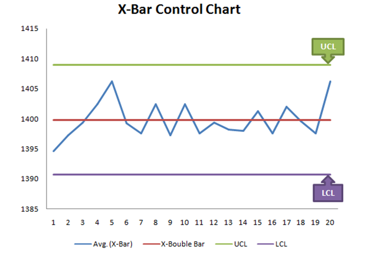
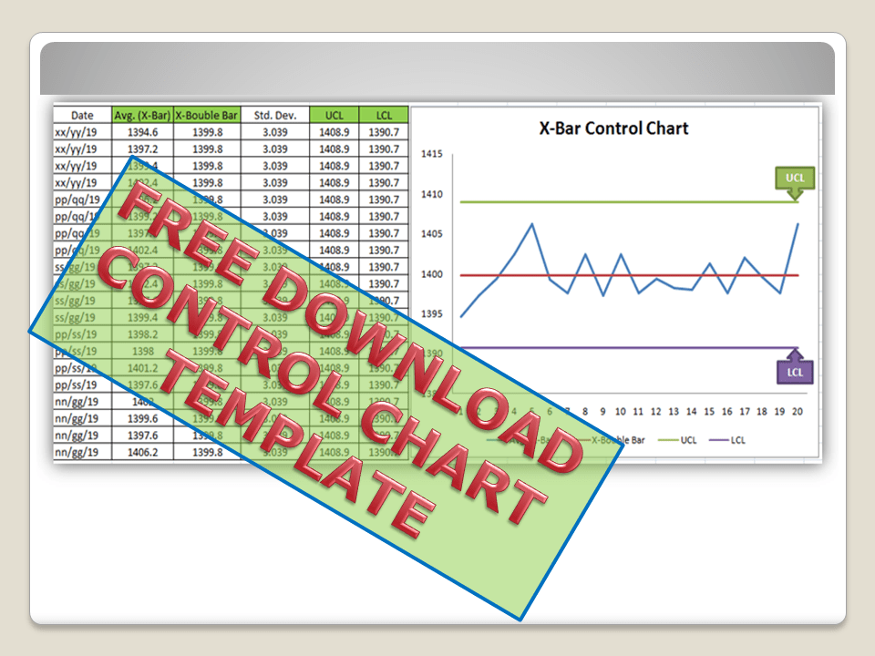
In Sl. No.1, Select X-Bar, X-Double Bar, UCL, LCL, and then select Insert Option and next to Line Chart. After selecting the Line Graph/Chart, The X-Bar Control Chart Excel Template will be ready as below.
3.2 Range Chart:
To Plot the
R-Control Chart, we have to calculate the [1] Range. [2] R-Bar (Average of
Range). [3]UCL. [4]LCL.
[1] Range: R=Max. Value – Min. Value of Subgroup.
[2] R- Bar (Average of Range): Put the Excel formula of average.
[3] UCL:
UCL= D4 x R-Bar
UCL= 2.114 x R-Bar Value of individual Subgroup. (Note for
Subgroup Size 5, D4=2.114).
Use this formula in Excel to calculate the UCL.
[4] LCL:
LCL=D3 x R-Bar
LCL=0 (Note Foe subgroup size 5, D3=0)
Simply put the “0” in the Excel sheet.
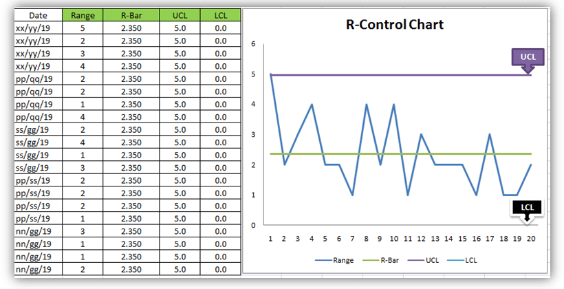
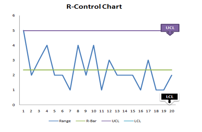
3.22 Plot R-Chart: Just follow steps 1 to 3, and select the line chart.
In step-1, you have to select the “Range, R-Bar, UCL, and
LCL” simultaneously and then select the Line Chart, after selecting the line
chart R-Control Chart Excel Template will be ready as below
Q2: How to add upper and lower control limits in Excel?
A2: Carefully read the aforesaid Articles.
Q3: How to create a control chart in Excel 2013?
A3: Step by Step guide is described above with Statistical process control chart examples. Please go through it.
Q4: How to create a Six Sigma control chart in Excel?
A4: Control charts are classified into two types [1] Variable type and [2] Attribute Type. Both two types are further classified into several as
[1]Variable types
X and MR Chart
X-Bar and Range
X-Bar and S
[2] Attribute Chart
np-chart
p-chart
u-chart
c-chart
In the above articles, we have described only how to create an X-bar and range type Control Chart in Excel with a process control chart example. As you can see all these above types of control charts are used in Six Sigma projects but the applicable chart depends on Data type and Subgroup size (Sample size).
Q5: How to calculate upper and lower control limits (UCL & LCL) in Excel?
A5: For X-Bar
Chart-UCL:
UCL=X Double Bar +3*Sigma
UCL= X Double Bar +3*Standard Deviation
For the calculation of the UCL in Excel, use the above formula.
LCL:
LCL=X Double Bar -3*Sigma
LCL= X Double Bar -3*Standard Deviation
Use the above Formula in Excel.
For R-Chart:
UCL:
UCL= D4 x R-Bar
UCL= 2.114 x R-Bar Value of individual Subgroup. (Note for
Subgroup Size 5, D4=2.114).
Shanti Gopal Pradhan is an experienced professional in Quality Management Systems, QA, Operations, Business Excellence, and Process Improvement. He has strong expertise in international standards including IATF 16949, ISO 9001, ISO 14001, ISO 45001, and ISO 17025, along with methodologies such as TQM, TPM, and Six Sigma.
He holds a degree in Mechanical Engineering along with an MBA, combining strong technical acumen with strategic business insight, he is a Certified Internal Auditor, Lead Auditor, and Six Sigma Black Belt, with a proven track record in driving quality transformation and operational excellence.
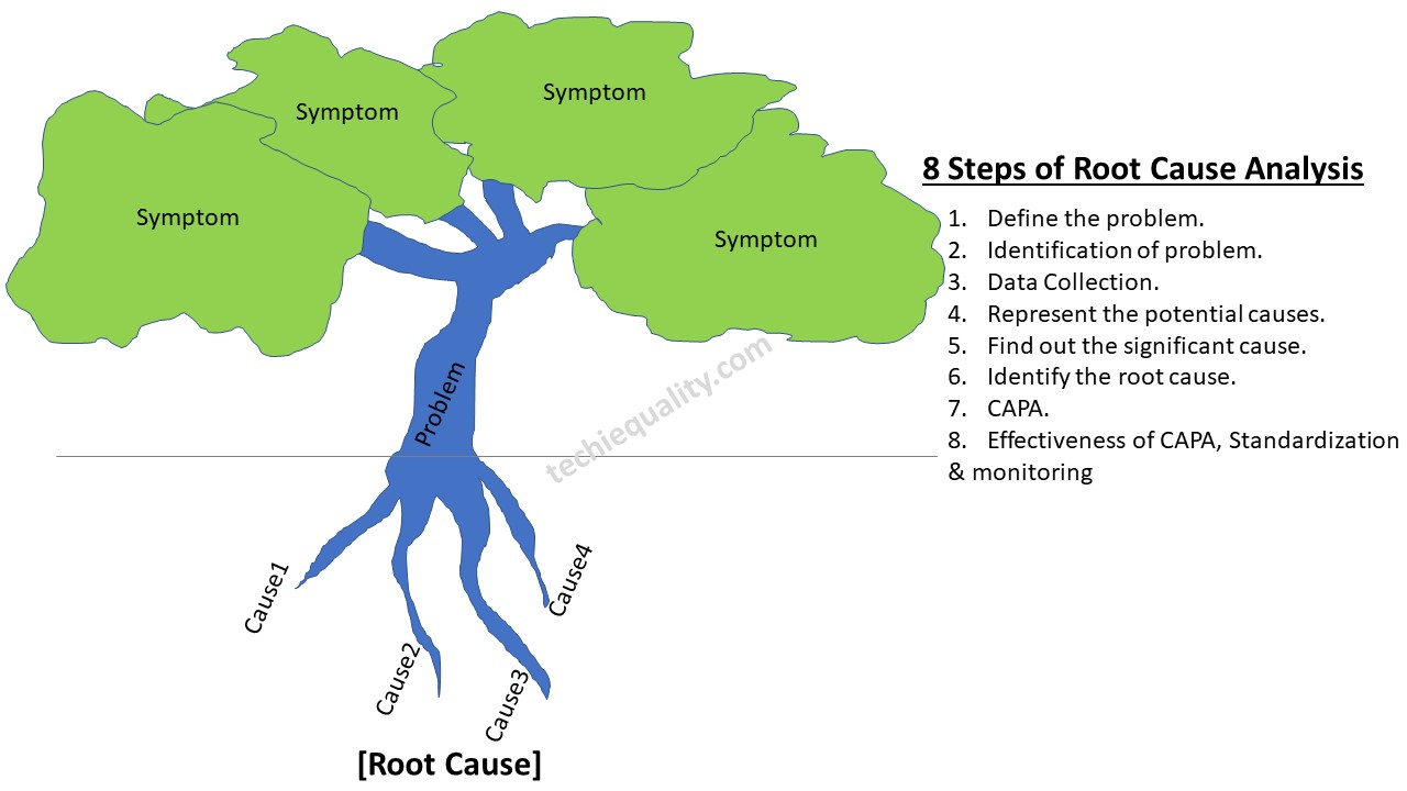
Root Cause Analysis is a frequently used and Popular Method to aid in catching the exact reason for a problem. It will help you to find out the primary cause of the problem so that we can determine what happened, and why it happened and also formulate the Prevention so that the problem will not occur again. It’s a vital part of the Continuous Improvement.
Define the Problem: – This step will
help you to understand the problem definition.
Step Two:
Identification of Problem: – What exactly happening, Where the problem is being occurred and what are the symptoms of the problem?
Step Three:
Collect Data – Before collecting the Data, You have to plot thePareto Chartof Existing Past data for the last six months at least. Then formulate the template according to the higher contributing causes with the help of the Pareto Principle (80/20 rules). Set up the Template machine-wise, process-wise, and shift-wise etc. At least collect the data for three months.
Represent The Potential Cause: – Now you have to plot the Pareto chartwith the Present collecting data. Next, to apply the Pareto principle to identify the Problems among the set, that are coming under the 80% contribution.
All Problems that are coming under the 80% contribution need to be plotted in the Fishbone Diagramindividually to represent the Potential Causes.
Find out the significant Causes: A hypothesis test needs to be executed here to find out the significant reasons.
For example, let us take the Shrinkage as the problem, which is coming under the 80% contribution (The decision will come from the Pareto chart considering its Principle rules). Let Shrinkage has three potential causes [1] High Pouring Temperature, [2] Wrong Gating System Design, [3] High Carbon Equivalent. To find out the significant causes of the three problems. We have to do the Hypothesis test as per the below pattern as
[1] High Pouring Temperature vs.
Shrinkage.
[2] Wrong Gating System Design vs.
Shrinkage
[3]High Carbon equivalent vs.
Shrinkage.
After doing the hypothesis testing as per the above pattern, one or a number of causes will come to the point as significant Causes.
Now you have to follow step six to identify the Root Cause.
Step Six:
Identify the Root Causes:-
Before you execute the root cause identification. List all significant causes. Thereafter, we have to do the Why-Why Analysis of all individual significant causes until to get the Root Causes. Once you completed the 5-whys analysis try to document these in why why analysis template.
Step Seven:
CAPA: Corrective and Preventive Action
Plan to be Prepared.
Effectiveness of CAPA: – After implementation of CAPA, Trend Analysis needs to be plotted to figure out the effectiveness of CAPA or Action Plan. If the Action Plan is fully effective then the control mechanism and action plan need to the incorporated in relevant documents (e.g. FMEA, SOP, Control Plan, etc.).
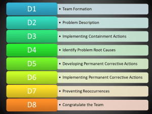
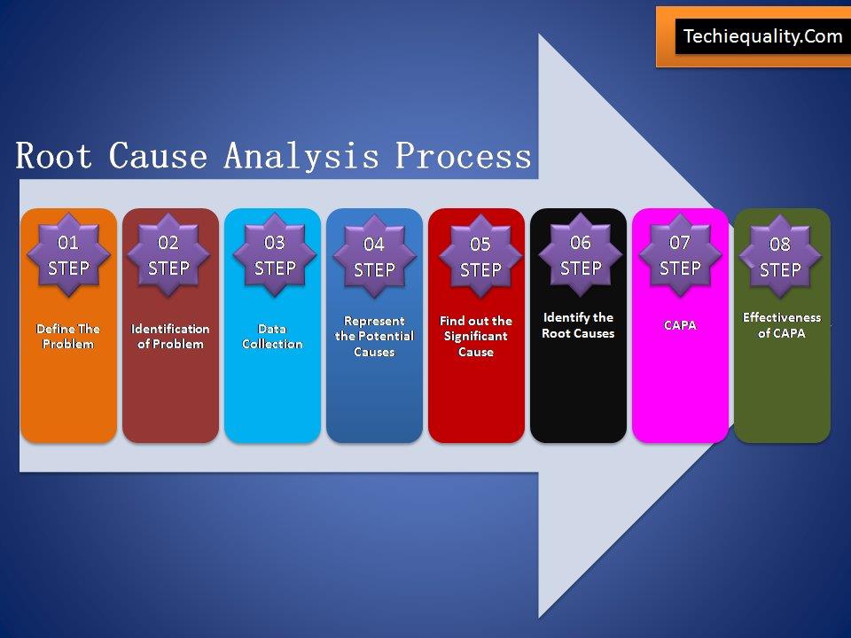
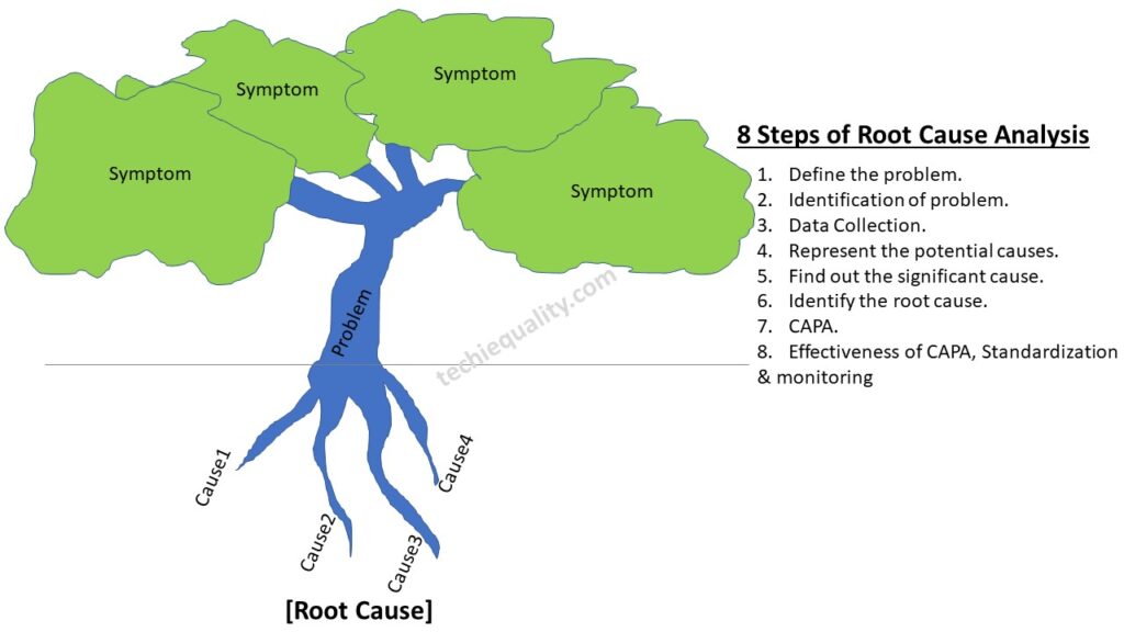
RCA or root cause analysis is a very important methodology to identify the root cause of any problem, issues, defects, non-conformities, customer complaints, warranty analysis, variation, deviation, abnormal activities, etc. There are many improvement projects being implemented in manufacturing industries such as the six sigma project, Quality Circle project, Kaizen, and small group activity project, where RCA is a vital milestone to successfully achieve the project goal. Proper RCA will help you to address the root cause for formulating the action plan to resolve the problem. You can follow the below 8 steps to do the proper RCA.
Root Cause Analysis
Before taking any example, we are going to know the tools used in RCA, for the problem statement i.e. [problem definition and identification] you can use the 5W1H or 5W2H tools. similarly, we have mentioned the tools used in the rest of the RCA steps are given below;
8 steps of RCA
Common Applicable Tools& Template
Define the problem
5W1H or 5W2H
Identification of the problem
5W1H or 5W2H
Data collection
Data collection Format, Pareto chart, etc.
Represent the potential cause
Fishbone or Cause & Effect or Ishikawa diagram
Find out the significant cause
Hypothesis test, validation of potential causes
Identify the root cause
Why-Why analysis [5W analysis]
CAPA
CAPA template, 8D, etc.
Effectiveness of CAPA, standardization & monitoring
Inspection report template, SOP, WI, CP, FMEA, etc.
RCA Examples:
Let’s consider a company manufacturing automobile parts and supplying those parts to OEM customers, but one day one complaint was received from the customer for a blow hole problem. for the same problem, the customer asked for an action plan. To resolve the problem and form an action plan the process QA engineer started the RCA [root cause analysis] of blow hole issues. They have followed the above steps for RCA and the same is given below.
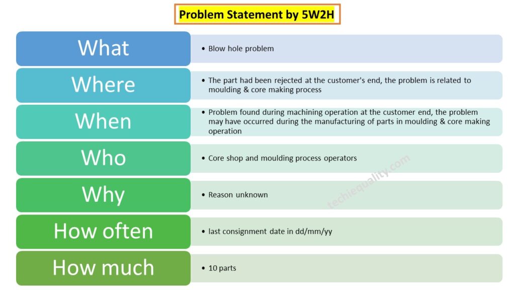
Problem Statement:
What: Blow hole problem
Where: The part had been rejected at the customer’s end, the problem is related to moulding & core making process
When: Problem found during machining operation at the customer end, the problem may have occurred during the manufacturing of parts in moulding & core making operation
Who: Core shop and moulding process operators
Why: Reason unknown
How often: last consignment date in dd/mm/yy
How much: 10 parts
Problem Statement by 5W2H
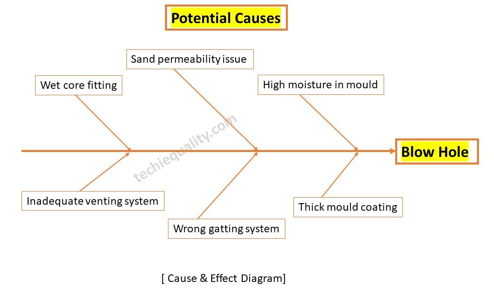
Now, with the help of a cause & effect diagram, we have to identify the potential causes for the blow hole problem, below are the listed potential causes but these are not limited to
Wet core fitted in moulding.
Inadequate venting system.
Wrong gatting system
High moisture in mould
sand permeability issue
Thick mould coating.
We plotted a cause-and-effect diagram using the above potential causes, and we show the diagram below;
Now, we have to find out the significant cause with the help of a hypothesis test or validation of potential causes. after doing the validation of all the above potential causes by following the validation methodology, we found that “wet core” was the significant cause. so the next step is the identification of the root cause.
RCA of blowhole by why-why analysis:
SC: Wet core fitted in moulding
Why: Core was wet
Why: The team did not follow the drying procedure properly.
Root Cause: Lack of awareness
After doing the root cause analysis, you have to formulate the CAPA and need to monitor the effectiveness of the action plan. then you can standardise the document and if applicable you can do the horizontal deployment of the same.
Many tools, techniques, templates, and formats help conduct root cause analysis, but here we will discuss only some common and popular ones listed below.
Root Cause Analysis is a systematic process for identifying the root causes of a problem rather than just addressing symptoms, enabling effective corrective action.
2. Why RCA Matters
RCA matters because it:
Prevents recurrence of problems
Improves process reliability.
Reduces costs from rework, failures, and incidents
Supports continuous improvement and learning
Encourages fact-based decision-making
Strengthens accountability without blame
3. When to Use RCA
RCA should be used when:
A significant incident or failure occurs
There are repeated or chronic problems
A problem has high risk, cost, or impact
Regulatory, safety, or quality requirements demand it
A process deviation leads to undesired outcomes
You need to understand system weaknesses, not just fix an error
4. When RCA is Useful
RCA is especially useful when:
The problem is complex or multi-factorial
The cause is not immediately obvious
Multiple teams or processes are involved
You need long-term corrective actions
Data, evidence, and subject matter experts are available
5. Benefits of RCA
Identifies true root causes, not symptoms
Leads to sustainable corrective actions
Improves process design and controls
Enhances organizational learning
Reduces repeat incidents
Strengthens risk management
Builds a culture of improvement
6. Limitations of RCA
Time- and resource-intensive
Results depend on data quality
Can be ineffective if:
Poorly facilitated
Politicized or blame-focused
Not ideal for:
Simple, one-off issues
Situations requiring immediate action only
May miss causes if the system boundaries are too narrow
7. Best Practices for Effective RCA
a. Define the Problem Clearly
Be specific, factual, and measurable
Focus on what happened, where, when, and the impact
b. Focus on Systems, Not People
Ask why the system allowed the error
Treat human error as a symptom, not a root cause
c. Use Structured Tools
Common RCA tools:
5 Whys
Fishbone (Ishikawa) Diagram
Fault Tree Analysis
Pareto Analysis
Process Mapping
7QC Tools
CAPA
d. Use Evidence and Data
Rely on facts, records, observations, and timelines
Avoid assumptions or opinions
e. Involve the Right People
Include process owners and subject matter experts
Encourage open, blame-free discussion
f. Identify Root Causes, Not Just Contributing Factors
Validate that removing the cause would prevent recurrence
g. Develop Strong Corrective Actions
Effective actions:
Address the root cause directly
Are measurable and realistic
Include ownership and deadlines
Prefer engineering or system controls over training alone
Shanti Gopal Pradhan is an experienced professional in Quality Management Systems, QA, Operations, Business Excellence, and Process Improvement. He has strong expertise in international standards including IATF 16949, ISO 9001, ISO 14001, ISO 45001, and ISO 17025, along with methodologies such as TQM, TPM, and Six Sigma.
He holds a degree in Mechanical Engineering along with an MBA, combining strong technical acumen with strategic business insight, he is a Certified Internal Auditor, Lead Auditor, and Six Sigma Black Belt, with a proven track record in driving quality transformation and operational excellence.
Pareto Chart Excel Template | Step by Step guide of template usages:-
Hi Readers! In this article, we have discussed on Pareto Chart Excel Template with a manufacturing example. and also you can learn here, the Pareto chart principle (80/20 rule). if you would like to download our excel template or format then, go through the below link.
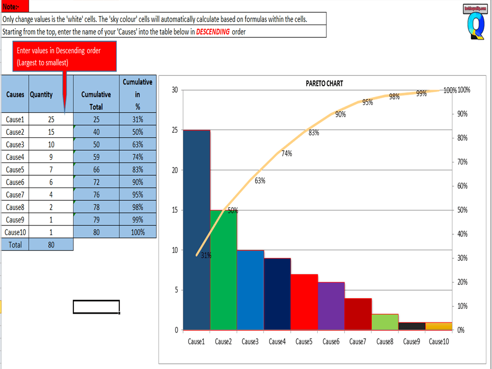
After downloading, the above Pareto Chart Excel Template Carefully read the Note and red highlighted box marked in excel.
Note 1:- White cells are only changed values. The sky colour cells will automatically calculate based on the formula within the cells.
Note 2:- Starting from the top, enter the name of causes into the table below in descending order (Largest to Smallest Values)
Example of Pareto chart:
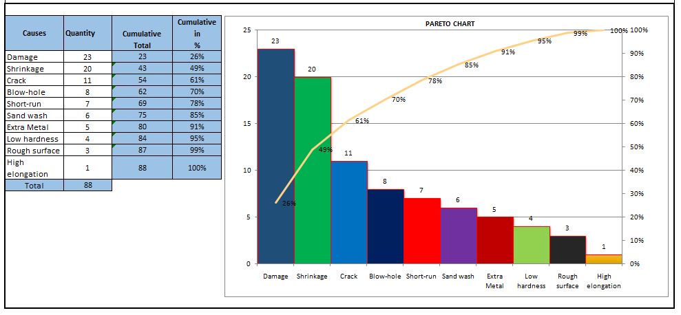
Let us have ten causes as Damage, Crack, Shrinkage, Short-run, Blowhole, Pin-hole, Extra Metal, Sand-wash, Rough Surface, Low hardness, and High elongation.
Causes
Rejection
Quantity
Damage
23
Shrinkage
20
Crack
11
Short-run
7
Blow-hole
8
Extra Metal
5
Sand wash
6
Rough surface
3
Low hardness
4
High elongation
1
Now you have to do the sorting of Rejection Quantity in
Descending order (Largest to smallest value)
Descending order of Rejection Quantity of above causes are,-
Causes
Rejection Quantity
Damage
23
Shrinkage
20
Crack
11
Blow-hole
8
Short-run
7
Sand wash
6
Extra Metal
5
Low hardness
4
Rough surface
3
High elongation
1
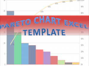
Now directly we have to enter the name of causes and Rejection quantity (After sorting the value in descending order) into white cells of the Excel template sheet. After entering the values the Pareto chart will look like as below.
The 80/20 Rule or Pareto Principle is the most important part of Pareto Analysis. The rule 80/20 says that 80% of the effects come from 20% of the causes.
In Italy, Vilfredo Pareto has originally observed that 20% of people were owned 80% of the land. This principle was applied to quality control and favoured the use of the statement of phrase, which is “The Vital few and useful many” to define the 80/20 rule in the 20th century by Dr. Joseph M. Juran. Nowadays this principle is so popular and very useful in describing the contribution of the causes.
Understanding of Principle:-
Let’s get started with this principle, and how it is applicable in different sectors like manufacturing and non-manufacturing unit or service sectors. This principle is not limited to any particular sector or unit’s problems or defects to identify the contribution. It will help you to resolve 80% of problems/causes/defects among the 100% of problems.
How this principle is related to the
different fields: – (Example)-
Filed failure (for example (a)-80% of the field failure comes from 20% of the Causes. (b)-80% of the field failure comes from 20% of the Customer).
80% of the results come from 20% of the Team.
Risk Management (e.g. 80% of the Risk comes from 20% of the Causes).
Let us have ten types of Causes and individual causes having a number of defects. Now we need to work on merely an 80% contribution to resolve the problem. But the things are how to identify the causes those are coming under the 80% contribution. So to identify the contribution we need to use the Pareto chart for knowing the contribution. So I would recommend you to download the above Pareto Chart Excel Template then, follow the steps and identify the contribution.
Advantages of Pareto Chart:
1. Production Optimisation.
2. Rejection Reduction.
3. Cost of Poor Quality Reduction.
4. Quality level Improvement.
5. Product Performance Improvement
6. Customer satisfaction Enhancement.
7. Rework cost reduction.
Etc.
The Pareto chart is the most commonly used tool in manufacturing industries, I remember when I was working in the quality department, how frequently I used this tool in our daily quality issue analysis. I used this tool on a daily line rejection analysis, as well as in different types of QA or QC projects like quality circle projects, SGA projects, Six Sigma projects, etc. With the help of the Pareto chart, you can easily visualize the defect’s contribution and accordingly, you can do an analysis of the majority contribution for improvement.
FAQ:
The Pareto chart is one of the commonly used 7 QC tools in manufacturing industries.
Shanti Gopal Pradhan is an experienced professional in Quality Management Systems, QA, Operations, Business Excellence, and Process Improvement. He has strong expertise in international standards including IATF 16949, ISO 9001, ISO 14001, ISO 45001, and ISO 17025, along with methodologies such as TQM, TPM, and Six Sigma.
He holds a degree in Mechanical Engineering along with an MBA, combining strong technical acumen with strategic business insight, he is a Certified Internal Auditor, Lead Auditor, and Six Sigma Black Belt, with a proven track record in driving quality transformation and operational excellence.
Fishbone Diagram Template With Example | Download Template
Download the Fishbone Diagram Template by clicking on the below link. Fishbone Diagram will help you to represent the Potential Causes of a Problem.
DOWNLOAD the Cause & Effect Diagram / Fishbone Diagram.
How to Use Fishbone
Diagram Template:
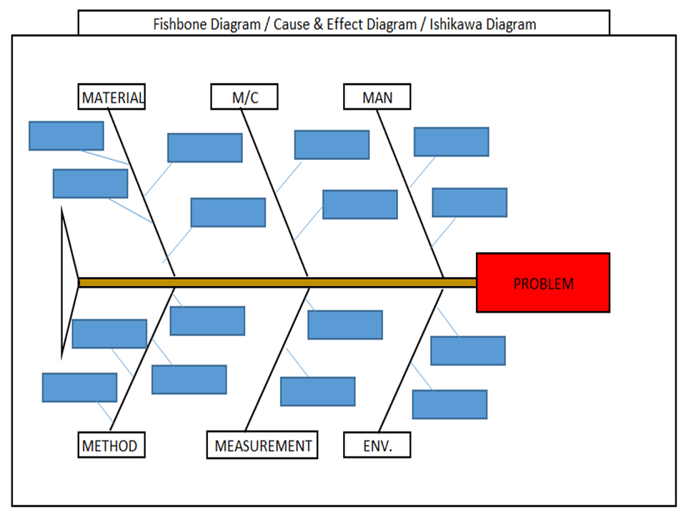
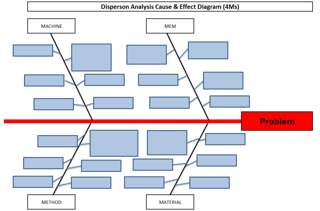
[Figure-1]
Step-1: Download the Fishbone Diagram Template (Link is given at the top)
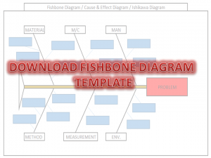
Step-2: Enter the Name of the Problem in the Red Highlighted Box, marked in the Excel template (e.g. refer to the above Figure-1 for easy understanding)
Step-3: Identify and then enter the Potential causes in the Sky color box in the Excel template under Man, Machines, Material, Method, Measurement, and Environment.
How to Identify the
Potential Causes of a Problem:
Step-1: To make a CFT Team (Cross-Functional team). Members of CFT should be from different and different processes/areas or departments. E.g. someone from production, Quality, technical, R&D, Maintenance, etc.
Step-2: Individually identify the Causes through
Brainstorming.
Step-3: Before you identify the causes by all team members, you have to list up all causes without any repetition. Next, all members of the team should sit together to identify the new causes through Brainstorming. And finally, do the list up of all causes identify by individual and team.
Step-4: Represent all potential causes in the Cause and Effect Diagram Template or Fishbone Diagram Template or Ishikawa Diagram Template.
Step-5: Identify the Significant Causes with the help of Hypothesis testing.
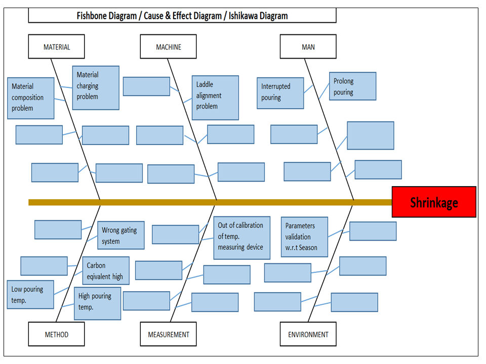
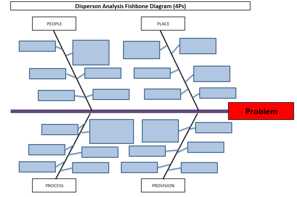
I have taken a Problem from the Iron casting Process as Shrinkage. Here I need to represent the Potential causes of Shrinkage in the Fishbone Diagram Template or Cause and Effect Diagram Template or the Ishikawa Diagram template. First of all, I made a CFT team considering the members from the production process, quality, Development, and Maintenance Department.
Instructed all members to identify the Potential cause relevant to their work function in individually through Brainstorming. Next, collect all Potential causes. And then call a meeting for further identification of Causes together with all members through Brainstorming. List up all Causes and represent those in the Fishbone Diagram Template, just like the below figure.
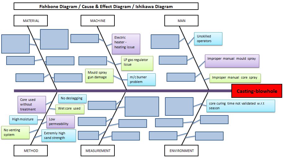
Example-2: Casting Blow-hole Problem:
Below are the potential causes that may cause the blow-hole problem in raw casting products;
Improper manual core spray.
Improper manual mould spray.
Unskilled operators.
Core curing time is not validated w.r.t season.
Core curing m/c burner problem.
LP gas regulator issue.
Electric heater -heating issue.
Mould spray gun damage.
No deslagging.
Wet core used.
Low permeability.
Extremely high sand strength.
No venting system.
High moisture.
Core used without treatment.
Benefits
of Fishbone Diagram:
It represents and displays the relationship of potential causes w.r.t Problem: – All Possible causes will represent them under which category among the man, machines, method, measurement, material, and environment.
Accumulate the possible Reasons in a single diagram: – It will be very difficult to resolve the problem without any idea of the Possible or Potential causes of any problem. So this diagram will show you all the causes simultaneously.
Involvement in Brainstorming: – It will help you to boost and structure the brainstorming to identify the possible causes or reasons.
It will help you to maintain the team focus to achieve the common goal: – As you know the team mission is to achieve the common goal means to identify the possible causes or reasons. All team members will identify the Causes or Reasons individually and together in a team to list-up the possible causes.
How to plot Ishikawa or cause and effect diagram of customer complaint:
first of all, download the cause and effect diagram template or Ishikawa diagram template from the given above link (at the top) and then follow the below steps. As per my own experience regarding the preparation of cause and effect diagrams related to customer complaints. at first, when I received a customer complaint, I just tried to understand the nature and type of problem and immediately called for a meeting for initial problem understanding with team members. Once it’s understood by all the team members, then we form a special team for 8D or CAPA formation.
Before doing the why-why analysis we have to identify the potential causes by using popular tools i.e. fishbone or cause & effect or Ishikawa diagram. To do so, the individual team members should identify the potential cause w.r.t customer complaints, Once you collect the all identified potential causes by individual members, then you have to plot the final fishbone diagram to keep in your mind with the repeated potential causes. when you choose to form the team at that time members should be in CFT of that process where the customer problem is related.
Shanti Gopal Pradhan is an experienced professional in Quality Management Systems, QA, Operations, Business Excellence, and Process Improvement. He has strong expertise in international standards including IATF 16949, ISO 9001, ISO 14001, ISO 45001, and ISO 17025, along with methodologies such as TQM, TPM, and Six Sigma.
He holds a degree in Mechanical Engineering along with an MBA, combining strong technical acumen with strategic business insight, he is a Certified Internal Auditor, Lead Auditor, and Six Sigma Black Belt, with a proven track record in driving quality transformation and operational excellence.
Root Cause Analysis Template | Excel Format with Manufacturing Example
Hello readers! Today we are going to discuss on an important topic is RCA (Root Cause Analysis), with details applications with manufacturing examples. If you would like to download the Root Cause Analysis Template in Excel format, then download it from the link given below.
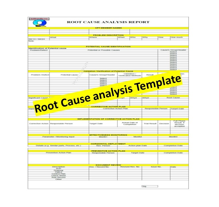
Root Cause Analysis Template sample copy: DOWNLOAD
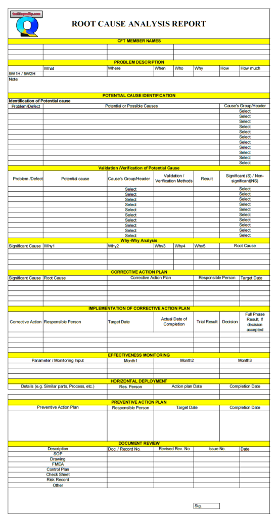
RCA (Root Cause Analysis) is the methodology that is used to analyze the problem, defect, issues, deviation, complaint, etc., to find out the root cause. This is a very common methodology used in manufacturing, process, and other industries. RCA methodology consists of many tools and techniques like 5W1H, 5Whys, cause and effect diagram, CAPA, Risk identification, Documentation, etc.
Root Cause Analysis plays an important role in problem-solving and continuous improvement. There are small and big problems in every company, and a problem becomes a big factor when it becomes a challenge for the company. Hence, we have to do the root cause analysis in time. Below are the steps you can follow for effective root cause analysis.
CFT Formation
Problem Description
Potential cause identification
Validation of the potential cause
Why-why analysis
Corrective action plan
Implementation of the corrective action plan
Effectiveness monitoring
Horizontal deployment
Preventive action plan
Document review
All the above 11 steps are important for effective root cause analysis and also, and we have prepared the RCA template considering with above points.
Now we will be discussing the details of all 11 steps with manufacturing examples.
CFT Formation
During the cross-functional team formation, you have to keep some important points in mind, all members should be from different functions/departments. Establish the clear roles and responsibilities of each member, make a communication plan, provide training, and support them to get the effective brainstorming section for identification of potential causes and solution ideas.
Suppose a company manufacturing automobile parts has a 5% rejection percentage, and they want to analyze the defects to find out the root cause and implement the action plan to reduce the rejection percentage and to achieve the target value.
As per 1st step of RCA, they form a CFT team for a particular process where the rejection percentage was high. The team members were from multiple departments, including Production, Quality, Maintenance, Tooling, Technical R&D, etc.
Problem Description:
For identification of defect contribution and description, you can use the popular common tools and methodologies like 7QC tools, 5W1H, and 5W2H, etc.
In the above example, you can easily identify the defect contribution by plotting the Pareto chart and describing the problem in any of the one methodologies like 5W1H or 5W2H as applicable. These are the very common tools and methodologies used in industries.
Potential cause identification:
Once you describe the problem, you can start the brainstorming section by selecting a CFT member, and you can represent these by plotting cause & effect diagram / fishbone diagram.
Allow your CFT member to freely identify the potential causes of the defect/ problem. Set a feasible & favorable rule for CFT so that each member can provide you maximum number of potential causes.
Validation of the potential cause
In this step, we have to identify the significant cause among all potential causes, to do so, there are many validation methods are used, like inspection, checking, testing, etc.
Suppose there is a shrinkage defect in an automobile casting part. Through the brainstorming section by CFT members, we have identified the many potential causes, like a wrong gating system, high pouring temperature, low pouring temperature, pouring time, core moisture condition, etc.
So, if you would like to validate those potential causes by a hypothesis test, then you have to collect the data first then, need to execute the applicable hypothesis test. After getting the p-value, you have to conclude a decision. This is one of the methods, but you can also apply the checking methods as well. In this method, you have to check the potential cause result/ condition/ parameter with the Standard specification or SOP or drawing, whether it is meeting the standard or not, if “not meeting the standard” then it’s a significant cause.
Why-why analysis
The 5-whys analysis is the most important step and method. Where you have to ask “why” multiple times to find out the root cause of a problem. Go through the example given below for a better understanding.
Significant cause: Shrinkage
Why1: Why shrinkage on casting part
Why2: Why low pouring temperature
Why3: Why pouring temperature of the last part casting was not monitored/checked
Root Cause: The pouring temperature monitoring /checking procedure was not followed.
Corrective action plan
Based on the root cause you have to prepare the action plan. For the above example, you can take corrective action as periodic awareness training on pouring temperature monitoring.
The action to eliminate the root cause of the problem is called corrective action.
Implementation of the corrective action plan
Before implementing the full phase implementation, you can do the trial implementation of corrective action, if it will be effective then do the full phase implementation.
Effectiveness monitoring
Effectiveness monitoring is essential to measure performance. For example, if you have implemented the action plan for shrinkage defects and started monitoring the shrinkage defect for 3 months, then you can get a clear-cut idea whether your action plan is effective or not. Otherwise, you can drop the corrective action idea and can immediately take the next corrective action plan and again monitor the effectiveness. This process should repeat until it achieves the target.
Horizontal deployment
If you have a similar process, then you can easily deploy the action plan in that process also. For example, if you have another manufacturing plant with the same process, then you can deploy the action plan in another plant also.
Preventive action plan.
The action to eliminate the potential cause of a problem is called preventive action. You can establish and implement the control mechanism for each potential cause can help you to eliminate and reduce the problem.
Document review
Document review & updation are the most important steps. Where you can standardize the process SOP, drawing, FMEA, Control plan, checksheet, Risk record, etc.
Below are some common and popular tools, techniques, methods, and important templates. Those are used directly or indirectly for the RCA, Continuous Improvement project.
A root cause analysis template is a structured document used to systematically investigate problems and identify the root causes. The template guides teams through logical steps to ensure permanent corrective actions.
Why Use a Root Cause Analysis Excel Template?
An Excel template is one of the most effective formats for root cause analysis because it is:
Easy to customize
Familiar to most teams
Ideal for data entry and tracking
Simple to share and update
Suitable for audits and documentation
A root cause analysis Excel template allows you to capture problems, potential causes, corrective & preventive actions, Horizontal deployment, and results in one structured file.
Root Cause Analysis Format Explained
This standard root cause analysis format in Excel includes the following sections:
CFT Member Name – Cross-Functional Team’s member list
Problem Description: Clear description of the issue/problem
Potential cause identification: To identify the potential cause through CFT
Validation / Verification of potential cause
Root Cause Identification – Why the problem occurred
Corrective Actions – Actions to eliminate the root cause
Implementation of the corrective action plan
Effectiveness Verification – Confirmation that the problem is solved
Horizontal deployment.
Preventive Action: Actions to eliminate the potential cause
Document review
This format ensures that problems are solved permanently, not repeatedly.
These practices increase the effectiveness of any root cause analysis Excel template.
Common Mistakes in Root Cause Analysis Format
Avoid these common errors:
Jumping to conclusions
Treating symptoms instead of causes
Weak problem statements
No follow-up on actions
Poor documentation
Using a structured RCA template helps prevent these mistakes.
What is the best root cause analysis template?
The best root cause analysis template is a clear Excel-based format that includes problem definition, root cause identification, corrective actions, and verification.
How do you format a root cause analysis?
A proper RCA format includes a problem statement, data analysis, root cause determination, corrective actions, and effectiveness checks.
Shanti Gopal Pradhan is an experienced professional in Quality Management Systems, QA, Operations, Business Excellence, and Process Improvement. He has strong expertise in international standards including IATF 16949, ISO 9001, ISO 14001, ISO 45001, and ISO 17025, along with methodologies such as TQM, TPM, and Six Sigma.
He holds a degree in Mechanical Engineering along with an MBA, combining strong technical acumen with strategic business insight, he is a Certified Internal Auditor, Lead Auditor, and Six Sigma Black Belt, with a proven track record in driving quality transformation and operational excellence.