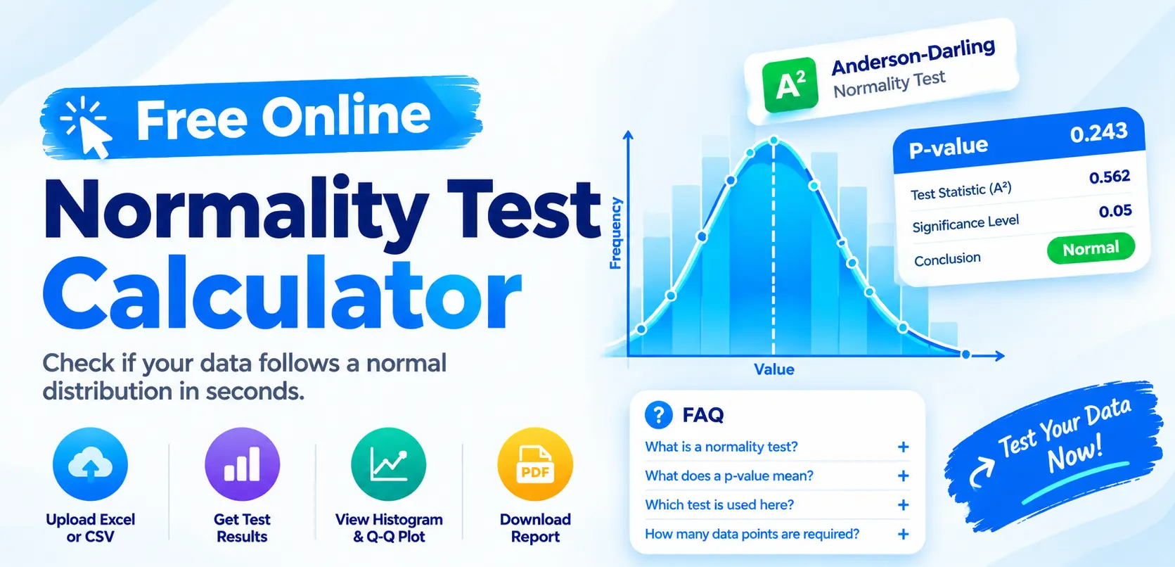
Free Online Normality Test Calculator
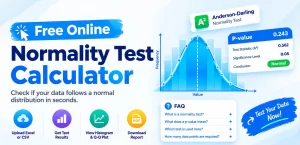
Check whether your data follows a normal distribution using our free online Normality Test Calculator. Analyze your data quickly with the Anderson-Darling test, p-value, histogram and Q-Q plot.
Normality Test Calculator | Free Online Normality Test
Checking whether your data follows a normal distribution is an important step in statistical analysis, Six Sigma, quality control, process improvement, and data analysis. Our free online Normality Test Calculator allows you to test your data without installing statistical software. You can upload an Excel or CSV file or enter your measurements manually. The calculator performs an Anderson-Darling normality test and provides the test statistic, p-value, normality conclusion, histogram, Q-Q plot, and statistical interpretation.
Free Online Normality Test Calculator
Use the calculator above to quickly determine whether your dataset is consistent with a normal distribution.
You can:
- Upload Excel (.xlsx or .xls) data
- Upload CSV data
- Enter data manually
- Select a measurement column from an Excel file
- Analyse multiple columns together
- Analyse an entire worksheet
- Calculate the Anderson-Darling normality test
- View the p-value and test statistic
- View the mean, standard deviation, minimum, maximum, and range
- Examine a histogram
- Examine a Q-Q plot
- Download a PDF normality test report
The calculator requires at least 8 data points to perform the analysis.
What Is a Normality Test?
A normality test is a statistical method used to determine whether a dataset is reasonably consistent with a normal probability distribution.
A normal distribution is commonly represented by the familiar bell-shaped curve. Data that approximately follows a normal distribution tends to be distributed symmetrically around its mean, with observations becoming less frequent as they move further away from the center.
Normality is an important assumption in many statistical methods. Therefore, checking the distribution of your data can help you determine whether a statistical method based on normality is appropriate.
A normality test does not prove that a dataset is perfectly normal. Instead, it provides statistical evidence about whether the data are inconsistent with a normal distribution. Based on the above, you can do the Normality Test Online.
Why Is Normality Testing Important?
Normality testing is frequently used in:
- Six Sigma projects
- Quality control
- Manufacturing
- Process capability analysis
- Statistical process control
- Measurement system analysis
- Engineering analysis
- Scientific research
- Hypothesis testing
- Statistical modelling
- Data analysis
For example, before performing a Cp or Cpk process capability analysis, analysts often examine whether the process data are reasonably consistent with a normal distribution.
Similarly, normality can be relevant when selecting statistical methods that make distributional assumptions.
However, normality should not be evaluated using a p-value alone. The shape of the data should also be examined using graphical methods such as a histogram and Q-Q plot.
How to Use the Normality Test Calculator
Using the online normality test calculator (our Free Normality Test) is straightforward.
Step 1: Prepare Your Data
Prepare a single column of numerical measurements.
For example:
1398
1402
1405
1397
1401
1404
1399
1403
1400
1406
Your dataset should contain numerical observations rather than text or categorical values.
Step 2: Upload Your Data or Enter It Manually
The calculator supports:
- Excel files
- CSV files
- Manual data entry
For Excel files, the first row can contain a column heading.
You can also select the relevant measurement column when your workbook contains multiple columns.
Step 3: Run the Normality Test
After loading the data, run the analysis.
The calculator evaluates the dataset using the Anderson-Darling normality test.
Step 4: Review the Results
The calculator provides:
- Sample size
- Mean
- Standard deviation
- Minimum
- Maximum
- Range
- Anderson-Darling statistic
- p-value
- Significance level
- Normality conclusion
You can then examine the histogram and Q-Q plot to understand the shape of your data.
Anderson-Darling Normality Test
The Anderson-Darling test is a statistical test used to evaluate whether sample data are consistent with a specified probability distribution, including the normal distribution.
In this calculator, the Anderson-Darling test is used to assess normality.
The results include an adjusted Anderson-Darling statistic (A²) and a p-value.
The calculator uses a significance level of:
α = 0.05
The p-value is then compared with the significance level.
Normality Test Hypotheses
The normality test can be expressed using two hypotheses.
Null hypothesis (H₀)
The data come from a normal distribution.
Alternative hypothesis (H₁)
The data do not come from a normal distribution.
The p-value provides evidence that helps determine whether the null hypothesis should be rejected at the selected significance level.
How to Interpret the Normality Test P-Value
The p-value is one of the most important parts of a normality test.
For this calculator, the significance level is:
α = 0.05
There are two common situations.
If p-value > 0.05
When the p-value is greater than 0.05, there is not enough statistical evidence at the 5% significance level to reject the null hypothesis of normality.
In practical terms:
The data are consistent with a normal distribution based on this test.
This does not mean that the data are proven to be perfectly normal.
For example:
p-value = 0.247
Because:
0.247 > 0.05
the normality test does not provide sufficient evidence to reject the normal-distribution assumption.
If p-value ≤ 0.05
When the p-value is less than or equal to 0.05, the test provides evidence against the null hypothesis of normality.
For example:
p-value = 0.018
Because:
0.018 ≤ 0.05
the normality hypothesis is rejected at the 5% significance level.
The next step should be to examine the histogram and Q-Q plot and investigate possible reasons for the non-normal pattern.
Why You Should Not Look at the P-Value Alone
A normality test should ideally be interpreted together with graphical analysis.
Your calculator provides both a histogram and a Q-Q plot for this purpose.
This is useful because statistical tests can be affected by sample size.
With a very large dataset, relatively small departures from normality can produce a small p-value.
With a small dataset, substantial departures from normality may not always produce strong statistical evidence.
Therefore, statistical significance and practical distribution shape should be considered together.
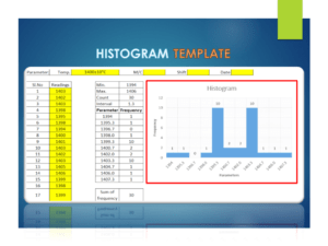
Understanding the Histogram
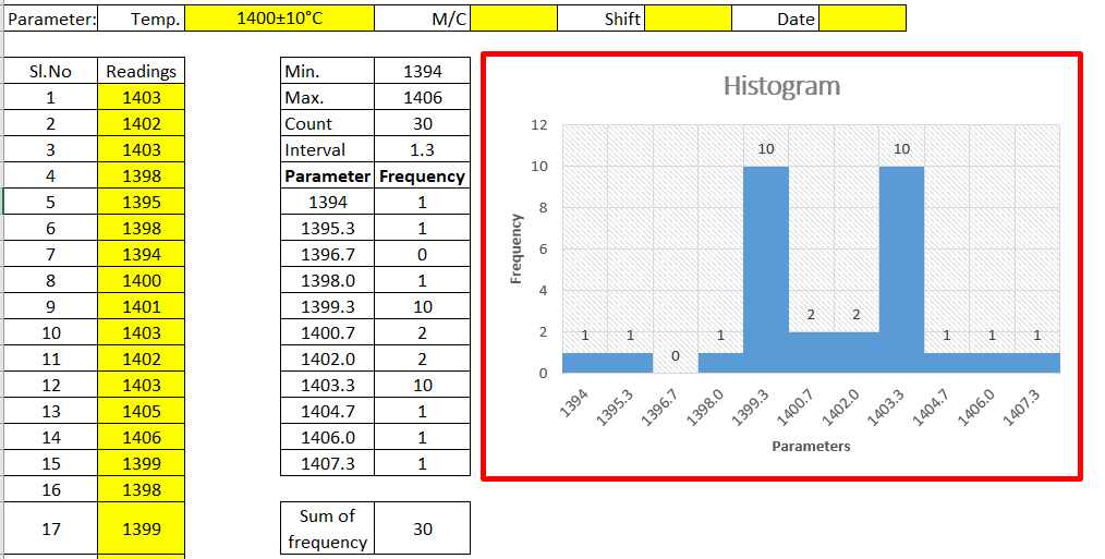
A histogram shows how frequently observations occur across different ranges of values.
A dataset that is approximately normally distributed often produces a roughly:
- Bell-shaped distribution
- Symmetrical distribution
- Single-peaked distribution
However, real-world data do not need to form a perfectly symmetrical bell curve to be useful for statistical analysis.
Look for patterns such as:
- Strong right skew
- Strong left skew
- Multiple peaks
- Heavy tails
- Extreme observations
- Gaps in the distribution
These patterns can provide clues about why a normality test may indicate non-normality.
Understanding the Q-Q Plot
A Q-Q plot, or quantile-quantile plot, compares the observed data with the theoretical quantiles expected under a normal distribution.
If the observations approximately follow the reference pattern, the data are more consistent with a normal distribution.
Large systematic departures from the reference line may indicate:
- Skewness
- Heavy or light tails
- Outliers
- Other departures from normality
The Q-Q plot is therefore a useful visual complement to the Anderson-Darling test.
What Does a Normal Q-Q Plot Look Like?
When data are reasonably consistent with a normal distribution, the points in a normal Q-Q plot generally follow an approximately straight-line pattern.
Small deviations are common in real datasets.
The important question is whether the deviations are random and relatively small or whether there is a clear systematic pattern.
For example, pronounced curvature at the ends of the Q-Q plot may indicate differences in the tails of the observed and theoretical distributions.
What If My Data Are Not Normally Distributed?
If your normality test indicates non-normality, do not immediately delete observations or transform the data.
First investigate the data.
Possible causes include:
1. Outliers
One or more extreme observations can strongly affect the distribution.
Investigate whether the observation represents:
- Measurement error
- Data-entry error
- An unusual but legitimate event
- A special cause
- A genuine part of the process
2. Skewness
Some processes naturally produce skewed data.
Examples can include measurements that have a natural lower boundary or processes where unusually large values occur more frequently than unusually small values.
3. Mixed Processes
A dataset may combine observations from different populations or operating conditions.
For example, measurements collected from two different machines or process settings may produce a multi-modal distribution.
4. Measurement Problems
Poor measurement systems can also contribute to unusual patterns.
Before making statistical conclusions, verify that the data were collected consistently.
Does Non-Normal Data Mean the Process Is Bad?
No.
A non-normal distribution does not automatically mean that a process is defective or out of control.
Normality describes the distribution of the measurements.
Process performance and process stability are different questions.
For example, a stable process can produce data that are not normally distributed.
The correct statistical method depends on the objective of the analysis, the data structure, and the assumptions of the method being used.
Normality Test and Six Sigma
Normality testing is commonly encountered in Six Sigma and quality improvement projects.
During a DMAIC project, analysts may evaluate the distribution of process measurements before selecting or interpreting statistical methods.
For example, normality may be considered when working with:
- Process capability
- Control charts
- Hypothesis tests
- Measurement data
- Process performance
- Statistical analysis
However, the appropriate method should always be determined from the characteristics of the data and the specific statistical objective.
Normality Test vs Histogram
A histogram is a graphical method for examining the distribution of data.
A normality test is a statistical method for testing a distributional assumption.
They complement each other.
| Method | Purpose |
| Histogram | Visually examine the distribution |
| Q-Q plot | Compare observed quantiles with theoretical normal quantiles |
| Anderson-Darling test | Statistically test consistency with normality |
| P-value | Quantify evidence against the null hypothesis |
Using both statistical and graphical evidence generally provides a more informative assessment than relying on one method alone.
How Many Data Points Are Needed?
The calculator requires a minimum of 8 observations before the analysis can be performed.
However, the appropriate sample size depends on the statistical objective and the characteristics of the dataset.
A larger sample generally provides more information about the underlying distribution, but larger samples can also make normality tests sensitive to relatively small departures from normality.
Therefore, sample size should always be considered when interpreting the result.
Normality Test Example
Suppose you collect measurements from a manufacturing process and want to determine whether the measurements are reasonably consistent with a normal distribution.
You enter the observations into the calculator.
The calculator reports:
- Sample size: 50
- Mean: 1401.2
- Standard deviation: 4.13
- Anderson-Darling statistic: calculated from the data
- p-value: calculated from the data
- Significance level: 0.05
Suppose the resulting p-value is:
0.126, means 0.126 > 0.05
there is not enough evidence at the 5% significance level to reject the null hypothesis of normality.
You would then examine the histogram and Q-Q plot to determine whether the distribution also appears reasonably consistent with normality.
What Is the Difference Between Normality and Normal Distribution?
A normal distribution is a theoretical probability distribution characterized by its mean and standard deviation.
Normality refers to how closely observed data are consistent with that distribution.
Can I Perform a Normality Test Online?
Yes.
An online normality test calculator can perform the statistical calculation directly in a web browser.
This can be useful when you want to quickly analyse a dataset without installing software.
The techiequality calculator allows you to upload Excel or CSV data or enter measurements manually and then analyse the data using the Anderson-Darling normality test.
Can I Use Excel Data for the Normality Test?
Yes.
The calculator supports Excel files with .xlsx and .xls extensions. It can also accept CSV files.
When an Excel workbook contains multiple columns, the calculator provides options for selecting a measurement column, combining multiple columns, or analysing a whole sheet.
Can I Download the Normality Test Report?
Yes.
After the analysis is completed, the calculator can generate a PDF normality test report.
The report includes the calculated statistical results and visual analysis.
This can be useful for maintaining statistical analysis records or documenting results during quality and Six Sigma projects.
Frequently Asked Questions
What is a normality test?
A normality test is a statistical procedure used to evaluate whether sample data are consistent with a normal distribution.
What is a normality test calculator?
A normality test calculator is an online statistical tool that calculates a normality test from a dataset and provides statistical results such as a test statistic and p-value.
Is this normality test calculator free?
Yes. The Techiequality online normality test calculator is a free
Which normality test does this calculator use?
This calculator uses the Anderson-Darling normality test.
What does p > 0.05 mean in a normality test?
A p-value greater than 0.05 means there is not enough statistical evidence at the 5% significance level to reject the null hypothesis that the data come from a normal distribution.
What does p ≤ 0.05 mean?
A p-value less than or equal to 0.05 provides evidence against the null hypothesis of normality at the 5% significance level. The histogram and Q-Q plot should also be examined.
What is the Anderson-Darling test?
The Anderson-Darling test is a statistical goodness-of-fit test that can be used to assess whether sample data are consistent with a specified distribution, including the normal distribution.
Can I upload CSV data?
Yes. The calculator supports CSV files.
Can I upload Excel data?
Yes. The calculator supports .xlsx and .xls files.
Can I enter data manually?
Yes. You can enter numerical observations manually instead of uploading a file.
How many observations are required?
The calculator requires at least 8 data points to run the analysis.
What should I do if my data are not normal?
First, investigate the histogram, Q-Q plot, outliers, skewness, measurement conditions, and whether the dataset combines different processes or populations. Then select an appropriate statistical method based on your analysis objective.
Thank you for visiting … Keep Visiting Techiequality


Shanti Gopal Pradhan is an experienced professional in Quality Management Systems, QA, Operations, Business Excellence, and Process Improvement. He has strong expertise in international standards including IATF 16949, ISO 9001, ISO 14001, ISO 45001, and ISO 17025, along with methodologies such as TQM, TPM, and Six Sigma.
He holds a degree in Mechanical Engineering along with an MBA, combining strong technical acumen with strategic business insight, he is a Certified Internal Auditor, Lead Auditor, and Six Sigma Black Belt, with a proven track record in driving quality transformation and operational excellence.