Normal Distribution Probability Formula, Calculation & Manufacturing Examples
Hello readers! Today we will be discussing the normal distribution probability calculation with manufacturing example. If observed or recorded data are normally distributed then you can calculate the probability in easy three ways by Z score table, by using excel function and last but not least method is by help of Minitab software. So here we are going to learn all three methods with manufacturing example.
Normal Distribution Probability Calculation:
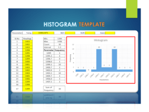
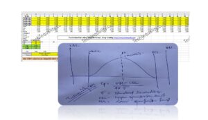
Before discussing on probability calculation of normally distributed data, you should ensure that data are followed normal distribution. To do so, you can either plot a graph or can execute the hypothesis test just to confirm the distribution. For example, you have plotted the histogram to know the data distribution for normality then you can pay attention towards the data symmetric followed by the bell curve. If data are symmetric then we can call the data are normally distributed. But sometimes it may be difficult to understand from the graph then you can go for a hypothesis test as well.
Once you confirm the normal distribution, whether data are normally distributed or not, then you can follow the following below 3- methods for calculating the probability.
Probability calculation by Z score table
By using Excel function
By using Minitab software
Normal Distribution Probability Calculation with Manufacturing Examples:
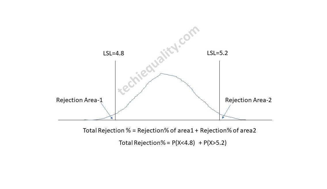
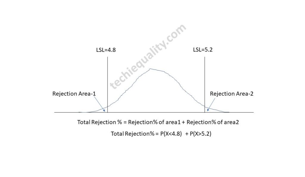
Now, let’s talk about the normal distribution examples and solutions of manufacturing industry. Suppose a company manufacturing the metal sheet having specification range of thickness is 5±0.2. Thickness of random sample of 31 nos sheet is given below then, Calculate the total rejection percentage?
Sheet No.
Sheet Thickness
1
4.97
2
4.99
3
5.01
4
5.04
5
4.98
6
4.99
7
5.03
8
5.05
9
4.96
10
4.98
11
5.02
12
5.04
13
5.05
14
5.21
15
5.03
16
5.04
17
5.1
18
5.09
19
5.01
20
5
21
5.03
22
5.01
23
5.12
24
5.08
25
5.09
26
4.99
27
5.04
28
5.07
29
5.08
30
5
31
4.98
Calculation:
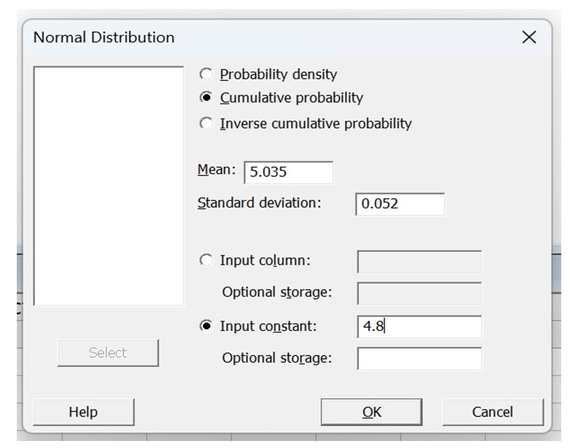
Mean = 5.035, Standard deviation = 0.052, USL = 5.2, LSL = 4.8
Total Rejection percentage calculation using Z Score:
The normal distribution probability formula using z score and cumulative probability table is given below.
Z Score Formula = (Observed Value – Mean) / Standard Deviation
Z Score @4.8 = 4.8-5.035/0.052
= -4.52
Z score @5.2 = 5.2- 5.035/0.052
= 3.17
Based on Z score vale -4.5, the cumulative probability (P(X<4.8)) is 0.0000034 (Data from z score table).
The cumulative probability P(X<5.2) based on Z score 3.17 is 0.9992
P(X>5.2) = 1- P(X<5.2) = 1-0.9992 = 0.0008
Total Rejection = P(X<4.8) + P(X>5.2)
= 0.0000034 + 0.0008 = 0.000803
Total Rejection% = 0.08%
Total Rejection percentage calculation using Excel function:
Formula for normal distribution probability using excel function is given below, just follow the beneath provided function to calculate the probability.
Mean = 5.035, Standard deviation = 0.052, USL = 5.2, LSL = 4.8
Excel Function Formula = NORM.DIST(x, mean, standard deviation, cumulative)
P(X<4.8) = NORM.DIST(4.8,5.035,0.052,TRUE-cumulative distribution function)
= 0.0
P(X>5.2) = 1- P(X<5.2) = 1- 0.9992 = 0.0008
Total Rejection% = 0.08%
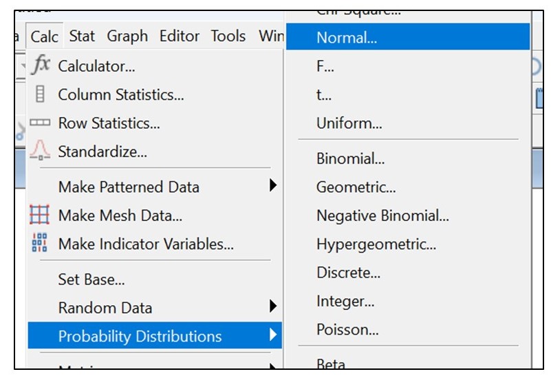
Total Rejection percentage calculation using Minitab:
Follow the below steps to open the normal distribution page
Shanti Gopal Pradhan is an experienced professional in Quality Management Systems, QA, Operations, Business Excellence, and Process Improvement. He has strong expertise in international standards including IATF 16949, ISO 9001, ISO 14001, ISO 45001, and ISO 17025, along with methodologies such as TQM, TPM, and Six Sigma.
He holds a degree in Mechanical Engineering along with an MBA, combining strong technical acumen with strategic business insight, he is a Certified Internal Auditor, Lead Auditor, and Six Sigma Black Belt, with a proven track record in driving quality transformation and operational excellence.
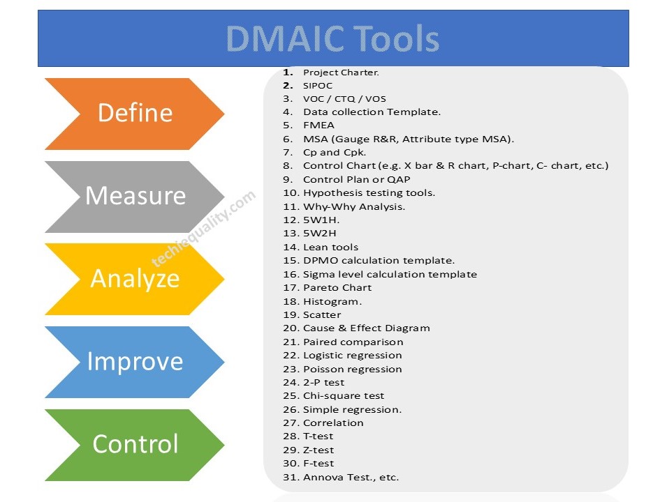
Hello readers! Today we are going to discuss an important topic on various DMAIC tools, Six Sigma methodologies, and the DMAIC template and its usage. Six Sigma is a very popular methodology that has been using in manufacturing industries for continuous improvement. A set of methodologies and various tools are used to improve the processes by optimizing efficiency, eliminating waste, reducing defects, minimizing variation, reducing errors, and increasing quality, etc. The main objectives of Six Sigma projects are to enhance the Sigma level and to reduce or minimize the DPMO (Defects per million opportunities).
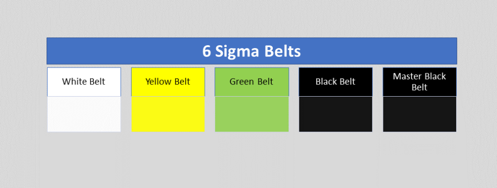
What are the Six Sigma Belt Levels?
As we know that there are various belts in Six Sigma certifications, for example, master black belts, black belts, green belts, yellow belts, white belts, etc. Let’s understand the details of all belts;
Six Sigma Belts Level
White Belt:
This is the first level of six sigma certification. During white belt certification, you can learn the overview of the entire six sigma course. This six sigma course mainly emphasizes the basic concept of six sigma, fundamental methodology, terminology, etc. the course time periods may depend on the course providers once you are certified in the course you can easily understand the basic of Six Sigma and can work as problem-solving team that supports the overall projects teams. Many times people are confused about choosing the six sigma certification belt level. But I hope after reading all the Six Sigma belt levels, you can easily choose the course for yourself.
Yellow Belt:
Don’t confuse yourself when hearing about different types of belts. Different types of belts are classified according to the different levels of course like basic to advanced, roles of the certificate holder, level of project, knowledge level, etc. so according to your understanding of Six Sigma you can choose the certification course. The yellow belt is the second level of the certification course. The yellow belt certificate holder can participate as a project team member. And can review the process improvement that supports the project and review the six sigma process. However, the yellow belt is not adequate to empower certificate holders to lead a six sigma project.
Green Belt:
Through the Green Belt, a GB-certified holder may have with proper knowledge and understanding of Six Sigma methodology, application of tools, etc. As a GB certified holder, you can lead the GB Six Sigma project or teams. In the GB project, you can take part as a team leader or member of the GB six sigma project with strategy implementation, methodology application, problem-solving, decision-making, etc. You can help with the black belt project for data collection and analysis.
Black Belt:
The black belt certified holder’s primary roles are process improvement, variation reduction, quality enhancement, DPMO reduction, and Sigma level enhancement by applying the six sigma methodology and concept. This is the advanced level, of course, compared to the green belt. BB certificate holder leads the project, trains and coaches the project teams as well.
Master Black Belt:
MBB is the high point of the six sigma course. A master black belt certificate holder trains and coaches the black belt and green belt holder. Your role is to make a six sigma strategy and implement an advanced level. Act as a six sigma technologist and give the strategic direction to the next level in your organization. You play a vital role as an expert in providing leadership, facilitation, methodology application, and strategic direction.
Now, we will discuss on some common numerical terminology of Six Sigma which is frequently used in projects like DPU, DPO, DPMO, DPPM, Cp, Cpk, RPN, PN, Gauge R&R, Sigma level, P value, etc. sigma level you can choose from the sigma level table w.r.t DPMO value or you can calculate the value on excel as well.
DPMO, DPU, DPO, DPPM:
DPMO (Defects per million opportunities):
Before starting the DPMO calculation and concept, we will be understanding what is defects and defective items with the manufacturing practical example. Let’s consider a process control inspector doing the inspection in the production line and he booked some non-conforming items. He has recorded 5 non-conforming items and rejected those due to finding the following defects in items
Items
Defects
Item-1
Defect-1, defect-2, defect-3
Item-2
defect-3
Item-3
defect-2, defect-3
Item-4
Defect-1, defect-2
Item-5
Defect-4
Now, you can see in the above table we have recorded the 5 items and their defects. Every 5 items have a defect, so all 5 items are defective items or non-conforming items. If you look closely at the above table then you can find one thing that each item has one or more than one defect in a single unit. So, for example, item-1 is a defective product and having 3 defects. I hope the concept of defective vs defects is now understood. So, let’s arrange the above data table for easy understanding.
Items
Defect-1
Defect-2
Defect-3
Defect-4
Item-1
x
x
x
Item-2
x
Item-3
x
x
Item-4
x
x
Item-5
x
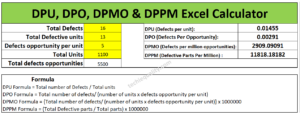
Total Defects =
2
3
3
1
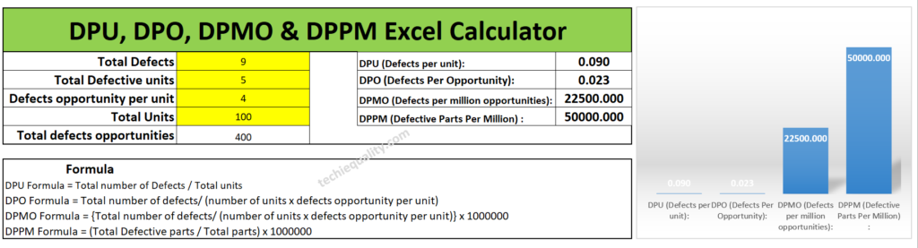
The total defects of the 5 items are 9. (2+3+3+1). And the total number of defective items is 5.
Now we will calculate the value of DPU, DPO, DPMO, and DPPM.
In the above table, we found the following data as;
Total Defects = 9
Total Defective unit = 5
Defects opportunity per unit = 4
Total Units (for example) = 100 nos.
Total defects opportunities = 400 (4 x 100)
DPU (Defects per unit):
DPU Formula = Total number of Defects / Total units
DPU Calculation: DPU = 9/100 = 0.09
Defects Per Opportunity- DPO:
DPO Formula = Total number of defects/ (number of units x defects opportunity per unit)
= Total number of defects/ Total defects opportunities
= 9/ 400 = 0.0225 = 0.023
(Defects per million opportunities) DPMO:
DPMO Formula =
{Total number of defects/ (number of units x defects opportunity per unit)} x 1000000
= (Total number of defects/ Total defects opportunities) x 1000000
DPMO Calculation:
= (9/400) x 1000000
= 22500
(Defective Parts Per Million) DPPM:
DPPM Formula = (Total Defective parts / Total parts) x 1000000
DPPM calculation: (5 / 100) x 1000000
= 50000
According to the above data set the DPU, DPO, DPMO, and DPPM calculated values are given below table.
Date Set:
Total Defects = 9
Total Defective unit = 5
Defects opportunity per unit = 4
Total Units (for example) = 100 nos.
Total defects opportunities = 400 (4 x 100)
Values:
DPU (Defects per unit): 0.09
DPO (Defects Per Opportunity): 0.023
DPMO (Defects per million opportunities):22500
DPPM (Defective Parts Per Million) : 50000
Excel calculator:
If you are interested to download the Excel DPMO calculator and DPPM calculator then download them from the below link.
It’s very simple to use our excel template just download the excel calculator and then follow the below steps.
Step-1: Download the excel DPMO and DPPM calculator from the above given link.
Step-2: Enter the value only on the yellow highlighted box.
Step-3: The DPU, DPO, DPMO, and DPPM values will be calculated automatically.
Manufacturing Example:
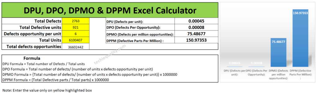
Let’s consider a company manufacturing automobile parts. And they are producing x nos of parts on a monthly basis but facing a huge rejection in the production line at the blanking and piercing operation process. so, it has been decided in the quality meetings for improvement projects to reduce the rejection% and improve the variation. So, for the improvement project, the Line QA engineer collected the following data for the calculation of DPU, DPO, DPMO, and DPPM for project input. Data are given in below table;
Total Defects = 2763
Total Defective unit = 921
Defects opportunity per unit = 6
Total parts produced = 6100407
Total defects opportunities = 3,66,02,442 (6100407 x 6)
Without wasting my time, I’m going to calculate the value by using the above excel template. And the calculated value is given below.
I would request to all my readers, who are currently reading this article try to calculate the DPMO and DPPM values manually by apply the above formula and match with the excel calculator value.
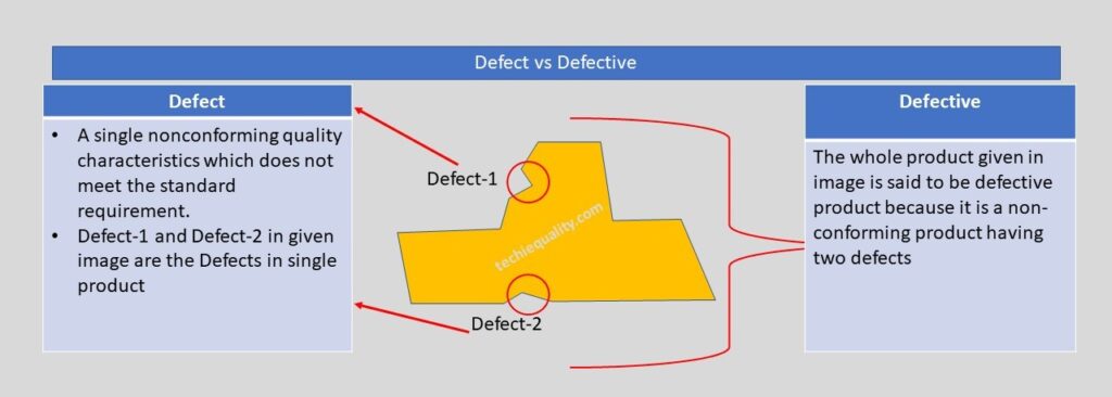
Let us understand the difference between Defect and Defective with the help of the above example. As you can see in the above image one product having two nonconforming quality characteristics which do not meet the standard or customer requirement, which is called a defect, and the whole product is called a defective product because having two defects. If you would like to know the total defective product and total defects in the above example, then we can easily say that the total defective product is 1 and the total defects are 2. Now I hope you understand the difference between defective and defects.
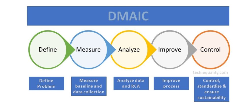
Six Sigma Methodologies:
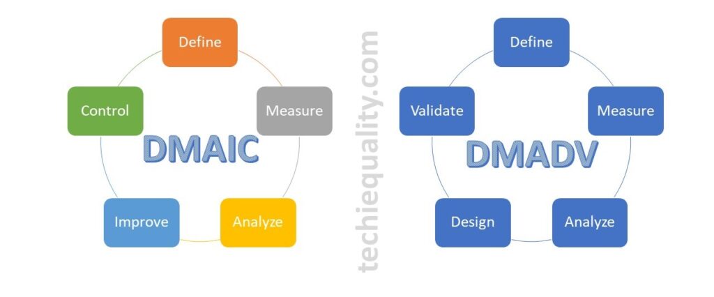
There are many methodologies used in six sigma projects but the popular methodology is DMAIC (Define, Measure, Analyze, Improve and Control). Similarly, in the design of the Six Sigma project, the popular methodology is used as DMADV (Define, Measure, Analyze, Design, and Validate). However in Lean Six Sigma, both lean tools and DMAIC methodology are used.
DMAIC Tools & DMAIC Template
DMAIC methodology is a very popular mythology that is used in six sigma projects. The DMAIC methodology consists of 5 phases i.e. Define Phase, Measure Phase, analyze Phase, Improve Phase, and Control Phase. We have already published common and popular DMAIC tools, DMAIC templates, and formats. But following DMAIC tools are listed below;
Shanti Gopal Pradhan is an experienced professional in Quality Management Systems, QA, Operations, Business Excellence, and Process Improvement. He has strong expertise in international standards including IATF 16949, ISO 9001, ISO 14001, ISO 45001, and ISO 17025, along with methodologies such as TQM, TPM, and Six Sigma.
He holds a degree in Mechanical Engineering along with an MBA, combining strong technical acumen with strategic business insight, he is a Certified Internal Auditor, Lead Auditor, and Six Sigma Black Belt, with a proven track record in driving quality transformation and operational excellence.
Hello readers! Today we will be discussing on different types of Six Sigma Project Examples in manufacturing industries. As we know that Six sigma projects are different types like yellow belt, green belt, black belt and master black belt projects. We have already published a post on different types of six sigma belts. Different types of methodologies used in six sigma projects like DMAIC or DMADV, etc. similarly six sigma projects also classified into several types like lean six sigma project, six sigma projects, design of six sigma project.
Here, sharing my own experience that how was I identifying the Six Sigma project in my work zone. I was simply following the below steps to identify the Six Sigma project.
Identify the current problems or issues, like defects issues, high process or product characteristics variation, high rejection, high warranty issues, customer complaints, high breakdowns, reduction of energy consumption, cycle time reduction, lead time reduction, etc.
Categories the problems like A types, B types, C types and K types.
Problem types
Description
A type
Quality circle project problem
B type
SGA project problems
C type
Six Sigma project problem.
K type
Kaizen problems
After categorization of problems you can select the C type problem for six sigma projects. Once you finalize the number of projects as per prioritize my six-sigma committee and top management, you can prepare the six-sigma project charter.
Prepare the project charter.
Follow the six-sigma methodology like DMAIC.
Define phase, Measure phase, analyze phase, improve phase and control phase.
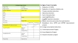
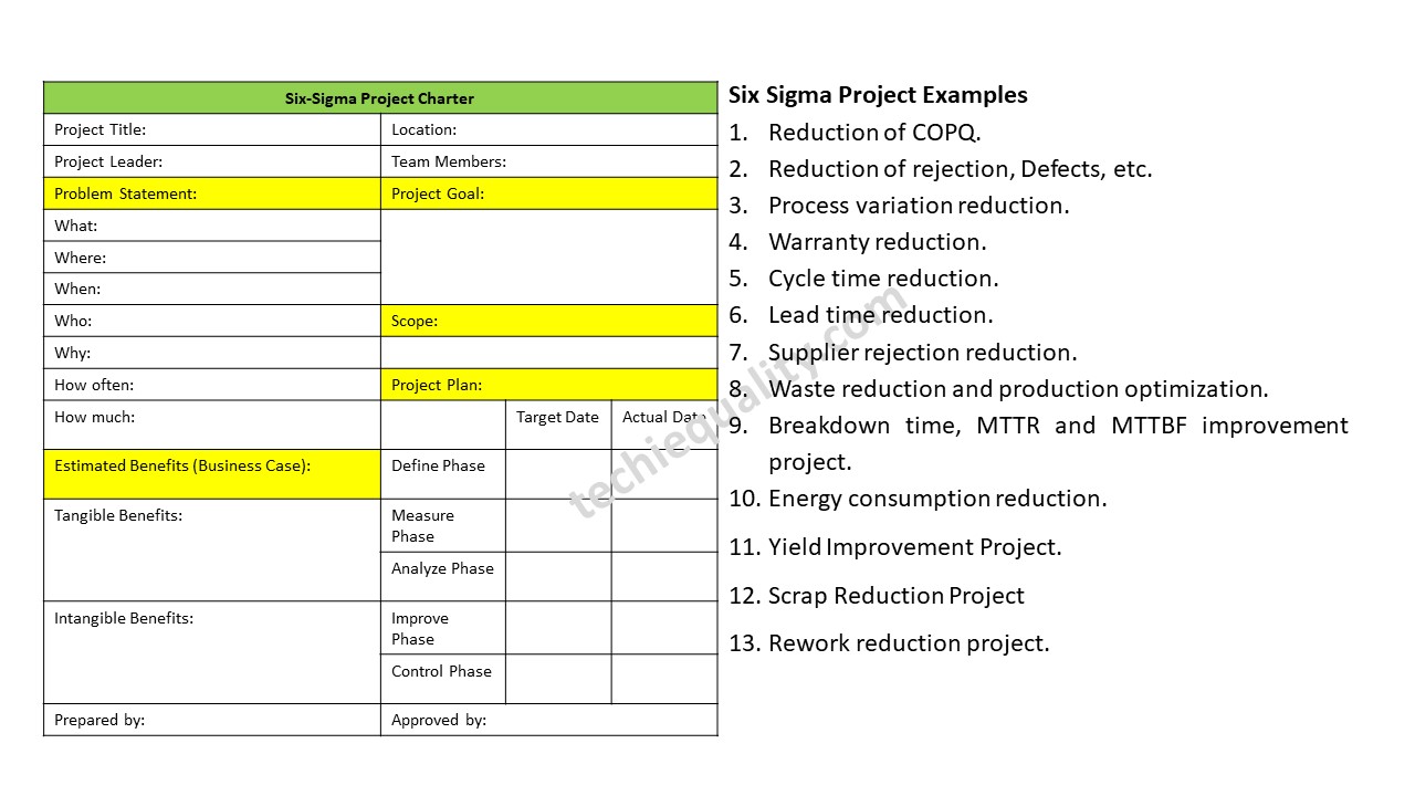
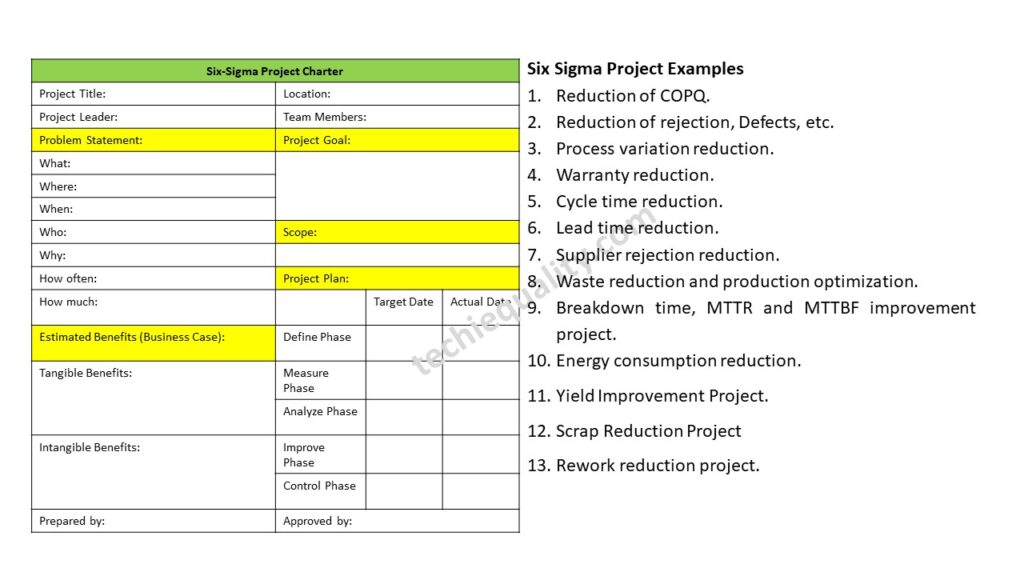
Six Sigma Project Examples:
Following are some example of six sigma project that you can consider to do but there are not limited to.
Reduction of COPQ.
Reduction of rejection, Defects, etc.
Process variation reduction.
Warranty reduction.
Cycle time reduction.
Lead time reduction.
Supplier rejection reduction.
Waste reduction and production optimization.
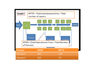
Breakdown time, MTTR and MTTBF improvement project.
Energy consumption reduction.
Conversion cost reduction.
Cost reduction project.
Six sigma projects on customer complaint.
Yield Improvement Project.
Scrap Reduction Project
Rework reduction project.
Process and Product failure improvement project.
Six Sigma Project Examples
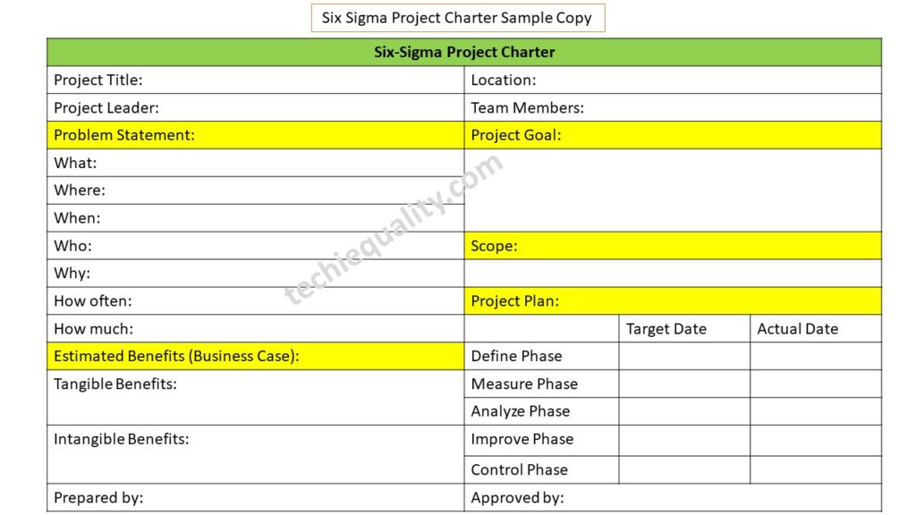
How to write six sigma project charter?
The Six sigma project charter is the main part of the any type of 6-sigma project. Which is consist with some basic information about project, problem statement, scope, goal, tangible and intangible benefits, team members, and final the approval part. After getting the approval from concern personnel, you can start your project.
Let’s consider an example here for preparing the six-sigma project charter, for doing so we are going to consider here an example of the manufacturing industry for better understanding, suppose the manufacturing unit is producing automobile parts and somehow rejection% at process P-1 is high. At process P-1, they are manufacturing Part-1. For reducing the high rejection percentage at process P-1, the six- sigma certified holder has taken a project on it and prepared the project charter.
Follow the below steps to prepare the six-sigma project charter:
Form a Six sigma team including designation, and roles & responsibility of all members.
Minimum, Keep the past 3 to 6 months data for calculation of sigma level, DPMO, and defects contribution. for better result and considering with all environmental impact you can consider 12 months to 18 months data. More data will provide you best result. You can manually calculate the DPMO or you can use the DPMO Calculator as well. After calculating the DPMO value, then easily from six sigma conversion table you can find the sigma level. For the knowing the defects contribution you can use the Paretochart.
Next part is the Problem statement, here you can write the statement by using the 5W1H or 5W2H template.
Define the scope, project goal, estimated benefits and project objectives.
First of all, try to form a six sigma team and define their project roles & responsibility, once you done the same next write the problem statement, same we are going to write here considering with the above example. We have used the 5W2H template to describe the problem statement.
As you know, there is high process rejection of Part-1 at process P-1.
Problem Statement:
What: high rejection of Part-1
Where: In Process P-1
When: during manufacturing of parts in three shifts
Who: Machine operators/ workforces.
Why: reason unknown
How often: monthly / daily
How much: you can mention here rejection in percentage or in PPM or in DPMO.
Project Goal:
Mainly describe the project objectives & goal like [1] to reduce the rejection% from x% to y%. or [2] To reduce the rejection PPP by 90% from x to y. [3] improve the sigma level e.g. 4 to 5.5.
Scope of project:
Here, you just mention the project boundary like what is included and what is excluded. For example, Process P-1 is included and process p-2 is excluded.
Estimated Benefits:
Tangible Benefits: Improvement of sigma level e.g. 4.4 to 5.5, Reduction of rejection e.g. 1.1% to 0.02%, DPPM from 11300 to 150, DPMO from 1800 to 25, and for example estimated cost saving 50 lakhs/annum.
Intangible benefits: For example, Increase Customer Satisfaction, Knowledge about 6-Sigma tools, Improved Presentation skill, improved analytical Knowledge, Improved team work & self, Problem Solving Skill developed.
Project Plan:
In the project plan section, you should take the target date of all 5 phases and monitor the actual date and delay of project. So that you can manage your total project period.
Shanti Gopal Pradhan is an experienced professional in Quality Management Systems, QA, Operations, Business Excellence, and Process Improvement. He has strong expertise in international standards including IATF 16949, ISO 9001, ISO 14001, ISO 45001, and ISO 17025, along with methodologies such as TQM, TPM, and Six Sigma.
He holds a degree in Mechanical Engineering along with an MBA, combining strong technical acumen with strategic business insight, he is a Certified Internal Auditor, Lead Auditor, and Six Sigma Black Belt, with a proven track record in driving quality transformation and operational excellence.
Hello readers! Today we will discuss on a specific topic, which is related to the Six Sigma project charter. How effectively you can prepare the Six Sigma project charter so that each and everything will be in a single template for making the decision on the project for approval and next further project work. There are several methodologies and tools used in Six Sigma projects, but the popular methodologies are DMAIC and DMADV and similarly, so many tools are used in the project as well. We have already published the main important topic covering DMAIC Tools and some six sigma project examples in manufacturing industries. I hope both topics will be very helpful before preparing the Project charter. So, let’s read these topics first and then prepare the project charter. Without wasting your time you can download the Six Sigma Project Charter Template from the below-given link.
Before preparing the Six Sigma project charter you have to understand the methodology, project types, and 6-sigma belts, which will help you to make your project successful. The popular 6-sigma bets are yellow, green, black, and master black belts, and similarly, the Six-sigma project, lean Six-sigma, and design of Six-sigma project generally followed the different and different types of methodology like, DMAIC (Define, Measure, Analyze, Improve & Control), DMADV (Define, Measure, Analyze, Design and Validate).
Once you list out the problem set, you can start preparing the Six Sigma project charter to represent the project details and for getting approval. First of all, keep the past data of a minimum of 3 months, or for better results, you can consider 18 months of past data for representing the problem statement, problem/defects contribution, DPMO /DPPM calculation, and also for sigma level calculation.
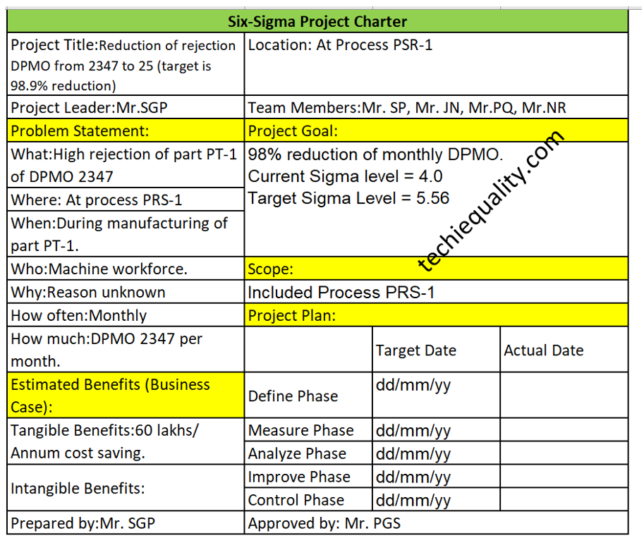
Step by Step guide of Project Charter preparation with Manufacturing Example:
Let’s consider a company manufacturing a part PT-1 at process PRS-1. The rejection quantity of that part PT-1 is 2347 and the production quantity is 76000. The number of opportunities per unit is 5.
First of all, we are going to calculate the DPMO.
DPMO = Total Rejection quantities x 1000000/ (Total units x opportunities per unit)
= 2347 x 1000000/ (76000 x5)
= 6176
Now, I am going to prepare the Six Sigma project charter.
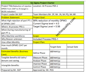
Project title: Reduction of rejection DPMO from 2347 to 25 (target is 98.9% reduction)
Problem Statement:
What: High rejection of part PT-1 of DPMO 2347
Where: At process PRS-1
When: During manufacturing of part PT-1.
Who: Machine workforce.
Why: Reason unknown
How often: Monthly
How much: DPMO 2347 per month.
Project goal: 98% reduction of monthly DPMO
Scope: Included Process PRS-1
Tangible Benefits: 60 lakhs/ Annum cost saving.
Six Sigma Project Charter Template Example
What are the key elements of a charter?
As you can see in the above project charter sample template, we have already highlighted the key elements of the Six Sigma project charter in yellow colour and these are the list below as;
Problem statement.
Project goals
Scope of the project
Estimated benefits/business case
Project plan. Etc.
What is the purpose of the project charter?
The main purpose of the project charter is to write down the key elements of the project and to get approval from the approver. And from time to time you have to update the Project plan status as well. It’s a synopsis of your Six Sigma project.
Shanti Gopal Pradhan is an experienced professional in Quality Management Systems, QA, Operations, Business Excellence, and Process Improvement. He has strong expertise in international standards including IATF 16949, ISO 9001, ISO 14001, ISO 45001, and ISO 17025, along with methodologies such as TQM, TPM, and Six Sigma.
He holds a degree in Mechanical Engineering along with an MBA, combining strong technical acumen with strategic business insight, he is a Certified Internal Auditor, Lead Auditor, and Six Sigma Black Belt, with a proven track record in driving quality transformation and operational excellence.
DPMO Calculation, Formula, Manufacturing Example & DPMO Excel Template
Hello readers! Today we will be discussing on DPMO calculation with manufacturing examples. The full form of DPMO is defects per million opportunities. Similarly, dpmo there are 3 more popular terms used in quality for the calculation of defect level and these are [1] DPPM, [2] DPO, [3] DPU. These terms are also frequently used in six sigma project work. If you would like to download the sample template of all 4 calculations in a single sheet then download it from below given link.
DPU Formula = Total number of Defects / Total units
DPO (Defects Per Opportunity):
DPO Formula = Total number of defects/ (number of units x defects opportunity per unit)
DPMO (Defects per million opportunities):
DPMO Formula = {Total number of defects/ (number of units x defects opportunity per unit)} x 1000000
DPPM (Defective Parts Per Million):
DPPM Formula = (Total Defective parts / Total parts) x 1000000
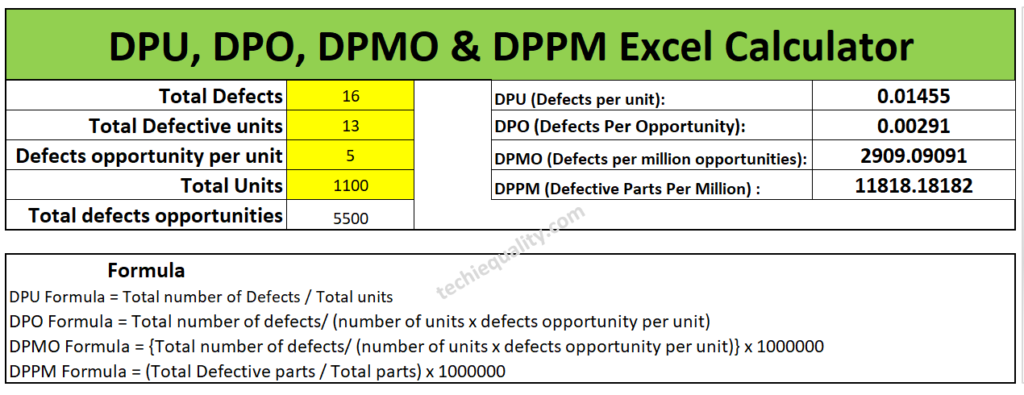
First of all, below example-1 is one of the scenarios that are given for calculating the DPMO, DPPM, DPO, and DPU for all my article readers. So, this is the task for you my readers for your better understanding. Similarly, we are also going to solve one of the scenario-based questions for calculating the DPMO, DPPM, DPU, and DPO.
Example-1 (Task for the reader):
Suppose a sheet metal automobile manufacturing company, produces an automobile part. In the press shop, we found that 4 parts had been rejected at press machine-1 & 9 parts at press machine-2. When a QA engineer had analyzed, he found that the total defective product has 16 defects. And defects opportunity per parts is 5 and total 1100 parts had been produced. Calculate the DPMO, DPPM, DPU and DPO?
Have you completed the calculation of above example-1 or not? If not yet then, we are going to help to calculate the same. First of all, note down the data, i.e. Total defects, Total defective parts, defects opportunity per part, total parts produced and total defects opportunity. I know that it will take more time for manual calculation of all calculations, that is why we are recommending you to download our excel automatic calculation template for easy and time-saving calculation. Downloading link is given at top of the articles just try to download the format or template. I would request you all my readers, you just calculate the DPMO and DPPM manually and try to match your value with Excel calculation, which is given below;
I hope you have completed the matching of the value calculated by the automatic excel template and your manual calculation. Now we will be discussing the different types of examples and will calculate the value by both manually and by using an automatic excel format. So, let’s get started.
Example-2:
Lets a company manufacturing a toy product and below are the data given in several processes. so, calculate the DPMO, DPPM, DPO and DPU of individual processes and overall process by manually and by using the excel template. And also try to compare both solutions.
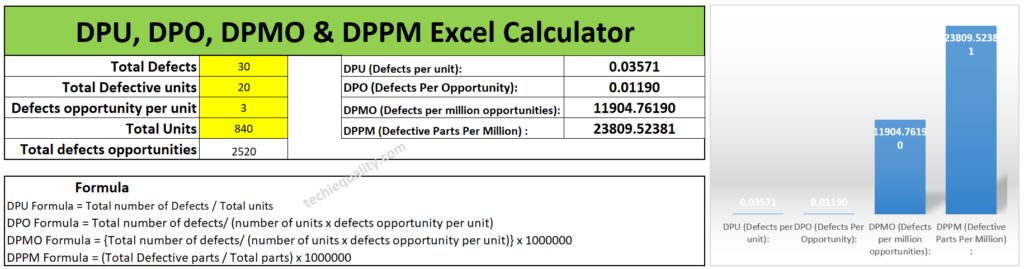
Process-1 Data Table:
Total Defects
30 nos
Total Defective parts
20 nos
Defects opportunity per part
3
Total parts produced
840 nos
Process-2 Data Table:
Total Defects
102 nos
Total Defective parts
80 nos
Defects opportunity per part
4
Total parts produced
987 nos
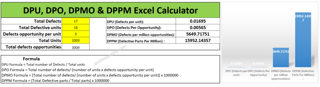
Process-3 Data Table:
Total Defects
17 nos
Total Defective parts
16 nos
Defects opportunity per part
3
Total parts produced
1003 nos
Calculate the DPMO, DPPM, DPO and DPU of individual processes and overall processes by manually and by using the excel template?
Solution of Process-1:
DPU Formula = Total number of Defects / Total units
= 30/840
=0.0357
DPO (Defects Per Opportunity):
DPO Formula = Total number of defects/ (number of units x defects opportunity per unit)
= 30/(840×3)
= 0.0119
DPMO (Defects per million opportunities):
DPMO Formula = {Total number of defects/ (number of units x defects opportunity per unit)} x 1000000
= [30/(840×3)]x1000000
=11904.7
DPPM (Defective Parts Per Million):
DPPM Formula = (Total Defective parts / Total parts) x 1000000
= (20/840) x1000000
=23809.5
Similarly, Excel template calculation is given below as;
Solution of Process-2:
DPU (Defects per unit):
DPU Formula = Total number of Defects / Total units
= 102/987
= 0.1033
DPO (Defects Per Opportunity):
DPO Formula = Total number of defects/ (number of units x defects opportunity per unit)
= 102/(987×4)
= 0.0258
DPMO (Defects per million opportunities):
DPMO Formula = {Total number of defects/ (number of units x defects opportunity per unit)} x 1000000
= [102/(987×4)]x1000000
= 25835.86
DPPM (Defective Parts Per Million):
DPPM Formula = (Total Defective parts / Total parts) x 1000000
= (80/987) x1000000
= 81053.69
You can compare the answer with the below given Excel calculated value.
Solution of Process-3:
DPU (Defects per unit):
DPU Formula = Total number of Defects / Total units
= 17/1003
= 0.0169
DPO (Defects Per Opportunity):
DPO Formula = Total number of defects/ (number of units x defects opportunity per unit)
= 17/1003×3
=0.0056
DPMO (Defects per million opportunities):
DPMO Formula = {Total number of defects/ (number of units x defects opportunity per unit)} x 1000000
= [17/1003×3]x1000000
= 5649.7
DPPM (Defective Parts Per Million):
DPPM Formula = (Total Defective parts / Total parts) x 1000000
= [16/1003]x1000000
= 15952.14
Below are the excel calculation of the above value, you can match the value;
Overall Process DPMO Calculation:
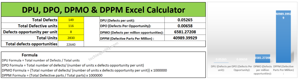
For doing so we need a combined data table, so we have clubbed all the data of process-1,2 & 3 and given in below; the same part is produced in all 3 processes.
Total Defects
149 nos
Total Defective parts
116 nos
Defects opportunity per part
8
Total parts produced
2830 nos
DPU (Defects per unit):
DPU Formula = Total number of Defects / Total units
= 149/2830
= 0.0526
DPO (Defects Per Opportunity):
DPO Formula = Total number of defects/ (number of units x defects opportunity per unit)
= 149/2830×8
=0.00658
DPMO (Defects per million opportunities):
DPMO Formula = {Total number of defects/ (number of units x defects opportunity per unit)} x 1000000
= [149/8×2830]x1000000
= 6581.27
DPPM (Defective Parts Per Million):
DPPM Formula = (Total Defective parts / Total parts) x 1000000
Shanti Gopal Pradhan is an experienced professional in Quality Management Systems, QA, Operations, Business Excellence, and Process Improvement. He has strong expertise in international standards including IATF 16949, ISO 9001, ISO 14001, ISO 45001, and ISO 17025, along with methodologies such as TQM, TPM, and Six Sigma.
He holds a degree in Mechanical Engineering along with an MBA, combining strong technical acumen with strategic business insight, he is a Certified Internal Auditor, Lead Auditor, and Six Sigma Black Belt, with a proven track record in driving quality transformation and operational excellence.
Process Flow Diagram Template | Examples |Symbols |PFD
Hi Readers! Here, today we will be discussing the process flow diagram, its symbols, and practical examples. We have prepared a PFD template for sample and example basis, if you would like to download the free template or format of the PFD-process flow diagram then, go through the below-given link.
The PFD or process flow diagram is a flow chart or process flow diagram or process mapping of a process. The PFD represents the process sequence and details (like a machine, activities, process sequence, relevant document, process control, decision, etc).
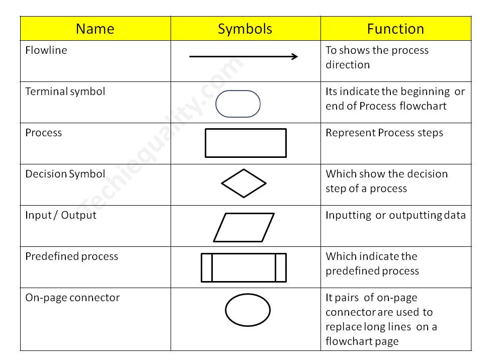
Symbols of Process flow diagram – PFD:
PFD/PFC has many symbols but we will discuss only common symbols. Details are given below;
Symbol Name
Function
Flowline
To show the process direction
Terminal symbol
It indicates the beginning or end of the Process flowchart
Process
Represent Process steps
Decision Symbol
Which shows the decision step of a process
Input / Output
Inputting or outputting data
Predefined process
Which indicates the predefined process
On-page connector
Pairs of on-page connectors are used to replace long lines on a flowchart page
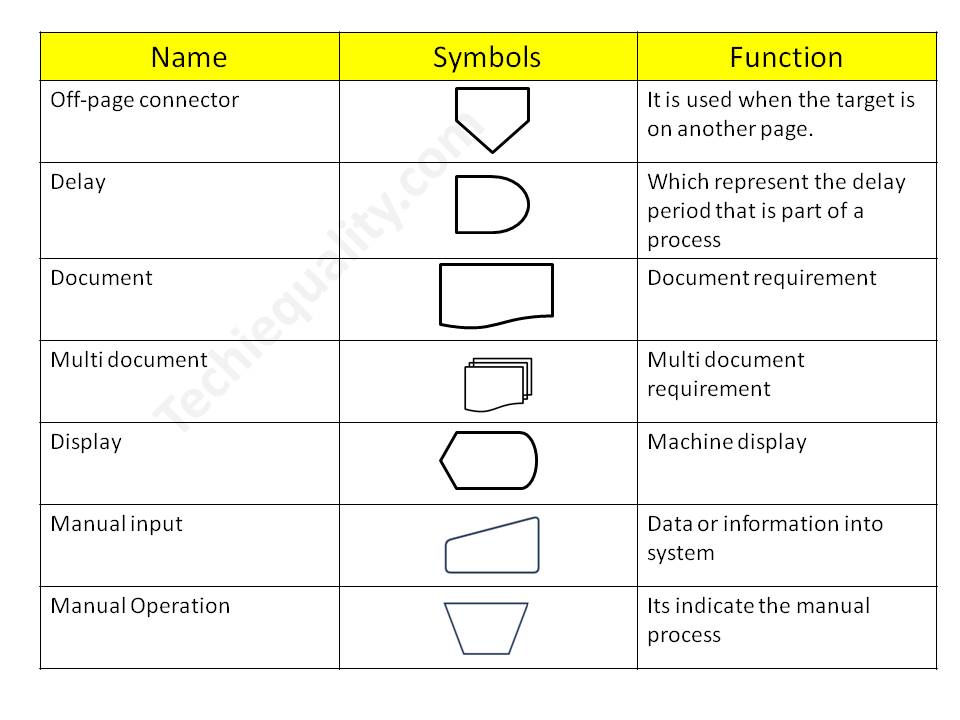
Off-page connector
It is used when the target is on another page.
Delay
Which represents the delay period that is part of a process
Document
Document requirement
Multi-document
Multi-document requirement
Display
Machine display
Manual input
Data or information in the system
Manual Operation
It indicates the manual process
Process Flow Chart symbols / PFD
4 Steps to create a PFD-Process flow Diagram:
Step-1:
CFT team formation including the process owner.
Step-2:
List out the process, activities, decision, machine, control mechanism, etc
Step-3:
Sequentially write down the process, activities, and decisions of the process
Step-4:
Plot the diagram by using the PFD symbols.
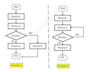
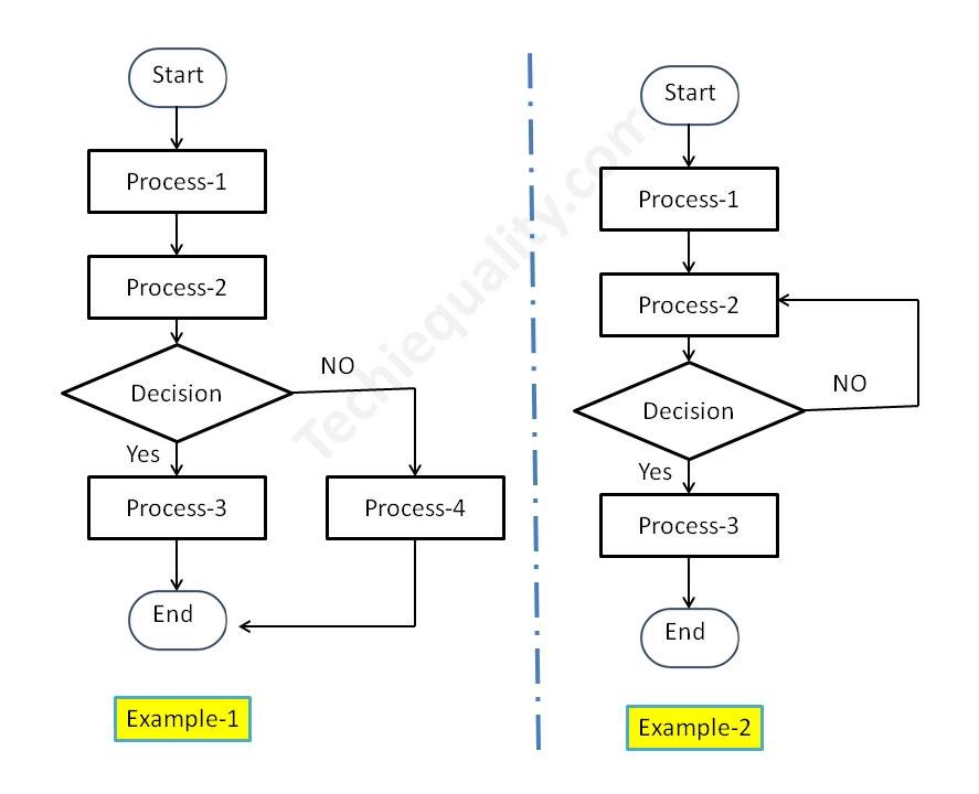
Process Flow Diagram Example:
We have created two process flow diagrams, i.e. [1] without repetition of the process after the decision and [2] with repetition of the process after the decision. Both two types of PDF are given below;
PFD/PFC-process flow chart example
Industrial Example:
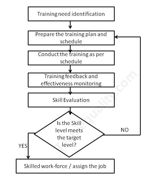
Here we have taken the process flow diagram example of Training, which is one of the most powerful things to competent the workforce and enhance the skill of employees. So that optimum knowledge can be utilized for effective output from operation by employees at an organization. Hence if you would like to create a process flow chart of education and training operations then the below example will be helpful to prepare the same. This is only for reference and learning purposes.
We have prepared the PFD followed by the above steps:
Step-1:
We have formed a team including the HRD member.
Step-2:
Identified the activities below
Training needs identification
Prepare the training plan and schedule
Conduct the training as per schedule
Training feedback and effectiveness monitoring
Skill evaluation.
Step-3:
We have arranged the activities sequentially as given below of education and training operations.
Activities-1
Training needs identification
Activities-2
Prepare the training plan and schedule
Activities-3
Conduct the training as per schedule
Activities-4
Training feedback and effectiveness monitoring
Activities-5
Skill evaluation
Step-4:
We have prepared the PFD – process flow chart for education and training operations and details are given below;
FAQ:
What is the process flow?
The process flow is the flow chart that represents the process sequences or process mapping including machine details, control data, document reference, etc.
What is the difference between SIPOC and PFD?
The SIPOC diagram consists of 5 elements i.e. Supplier, Input, Process, Output, and Customer. the PDF is the process mapping that represents the process sequences.
What is flowchart?
The FC is a flow diagram or mapping of activities.
What are the 3 types of PFD?
[1] System PFD, [2] General PFD, [3] Detailed PFD
Free Templates / Formats of QM: we have published some free templates or formats related to Quality Management with manufacturing / industrial practical examples for better understanding and learning. if you have not yet read these free template articles/posts then, you could visit our “Template/Format” section. Thanks for reading…keep visiting techiequality.com
Shanti Gopal Pradhan is an experienced professional in Quality Management Systems, QA, Operations, Business Excellence, and Process Improvement. He has strong expertise in international standards including IATF 16949, ISO 9001, ISO 14001, ISO 45001, and ISO 17025, along with methodologies such as TQM, TPM, and Six Sigma.
He holds a degree in Mechanical Engineering along with an MBA, combining strong technical acumen with strategic business insight, he is a Certified Internal Auditor, Lead Auditor, and Six Sigma Black Belt, with a proven track record in driving quality transformation and operational excellence.
What is Visual Management?| Visual Management Board Examples
Hi Readers! Here, today we are going to discuss on what is visual management. Its examples and tools. The Visual management is a method to visualize the performance, standards, and signs in operation or any activities. This visual standard is widely used in a manufacturing operation to enhance operation excellence, performance and optimize the output from the operation or activities. The main purpose of the visual management is to communicate the important criteria to the shop floor workforce in visual forms.
Benefits of Visual Management
Cost reduction
Easy understanding of performance
Quick reference of critical parameters and one-step process.
Waste reduction
Reduced dependency for understanding the critical operation standard
Status of objectives
Information sharing
Improve productivity, rate of quality, cost, delivery, morale, and product & operator safety.
Promote values
Raise awareness
Improve accountability, etc.
What are the common tools used in industries to implement visual management? As we all know that we can easily understand and remember the visual sign rather than information in other forms. So it’s an effective method to control your operation process and optimize the output. The common tools and methods used in industries are given below;
FIFO (First in First Out): This is a very helpful tool that you can control your material flows in systematic ways. In this process, you can easily manage your material storage and movement.
5’S: the 5’S stand for Sort, set in Order, Shine, Standardize, and Sustain.
Display: Display board, Sign, labels, and marking.
OPL, OK and Not OK process sample display, colour code, level, Visual poka yoke, do & don’t, and Andon system.
Digital display
Example of visual management
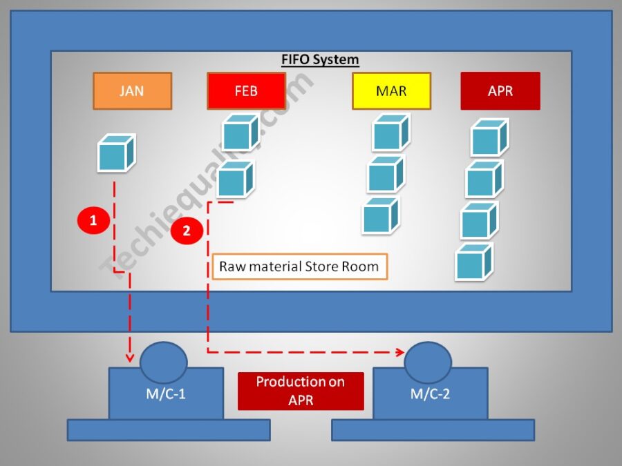
FIFO:
Visual management is one of the best techniques in an organization by which very easily and quickly, you can understand critical information in visual ways. I think visual information is very easy to understand and helps to enhance the optimize the output and minimize the waste/ errors. FIFO is the one of the visual management systems which means First-In-First-Out. For inventory management, FIFO is the one of the best techniques to help for systematic storage and handling of materials/products/elements, etc. Some common FIFO systems are –colour code systems, numbering, bin cards, digital FIFO systems, IOT-based FIFO, etc.
Example: suppose an organization is being planned to implement the FIFO visual management system at raw material store room. So the store manager decided to store the material in month-wise material received in the different racks with month-wise colour codes. So that the first incoming raw material can be used first in the production area. Accordingly, to the colour code, the store manager issued the material to the user department. In the below image, you can easily understand that how the material is stored with month-wise colour code. As you can see in the below image, production is for the month of April, and the store manager issuing the material available in the month of January instead of month April. This is the material issuing and handling followed by the FIFO system.
5’S:
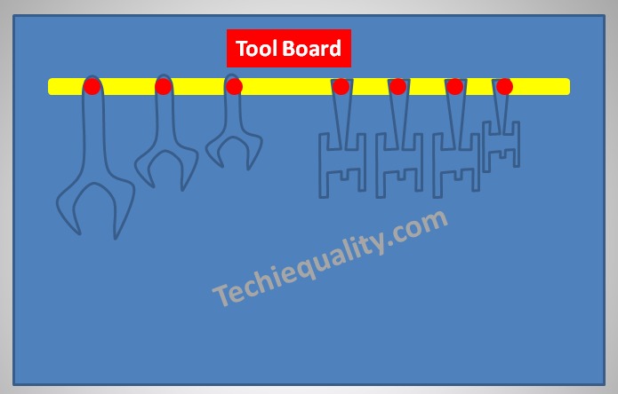
The 5’S is the base pillar of visual management or visual control. The terms 5’S are the [1] Sort, [2] Set in order [3] Shine, [4] Standardize and [5] Sustain. From the office to the manufacturing shop floor, you can easily implement the 5’S concept. We have taken an example as a tool board for a better understanding of the 5’S concept for easy implementation in the manufacturing industry. As you can see in the tool board image below that how the different sizes and types of tools are placed in a systematic manner followed by the5’S concept.
Match Marking:
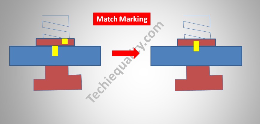
Match marking refers to the process in which a pictorial view is provided to place the pieces in the position of the marked point by identifying the final output image. E.g. In the image attached below an object is placed between the nut and the bolt. Now by looking at the final image, we can understand that the nut has to be rotated in such a way that the object placed in between the nut and bolt gets tightened or fixed. To do this one will need to rotate the nut to an extent that it matches with the yellow mark as shown in the output image.
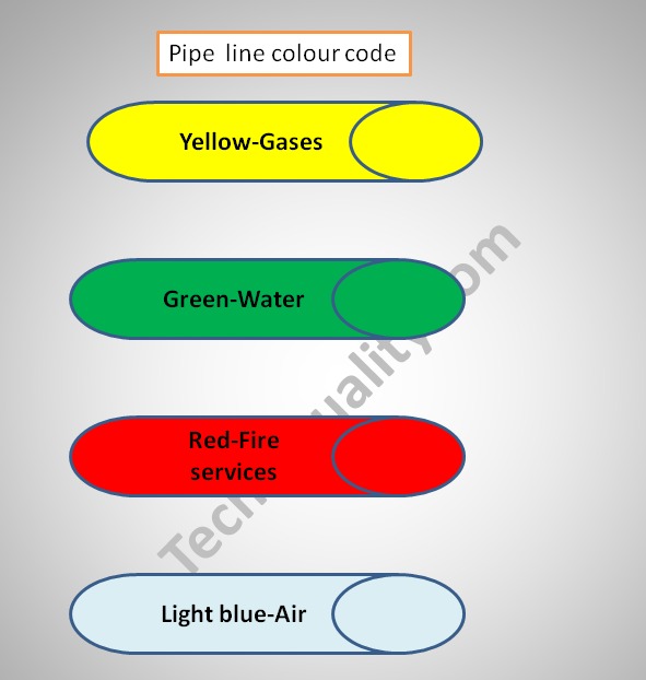
Pipeline colour code on shop floor:
Pipeline colour coding is done to help one identify the contents flowing through the pipe. Also, additional details would be required to be provided if any hazardous material is flowing through the pipe to avoid any mishap. Thus pipeline colour coding helps in obtaining crucial information about the pipes contents. E.g. Now in the image provided below we can see the Pipeline visual display has been provided in four colours:-
The yellow coloured pipeline represents gas.
The green coloured pipeline represents water.
The red coloured pipeline represents components required for fire services.
The Light blue coloured pipeline represents air element present.
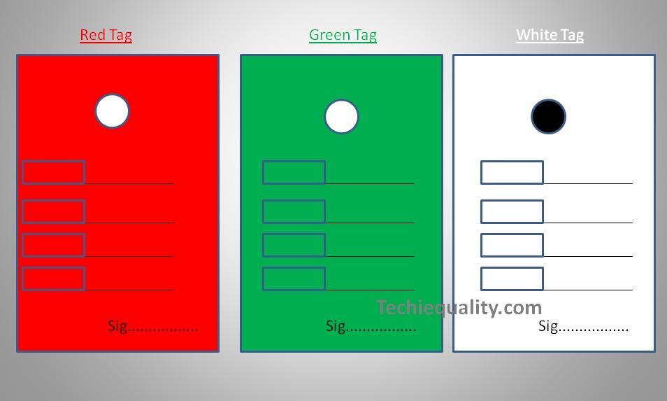
Tag System:
The Tag system helps in the easy identification of the segment of a product with the help of just the tag. Now let’s understand how? When any kind of production takes place in a factory it’s quite understood that on production you do get some wastage or rejections. Suppose a factory does the production of garments. Now in the process of production, there are certain items that get rejected for several reasons. Again there are several garments that need to be recertified before being sent out to the market.
Through the below presented image, we can easily understand that the garments which are tagged in Red are the rejected ones and cannot be sent out to the market. Green Tags represent the ones that are perfect to be sent out to the buyers. White tags are the ones that have been kept on hold for further verification due to the possibility of thread cutting or needs stitching before it’s sent out to the market.
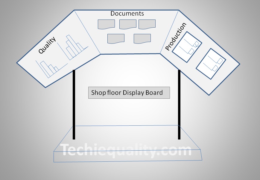
Visual Management Board:
Shop floor display helps in streamline the process of work. The visual display helps in improving the workplace functioning by ensuring that the important information is clearly presented in a professional manner. Shop floor display works as a fundamental to any well communicated working environment. It helps in managing the operations of the manufacturing unit for effective planning and productivity. In the image provided below following information is provided for better understanding:-
Quality is presented with the help of a graph which helps one in identifying and comparing whether the quality is improving or deteriorating by merely looking at the graph. Similarly, different charts are displayed related to production performance to know the status, and understand the present position. In the shop-floor visual management board, you can display the critical information related documents, OPL, master sample, instruction, etc.
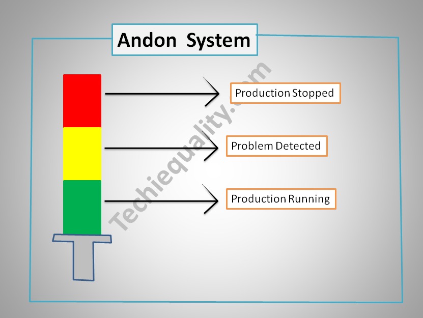
Andon System:
The Andon system is one of the strong visual management tools or visual control systems which promptly alerts about the status or problem of the operation line. In the below image, we have considered three colours Andon alert system as an example. Where different colours indicate different meanings. [1] Green colour light –There is no problem in the operation line. [2] yellow colour light- problem detected in line, [3] red colour light- problem exists, production stopped / operation stopped.
Shanti Gopal Pradhan is an experienced professional in Quality Management Systems, QA, Operations, Business Excellence, and Process Improvement. He has strong expertise in international standards including IATF 16949, ISO 9001, ISO 14001, ISO 45001, and ISO 17025, along with methodologies such as TQM, TPM, and Six Sigma.
He holds a degree in Mechanical Engineering along with an MBA, combining strong technical acumen with strategic business insight, he is a Certified Internal Auditor, Lead Auditor, and Six Sigma Black Belt, with a proven track record in driving quality transformation and operational excellence.
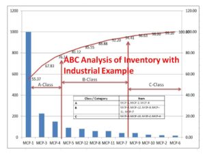
ABC Analysis of Inventory with Industrial Example:
Hi Readers! Here, we are going to discuss one of the popular inventory management systems, which is nothing namely called ABC Analysis of Inventory. As you know that in the industry managing stock of raw materials, bop, WIP, semi-finished products, and the finished product is a matter, if you don’t have any control over inventory then a huge amount of product or material stock, Space consumption, and money consumption for a certain period will be there. That-why proper inventory control or management should be there in place so that you can get the benefit from low inventory costs.
To achieve maximum benefits with minimum efforts, it is essential to manage inventory control, so here, we are going to discuss the step-by-step process of abc analysis of inventory control.
ABC Analysis of Inventory with Industrial Example:
ABC analysis classifies a large number of items in inventory into three categories- A-class, B-class, and C-class items. The classification is based on annual usage in value. ABC analysis aims to reduce the cost of managing inventory by controlling the inventory of a few high-value items. The abc analysis technique is based on the Pareto chart law. A higher contribution of annual usage is because of low items. These high annual usage inventory values should be paid more attention.
Class or Category
Annual Usage (Not limited to)
A-Category
70-80%
B-Category
15-25%
C-Category
5%
ABC Analysis Example:
For example, the Maintenance department of ABC Limited has recorded the annual usage unit of machine maintenance parts as below for doing the ABC analysis and categorizes the items into A, B & C for better inventory control and minimizing the inventory carrying costs.
Item
Annual Usage Unit
Unit Cost in $
MCP-1
5000
200
MCP-2
800
25
MCP-3
1500
150
MCP-4
2500
60
MCP-5
3000
30
MCP-6
900
18
MCP-7
2000
20
MCP-8
1200
50
MCP-9
1000
40
MCP-10
1300
19
MCP-11
600
100
MCP-12
2000
40
ABC Analysis of Inventory Steps by Steps Calculation:
Step-1: Calculate the annual usage cost by multiplying the quantity of each item with their respective price.
Item
Annual Usage Unit
Unit Cost in $
Annual Usage Cost ($)
MCP-1
5000
200
1000000
MCP-2
800
25
20000
MCP-3
1500
150
225000
MCP-4
2500
60
150000
MCP-5
3000
30
90000
MCP-6
900
18
16200
MCP-7
2000
20
40000
MCP-8
1200
50
60000
MCP-9
1000
40
40000
MCP-10
1300
19
24700
MCP-11
600
100
60000
MCP-12
2000
40
80000
Step-2: Rearrange the above items in descending order (largest to smallest).
Item
Annual Usage Unit
Unit Cost in $
Annual Usage Cost (xK$)
MCP-1
5000
200
1000
MCP-3
1500
150
225
MCP-4
2500
60
150
MCP-5
3000
30
90
MCP-12
2000
40
80
MCP-8
1200
50
60
MCP-11
600
100
60
MCP-7
2000
20
40
MCP-9
1000
40
40
MCP-10
1300
19
24.7
MCP-2
800
25
20
MCP-6
900
18
16.2
Step-3: Calculate the cumulative annual usage cost:
Item
Annual Usage Unit
Unit Cost in $
Annual Usage Cost (xK$)
Cum. Annual Usage Cost (xK$)
MCP-1
5000
200
1000
1000
MCP-3
1500
150
225
1225
MCP-4
2500
60
150
1375
MCP-5
3000
30
90
1465
MCP-12
2000
40
80
1545
MCP-8
1200
50
60
1605
MCP-11
600
100
60
1665
MCP-7
2000
20
40
1705
MCP-9
1000
40
40
1745
MCP-10
1300
19
24.7
1769.7
MCP-2
800
25
20
1789.7
MCP-6
900
18
16.2
1805.9
Step-4: Calculate the cumulative percentage
Item
Annual Usage Unit
Unit Cost in $
Annual Usage Cost (xK$)
Cum. Annual Usage Cost (xK$)
Cum. Percentage %
MCP-1
5000
200
1000
1000
55.37
MCP-3
1500
150
225
1225
67.83
MCP-4
2500
60
150
1375
76.14
MCP-5
3000
30
90
1465
81.12
MCP-12
2000
40
80
1545
85.55
MCP-8
1200
50
60
1605
88.88
MCP-11
600
100
60
1665
92.20
MCP-7
2000
20
40
1705
94.41
MCP-9
1000
40
40
1745
96.63
MCP-10
1300
19
24.7
1769.7
98.00
MCP-2
800
25
20
1789.7
99.10
MCP-6
900
18
16.2
1805.9
100.00
Step-5: Select the category by “A” by max. 80% contribution, “B” by 25% and “C” by 5%
Item
Annual Usage Unit
Unit Cost in $
Annual Usage Cost (xK$)
Cum. Annual Usage Cost (xK$)
Cum. Percentage %
Class/Category
MCP-1
5000
200
1000
1000
55.37
A
MCP-3
1500
150
225
1225
67.83
A
MCP-4
2500
60
150
1375
76.14
A
MCP-5
3000
30
90
1465
81.12
B
MCP-12
2000
40
80
1545
85.55
B
MCP-8
1200
50
60
1605
88.88
B
MCP-11
600
100
60
1665
92.20
B
MCP-7
2000
20
40
1705
94.41
B
MCP-9
1000
40
40
1745
96.63
C
MCP-10
1300
19
24.7
1769.7
98.00
C
MCP-2
800
25
20
1789.7
99.10
C
MCP-6
900
18
16.2
1805.9
100.00
C
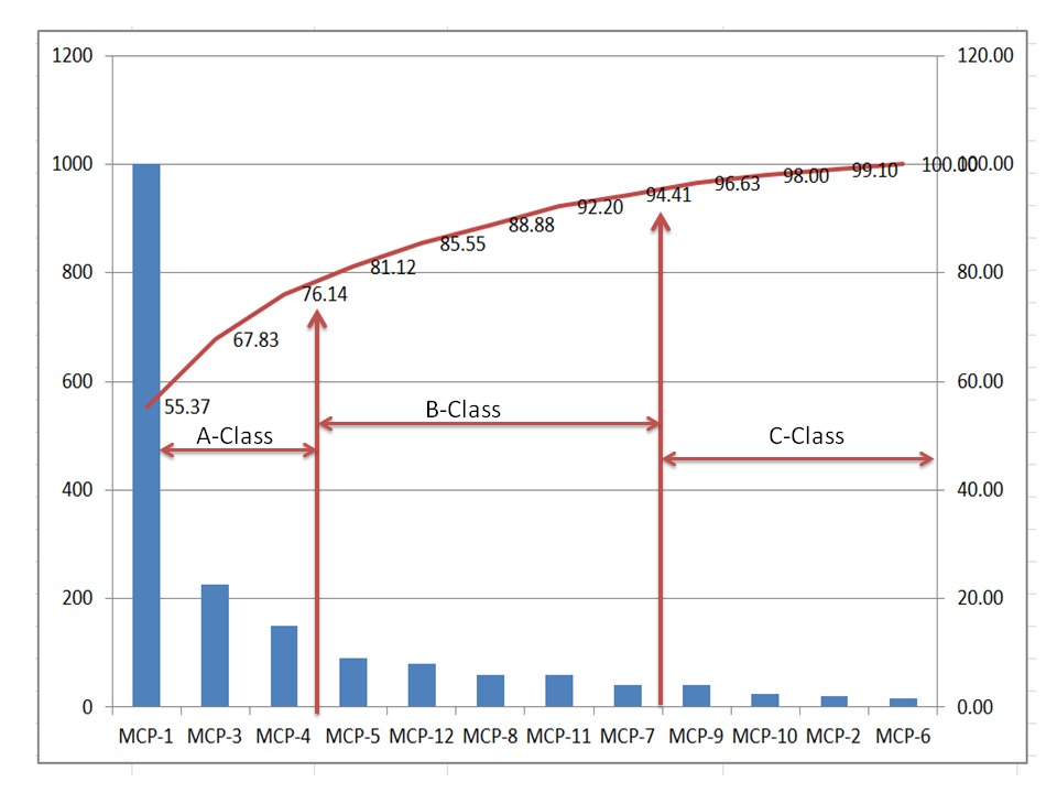
Note: Based in Cumulative percentage we have selected “A” category up to 80% contribution, “B” category from 80% to 95%, and “C” category from 95% to 100% contribution.
Class / Category
Item
A
MCP-1, MCP-3, MCP-4
B
MCP-5, MCP-12, MCP-8, MCP-11, MCP-7
C
MCP-9, MCP-10, MCP-2, MCP-6
Free Templates / Formats of QM: we have published some free templates or formats related to Quality Management with manufacturing / industrial practical examples for better understanding and learning. if you have not yet read these free template articles/posts then, you could visit our “Template/Format” section. Thanks for reading…keep visiting techiequality.com
Shanti Gopal Pradhan is an experienced professional in Quality Management Systems, QA, Operations, Business Excellence, and Process Improvement. He has strong expertise in international standards including IATF 16949, ISO 9001, ISO 14001, ISO 45001, and ISO 17025, along with methodologies such as TQM, TPM, and Six Sigma.
He holds a degree in Mechanical Engineering along with an MBA, combining strong technical acumen with strategic business insight, he is a Certified Internal Auditor, Lead Auditor, and Six Sigma Black Belt, with a proven track record in driving quality transformation and operational excellence.
P Chart Excel Template | Formula | Example | Control Chart | Calculation
Hi Readers! Here, we are going to discuss on attribute type control chart, especially on the P chart. Also, you can learn the formula, and calculation part with industrial or manufacturing examples. You can download the P chart excel template from below given link.
Sample P chart excel template with industrial example-Download Here
Attribute type Control chart (P Chart):
The P chart, attribute type control chart, or proportion nonconforming chart is generally used to identify the common or special causes present in the process and also used for monitoring and detecting process variation over time. It helps to determine whether the process is in a state of statistical stable or not. Overall, it indicates that special causes are present in the process or not, whether the process is under control or not, and process variability.
How to select proportion nonconforming (P chart):
Step-1: Data Types?
Ans.:- Discrete type data (Attribute type data)
Step-2: Is the interest in nonconforming units or one defect per unit?
Ans.:- yes, one defect per unit
Step-3.:- Is the sample size constant?
Ans.:- Yes or No, then use P chart.
Note; for both the cases, if the sample size is constant or if not, in this scenario you can select p chart.
Data Type:——
Discrete type data (Attribute type data)
Is the interest in nonconforming units or one defect per unit?—-
Yes
Is the sample size constant?
Yes or No
Select Chart type:
P Chart
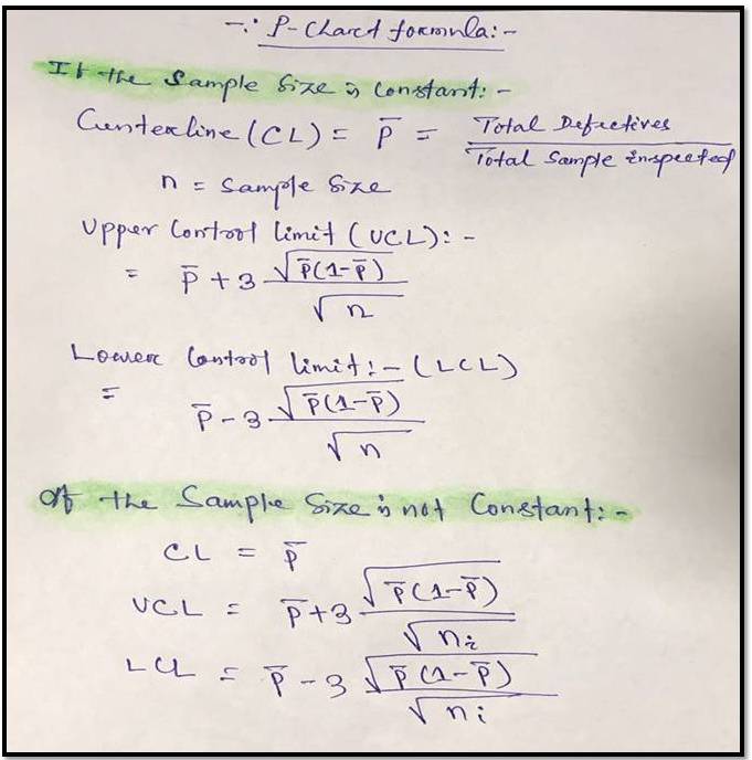
P Chart Formula:
For plotting the P chart in excel we have to calculate the three important things i.e. [1] Center line, [2] Upper control limit, & [3] lower control limit.
[P Chart Formula]
P chart example & Calculation for constant sample size:
In a manufacturing unit producing the auto part products, a process quality engineer would like to monitor the process control, so he started to collect the data for 30 days and daily inspected 250 products & recorded the defectives or nonconforming parts (Defects-blow hole, shrinkage, pinhole, etc.). 30 days data is given in below table.
Date
Constant sample size (n)
Defective/ Nonconforming
1
250
1
2
250
2
3
250
2
4
250
1
5
250
2
6
250
1
7
250
0
8
250
1
9
250
4
10
250
2
11
250
3
12
250
1
13
250
0
14
250
3
15
250
10
16
250
1
17
250
4
18
250
3
19
250
2
20
250
1
21
250
3
22
250
2
23
250
1
24
250
3
25
250
2
26
250
2
27
250
1
28
250
2
29
250
3
30
250
1
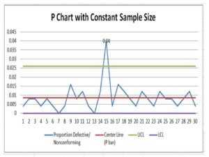
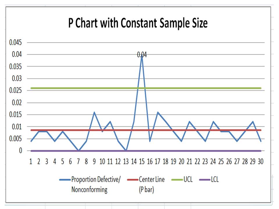
With the help of the above data, we are going to calculate and plot the P chart. As we know that we have to calculate the 3 important things, Center line, upper control limit & lower control limit.
Center Line (CL)-P bar: – Total Defectives/ Total sample Inspected
= 64/ (30*250)
= 0.0085
=0.009
Upper Control limit (UCL):-
= P bar+3*square root of (p bar*(1-p bar)/sample size)
= 0.009+3* square root of (0.009*(1-0.009)/250)
=0.009+3*0.005972
=0.026
Lower Control Limit (LCL):-
= P bar-3*square root of (p bar*(1-p bar)/sample size)
= 0.009-3* square root of (0.009*(1-0.009)/250)
=0.009-3*0.005972
= -0.0089
= -0.009
0 (Note: The LCL value is negative, so the final value of LCL is zero)
Now, you have to calculate the proportion defective or nonconforming
Proportion defective:
Here, I’m calculating the proportion defective of day-1, so similarly you can calculate for next day onwards
= Day-2 Defects/Sample size
= 1/250 = 0.004
Now, Based on the above data i.e. proportion defects, center line, upper control limit, and lower control limit, we have plotted the P chart in Excel. If you would like to download the p chart excel template with the same calculation then, download it from the above given link and similarly you can download the other template or format by Click Here
Interpretation of P Chart:
In the above p chart, we have seen that one proportion defect value is beyond the upper control limit. It means on day-15 special cause is present so, we have to take the action on it to control the process.
Free Templates / Formats of QM: we have published some free templates or formats related to Quality Management with manufacturing / industrial practical examples for better understanding and learning. if you have not yet read these free template articles/posts then, you could visit our “Template/Format” section. Thanks for reading…keep visiting techiequality.com
Shanti Gopal Pradhan is an experienced professional in Quality Management Systems, QA, Operations, Business Excellence, and Process Improvement. He has strong expertise in international standards including IATF 16949, ISO 9001, ISO 14001, ISO 45001, and ISO 17025, along with methodologies such as TQM, TPM, and Six Sigma.
He holds a degree in Mechanical Engineering along with an MBA, combining strong technical acumen with strategic business insight, he is a Certified Internal Auditor, Lead Auditor, and Six Sigma Black Belt, with a proven track record in driving quality transformation and operational excellence.
C Chart Excel Template| Formula |Example |Calculation:
Hi Readers! Today, we will be discussing here on attribute type SPC chart i.e. C chart. Its formula, calculation, and industrial example. The C chart is also called the number of nonconformities chart. Where the sample size is constant. Read the below description to learn about its selection and application in industries. If you are interested in downloading the sample C Chart Excel Template then, click on the given below link.
Sample C Chart Excel Template with industrial example-Download.
Number of nonconformities chart (C Chart):
The C chart, attribute type SPC control chart, or the number of nonconformities chart is generally used to identify the common or special causes present in the process and is also used for monitoring and detecting process variation over time. It helps to determine whether the process is in a state of statistical stable or not. Overall, it indicates that special causes are present in the process or not, whether the process is under control or not, and process variability. This C chart is selected when there is a constant sample size and multiple defects per unit are present.
Selection of Attribute type SPC Control chart (C Chart):
Step-1: Data Types?
Condition: – Discrete type data (Attribute type data)
Step-2: Is the interest in nonconformities or multiple defects per unit?
Condition: – yes, multiple defects per unit
Step-3.:- Is the sample size constant?
Condition: – Yes, then use the C chart.
Description
Condition
Data Type:
Discrete type data (Attribute type data)
Is the interest in nonconformities or multiple defects per unit?
Yes, Multiple defects per unit present
Is the sample size constant?
Yes
Chart type:
C Chart
C Chart Formula:
The three important things need to be calculated before plotting the C chart i.e. [1] Centerline, [2] Upper control limit, & [3] lower control limit.
Centerline (CL) or C bar = Total number of nonconformities or defects / Number of samples
Upper control limit (UCL) = C-bar + 3 x Square root of C-bar
Lower control limit (LCL) = C-bar – 3 x Square root of C-bar
The formula of C chart
CL or C- bar =
Total number of nonconformities or defects / Number of samples
UCL =
C-bar + 3 x Square root of C-bar
LCL =
C-bar – 3 x Square root of C-bar
How to plot a c chart in excel?
Here, I’m going to share my own industrial experience regarding the application and usage of a c chart in the manufacturing industry by providing a sample example for your quick learning and implementation in your organization. I have considered 50 sample sizes, and three different defects and collected the data for 30 days. Details of data are given below table.
Date
Constant sample size (n)
Defect-1
Defect-2
Defect-3
Total Defects
1
50
1
1
2
2
50
1
1
2
4
3
50
2
2
1
5
4
50
1
1
2
5
50
1
1
2
4
6
50
1
1
2
7
50
1
1
1
3
8
50
2
2
2
6
9
50
2
2
3
7
10
50
1
1
2
4
11
50
1
1
3
5
12
50
1
1
1
3
13
50
5
5
7
17
14
50
1
1
2
15
50
1
1
1
3
16
50
2
2
1
5
17
50
1
1
2
18
50
1
1
1
3
19
50
1
1
3
5
20
50
1
1
2
21
50
2
2
4
22
50
1
1
2
23
50
2
2
2
6
24
50
1
1
3
5
25
50
1
1
1
3
26
50
2
2
4
27
50
1
1
1
3
28
50
1
1
2
29
50
1
1
1
3
30
50
1
1
1
3
All the above three defects are attribute type defects. Before plotting the c chart in excel we have to calculate the three important things first, one is CL, UCL & LCL.
Calculation:
Centerline (CL) or C-bar:
Formula = Total number of nonconformities or defects / Number of samples
CL = 121 / 30 =4.033
UCL (Upper control limit):
Formula = C-bar + 3 x Square root of C-bar
UCL = 4.033 + 3* Square root of 4.033
UCL = 4.033+3*2.008
UCL = 10.0577
UCL = 10.058
LCL (Lower control limit):
LCL = C-bar – 3 x Square root of C-bar
LCL = 4.033 – 3* Square root of 4.033
LCL = 4.033-3*2.008
LCL = 4.033-6.024
LCL = -1.991 (the value is negative so LCL is Zero)
LCL = 0.00
Calculation value
CL =
4.033
UCL =
10.058
LCL =
0
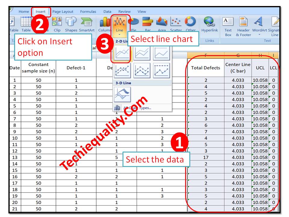
Follow the below step to plot the c chart in excel:
Step-1: open the excel sheet.
Step-2: Do the data entry on the Excel sheet.
Step-3: Select the data and then go to the insert option in the main menu and next to select line chart. The detail is mentioned in the below image.
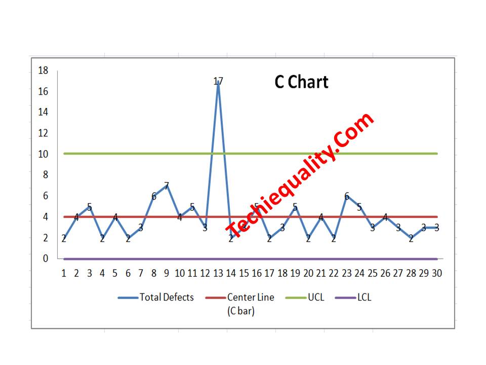
C Chart:
With the help of the above data, we have plotted the c chart, which is given below. if you would like to download the C Chart Excel Template then, click here.
Interpretation of the above C Chart:
In the above C chart, we have seen that one defect value is beyond the upper control limit. It means on day-13 special cause was present in the process, so we have to take the action on it to control the process.
Free Templates / Formats of QM: we have published some free templates or formats related to Quality Management with manufacturing / industrial practical examples for better understanding and learning. if you have not yet read these free template articles/posts then, you could visit our “Template/Format” section. Thanks for reading…keep visiting techiequality.com
Shanti Gopal Pradhan is an experienced professional in Quality Management Systems, QA, Operations, Business Excellence, and Process Improvement. He has strong expertise in international standards including IATF 16949, ISO 9001, ISO 14001, ISO 45001, and ISO 17025, along with methodologies such as TQM, TPM, and Six Sigma.
He holds a degree in Mechanical Engineering along with an MBA, combining strong technical acumen with strategic business insight, he is a Certified Internal Auditor, Lead Auditor, and Six Sigma Black Belt, with a proven track record in driving quality transformation and operational excellence.