Normal Distribution Probability Formula, Calculation & Manufacturing Examples
Hello readers! Today we will be discussing the normal distribution probability calculation with manufacturing example. If observed or recorded data are normally distributed then you can calculate the probability in easy three ways by Z score table, by using excel function and last but not least method is by help of Minitab software. So here we are going to learn all three methods with manufacturing example.
Normal Distribution Probability Calculation:
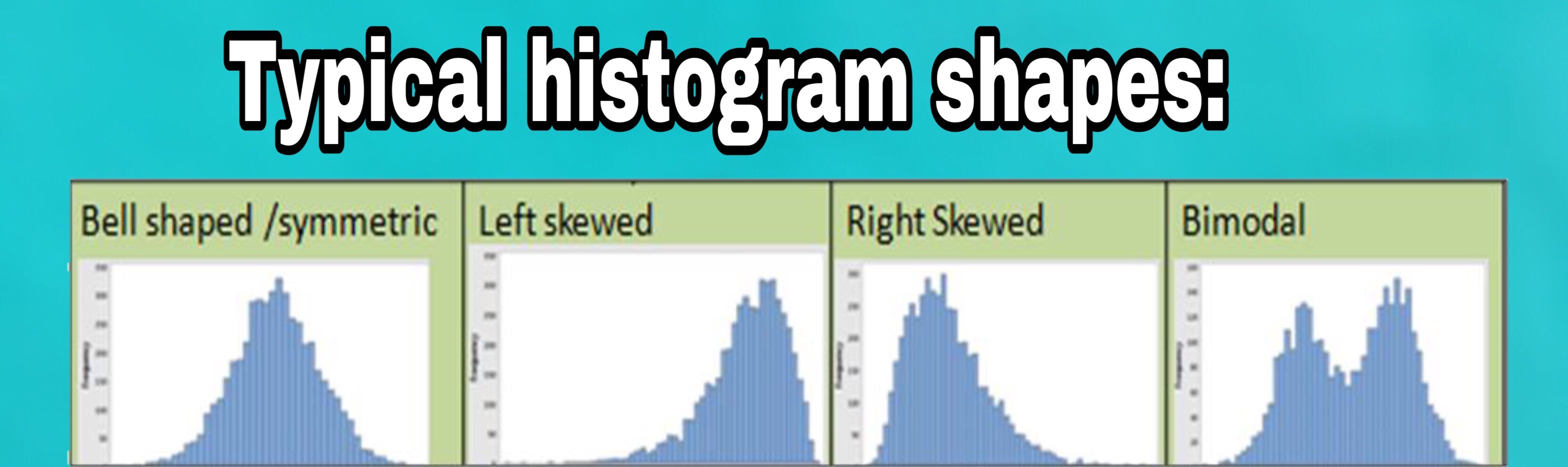
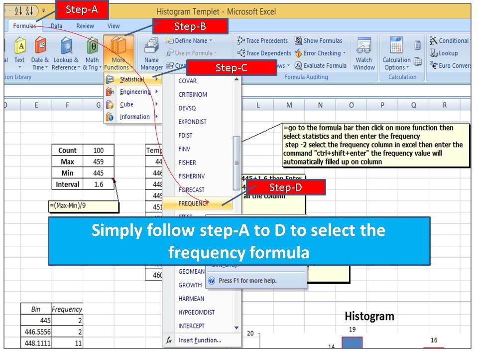
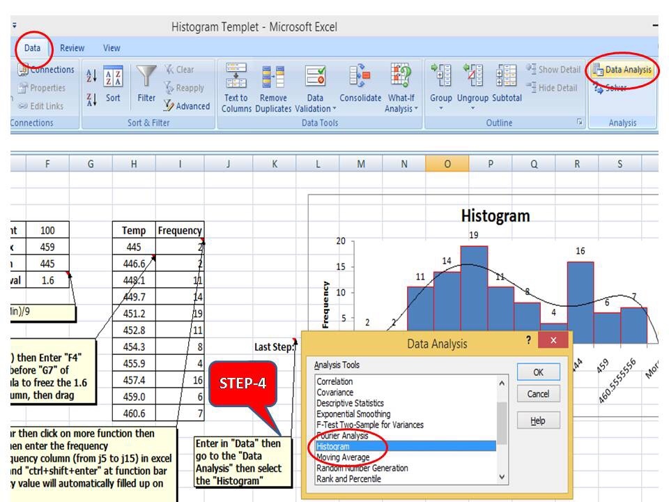
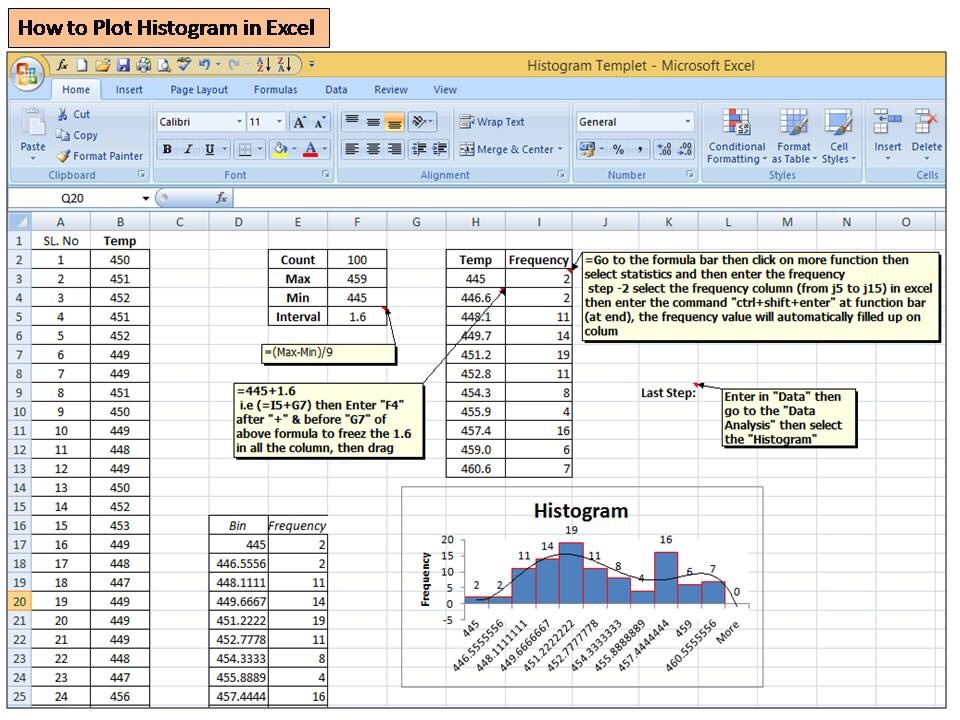
Before discussing on probability calculation of normally distributed data, you should ensure that data are followed normal distribution. To do so, you can either plot a graph or can execute the hypothesis test just to confirm the distribution. For example, you have plotted the histogram to know the data distribution for normality then you can pay attention towards the data symmetric followed by the bell curve. If data are symmetric then we can call the data are normally distributed. But sometimes it may be difficult to understand from the graph then you can go for a hypothesis test as well.
Once you confirm the normal distribution, whether data are normally distributed or not, then you can follow the following below 3- methods for calculating the probability.
- Probability calculation by Z score table
- By using Excel function
- By using Minitab software
Normal Distribution Probability Calculation with Manufacturing Examples:
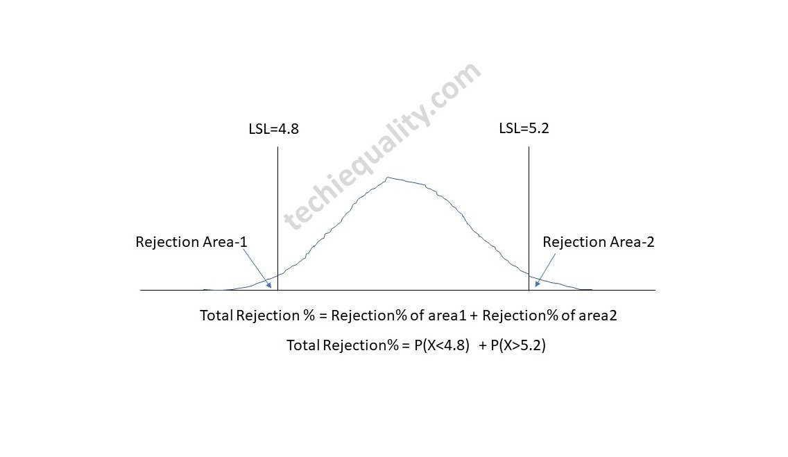
Now, let’s talk about the normal distribution examples and solutions of manufacturing industry. Suppose a company manufacturing the metal sheet having specification range of thickness is 5±0.2. Thickness of random sample of 31 nos sheet is given below then, Calculate the total rejection percentage?
| Sheet No. | Sheet Thickness |
| 1 | 4.97 |
| 2 | 4.99 |
| 3 | 5.01 |
| 4 | 5.04 |
| 5 | 4.98 |
| 6 | 4.99 |
| 7 | 5.03 |
| 8 | 5.05 |
| 9 | 4.96 |
| 10 | 4.98 |
| 11 | 5.02 |
| 12 | 5.04 |
| 13 | 5.05 |
| 14 | 5.21 |
| 15 | 5.03 |
| 16 | 5.04 |
| 17 | 5.1 |
| 18 | 5.09 |
| 19 | 5.01 |
| 20 | 5 |
| 21 | 5.03 |
| 22 | 5.01 |
| 23 | 5.12 |
| 24 | 5.08 |
| 25 | 5.09 |
| 26 | 4.99 |
| 27 | 5.04 |
| 28 | 5.07 |
| 29 | 5.08 |
| 30 | 5 |
| 31 | 4.98 |
Calculation:
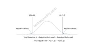
Mean = 5.035, Standard deviation = 0.052, USL = 5.2, LSL = 4.8
Total Rejection percentage calculation using Z Score:
The normal distribution probability formula using z score and cumulative probability table is given below.
Z Score Formula = (Observed Value – Mean) / Standard Deviation
Z Score @4.8 = 4.8-5.035/0.052
= -4.52
Z score @5.2 = 5.2- 5.035/0.052
= 3.17
Based on Z score vale -4.5, the cumulative probability (P(X<4.8)) is 0.0000034 (Data from z score table).
The cumulative probability P(X<5.2) based on Z score 3.17 is 0.9992
P(X>5.2) = 1- P(X<5.2) = 1-0.9992 = 0.0008
Total Rejection = P(X<4.8) + P(X>5.2)
= 0.0000034 + 0.0008 = 0.000803
Total Rejection% = 0.08%
Total Rejection percentage calculation using Excel function:
Formula for normal distribution probability using excel function is given below, just follow the beneath provided function to calculate the probability.
Mean = 5.035, Standard deviation = 0.052, USL = 5.2, LSL = 4.8
Excel Function Formula = NORM.DIST(x, mean, standard deviation, cumulative)
P(X<4.8) = NORM.DIST(4.8,5.035,0.052,TRUE-cumulative distribution function)
= 0.0
P(X>5.2) = 1- P(X<5.2) = 1- 0.9992 = 0.0008
Total Rejection% = 0.08%
Total Rejection percentage calculation using Minitab:
- Follow the below steps to open the normal distribution page
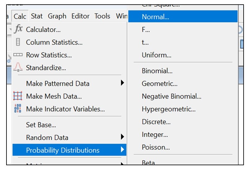
- Select the below option and then, click on “OK”.
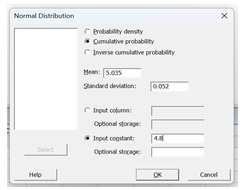
P(X<4.8) = 0.0000031
Similarly calculate the P(X>5.2)
P(X>5.2) = 1- P(X<5.2)
= 1-0.9992 = 0.0008
Total Rejection = 0.0000031 + 0.0008 = 0.0008031
Total Rejection% = 0.08%
Useful Post:
SDCA Cycle understanding with Manufacturing Example | PDCA vs SDCA
DPMO Calculation, Formula, Template & Manufacturing Example
Six Sigma Project Charter Template
Six Sigma Project Examples | 15+ Project Examples
More on Techiequality


Shanti Gopal Pradhan is an experienced professional in Quality Management Systems, QA, Operations, Business Excellence, and Process Improvement. He has strong expertise in international standards including IATF 16949, ISO 9001, ISO 14001, ISO 45001, and ISO 17025, along with methodologies such as TQM, TPM, and Six Sigma.
He holds a degree in Mechanical Engineering along with an MBA, combining strong technical acumen with strategic business insight, he is a Certified Internal Auditor, Lead Auditor, and Six Sigma Black Belt, with a proven track record in driving quality transformation and operational excellence.