P Chart Excel Template | Formula | Example | Control Chart | Calculation
Hi Readers! Here, we are going to discuss on attribute type control chart, especially on the P chart. Also, you can learn the formula, and calculation part with industrial or manufacturing examples. You can download the P chart excel template from below given link.
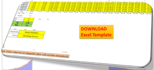
Sample P chart excel template with industrial example-Download Here
Attribute type Control chart (P Chart):
The P chart, attribute type control chart, or proportion nonconforming chart is generally used to identify the common or special causes present in the process and also used for monitoring and detecting process variation over time. It helps to determine whether the process is in a state of statistical stable or not. Overall, it indicates that special causes are present in the process or not, whether the process is under control or not, and process variability.
How to select proportion nonconforming (P chart):
Step-1: Data Types?
Ans.:- Discrete type data (Attribute type data)
Step-2: Is the interest in nonconforming units or one defect per unit?
Ans.:- yes, one defect per unit
Step-3.:- Is the sample size constant?
Ans.:- Yes or No, then use P chart.
Note; for both the cases, if the sample size is constant or if not, in this scenario you can select p chart.
| Data Type:—— | Discrete type data (Attribute type data) |
| Is the interest in nonconforming units or one defect per unit?—- | Yes |
| Is the sample size constant? | Yes or No |
| Select Chart type: | P Chart |
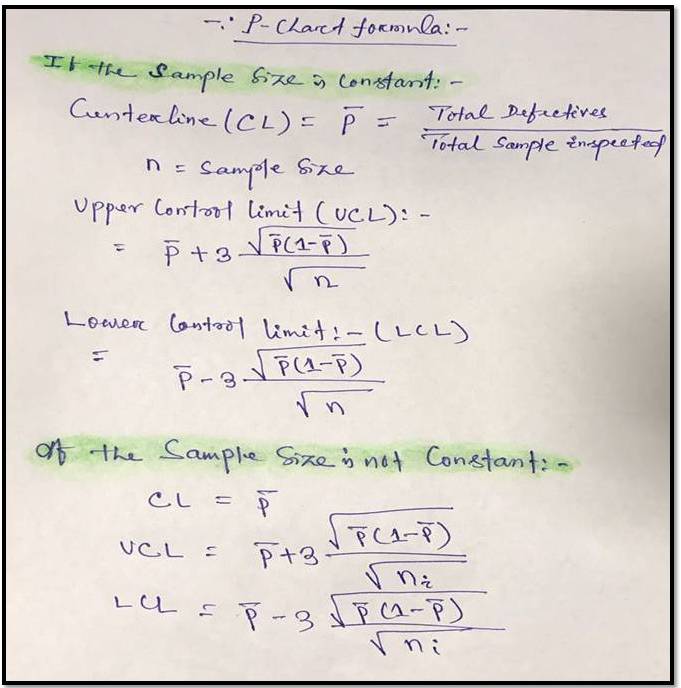
P Chart Formula:
For plotting the P chart in excel we have to calculate the three important things i.e. [1] Center line, [2] Upper control limit, & [3] lower control limit.
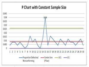
P chart example & Calculation for constant sample size:
In a manufacturing unit producing the auto part products, a process quality engineer would like to monitor the process control, so he started to collect the data for 30 days and daily inspected 250 products & recorded the defectives or nonconforming parts (Defects-blow hole, shrinkage, pinhole, etc.). 30 days data is given in below table.
| Date | Constant sample size (n) | Defective/ Nonconforming |
| 1 | 250 | 1 |
| 2 | 250 | 2 |
| 3 | 250 | 2 |
| 4 | 250 | 1 |
| 5 | 250 | 2 |
| 6 | 250 | 1 |
| 7 | 250 | 0 |
| 8 | 250 | 1 |
| 9 | 250 | 4 |
| 10 | 250 | 2 |
| 11 | 250 | 3 |
| 12 | 250 | 1 |
| 13 | 250 | 0 |
| 14 | 250 | 3 |
| 15 | 250 | 10 |
| 16 | 250 | 1 |
| 17 | 250 | 4 |
| 18 | 250 | 3 |
| 19 | 250 | 2 |
| 20 | 250 | 1 |
| 21 | 250 | 3 |
| 22 | 250 | 2 |
| 23 | 250 | 1 |
| 24 | 250 | 3 |
| 25 | 250 | 2 |
| 26 | 250 | 2 |
| 27 | 250 | 1 |
| 28 | 250 | 2 |
| 29 | 250 | 3 |
| 30 | 250 | 1 |
With the help of the above data, we are going to calculate and plot the P chart. As we know that we have to calculate the 3 important things, Center line, upper control limit & lower control limit.
Center Line (CL)-P bar: – Total Defectives/ Total sample Inspected
= 64/ (30*250)
= 0.0085
=0.009
Upper Control limit (UCL):-
= P bar+3*square root of (p bar*(1-p bar)/sample size)
= 0.009+3* square root of (0.009*(1-0.009)/250)
=0.009+3*0.005972
=0.026
Lower Control Limit (LCL):-
= P bar-3*square root of (p bar*(1-p bar)/sample size)
= 0.009-3* square root of (0.009*(1-0.009)/250)
=0.009-3*0.005972
= -0.0089
= -0.009
0 (Note: The LCL value is negative, so the final value of LCL is zero)
Now, you have to calculate the proportion defective or nonconforming
Proportion defective:
Here, I’m calculating the proportion defective of day-1, so similarly you can calculate for next day onwards
= Day-2 Defects/Sample size
= 1/250 = 0.004
Now, Based on the above data i.e. proportion defects, center line, upper control limit, and lower control limit, we have plotted the P chart in Excel. If you would like to download the p chart excel template with the same calculation then, download it from the above given link and similarly you can download the other template or format by Click Here
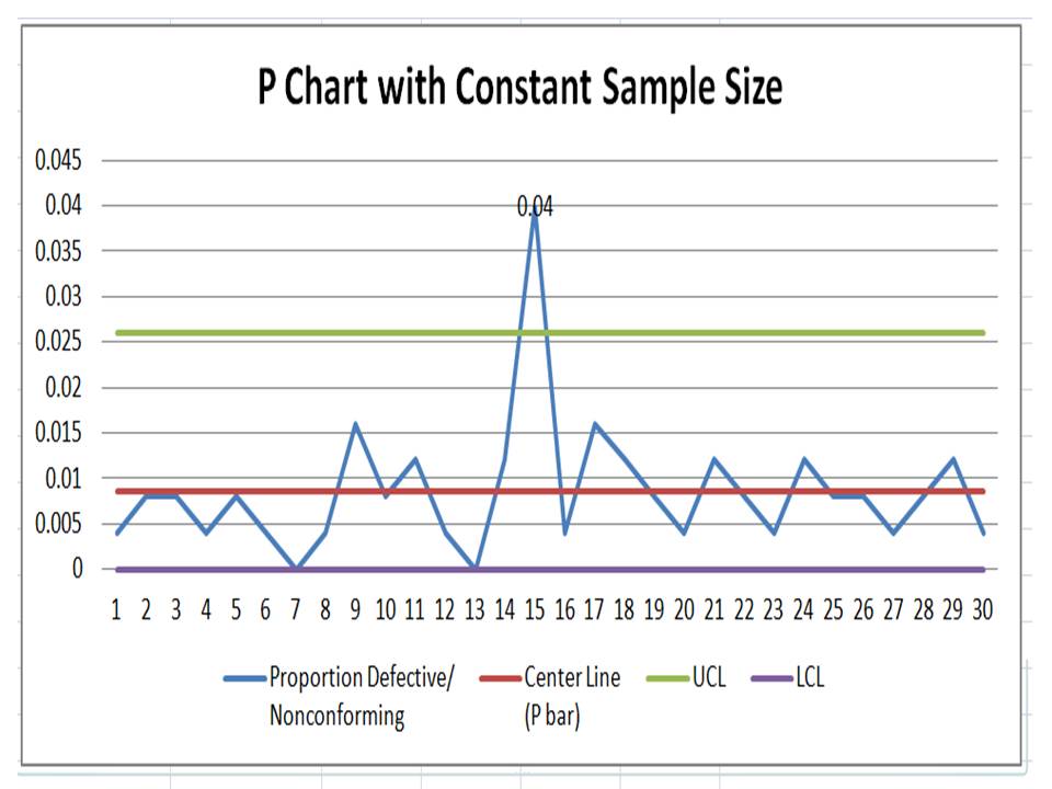
Interpretation of P Chart:
In the above p chart, we have seen that one proportion defect value is beyond the upper control limit. It means on day-15 special cause is present so, we have to take the action on it to control the process.
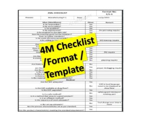
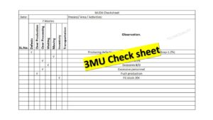
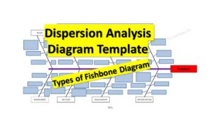
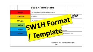
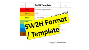
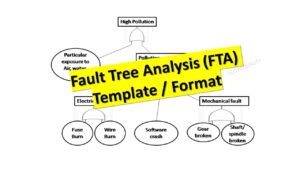
Free Templates / Formats of QM: we have published some free templates or formats related to Quality Management with manufacturing / industrial practical examples for better understanding and learning. if you have not yet read these free template articles/posts then, you could visit our “Template/Format” section. Thanks for reading…keep visiting techiequality.com
More on TECHIEQUALITY


Popular Post

Shanti Gopal Pradhan is an experienced professional in Quality Management Systems, QA, Operations, Business Excellence, and Process Improvement. He has strong expertise in international standards including IATF 16949, ISO 9001, ISO 14001, ISO 45001, and ISO 17025, along with methodologies such as TQM, TPM, and Six Sigma.
He holds a degree in Mechanical Engineering along with an MBA, combining strong technical acumen with strategic business insight, he is a Certified Internal Auditor, Lead Auditor, and Six Sigma Black Belt, with a proven track record in driving quality transformation and operational excellence.