Process Flow Diagram Template | Examples |Symbols |PFD

Process Flow Diagram

Process Flow Diagram Template | Examples |Symbols |PFD

Hi Readers! Here, today we will be discussing the process flow diagram, its symbols, and practical examples. We have prepared a PFD template for sample and example basis, if you would like to download the free template or format of the PFD-process flow diagram then, go through the below-given link.

The process flow diagram template or format in excel-DOWNLOAD-PFD in Excel template or format.

What is a Process Flow Diagram- PFD?

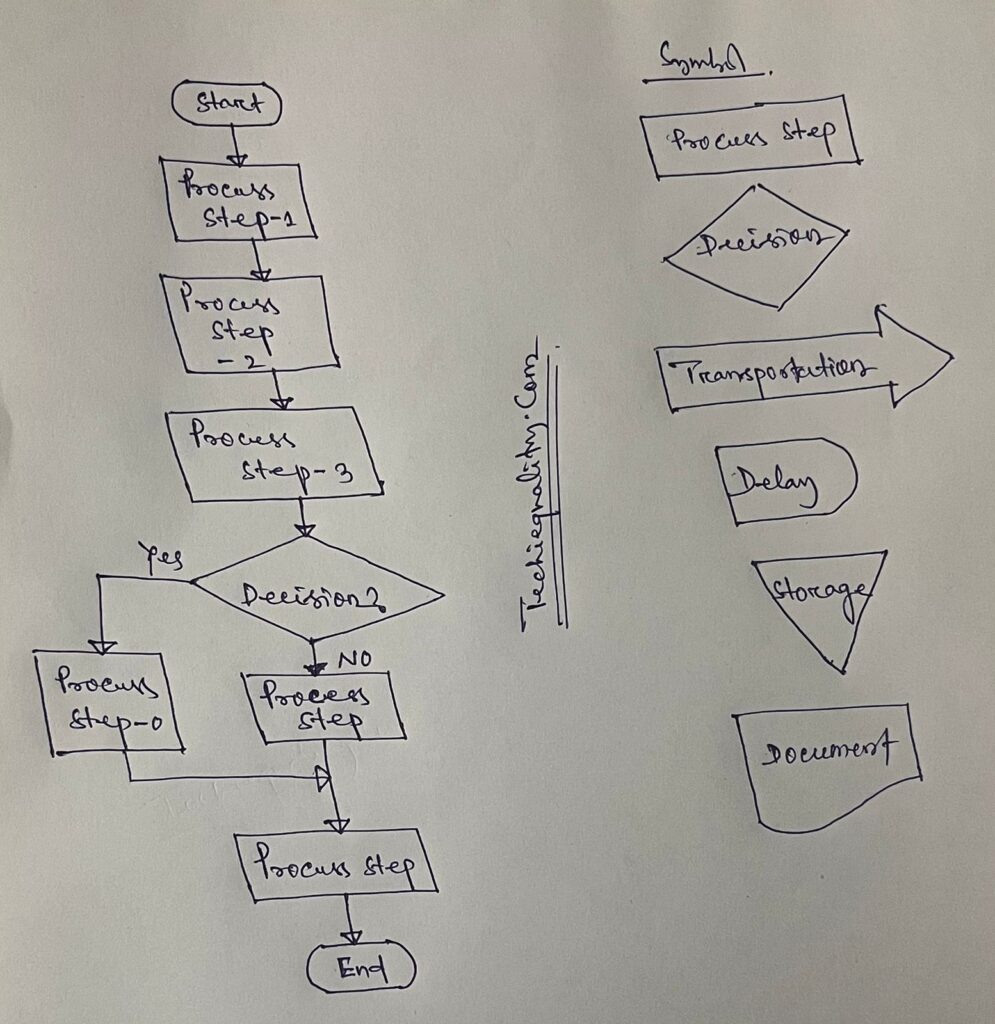
The PFD or process flow diagram is a flow chart or process flow diagram or process mapping of a process. The PFD represents the process sequence and details (like a machine, activities, process sequence, relevant document, process control, decision, etc).

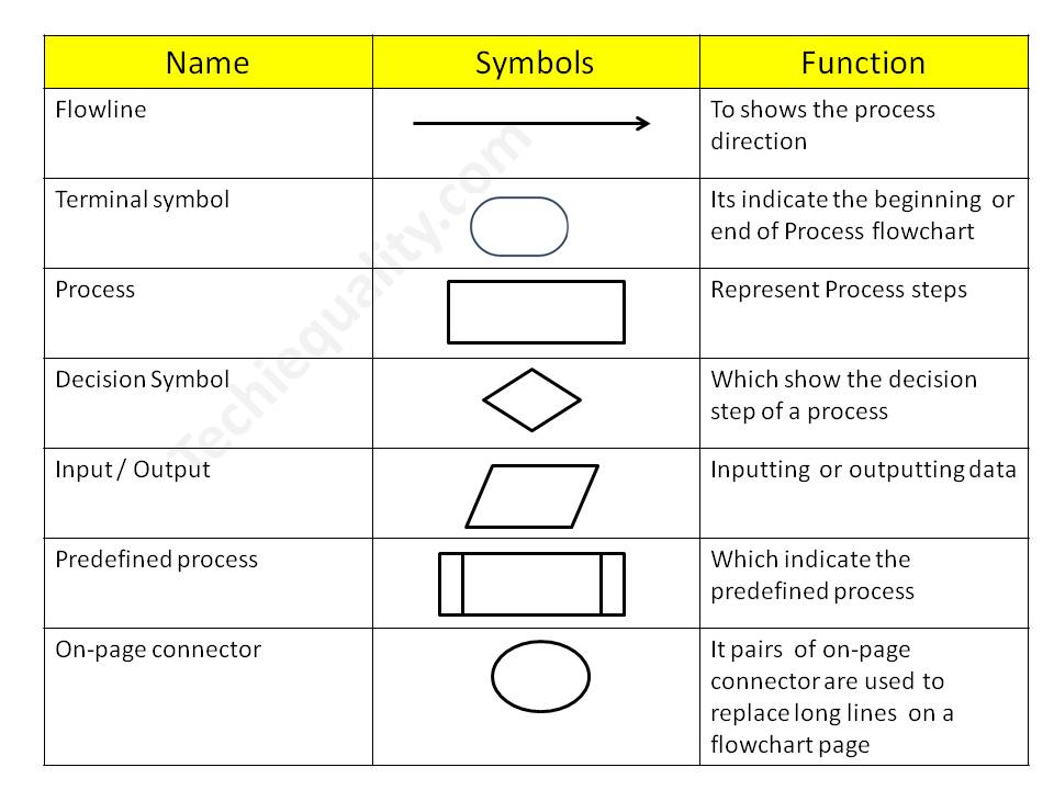
Symbols of Process flow diagram – PFD:

PFD/PFC has many symbols but we will discuss only common symbols. Details are given below;

Symbol NameFunction
FlowlineTo show the process direction
Terminal symbolIt indicates the beginning  or end of the Process flowchart
ProcessRepresent Process steps
Decision SymbolWhich shows the decision step of a process
Input / OutputInputting  or outputting data
Predefined processWhich indicates the predefined process
On-page connectorPairs of on-page connectors are used to replace long lines  on a flowchart page
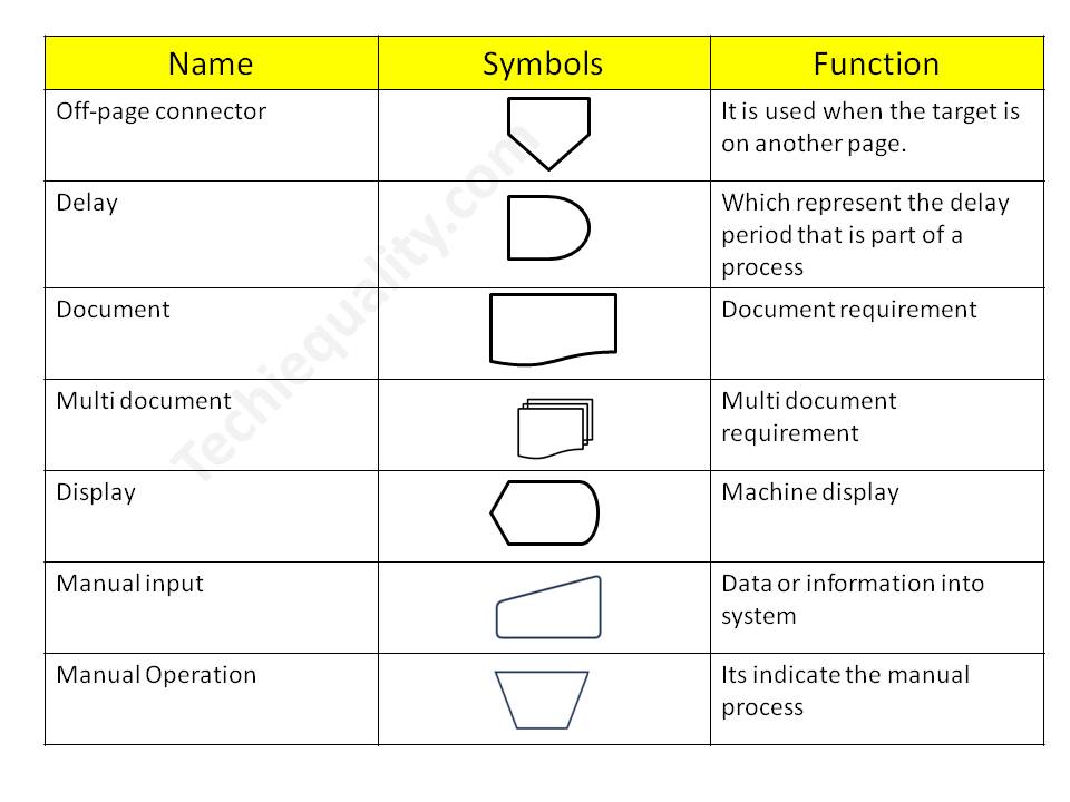
Off-page connectorIt is used when the target is on another page.
DelayWhich represents the delay period that is part of a process
DocumentDocument requirement
Multi-documentMulti-document requirement
DisplayMachine display
Manual inputData or information in the system
Manual OperationIt indicates the manual process

Process Flow Chart symbols / PFD

Process Flow Diagram

4 Steps to create a PFD-Process flow Diagram:

Step-1:

CFT team formation including the process owner.

Step-2:

List out the process, activities, decision, machine, control mechanism, etc

Step-3:

Sequentially write down the process, activities, and decisions of the process

Step-4:

Plot the diagram by using the PFD symbols.

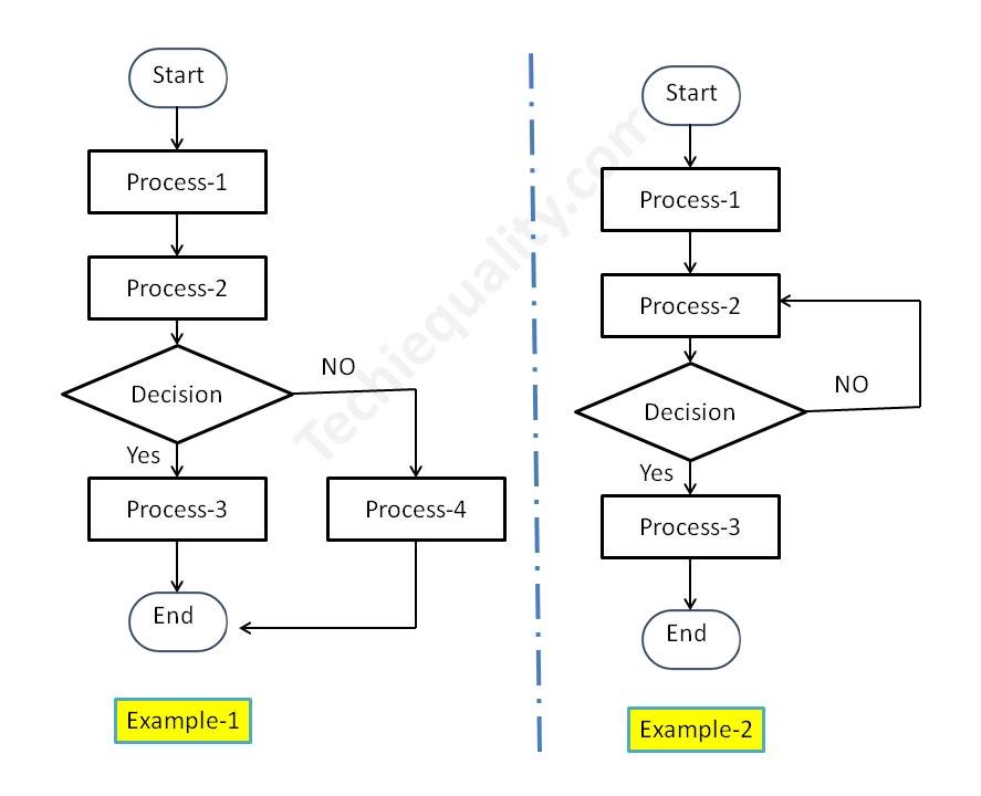
Process Flow Diagram Example:

We have created two process flow diagrams, i.e. [1] without repetition of the process after the decision and [2] with repetition of the process after the decision. Both two types of PDF are given below;
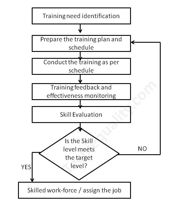
Process Flow Diagram
PFD/PFC-process flow chart example

Industrial Example:

Here we have taken the process flow diagram example of Training, which is one of the most powerful things to competent the workforce and enhance the skill of employees. So that optimum knowledge can be utilized for effective output from operation by employees at an organization. Hence if you would like to create a process flow chart of education and training operations then the below example will be helpful to prepare the same. This is only for reference and learning purposes.

We have prepared the PFD followed by the above steps:

Step-1:

We have formed a team including the HRD member.

Step-2:

Identified the activities below

  • Training needs identification
  • Prepare the training plan and schedule
  • Conduct the training as per schedule
  • Training feedback and effectiveness monitoring
  • Skill evaluation.

Step-3:

We have arranged the activities sequentially as given below of education and training operations.

Activities-1Training needs identification
Activities-2Prepare the training plan and schedule
Activities-3Conduct the training as per schedule
Activities-4Training feedback and effectiveness monitoring
Activities-5Skill evaluation

Step-4:

We have prepared the PFD – process flow chart for education and training operations and details are given below;

process mapping

FAQ:

What is the process flow?

The process flow is the flow chart that represents the process sequences or process mapping including machine details, control data, document reference, etc.

What is the difference between SIPOC and PFD?

The SIPOC diagram consists of 5 elements i.e. Supplier, Input, Process, Output, and Customer. the PDF is the process mapping that represents the process sequences.

What is flowchart?

The FC is a flow diagram or mapping of activities.

What are the 3 types of PFD?

[1] System PFD, [2] General PFD, [3] Detailed PFD

Free Templates / Formats of QM: we have published some free templates or formats related to Quality Management with manufacturing / industrial practical examples for better understanding and learning. if you have not yet read these free template articles/posts then, you could visit our “Template/Format” section. Thanks for reading…keep visiting techiequality.com

Useful Post:

4M Change Management | How to implement in Manufacturing unit | Template | Format

C Chart Excel Template | Formula | Example | Calculation

P Chart Excel Template | Formula |Example |Control Chart | Calculation

ABC Analysis of Inventory with Industrial Example

How to calculate z-score in excel with manufacturing example

7QC Tools for Problem Solving | What are 7 QC Tools

7QC Tools for Problem Solving

7QC Tools for Problem Solving | What are 7 QC Tools

7QC Tools for Problem Solving techniques are generally used in manufacturing, Non-manufacturing industries, and service sectors to resolve problems.

Download 7-QC Tools Template/ Format

Definition and History:-

The 7QC Tools (Also Known as “Seven Basic Tools of Quality”) originated in Japan. First emphasized by Kaoru Ishikawa, a professor of engineering at Tokyo University and the father of “quality circles”. These tools are used to solve critical quality-related issues. You can use the 7 basic tools of quality to help understand and solve problems or defects in any industry. With the help of Excel, you can plot the graphs / Diagrams to resolve the daily quality problems. I will help you to understand the basic ideas and knowledge of 7QC Tools and their usage.

For solving problems seven QC tools are used Pareto Chart, Cause & Effect Diagram, Histogram, Control Charts, Scatter Diagrams, Graphs/Process Flow Diagram, and Check Sheets. All these tools are important tools used widely in the manufacturing field to monitor the overall operation and continuous process improvement. seven QC tools are used to find out the Root cause of the problem and implement the action plan to improve the process efficiency.

7QC tools are:-

  1. Pareto Chart
  2. Cause and effects diagram
  3. Histogram
  4. Scatter Diagram
  5. Control Chart
  6. Check Sheet
  7. PFD(Process Flow diagram)/Graphs
7QC Tools for Problem Solving

 Benefits of 7QC Tools:-

  • Improve management decisions.
  • Simple and easy for implementation
  • Continuous quality improvement
  • Quick results
  • Enhances customer satisfaction through improved quality product
  • Reduce cycle time and improve efficiency
  • Control cost of poor quality / Cost of quality
  • Reduce defects and optimize the production
  • Reduce variations and improve the quality of Products
  • Encouragement of teamwork and confidence
  • Enhancement of customer focus.

Pareto Chart:-

A Pareto Chart is named after the Italian Economist Vilfredo Pareto. It is a type of chart that contains both bars and a line graph, where the individual values are represented in the bar graph in descending order (largest to smallest value) and the cumulative percentage is represented in the line graph.

Click here to learn “How to Plot Pareto Chart In Excel”.

Understanding the Pareto Chart principle (The 80/20 rule): 

The Pareto principle is also known as the 80/20 rule derived from the Italian Economist Vilfredo,

The principle is understood as –

20% of the input creates 80% of the results

Or

80 % of the effects come from 20% of the causes.

Pareto Chart Example

[Figure-1]

In the above Pareto Chart[Figure-1], we can see the cumulative% in the line graph, According to the Pareto Chart principle 80/20 rule, the 80% cumulative in the line graph is filling under the low hardness, which means BH, Damage, SH and Low hardness defers are coving the 80% of contribution over total types of defects. And those 80 % of contributions were due to the 20% caused.

 Histogram:-

The histogram is one of the 7QC tools, which is the most commonly used graph to show frequency distribution.

Helps summarize data from a process that has been collected over a period of time.

Click here to know the “How to Plot Histogram in Excel:

Histogram Template
Histogram Template

[Figure-2]

Fish-bone Diagram/Cause and Effects /Ishikawa Diagram:-

The cause and Effects Diagram looks like a fish that’s why it’s called Fish-bone Diagram, also called the Ishikawa diagram.

It’s a visualization tool for categorizing the potential causes of a problem in order to identify its root causes.

CFT members are identifying the potential cause through the Brainstorming process of individuals and together.

 The Potential cause is related w.r.t below as

  • Machine
  • Manpower
  • Environment
  • Method
  • Materials
  • Measurement
Fishbone Diagram Example

[Figure-3]

Scatter diagram:-

The scatter diagram graphs pairs of variable data, with one variable on each axis, to look for a relationship between them. If the variables correlate, the points will fall along a line or curve. The better the correlation, the more points will strongly cluster to the line. It generally gives the idea of the correlation between the variables.

Scatter Diagram Template

[Figure-4]

In the above figure-4, the positive and Negative correlation is only due to the direction, and in both the correlation, points are clustered to the line but in the last figure in figure-4, Points are not clustered to the line but spread over the X and Y-axis.  

Control Chart:-

A line on a control chart is used as a basis for judging the stability of a process. If the observed points are beyond a control limit then it is evidence that special causes are affecting the process.

Control Charts can be used to monitor or evaluate a process.

There are basically two types of control charts, those for variable data and those for attributes data.

Click here to learn more about the Control Chart and Statistical Process Control. 

Benefits:-Higher Quality, Lower Unit Cost, Higher effective Capability, etc.

Selection of Control Charts based on Attribute / Variable Type Data:-

selection of control chart

Calculation of Average and Range Charts-

Click here to know the details.

The formula of the Attributes Control Chart:-

Click here to learn the formula and calculation.

Nomenclature of Control Chart:-

7QC tools for problem solving

Check Sheet:-

Check Sheet is a simple document used for collecting data in real time. Variable or Attribute type data is collected through a Check sheet. A check sheet generally helps to make the decision on the basis of a fact and to collect the data for analysis and evaluation.

Sample check Sheet:-

LogoTitle:-………Format No-

Issue no-…  rev. no-

Date-

ParametersSpecificationObservationsRemarks


           Checked by:-                                                                  Verified by:-

Process Flow diagram/Graphs:-

A process flow diagram is a diagram used to indicate the general flow of plant processes and equipment.

flow chart

The 7QC tools are the most commonly used tool in the industry for improvement, With the help of the 7QC tools you can understand the process/activities, analyze the data, and interpret the result/graph/output.

FAQ:

Which are the 7 QC tools?

The seven QC tools are

  1. Pareto Chart
  2. Fishbone diagram
  3. Histogram
  4. Scatter Diagram
  5. Control Chart
  6. Check Sheet
  7. PFD(Process Flow diagram)/Graphs /Stratification

Useful Article:

why why analysis methodology | 5-why analysis step by step guide

Rework vs Repair |IATF Requirement for Control of Reworked/ Repaired Product

How to plot the Run Chart in Minitab

Run Chart Example | Concept & Interpretation of Result with Case Study | Industrial Example:

Thank you for reading..keep visiting Techiequality.Com

I hope the above article “7QC Tools for Problem Solving” is useful to you…

Popular Post: