Pareto Chart Example of Manufacturing Units

Pareto Chart Example

Pareto Chart Example of Manufacturing Units

Pareto Chart Example: Hello Readers! Today we will discuss about the pareto chart principle (80/20 Rule) with manufacturing examples.

DOWNLOAD the Below Example Pareto chart in Excel format.

Pareto Principle (80/20 Rule): –

The 80/20 Rule or Pareto Principle is the most important part of Pareto Analysis. The rule 80/20 says that 80% of the effects come from 20% of the causes.

History of 80/20 Rule: In Italy, Vilfredo Pareto has originally observed that 20% of people were owned 80% of the land. This principle was applied to quality control and favoured the use of the statement of the phrase, which is “The Vital few and useful many” to define the 80/20 rule in the 20th century by Dr. Joseph M. Juran.

Understanding of Principle with Manufacturing Example:

 We have taken the major defects related to the Metal fabrication and casting Process. We will analyze the contribution of defects among all with the help of the Pareto principle 980/20 Rule). So, let’s get started with two important examples, details are given below.

Example:
Defects Quantity
Fatigue 41
High temp. defect 37
Mechanical Property degradation 32
Creep 28
Env. Interaction 23
Microstructural changes 19
Wear 16
Abbrasive Wear 12
fretting 9
Erosion 5

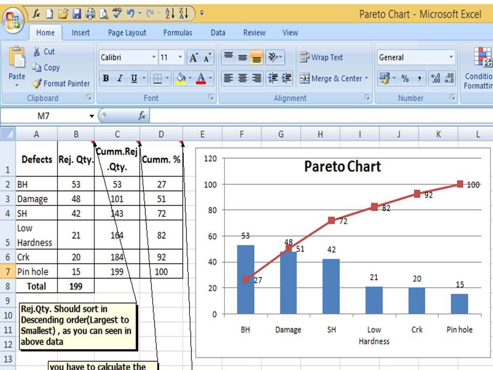
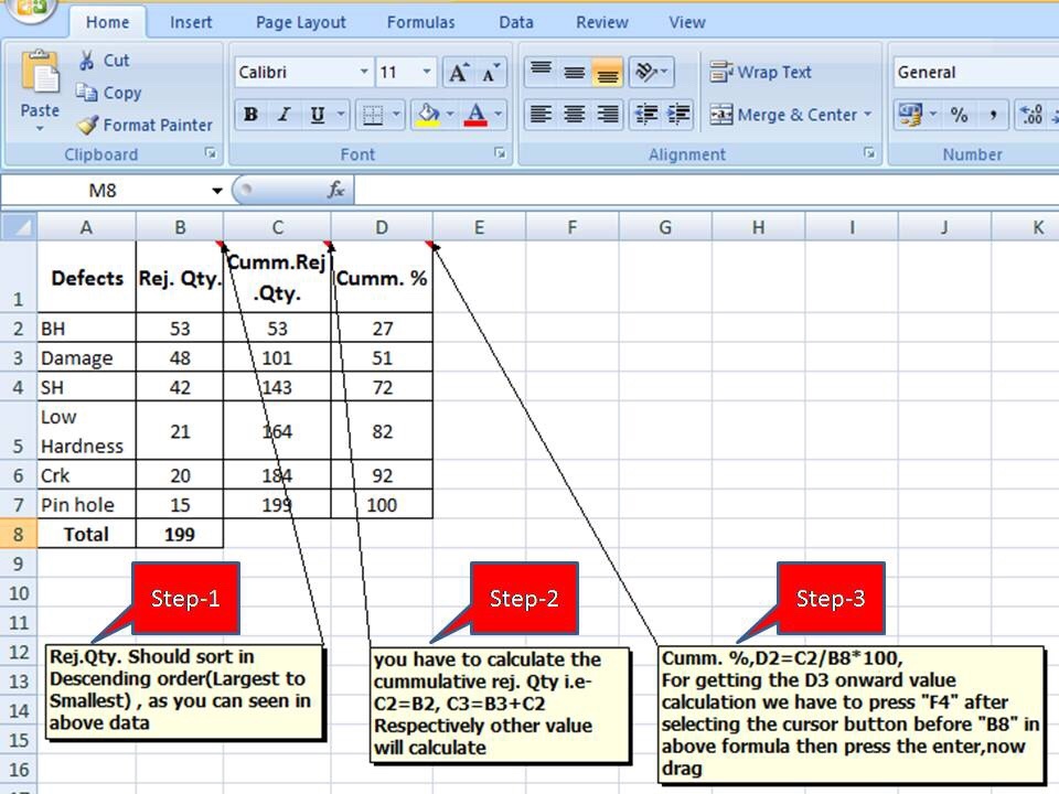
Now, we are supposed to calculate the Cumulative total and Cumulative percentage

Defects Quantity Cumulative
Total
Cumulative in
%
Fatigue 41 41 18%
High temp. defect 37 78 35%
Mechanical Property degradation 32 110 50%
Creep 28 138 62%
Env. Interaction 23 161 73%
Microstructural changes 19 180 81%
Wear 16 196 88%
Abbrasive Wear 12 208 94%
fretting 9 217 98%
Erosion 5 222 100%

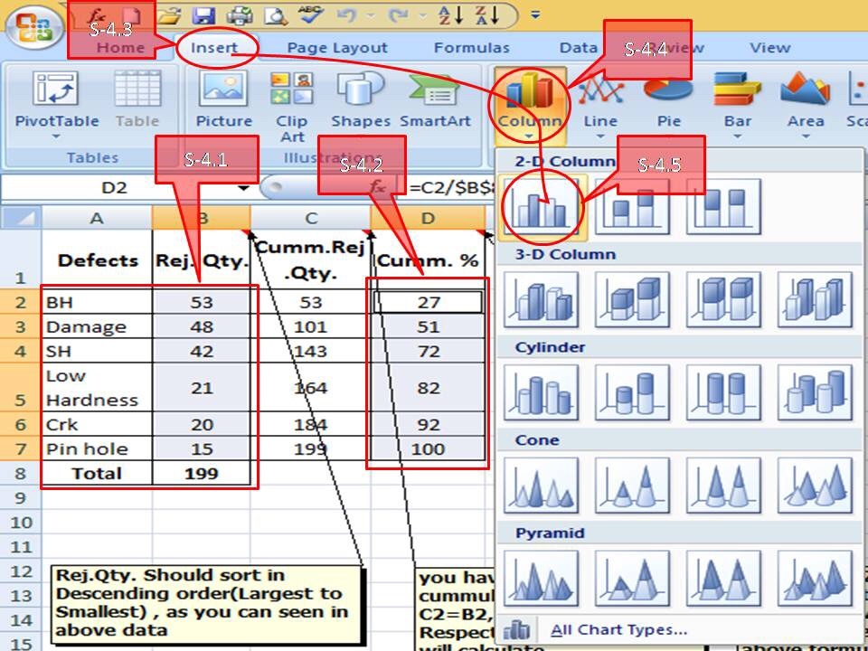
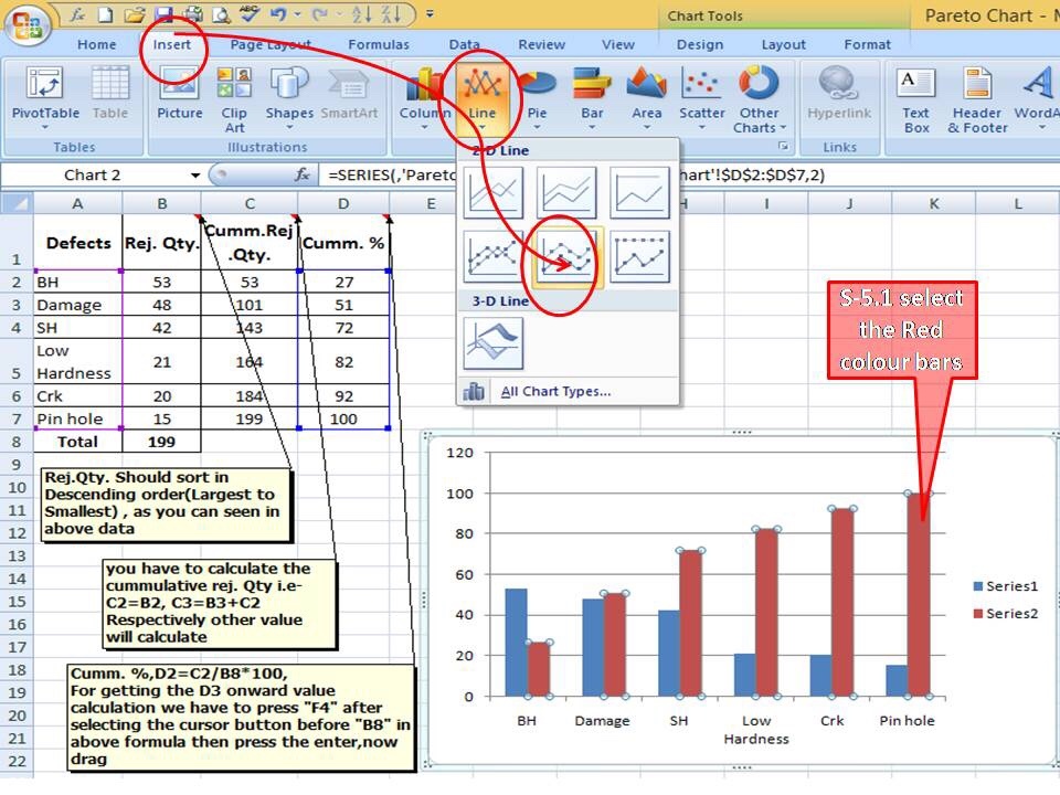
Now, we will plot the Pareto chart and will apply the 80/20 rule to know the 80% contribution among all defects.

Pareto Chart Example

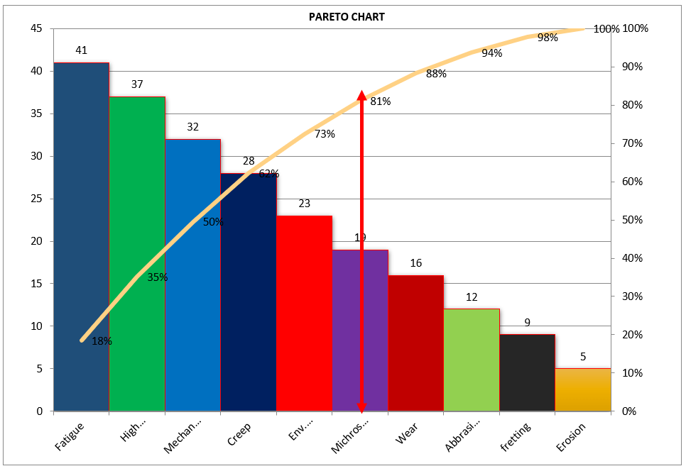
Application of 80/20 rule on the above example: kindly go through the above example and Pareto chart as well, in the aforesaid Pareto chart we have marked by the red color arrow and it is indicating the 80% contribution on a line graph, which means whatever defects are coming under the arrow are contributing the 80% contribution. If you are able to resolve these defects means, your 80% contribution will be solved out of 100%.

I hope the above articles are useful and you people are understood well.

Useful Links:

Histogram Example | Foundry Industries Examples

Histogram Template with example | Download

Repeatability vs Reproducibility | Discussion of Key difference.

Histogram Template with example | Download

More on TECHIEQUALITY

Thank you for reading…. Keep visiting Techiequality.Com

Let us know if you have any questions…

Popular Post:

How to Plot Pareto Chart in Excel | Manufacturing example | Download Format

How to Plot Pareto Chart in Excel

How to Plot Pareto Chart in Excel | Manufacturing example

How to Plot Pareto Chart in Excel ( with example), step-by-step guide and illustration with example is given below, just follow to prepare the Pareto chart in Excel.

DOWNLOAD-Pareto Chart Excel Template/Format.

History and Definition:

A Pareto Chart is named after the Italian Economist Vilfredo Pareto. It is a type of chart which contains both bars and a line graph, where the individual values are represented in the bar graph in descending order (largest to smallest value) and the cumulative percentage is represented in the line graph.

Purpose of Pareto Chart:

The purpose of the Pareto Chart is to indicate the Contributions among the set of data.

E.g. let us have six types of defects that we would like to know the most cumulative contributions among them those contributing the 90%, in such a scenario, we have to plot the Pareto Chart to know the 90% contribution with the help of line Chart, we simply cover the 90% level of line Chart, those are coming under the line graph will represent the 90% contribution. so simply Pareto Chart is helping here to identify the contribution.

Understanding the Pareto Chart principle (The 80/20 rule):

The Pareto principle is also known as the 80/20 rule derived from the Italian Economist Vilfredo,

The principle is understood as –

20% of the input creates 80% of the results

Or

80 % of the effects come from 20% of the causes.

Illustration of How to Plot Pareto Chart in Excel

How to Plot Pareto Chart in Excel

In the above Pareto Chart, we can see the cumulative% in the line graph, According to the Pareto Chart principle 80/20 rule, the 80% cumulative in the line graph is filling under the low hardness, which means BH, Damage, SH and Low hardness defers are coving the 80% of contribution over total types of defects. And those 80 % contributions were due to the 20% of the cause.

Advantages of Pareto Chart:

1. To optimize the production

2. Reduces the Rejections

3. Reduce the COPQ/COQ

4. Improve the quality

5. Improve the performance of the product

6. Improve the customer satisfaction

7. Reduce the rework cost.

Etc.

How to Plot Pareto Chart in Excel ( with example):

Step -1

We have six types of defects BH(Blow Hole), Damage, SH(Shrinkage), Low hardness, Crk( Crack), and pinhole, and the total rejection quantity is 199. So now we have to arrange/sort the rejection Quality value in descending order (largest to smallest)

Then we have to calculate the cumulative rejection quantity and cumulative % as per the below step ( from steps 1 to 3)

How to Plot Pareto Chart in Excel

As described above, the Rejection quantity should be sorted in descending order(Largest to smallest), then you have to calculate the cumulative rejection quantity i.e C2=B2, C3=B3+C2, respectively other values need to be calculated, and finally Cumulative %, D2=C2/B8x100, for getting the D3 onward value calculation, we have to press “F4” after selecting the cursor button before “B8” in the above formula then press the enter, now drag.

Step -2

steps

Now you have to select defects, rejection quantity, and cumulative % column as per the above, and then go to the insert column and select the bar chart. Simply follow the steps(From S-4.1 to S-4.5) given in above.

Step -3

After selecting the bar chart, just follow the steps (select “insert” in the Excel sheet then line and finally select the “Line” graph) as described below ( convert the red colour bar into the line Chart )

After the conversation of the secondary red colour bar into the Line Chart, the Pareto Chart will be ready to use as

steps

In the above Pareto chart, you can see the bar represents the defect’s Rejection quantity and the line represents the contribution of the cumulative percentage.

Example:

A total of 44 numbers SHE-related incident has been registered in the manufacturing industry in the last couple of financial year. To know the contribution of the individual incidents the SHE officer prepared the Pareto chart. The same Pareto chart is given below.

How to Plot Pareto Chart in Excel
DOWNLOAD-Pareto Chart Excel Template

How do you analyze a Pareto chart?

you can follow the below steps to analyze the Pareto chart;

  1. Collect the data.
  2. plot a Pareto chart with the help of the above steps.
  3. Apply the 80:20 rules/principle.
  4. select the defects under 80% contribution
  5. Brainstorm the potential cause.
  6. Do the hypothesis test or validate the potential cause to find out the significant cause.
  7. Do the RCA
  8. Take the action plan
  9. Implement the plan.
  10. Monitor the effectiveness.

Example-2 of How to Plot Pareto Chart in Excel

Plot the Pareto chart of the given below data.

DefectsRejection Quantity
A100
B80
C70
D50
E30

follow the below steps to plot the Pareto chart

Step-1:

First of all, calculate the cumulative rejection quantity

DefectsRejection QuantityCumulative Rejection Quantity
A100100
B80180
C70250
D50300
E30330

Step-2:

calculate the cumulative rejection %

DefectsRejection QuantityCumulative Rejection QuantityCumulative rejection %
A10010030
B8018055
C7025076
D5030091
E30330100

Step-3:

Select the Defects, Rejection quantity, and cumulative rejection % column, and then go to the Insert—>>Line chart. once you select the line chart then, select the cumulative rejection% line chart as the secondary axis. go through the below image for a better understanding.

How to Plot Pareto Chart in Excel

Step-4:

Select the rejection quantity line chart and then, go to the insert——>>Column chart. now the Pareto chart is ready, if you want to customise the colour, and gap then do it manually for a better visual effect.

How to Plot Pareto Chart in Excel

Some useful Articles;

Pareto Chart Example of Manufacturing Units.

Pareto Chart Excel Template.

Control Chart Excel Template |How to Plot Control Chart in Excel | Download Template.

SPC Format |DOWNLOAD Excel Template of SPC Study.

7QC Tools Excel Template |DOWNLOAD Format

More on TECHIEQUALITY

Thank you for reading…keeps visiting Techiequality.Com

Popular Post: