7QC Tools Excel Template |DOWNLOAD Format

7QC Tools Excel Template

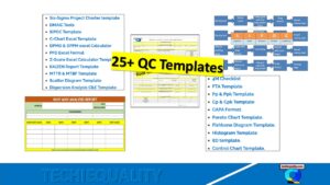
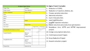
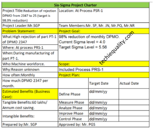
7QC Tools Excel Template |DOWNLOAD Format:

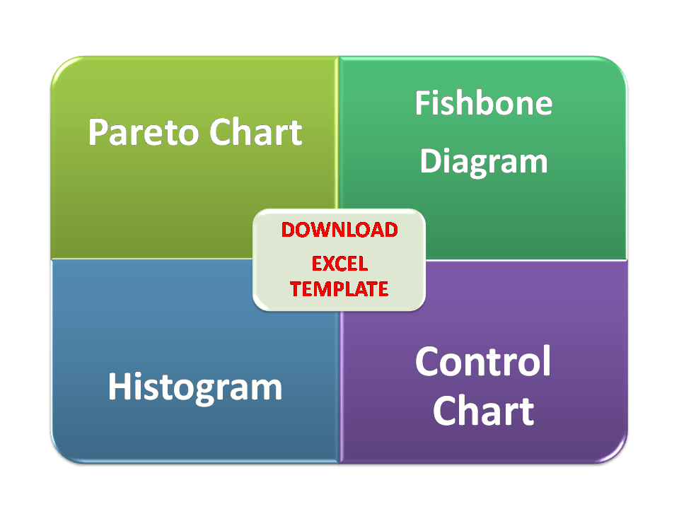
7QC tools are the most important tools that are used to analyze the Non-conforming products or services. As you know that the manufacturing process is a dynamic operation where common or special causes are always available at any extent. For analysis, the common and special cause’s 7QC tools are usually used. 7QC tools consist of [1] Pareto chart [2] Cause and Effect Diagram [3] Histogram [4] Scatter Diagram [5] Control Chart [6] Check sheet [7] Graph /Process flow. We have prepared a simple Excel template/ format and offering it here to our valuable readers to download these formats /templates. Links are given below to download the 7QC Tools Excel Template.

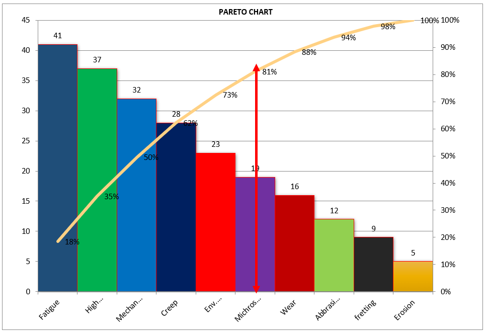
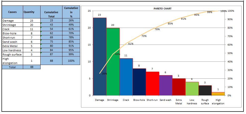
DOWNLOAD-Pareto Chart Excel Template/ Format.

Cause & Effect Diagram Excel Template/ FormatDOWNLOAD.

DOWNLOAD Control Chart Excel Template/ Format.

Histogram Excel Template/ FormatDOWNLOAD

7QC Tools Excel Template

Usages Matrix of 7-QC Tools:

7QC Tools Problem Identification Process Analysis Solution Development Result Evaluation
Pareto Chart Yes Yes   Yes
Fishbone Diagram Yes Yes    
Histogram Yes     Yes
Scatter Diagram   Yes Yes Yes
Control Chart Yes Yes   Yes
Check Sheet Yes Yes   Yes
Flow Char Yes   Yes  

Benefits of 7QC Tools:

  • Identifies Problem.
  • Priorities task.
  • Give importance to planning.
  • Process analysis.
  • Result evaluation.

The Techiequality.Com has been helping its readers with all extensions to enhance their skills with best industrial practices w.r.t QA, QC, Six Sigma concept, Lean design, lean manufacturing, business excellence, 5’S, etc. So mentioned some posts below that you would love to read…

Download QA, QC formats.

why why analysis methodology | 5-why analysis step by step guide.

Decision of process capability analysis |Download Format.

Pull Production System | Concept.

Jidoka Autonomation, Bakayoke & Yo-I-don |Concept in TPS.

Swot Analysis of Company Challenges.

Histogram Example | Foundry Industries Examples.

Repeatability vs Reproducibility | Discussion of Key difference.

Verification vs Validation | What is the difference between verification and validation?

Rework vs Repair |IATF Requirement for Control of Reworked/ Repaired Product.

Thank you for reading…Keep visiting Techiequality.Com

I hope the above information is useful to you for your skill enhancement and deployment of 7QC tools in your organization …

Popular Post:

Pareto Chart Example of Manufacturing Units

Pareto Chart Example

Pareto Chart Example of Manufacturing Units

Pareto Chart Example: Hello Readers! Today we will discuss about the pareto chart principle (80/20 Rule) with manufacturing examples.

DOWNLOAD the Below Example Pareto chart in Excel format.

Pareto Principle (80/20 Rule): –

The 80/20 Rule or Pareto Principle is the most important part of Pareto Analysis. The rule 80/20 says that 80% of the effects come from 20% of the causes.

History of 80/20 Rule: In Italy, Vilfredo Pareto has originally observed that 20% of people were owned 80% of the land. This principle was applied to quality control and favoured the use of the statement of the phrase, which is “The Vital few and useful many” to define the 80/20 rule in the 20th century by Dr. Joseph M. Juran.

Understanding of Principle with Manufacturing Example:

 We have taken the major defects related to the Metal fabrication and casting Process. We will analyze the contribution of defects among all with the help of the Pareto principle 980/20 Rule). So, let’s get started with two important examples, details are given below.

Example:
Defects Quantity
Fatigue 41
High temp. defect 37
Mechanical Property degradation 32
Creep 28
Env. Interaction 23
Microstructural changes 19
Wear 16
Abbrasive Wear 12
fretting 9
Erosion 5

Now, we are supposed to calculate the Cumulative total and Cumulative percentage

Defects Quantity Cumulative
Total
Cumulative in
%
Fatigue 41 41 18%
High temp. defect 37 78 35%
Mechanical Property degradation 32 110 50%
Creep 28 138 62%
Env. Interaction 23 161 73%
Microstructural changes 19 180 81%
Wear 16 196 88%
Abbrasive Wear 12 208 94%
fretting 9 217 98%
Erosion 5 222 100%

Now, we will plot the Pareto chart and will apply the 80/20 rule to know the 80% contribution among all defects.

Pareto Chart Example

Application of 80/20 rule on the above example: kindly go through the above example and Pareto chart as well, in the aforesaid Pareto chart we have marked by the red color arrow and it is indicating the 80% contribution on a line graph, which means whatever defects are coming under the arrow are contributing the 80% contribution. If you are able to resolve these defects means, your 80% contribution will be solved out of 100%.

I hope the above articles are useful and you people are understood well.

Useful Links:

Histogram Example | Foundry Industries Examples

Histogram Template with example | Download

Repeatability vs Reproducibility | Discussion of Key difference.

Histogram Template with example | Download

More on TECHIEQUALITY

Thank you for reading…. Keep visiting Techiequality.Com

Let us know if you have any questions…

Popular Post:

Pareto Chart Excel Template | Download format

Pareto Chart Excel Template

Pareto Chart Excel Template | Step by Step guide of template usages:-

Hi Readers! In this article, we have discussed on Pareto Chart Excel Template with a manufacturing example. and also you can learn here, the Pareto chart principle (80/20 rule). if you would like to download our excel template or format then, go through the below link.

DownloadPareto chart Excel Template.

Pareto Chart Excel Template

[Figure 1]

How to Use Pareto Chart Excel Template:

After downloading, the above Pareto Chart Excel Template Carefully read the Note and red highlighted box marked in excel.

Note 1:- White cells are only changed values. The sky colour cells will automatically calculate based on the formula within the cells.

Note 2:- Starting from the top, enter the name of causes into the table below in descending order (Largest to Smallest Values)

Example of Pareto chart:

Let us have ten causes as Damage, Crack, Shrinkage, Short-run, Blowhole, Pin-hole, Extra Metal, Sand-wash, Rough Surface, Low hardness, and High elongation.

Causes Rejection Quantity
Damage 23
Shrinkage 20
Crack 11
Short-run 7
Blow-hole 8
Extra Metal 5
Sand wash 6
Rough surface 3
Low hardness 4
High elongation 1

Now you have to do the sorting of Rejection Quantity in Descending order (Largest to smallest value)

Descending order of Rejection Quantity of above causes are,-

Causes Rejection Quantity
Damage 23
Shrinkage 20
Crack 11
Blow-hole 8
Short-run 7
Sand wash 6
Extra Metal 5
Low hardness 4
Rough surface 3
High elongation 1

Now directly we have to enter the name of causes and Rejection quantity (After sorting the value in descending order) into white cells of the Excel template sheet. After entering the values the Pareto chart will look like as below.

Pareto chart example
Pareto Principle (80/20 Rule):-

The 80/20 Rule or Pareto Principle is the most important part of Pareto Analysis. The rule 80/20 says that 80% of the effects come from 20% of the causes.

In Italy, Vilfredo Pareto has originally observed that 20% of people were owned 80% of the land. This principle was applied to quality control and favoured the use of the statement of phrase, which is “The Vital few and useful many” to define the 80/20 rule in the 20th century by Dr. Joseph M. Juran. Nowadays this principle is so popular and very useful in describing the contribution of the causes.

Understanding of Principle:-

Let’s get started with this principle, and how it is applicable in different sectors like manufacturing and non-manufacturing unit or service sectors. This principle is not limited to any particular sector or unit’s problems or defects to identify the contribution. It will help you to resolve 80% of problems/causes/defects among the 100% of problems.  

How this principle is related to the different fields: – (Example)-

  • Filed failure (for example (a)-80% of the field failure comes from 20% of the Causes.
    (b)-80% of the field failure comes from 20% of the Customer).
  •  80% of the results come from 20% of the Team.
  • Risk Management (e.g. 80% of the Risk comes from 20% of the Causes).

Let us have ten types of Causes and individual causes having a number of defects. Now we need to work on merely an 80% contribution to resolve the problem. But the things are how to identify the causes those are coming under the 80% contribution. So to identify the contribution we need to use the Pareto chart for knowing the contribution. So I would recommend you to download the above Pareto Chart Excel Template then, follow the steps and identify the contribution.

Advantages of Pareto Chart:

1. Production Optimisation.

2. Rejection Reduction.

3. Cost of Poor Quality Reduction.

4. Quality level Improvement.

5. Product Performance Improvement

6. Customer satisfaction Enhancement.

7. Rework cost reduction.

Etc.

The Pareto chart is the most commonly used tool in manufacturing industries, I remember when I was working in the quality department, how frequently I used this tool in our daily quality issue analysis. I used this tool on a daily line rejection analysis, as well as in different types of QA or QC projects like quality circle projects, SGA projects, Six Sigma projects, etc. With the help of the Pareto chart, you can easily visualize the defect’s contribution and accordingly, you can do an analysis of the majority contribution for improvement.

FAQ:

The Pareto chart is one of the commonly used 7 QC tools in manufacturing industries.

Similar Articles:

Histogram Example | Foundry Industries Examples.

Histogram Template with example | Download.

How to plot Histogram in Excel (Step by step guide with example)

SPC Format |DOWNLOAD Excel Template of SPC Study

7QC Tools for Problem Solving | What are 7 QC Tools

Root Cause Analysis | 8 Steps of RCA

More on TECHIEQUALITY

Thanks for reading…Keeps Visiting Techiequality.Com

Popular Post: