Histogram Example | Foundry Industries Examples
Histogram Example: Hello, Readers! Here we will discuss two important industrial examples to prepare a Histogram and its interpretation. If you are interested in downloading the Excel template/format, then go through the beneath links.
DOWNLOAD [Histogram Template in Excel format].
How to Prepare Histogram in Excel?
Example-1:
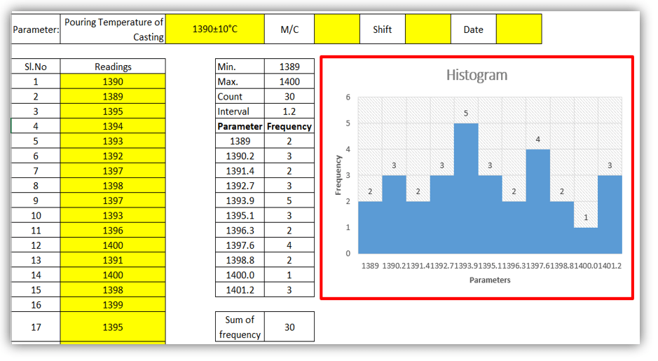
A Process engineer of an organization (XYZ Ltd) had decided to know the bins range [frequency distribution] of pouring temperature of casting and he has started collecting the data of 30 number readings and analyzing that data distribution that histogram graph is normal or non-normal. Illustrations of the same readings are given below,
DOWNLOAD Example-1’s Histogram Excel Template.
| Parameter: | Pouring Temperature of Casting | 1390±10°C | M/C | Shift | Date |
| Sl. No | Readings | Sl. No | Readings |
| 1 | 1390 | 16 | 1399 |
| 2 | 1389 | 17 | 1395 |
| 3 | 1395 | 18 | 1397 |
| 4 | 1394 | 19 | 1396 |
| 5 | 1393 | 20 | 1392 |
| 6 | 1392 | 21 | 1393 |
| 7 | 1397 | 22 | 1393 |
| 8 | 1398 | 23 | 1400 |
| 9 | 1397 | 24 | 1389 |
| 10 | 1393 | 25 | 1390 |
| 11 | 1396 | 26 | 1390 |
| 12 | 1400 | 27 | 1391 |
| 13 | 1391 | 28 | 1392 |
| 14 | 1400 | 29 | 1393 |
| 15 | 1398 | 30 | 1397 |
| Min. | 1389 |
| Max. | 1400 |
| Count | 30 |
| Interval | 1.2 |
| Parameter | Frequency |
| 1389 | 2 |
| 1390.2 | 3 |
| 1391.4 | 2 |
| 1392.7 | 3 |
| 1393.9 | 5 |
| 1395.1 | 3 |
| 1396.3 | 2 |
| 1397.6 | 4 |
| 1398.8 | 2 |
| 1400.0 | 1 |
| 1401.2 | 3 |
| Sum of frequency | 30 |
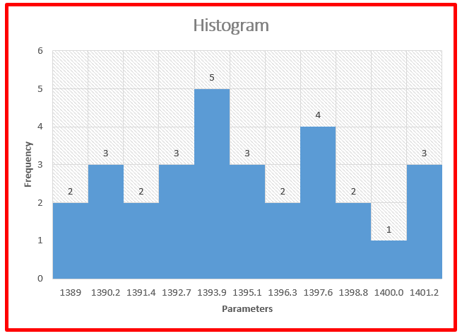
Interpretation of Result: Non-normal data distribution.
Example-2:
We have collected the 30 readings of green sand permeability, details are given below and also, and we have plotted a histogram to know the data frequency distribution.
DOWNLOAD Exanple-2’s Histogram Excel Format.
| Parameter: | Green sand Permeability | 200±10 | M/C | Shift | Date |
| Sl. No | Readings | Sl. No | Readings |
| 1 | 201 | 16 | 200 |
| 2 | 200 | 17 | 201 |
| 3 | 202 | 18 | 201 |
| 4 | 201 | 19 | 203 |
| 5 | 200 | 20 | 201 |
| 6 | 199 | 21 | 198 |
| 7 | 199 | 22 | 199 |
| 8 | 198 | 23 | 197 |
| 9 | 201 | 24 | 197 |
| 10 | 200 | 25 | 198 |
| 11 | 199 | 26 | 199 |
| 12 | 198 | 27 | 200 |
| 13 | 197 | 28 | 201 |
| 14 | 199 | 29 | 203 |
| 15 | 198 | 30 | 200 |
| Min. | 197 |
| Max. | 203 |
| Count | 30 |
| Interval | 0.7 |
| Parameter | Frequency |
| 197 | 3 |
| 197.7 | 0 |
| 198.3 | 5 |
| 199.0 | 0 |
| 199.7 | 6 |
| 200.3 | 6 |
| 201.0 | 0 |
| 201.7 | 7 |
| 202.3 | 1 |
| 203.0 | 0 |
| 203.7 | 2 |
| Sum of frequency | 30 |
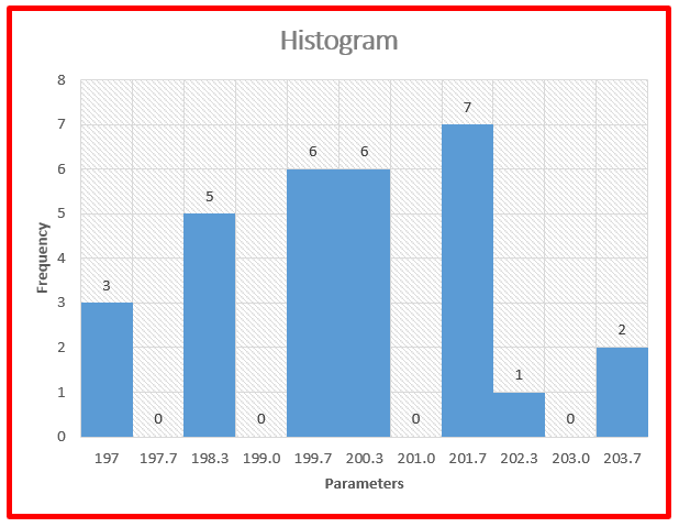
Interpretation of Result: Non-Normal data distribution.
Useful Links:
How to Plot Pareto Chart in Excel ( with example)
OEE Calculation-How To Calculate OEE (Overall Equipment Effectiveness) with Example
Implementation of KAIZEN in Industry


Thank you for reading…. Keep visiting Techiequality.Com
Let us know if you have any questions…
Popular Post:

Shanti Gopal Pradhan is an experienced professional in Quality Management Systems, QA, Operations, Business Excellence, and Process Improvement. He has strong expertise in international standards including IATF 16949, ISO 9001, ISO 14001, ISO 45001, and ISO 17025, along with methodologies such as TQM, TPM, and Six Sigma.
He holds a degree in Mechanical Engineering along with an MBA, combining strong technical acumen with strategic business insight, he is a Certified Internal Auditor, Lead Auditor, and Six Sigma Black Belt, with a proven track record in driving quality transformation and operational excellence.