How to make a box plot in excel | Manufacturing Example:
Hi Readers! If are really searching to learn about how to make a box plot in excel then you are on the right platform. So here we are going to explain the same in detail with manufacturing or industrial examples for better understanding. And you can easily apply it in your manufacturing process to know the data symmetric. But also you can use several other tools as well. First of all, here we will learn what are box plots and their uses & interpretation.
What is Box plot?
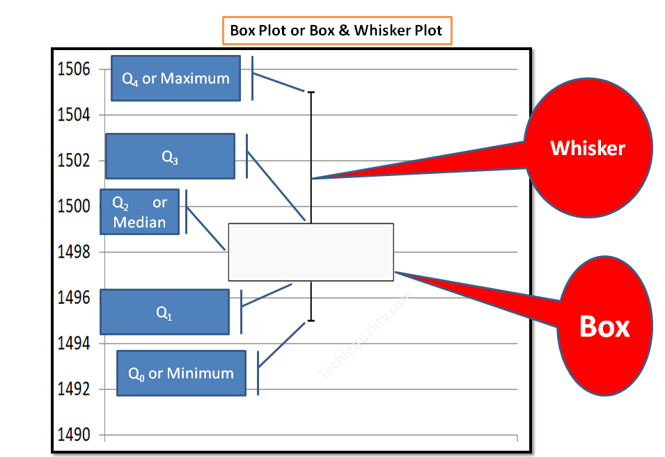
The box plot (Boxplot) or box and whisker plot is a graphical representation of numerical data spread and skewness. It helps to know whether numerical data are symmetric or not. As you know that it is also called as box and whisker plot, so the plot contains box and lines (Whiskers). It generally consists of five number summary i.e. zero quartile (Q0), First quartile (Q1), Second quartile (Q2), Third quartile (Q3), Fourth quartile (Q4).
[Box plot Sample figure]
Box plot terminology:
- Zero Quartile (Q0) or Minimum number: This is the minimum value of the data set.
- First quartile (Q1): Lowest 25% value of the data set.
- Second quartile (Q2) or Median: Lowest 50% value of the data set or middle value of the data set.
- Third quartile (Q3): Lowest 75% value of the data set.
- Fourth quartile (Q4) or Maximum number: Maximum value of the data set.
- Inter Quartile Range (IQR): Third Quartile (Q3) – First Quartile (Q1)
How to make a box plot in excel? (Step by Step guides with manufacturing example):
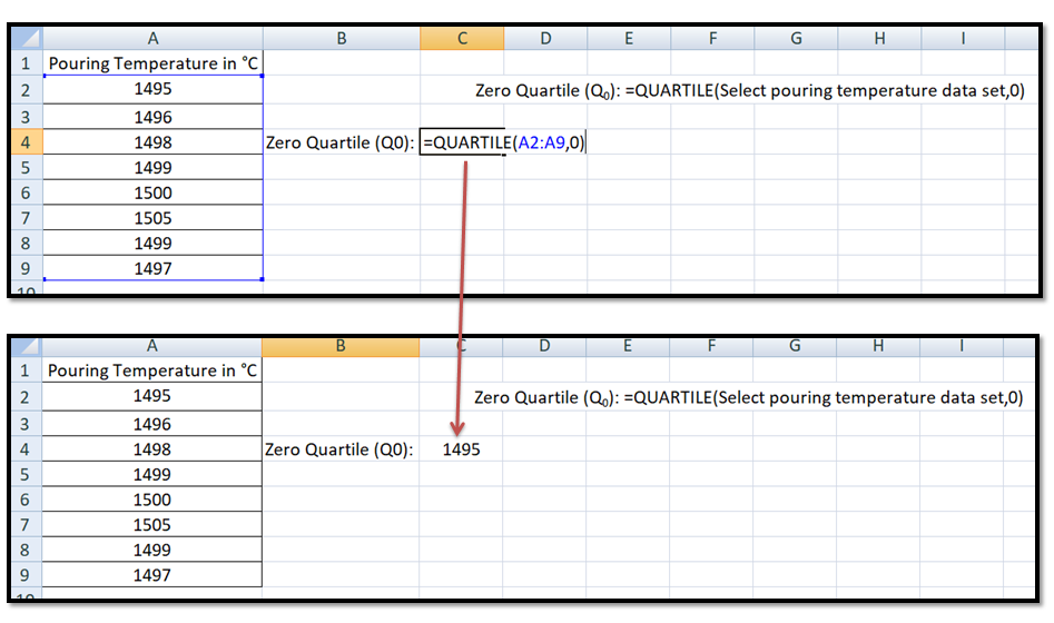
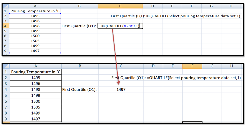
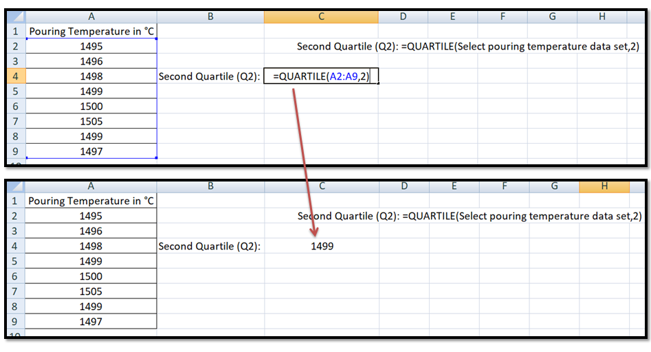
Suppose a manufacturing company produces an automobile part. One day a process quality engineer has instructed to quality supervisor to record the pouring temperature reading for knowing the data symmetric by making a box plot. So the supervisor started collecting data from shift-wise and recorded the data in excel for making the boxplot. The same data are given in the below table.
| Pouring Temperature in °C |
| 1495°C |
| 1496°C |
| 1498°C |
| 1499°C |
| 1500°C |
| 1505°C |
| 1499°C |
| 1497°C |
Now, we have to calculate the quartile value of each quartile so the Excel function of each quartile is given below;
- Zero Quartile (Q0) or Minimum number: =QUARTILE(array, quart)
- First quartile (Q1): =QUARTILE(array, quart)
- Second quartile (Q2) or Median: =QUARTILE(array, quart)
- Third quartile (Q3): =QUARTILE(array, quart)
- Fourth quartile (Q4) or Maximum number: =QUARTILE(array, quart)
Note, in the above excel function the “array” is the data set means for the above data table its pouring temperature data set and “quart” will be different for different quartiles. Try the given below function and calculate the each quartile value (note we have calculated all the functions and box plots by using excel 2007 version only).
Final excel function of each quartile:
| Pouring Temperature in °C |
| 1495 |
| 1496 |
| 1498 |
| 1499 |
| 1500 |
| 1505 |
| 1499 |
| 1497 |
- Zero Quartile (Q0): =QUARTILE(Select pouring temperature data set,0)
- First quartile (Q1): =QUARTILE(Select pouring temperature data set,1)
- Second quartile (Q2) or Median: =QUARTILE(Select pouring temperature data set,2)
- Third quartile (Q3): =QUARTILE(Select pouring temperature data set,3)
- Fourth quartile (Q4) or Maximum number: =QUARTILE(Select pouring temperature data set,4)
Calculation of Quartiles by Using Excel Function:
Zero Quartile (Q0) or Minimum: By using the excel function given in the below figure, try to calculate the Q0 value. After applying the mentioned excel function in a given data set we found the value is 1495.
First quartile (Q1): Similarly we have calculated the first quartile and the rest of the quartiles by applying the above excel function. We have mentioned the excel function in the below figure and applied the same in the pouring temperature data set and found the value is 1497.
Second quartile (Q2) or Median:
Go through the below figure and calculate the second quartile value, we have found the value 1499.
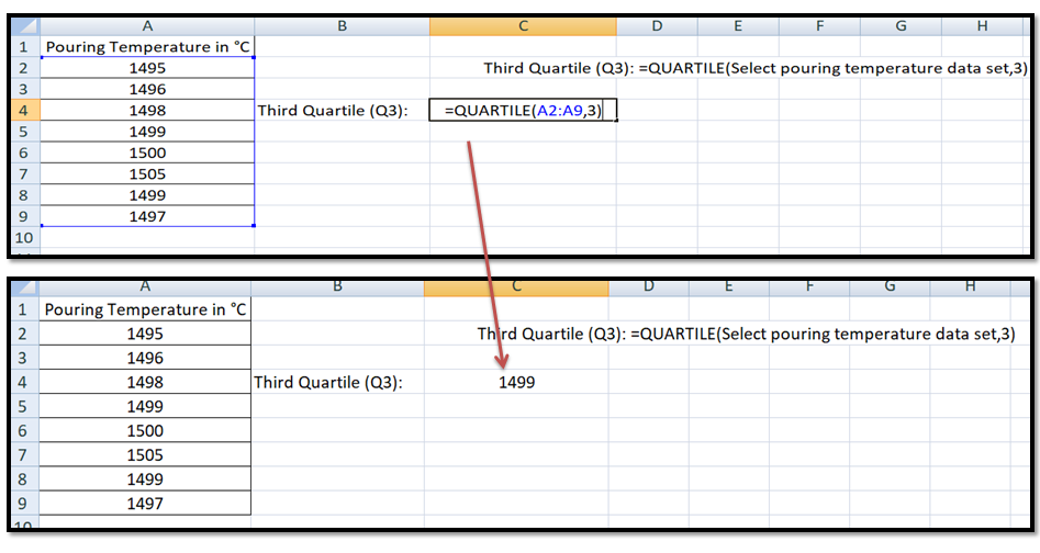
Third quartile (Q3):
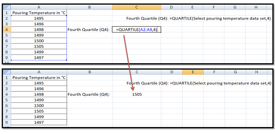
Fourth quartile (Q4) or Maximum number: Apply the excel function, given in the below figure and calculate the quartile value.
After applying the individual quartile’s excel function, we have summarized the all values and recorded them in the below table. Next, we are going to make a box plot in excel, so follow the below given complete guidelines or step-by-step process to make the box and whisker plot in excel.
| Q1 = | 1497 |
| Min. or Q0 = | 1495 |
| Q2 = | 1499 |
| Max. or Q4 = | 1505 |
| Q3 = | 1499 |
| Upper error bar (Q4-Q3) = | 6 |
| Lower error bar (Q1-Q0) = | 2 |
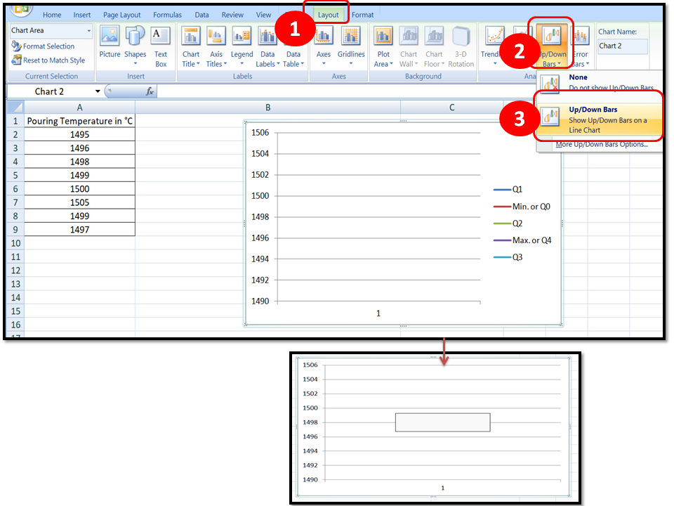
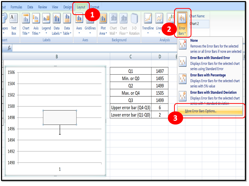
Step by Step Guides on How to make a box plot in excel:
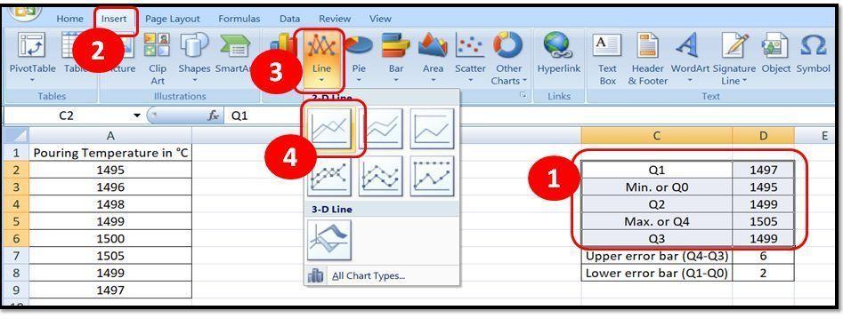
Step1:
As you know that we have already calculated the quartiles values, just arrange the quartile value as per the given below figure and select the all values after that follow the step-1 to step-4 (as per the below figure).
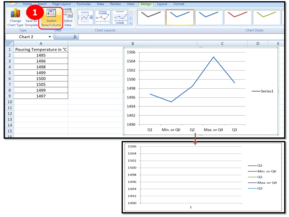
Step2: Select the option “Switch Row/Column” in excel
Step3: Select the excel option as per instructions given in the below figure.
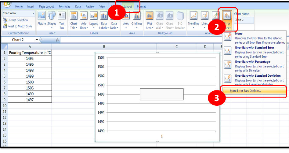
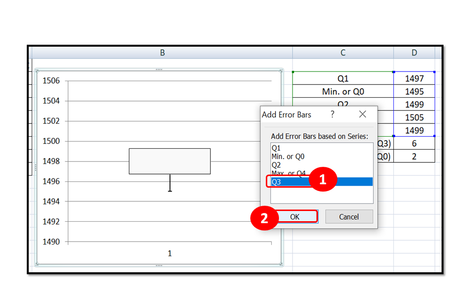
Step4:
In the above process, we have plotted the box and now we have to make the whisker, so follow the below instruction as per beneath figure.
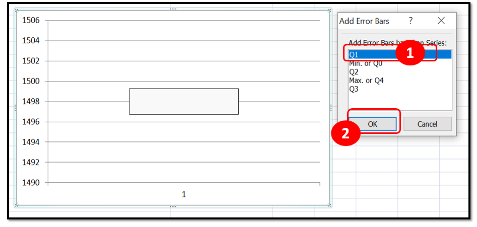
Step5: Follow the below instruction
Step6:
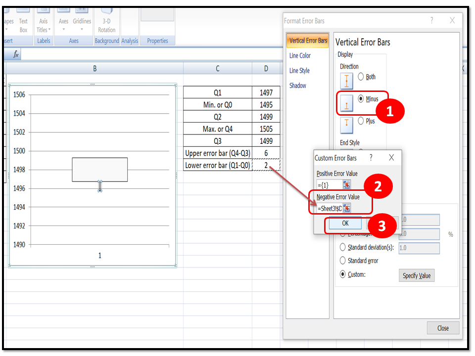
Here, we will learn the steps to make the lower whisker, so go through the below figure and follow the given instructions.
Step7: similarly, we will make the upper whisker by following the below given steps
Step8: Follow the steps in the below figure
Step9:
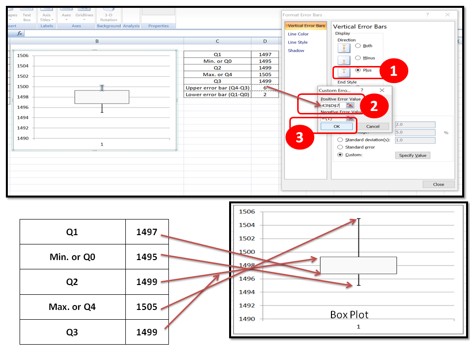
Conclusion and Interpretation of the above Box Plot:
As you can see the above box plot that the data are not spread in symmetric. Here we are also going to plot the histogram to compare the both boxplot and histogram to know the comparison value. You can learn more about the step-by-step guide to plotting histogram in excel with examples and also can download the histogram template or format.
Histogram:
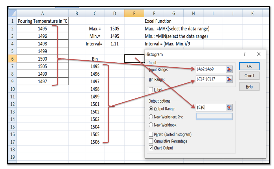
Step1: Enter the Pouring temperature reading in excel and then calculate the interval value by using the excel function given in below figure. Next select the option “data” in excel sheet and then select “Data analysis” option and then finally select the histogram option.
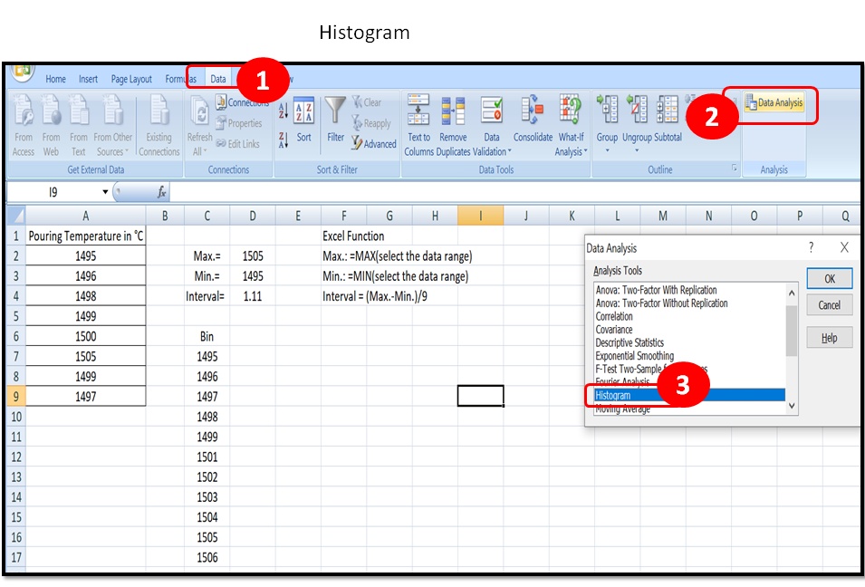
Step2: Select the appropriate data set as per below instruction given in figure
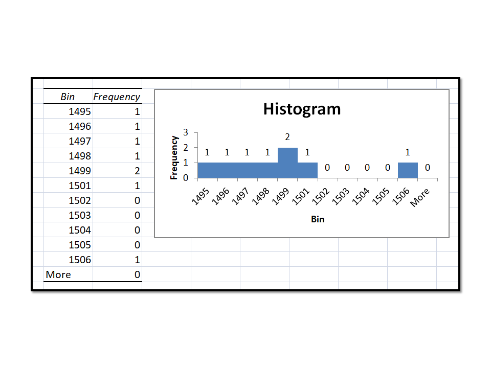
Now, Histogram is ready so here we will compare the both the plot histogram vs Box plot
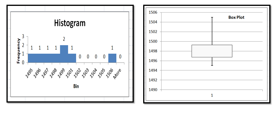
From both the graph we have concluded that data are not symmetrically distributed (Graph are not symmetric).
Free Templates / Formats of QM: we have published some free templates or formats related to Quality Management with manufacturing / industrial practical examples for better understanding and learning. if you have not yet read these free template articles/posts then, you could visit our “Template/Format” section. Thanks for reading…keep visiting techiequality.com


Popular Post

Shanti Gopal Pradhan is an experienced professional in Quality Management Systems, QA, Operations, Business Excellence, and Process Improvement. He has strong expertise in international standards including IATF 16949, ISO 9001, ISO 14001, ISO 45001, and ISO 17025, along with methodologies such as TQM, TPM, and Six Sigma.
He holds a degree in Mechanical Engineering along with an MBA, combining strong technical acumen with strategic business insight, he is a Certified Internal Auditor, Lead Auditor, and Six Sigma Black Belt, with a proven track record in driving quality transformation and operational excellence.